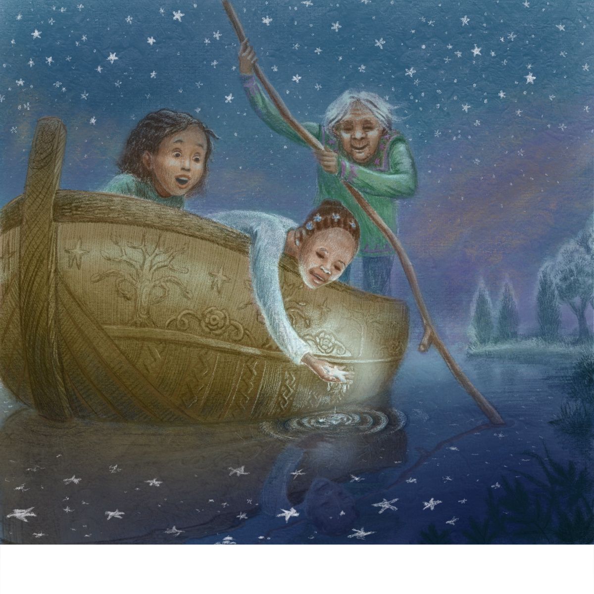
Star in the water WIP
-
This concept is so magical I love it~! I personally would love to see more of the water since that's where the magic is. I also wonder if it would add more interest if we're further along in the moment where they've already collected a few (or a bunch!) of stars already and they are heaped on the boat with them. And they could be a variety of sizes (and maybe colors??).
Here are some other compositions I found on Pinterest that I feel would work really well:
With this one I can totally see there being a lot of stars at the front of the boat and less stars behind the boat since they've collected a lot of them already.
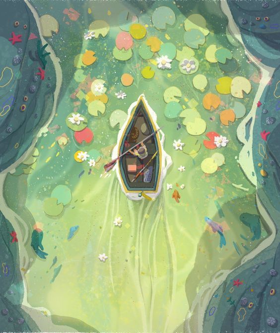
This one is just an example of a view that shows more of the water that would be filled with a variety of stars.
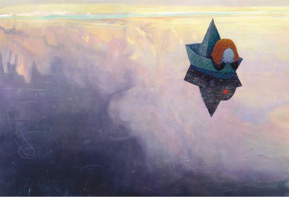
Your composition is already really engaging as it is, so feel free to ignore my two cents! Haha. I can't wait to see the finished piece!

-
@aprilshin Hi! Thank you so much for your opinion. I really appreciate that you took the time to find those beautiful reference paintings. I think you’re right - the water deserves more attention. My initial idea was to show the first moment that they discover that the star can be picked up from the water, but your idea about having them already collecting them is fun too. Thanks so much for the food for thought.

-
@kathrynadebayo said in Star in the water WIP:
The boy is scooping up one of the reflections of the stars on the water, but amazingly, he can actually hold it.
Based on your description here, don't lose sight of the fact that your story is the boy's amazement that the star isn't just a reflection, but real. For that I think you need to make the stars in the water clearly more ephemeral (think ripple lines in water) and the one in his hand much more concrete and 3D. I liked that you had zoomed in because that way we got to see the expressions more. Yes, the water and the idea of a star "catch" in the boat are nice additions and might fill out the story, but the focus is the scooping, and the amazement at the difference. I think your last two sketches depict this well, with perhaps the addition of a surprised expression on the child who is doing the scooping. But I think you're getting there!
-
@lauraa Hi Laura, thank you so much for your advice! I really appreciate your input. I agree with what you’ve written here and I think it’s helpful to be brought back to the original intent. I’ve gotten into coloring the most recent sketch a bit and have been working on the expressions, so I’d love to know if you think the girl scooping the star looks surprised enough. I’m also going for a feeling of wonderment.
 Thanks again!
 -
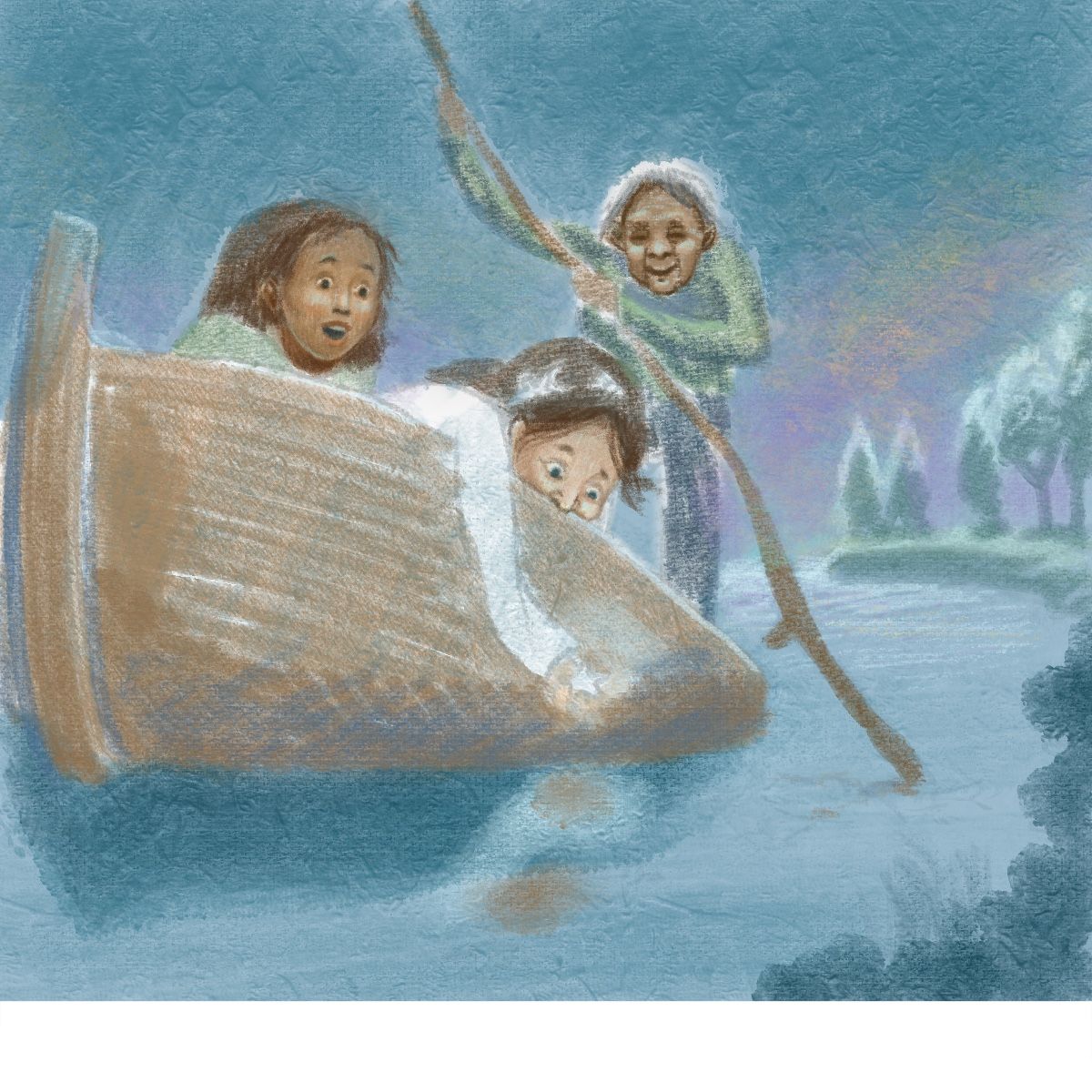
I started coloring this and working on the faces first. Before I get too far along, I’d love to know if there are compositional issues that anyone picks up on. Thanks so much for any advice you feel like sharing.
-
@kathrynadebayo Yes, I do think she looks the right amount of surprised. I am wondering a little bit about the other girl (was it originally a boy?) who has her nose on the boat. She just looks a little uncomfortable to me and the nose looks slightly too adult. A draw through might be worth it on that one.
Would you be seeing a little bit of the underside of Grandma's neck? I really like her expression!
I also like the colors in the sky a lot! Of course, what's really going to make it is that glowing star!
-
@kathrynadebayo Really love this idea!
-
@lauraa You’re so right! I’ve changed that kid again. Hopefully she looks less awkward now. Yes, the characters themselves keep morphing, but I think that’s a fun part of digital art - easy to change!
-
@miranda-hoover Hi Miranda! Thanks for the comment! Your piece looks amazing this month.

-
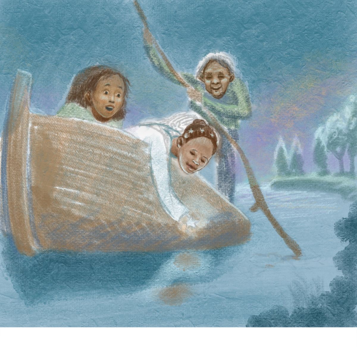
-
Here’s some more progress. I hope the star stands out enough?
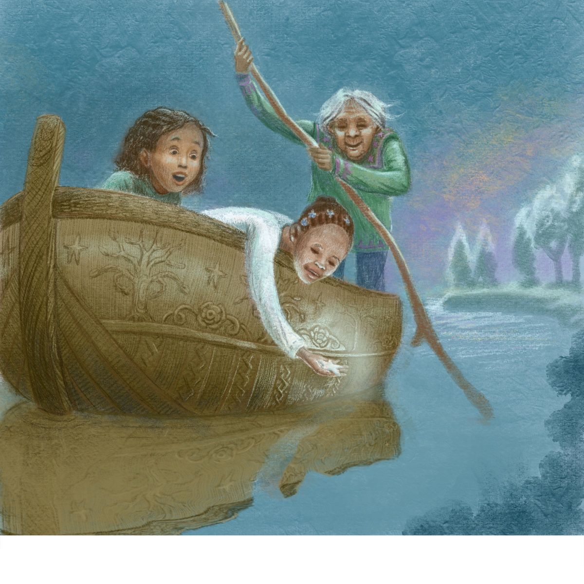
-
I love the one with the man and child - their expressions are wonderful and the composition and perspective really take you into their moment.
-
@helen hello! Thank you for your encouraging words. Maybe I’ll finish that one too at some point.

-
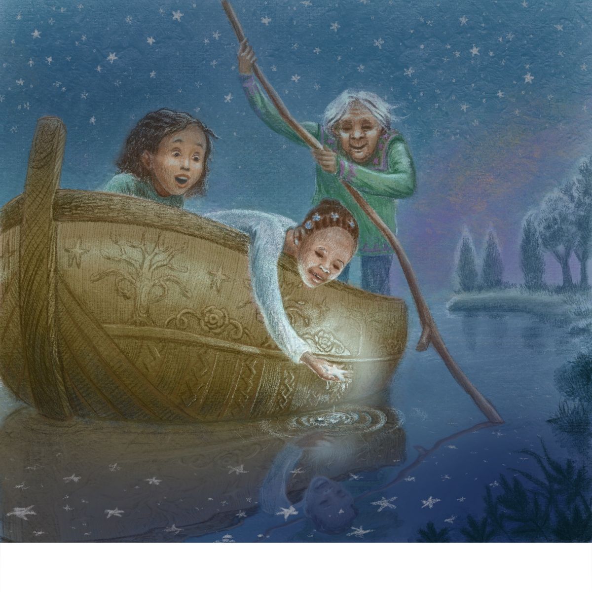
Here’s the progress so far… does the piece look coherent even with the different textures? Comments about any other things you see to improve are certainly welcome.

Also, on my phone this is looking darker than I thought it did while working on it - does it look too dark to you guys?
-
@kathrynadebayo Hi Katheryn! I'm not sure if this is too late now but based on your boat's perspective, the Horizon Line should be lower. I love the piece tho. I love the atmosphere.
-
@nyrryl-cadiz Hi Nyrryl! Thank you so much for pointing that out. I can totally see it now!
-
Just to say, this has been really lovely to read and see the work coming together!
Best of luck -
@anita-jean oh that’s great to hear.
 I love seeing other people’s works in progress. It’s amazing how art can improve when a group of minds collaborates.
 -
Here’s a new version with the horizon line lower.
 It might still be too high though…hmm…
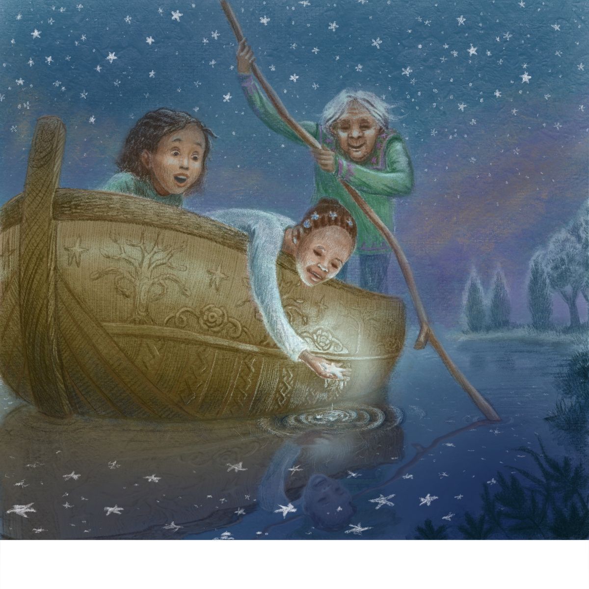
-
Ok, a little lower.

