I would love a critique on this storybook Illustration
-
Hi everyone, I've been doing graphic design for a while, but have wanted to transition into illustration.
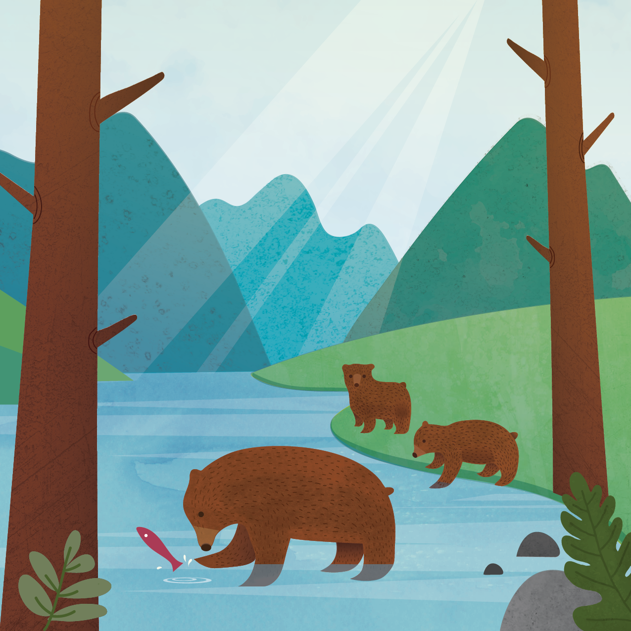
My friend wrote a children's book about animals and I told her I'd love to take a stab at illustrating it. This page is about a momma bear teaching her cubs to fish. I'd love some feedback before I send this off to her as a sample. Anything that can be improved?
Thanks!

-
@ContinuousLines It's fun that you might get to work on a project with a friend! Something that comes to mind is having the mama bear interact with the cubs or at least have them close enough to be observing. To me this is a mama bear fishing to feed her babies, not teaching them.
-
@ContinuousLines This is a fine illustration of some nature. I take a lot of pictures of my kids and my favorite pictures are the ones where I stick the camera in their faces.
-
This is a really great start for an illustration. the textures are very interesting and comforting to look at. I would try adding some more detail to the environment to make it a little more interesting to look at. More greenery/bushes/vines are always really nice to look at.
-
This is really calm and beautiful. I love the colors and clean edges. To address @Frogpunzel ‘s idea, could you flip the mama bear around to face the cubs? One technical detail you might want to consider is how the rays of light stream down in the background… making sure that all the lines come from the same vanishing point (the sun) will help them read as sun rays. Thank you for sharing this piece… looking forward to seeing more.
-
@Elisa-Miko-Price thanks for the feedback, I was also thinking about adding some more plants, I’ll give it a go! Thanks

-
Great start! I think, try playing with the contrast between the similar items; so contrast between the bears or the contrast between the mountains, etc.
I hope that helps.
-
@Frogpunzel yes that’s a good point, I guess this section of the story is more about the bears eating their natural diet as opposed to food from humans, rather than what I originally wrote about them being taught to fish, but I think it’s a great suggestion none the less. Thanks

-
Hi @ContinuousLines this is really sweet- I like how the two bears are focused on their fishing and the third is looking up at the camera. Your character design is really simple and appealing. I also like the color choices.
As far as constructive things go.. I would agree that adding some details would be nice. You have set up a really lovely back, middle, and foreground, but I would try adjusting the values so they are more clearly defined.. you could either do lighter background, darker middle ground, and really dark foreground with more shrubbery so its almost like the bears are being framed.. or light, dark, light.. etc. I love playing around with that stuff
 I really like your light beam as well... but what if it was hitting the bears more and really made them pop? I think this is such a great start and can't wait to see what you can do!
I am also doing a book with a friend (well my cousin) and its SO fun to work together. Best wishes! -
Great tip, I was thinking the bears are looking a bit flat against each other, will give it a go

-
@Annaaronson great idea! Will give it a try. Thank you!
-
I really like the style and textures you have here. I have read over the other comments and have a couple of suggestions, though I do think it looks really good as is and could work in a book.
If you make the mountains in the back a little more grey or neutral they will get pushed back into the background, creating a lot more depth in the illustration.
Turning the mother bear around so the cubs can see what she is doing, and having them looking at the fish will help to illustrate that she is showing them how to fish.
I would like to see a version of this where the camera is right at the water level looking up at the mother bear, and quite a bit closer to her so she fills the page. You could still see the background elements a bit around her, and maybe in the negative space under her, around her legs, you can see the cubs on the far shore watching what she is doing. -
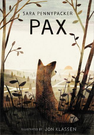
@ContinuousLines The graphic style of this really cute and I think there are some things working really well… the simple style of the bears and the colors etc. I think, though, the perspective of the piece is getting lost in the flatness. I don’t know if that makes sense. I think you could keep the simple style you are going for and still accomplish that. You might play with pushing the values a bit more. Jon Klassen does this really well. His style is definitely flat and graphic, but he uses texture and color and light to create a sense of perspective. Things that are close have much more texture and detail and the things that are further away are very very simple. He also pushes the darks and lights to pull your attention where he wants it. I hope that’s helpful. Very cute.

