Beach scene feedback please
-
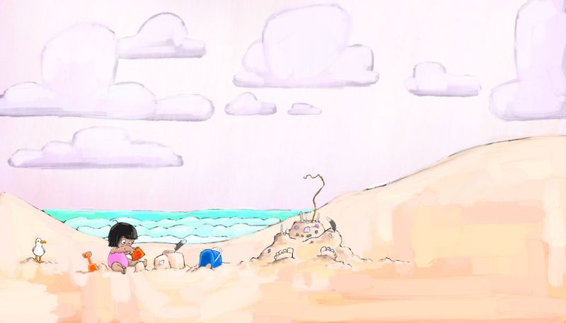
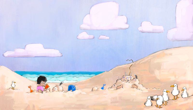
I changed the color of the sky completely but I kinda miss the blue it maybe to close in value to the sand

..
-
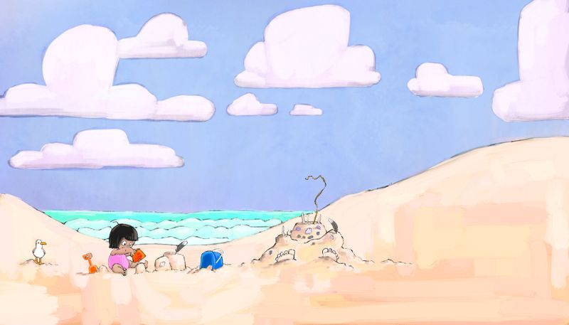
Ok back to blue

-
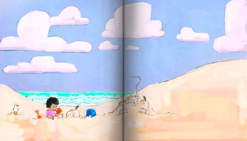
@Asyas_illos this is looking great - the one thing I am wondering is if this is a 2 page spread? I made a mock gutter layer for a project I’m working on - I’ve been putting it on my top layer when sorting out a composition. I applied it to your painting and to me It looks like it might be good to scoot the sand castle/buried parent over a bit if it is a 2 page spread.... but maybe it is not a 2 page spread
")
-
@Kevin-Longueil that's great! Thank you! Its just a personal piece possibly
Portfolio but I could try and scoot the “sandman” over a tad. Love that gutter trick -
@Kevin-Longueil how’s this? Is that a download, the faux gutter? I use procreate. Or did you make it yourself? -
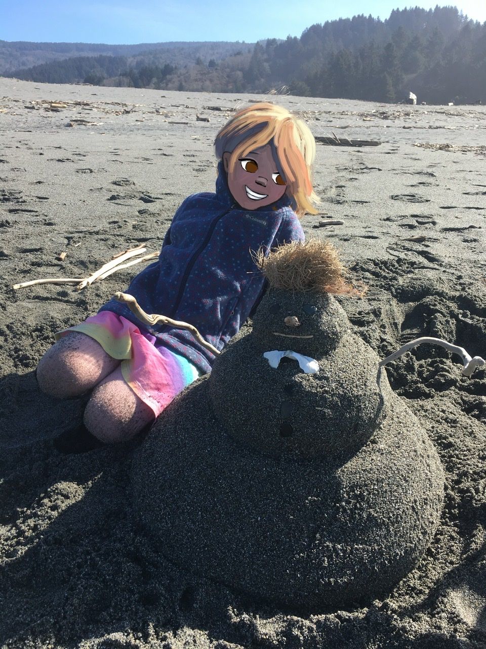
Here was my inspiration! LOL how scary is my daughter?! Hahaha we built this sandman last fall/winter in humboldt .
-
@Asyas_illos Love the hair! The piece does look better to me but my thoughts were just in case it was a 2 page spread
(i use procreate too - the faux gutter is just a transparent layer with a straight technical pen line down the middle with a couple quick soft airbrush passes over it..takes just a minute to make) -
@Asyas_illos very cute -- and love the inspiration pic!
So, as @Kevin-Longueil said, if this is meant to be a two page spread (which might be a good thing to include if you're looking to build a picture book portfolio), then you may want to compose the illustration not only thinking about the gutter, but leaving a space for the placement of text. Two good spots that jump out to me for text placement are the right side of the sky (if you move clouds) or the bottom right in the sand (perhaps moving the buried parent character up a smidge to leave room.
What I noticed about the composition: the characters are all almost on the same plane and are all similar in size. With nothing in the foreground, there isn't a focal point to draw my eye with the characters; my eyes keep wanting to focus on the clouds (which are great, by the way, but not your intended focal point, I'm guessing).
This is just one possible solution: move your main character into the foreground so that she's bigger than everyone else. We'll get to see more of her face and will more easily read her expression, which will help sell the overall emotion of the piece.
And one more teensy note about color: if an art director were looking at this piece in your portfolio, they might question your color choices. That bright turquoise of the sea can sometimes have a substantial color shift when converted over to CMYK for printing. It also competes for dominance.
Love the new color of the sky! Perhaps warming up the blue in the water will help with color cohesion?
Sorry if I'm coming across as being very nitpicky. Honestly, this is one of my favorite pieces of yours. (After the Alice fairytale traveler!)
 ️
️ -
@Melissa-Bailey-0 not nit-picky at all! That's what we’re here for right?! All very good and valid points. I think I may end up removing some of the clouds altogether and I actually have more characters I am adding, I’m not entirely sure that the girl is the main character, so I’ll take the planes in mind mine as sketch them out. As for the cmyk thing, I have no idea but that’s a bummer cuz I love turquoise! I’ll have check out some books and see how close some get to turquoise.
I’ll work on the color. @Kevin-Longueil thanks for the tip! -
My daughter died laughing at her picture
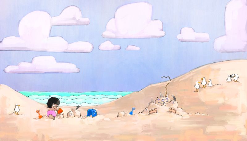
 ok so I adjusted the water a little
  an removed a couple clouds. Also moved the group of seagulls on the
right to the foreground. They got a little blurry though when I enlarged them, maybe it works because the focus is behind them anyway? Should i redraw them clearer? Does this give the image depth @Melissa-Bailey-0 ? I have decided on an old man flying an elaborate kite for the top right side and maybe have the kite tail going across the spread. we’ll see if it still works composition-wise after a sketch
-
@Asyas_illos I like the seagulls! And with this newest composition, my eyes go to the girl and the sandman right away. I'm no expert, but it seems more pleasing for the eye to move. Really darling illustration!
-
@Asyas_illos yes, the image has more depth, and your seagulls are so cute! (The reason they got blurry is because of how Procreate works. You can move elements around but once you change their size in any way, they get blurry. When I'm working in Procreate, I either make all the changes to the composition at the rough sketch phase, which doesn't matter if it gets blurry cuz it's going to be drawn over anyway, or export it as a PSD and make changes to more finished elements in Photoshop, which allows you to resize without losing clarity, then if there's still more work to do I export it back to Procreate and keep working. LONG explanation! Anyway, that's the way I get around the blurriness issue.)

Adjusting the water did help, but it's still drawing the eye more than it should. It feels like it's trying to be a character but it's a background element. It's the only cool blue in your composition--all your other blues are warm blues. Even though aqua is your favorite color, does it belong in this particular illustration?
Water reflects the colors of whatever's around it -- your lovely sky is so soft, almost periwinkle and the water would reflect that in real life. Here are some examples:
 Example 1
 Example 2
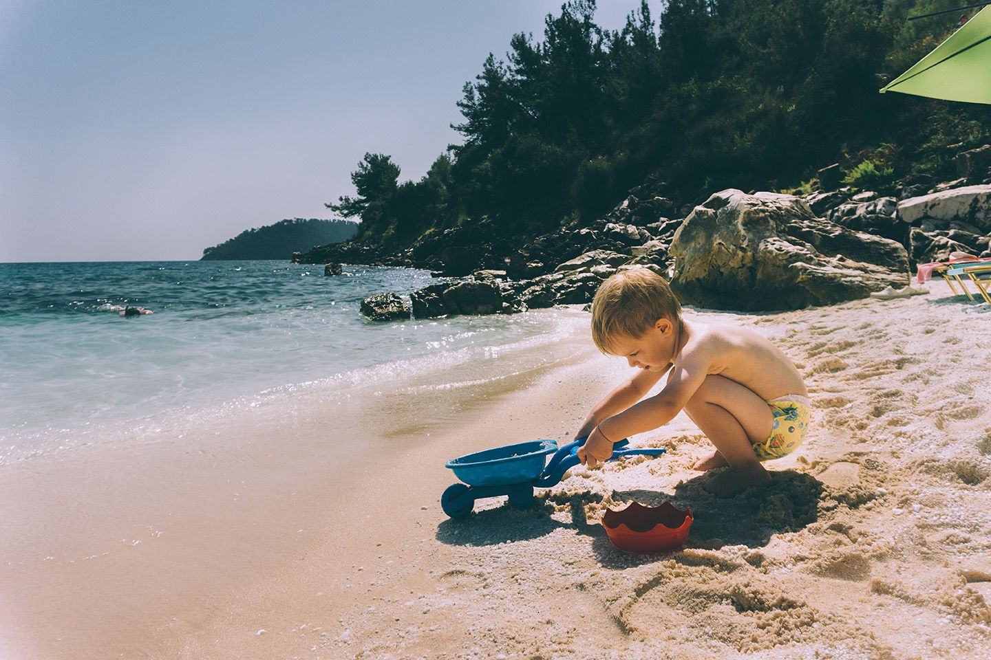 Example 3
Why not try coloring the water again on a separate layer? That way it's easy to delete if you don't like the change.
Really loving this piece, Asya! Love how you rendered the sand with all those painterly strokes and subtle hues. And there's definitely some Beekle inspiration in the clouds, which are great! Looking forward to seeing it all done.