APRIL CONTEST: Design A Fairy-Tale Inn
-
@ellenseal14 thanks so much!! Yeah I bet he d be really annoying especially on very hard mode!!
-
@Asyas_illos they looked good to me
 I am going to play around with the template and Procreate in the next few weeks and see if there is anything I can do to make the process smother. Thank you for working through all these problems last month!
 -
Everyone's submissions should now be viewable in the gallery on the current contest page. If you noticed that I missed one please let me know. Thank you for everyone's willingness to work with us on the changes!
The new prompt should be up on the Critique Arena site later this week (we will also be posting it here on the forum).
-
@AustinShurtliff thank you for being patient! Also it’s not a big deal but I noticed on my entry of the sand castle there’s a tiny image in the center of the Rose entry lol.
-
@AustinShurtliff pretty sure I put an entry up on the critique site last Thursday or Friday that’s not showing in the scroll. Not that it’s going to make the top 16 or anything, just letting you know that there might be some missing. Or I might have screwed up with template.
-
@Larue thanks a lot

-
@Joe-Koz Hi Joe, I've just had a look at the slideshow and I can see two of yours.
I'm not really a fan of the slideshow format to be honest. You can't expand any of them to have a good look and there are some on there that are not on this thread and I would like to see them at my own pace. You have to keep clicking back and forward.
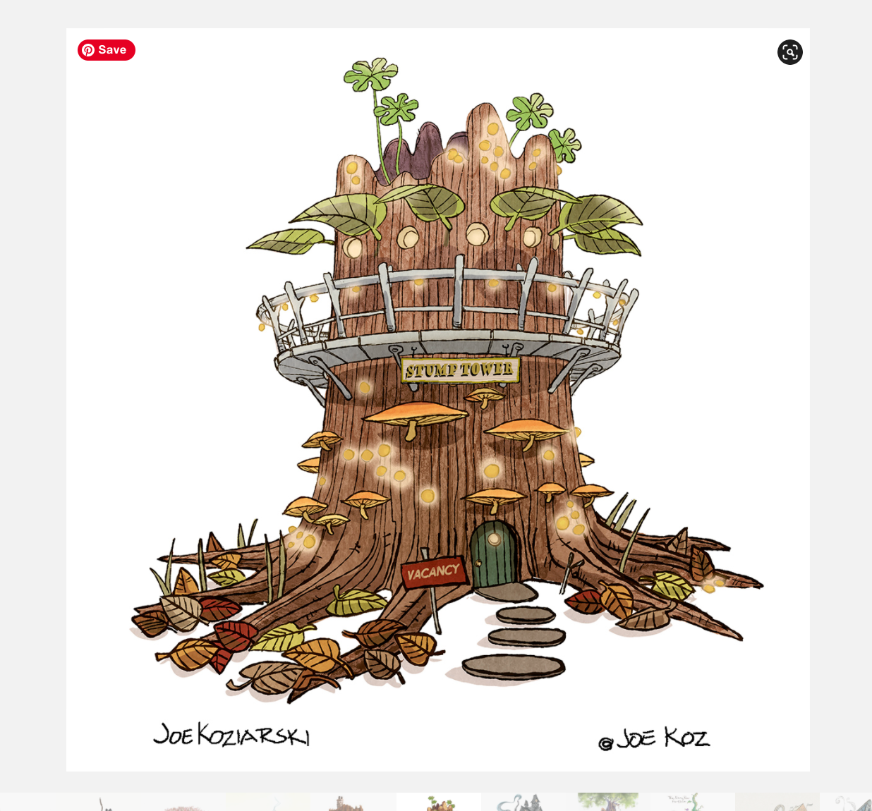
These are the two I can see:


-
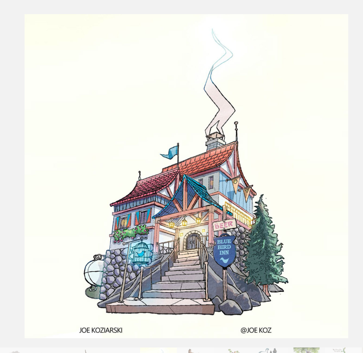
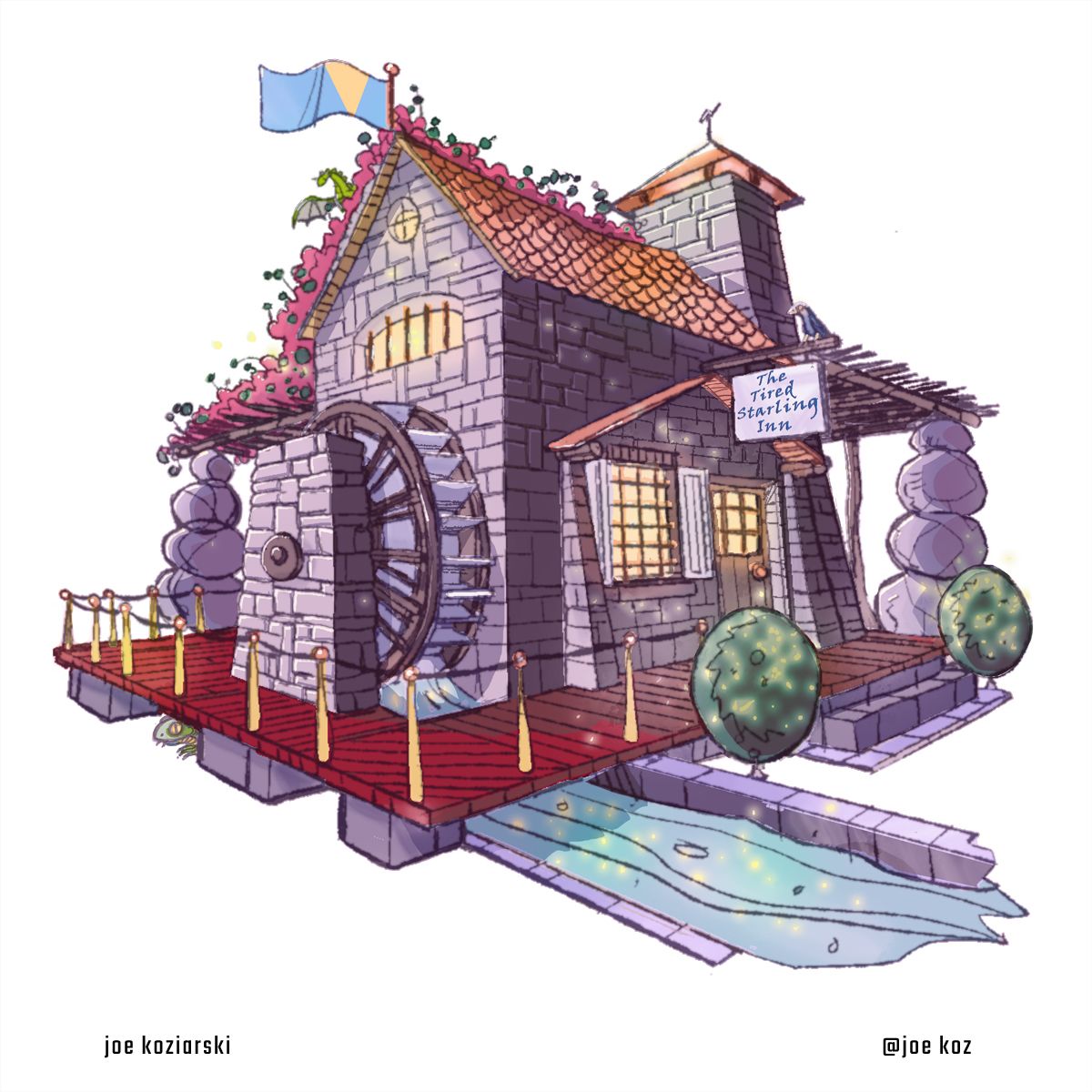
@lizardillo here is the one that never got posted.
I’m not a big fan of the new format. At this point I still prefer the forum, I like to read the discussions and comments on all the posts.

-
@Joe-Koz I hope that can get added. It's great.
I like the forum format too. It would be a shame to lose the personal touch of the notes and backstories that people add. And the interaction between everyone is wonderful. Plus you can see the uploads in real-time. There are a few on the slideshow I would have missed seeing if I had not gone back today to look. I waited for it to load and scroll right to the end so it looped back to the start.
I personally would prefer the critique arena page to be a list of images (like the format here) so you can scroll up and down. The images are all shown in isolation at the moment, and I feel that they all form more of collection that is nice to be seen together.
Saying that, it's great that this has been created and it's all new at the moment, so happy to go with the flow as it develops.
-
@lizardillo pretty much my exact thoughts. Most of the posts won’t make the top 16, so at this point there won’t be any comments or background info on the large majority. Now it’s just a contest page, hope some kind of comment/discussion gets added.
-
@AustinShurtliff HI Austin! I noticed that in my case you only selected the artwork that has a bit of background (green sky) while I have uploaded another version of it without background(on the same post in this thread)
Since the rules of submition stated that we should not have a background and that we are allowed multiple entries, could you please also include my second "version" of the artwork in there?
I d hate to be "disqualified" from concidering, because of a greeny sky so that is why I made two versions and let the judges decide if it is worth it!
Hope that is not too much to ask.
If you can t find my entries in the thread, I d be happy to upload them again!!Cheers and thanks for what you re doing!
-
@Joe-Koz I love this I didn’t see this one anywhere. I prefer the forum also as well as not having the template it’s caused unnecessary technical complications.
-
I didn't enter a final entry, but I prefer the forum as well. The site is nice though. I think a small grid style of all submissions would be nice, so they all get equalish exposure, then when you click one, it takes you to a slideshow/expanded view.
-
Hello , I m just wondering when the critique arena live voting is for April’s contest ? I misssed the last one live ....... don’t want o miss it again
-
Hi, I agree too that the forum is great to post the entries as you get feed back and votes which gives you an idea of how well your work is beeing received. Also I like seeing the entries come in one after another and beeing able to look t each one at my own pace. It would be a loss of value to not be able to have that interaction anymore.
-
@Isabel-Reyes-Feeney It’s usually if not always the second Thursday of the month at 2p mountain time. Plan on it being the afternoon of May 13th unless you hear otherwise.
-
@Isabel-Reyes-Feeney Yep, what @Kevintreaccar said! The next Critique Arena will be May 13 at 2pm mountain time, we'll be announcing on social media soon

-
Hey @AustinShurtliff is there anyway to fix my sandcastle inn on the critique arena website before thursday? It somehow got uploaded with a tiny image of the Rose inn in the center. Thanks
-
@Georgios-Christopoulos No problem! I just switched out the one with the background with the non-background version on the CA website (sorry I took so long to get back to you!)
-
@Asyas_illos thats really weird. I just fixed it. Thanks for catching it!