April INN - Wip
-
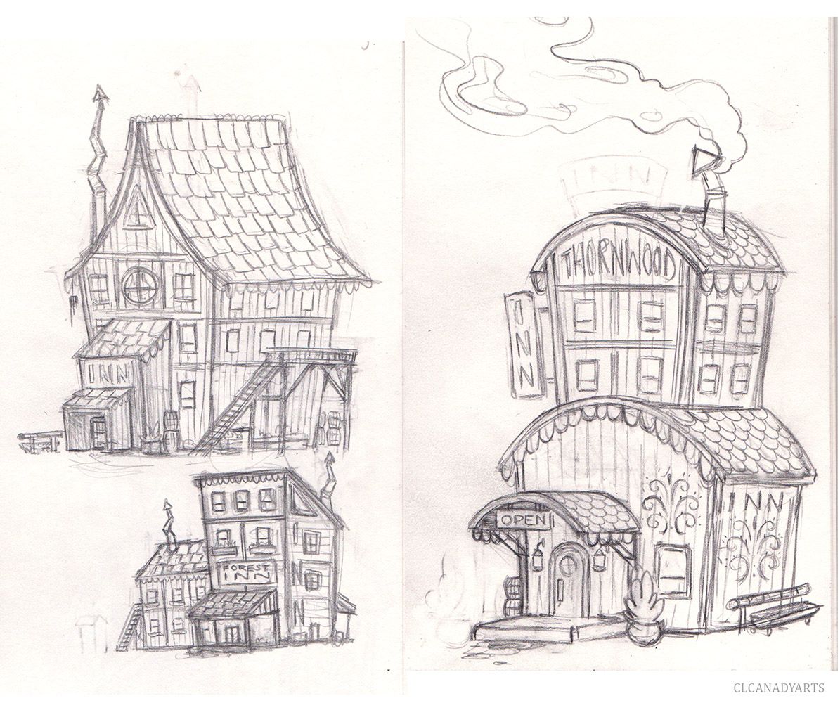
First rough sketches. Not planned out, was half asleep. So perspective is wonky, lines are all over the place in some areas.
Smallest one, is just too old west boring. I like the others though.
The right rounded one was more for my kidzy sheets, but it is still a bit too adult. Hard to super simplify a building.
-
I like the rounded one. It has some interesting shapes that are not as common.
-
I love the shape of the rounded one!! its beautiful, simple jet fresh! also I really like the details around the door and the chimney, giving this a kind of cute/cosy feeling.
If you decide to go with that design I would see if you could do a bit more with the main house, I like the wood structure but the symbols and window seem a bit lost there. Maybe try out some round windows, as you went for that choice also with the door and the window in the door.
also I like the sound of thornwood inn, it just doesn't really connect with the design of the Inn as its all about rounded shapes, it only connects with the logo, but I'm not sure that this is enough to sell it.hope this is helpful for you
 excited to see how this will evolve!
 -
I like the rounded one too. I agree with making the windows more rounded too. When I read 'Thornwood Inn' I am imagining it would have some sort of sharp, bushy, thorny bramble-like plants growing up and around it (although spiky thorns are not that welcoming and the rounded shape at the moment is very friendly and welcoming). Or it is it that this inn is a welcome refuge to a traveller trying to get through the deep, dark thorny wood?
-
Neat story! What's the backstory behind the design choices? I'm gettin' a vaguely western vibe.
The design on the right seems most cohesive and believable.
-
@CLCanadyArts I really like the rounded one I don’t think it’s too adult at all
-
@Freya-Chakour It is the one I'm leaning towards. I had an idea to make "Thornwood" trees, that are rounded, and curly, but poky. So they aren't super scary, but are still dangerous. The inn would be a welcome cheerful site, after traveling through the prickly forest. Rounded, to match the rounded trees. The dots in the logo that represent the thorns, will be more noticeable. But maybe a shape that contrasts with the rounded trees would stand out more? I feel round is happy, and after a long painful journey though the sharp forest, a round cheerful site would be rejuvenating, but the logo acknowledges they are in the bad wood.
@lizardillo Exactly, refuge from the thorny wood.
@Braden-Hallett Refuge from the thorny woods, a cheerful rejuvenating sight., It is still a western vibe. I'm struggling to break myself of it. I love old western movies. Need to indulge in some more inspirational art.
@Asyas_illos I'm tempted to finish it in my more mature style, and redraw the same exact building in my more cartoony style.
Thank you everyone for comments/critique, always appreciated. Might change the logo, still going to play with more building ideas, and try to break free of the western motifs. I see other peoples entries, and they are so creative! I feel a bit stuck.
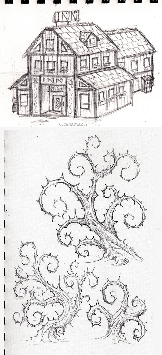
New inn idea, but still too blah.. Inn sign on top is supposed to be wrought iron. .Still liking the rounded one.
Thorny woods idea, I really want to show the trees around the inn, but I think that would break the prompt... No background, just white only. Without the thorn trees, the logo doesn't make much sense.
-
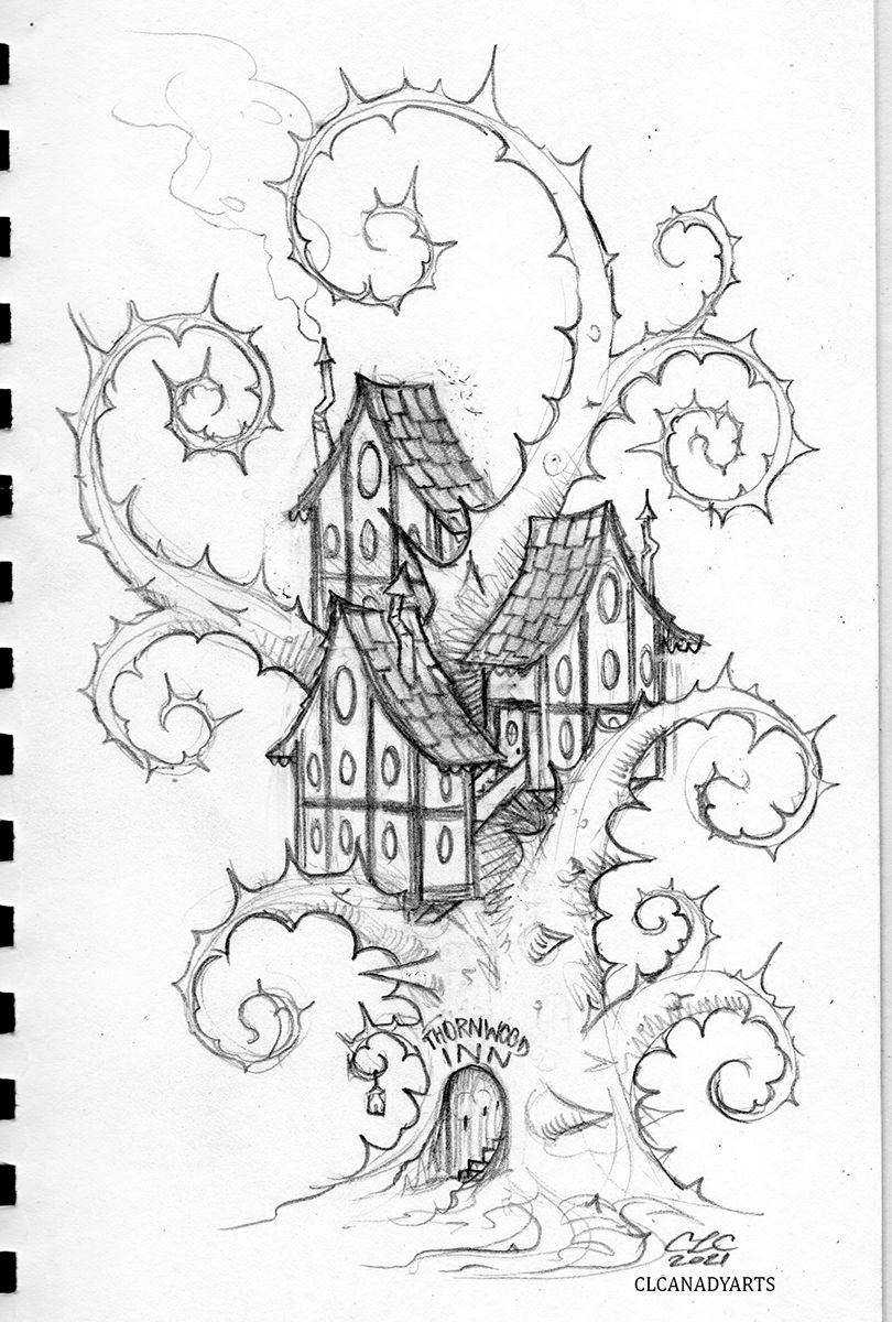
So how do I show thorn trees when no backgrounds are allowed? Make the INN part of a thorn tree.Left out the logo, it didn't fit.
-
@CLCanadyArts now this became so interesting!!
-
@CLCanadyArts whoa! Everybody is upping their game!
-
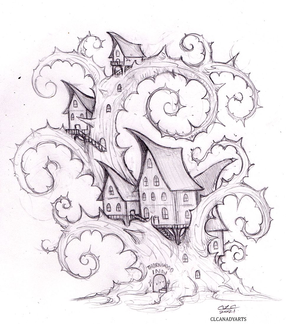
Hmmm. Playing around some more. What if the tree was partially hollowed out, main lobby/kitchen at the bottom, stairways,straight and spiral, leading up to the rooms. Maybe even some baths below, a basement of sorts. Hollow under the tree.
-
@CLCanadyArts I d certainly entertain the idea of a premium "hanging like a swing" room from one branch!
-
@Georgios-Christopoulos Hehe, i thought about hanging rooms, but felt they would all need to be handing to an extent then. Maybe if I designed the tree with a nice long hook branch up top it would look right with just a single hanging penthouse.

I like the idea of hanging rooms, with suspended bridges between them.
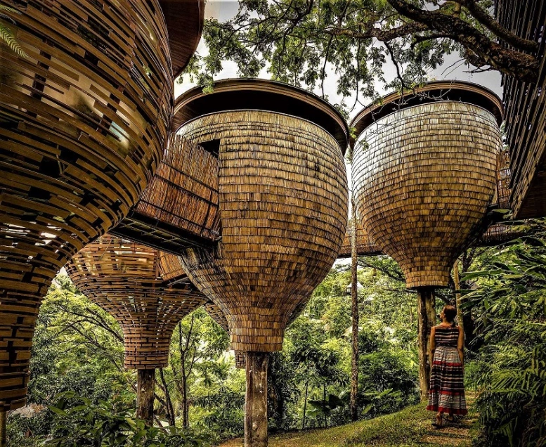
These acorn looking rooms are really peeking my interest
-
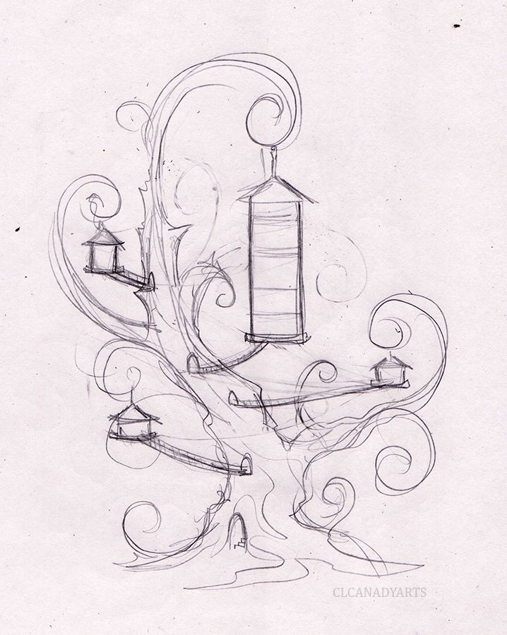
@Georgios-Christopoulos Hanging rooms. Super rough idea.

-
@CLCanadyArts This is so cool! Love this idea

-
@CLCanadyArts super cool.cheers!!
-
@CLCanadyArts I would totally love to stay in an inn like this! Great concept!
-
Didn't refine the last sketch, all I could see was bird feeders.
 New sketch with hanging and mounted rooms.
I could cut the whole top branch off really. Hmm.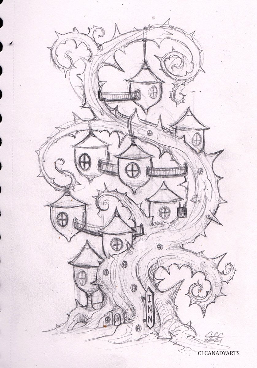
-
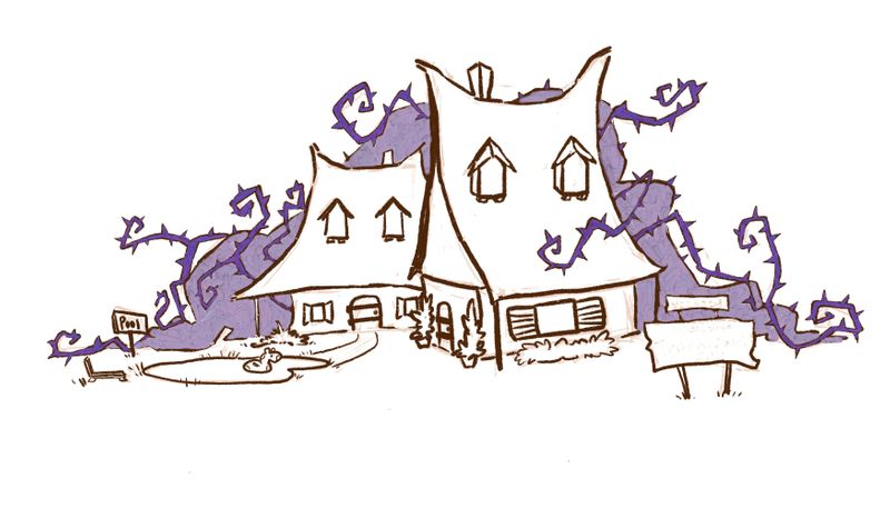
Well I haven’t been back here in awhile and I had just started another entry that also has a thorny bramble! Not as creatively done as yours though love your designs! There are some similarities with the roof on one of your other designs though I was trying to do like a cat or owl ear thing. I feel like I need your blessing to continue lol

-
@Asyas_illos It's great,I hope you finish it! I'm not sure If I will get around to finishing mine, I have so many obligations right now. Trying to get it done though.