GLOW UP - illustration feedback appreciated
-
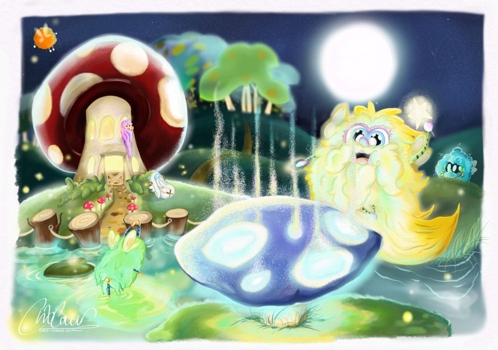
Hi everyone! I wanted to share with you my latest illustration I've been slaving over for the last 10 days. The concept evolved quite a lot from it's original design. This was all about learning what tools work best for different textures and also lighting. I know there is a lot going on. I'm really trying to build my illustration portfolio so would appreciate some feedback
")
-
@ChrisConnor The style you have is very cute! I love the glowing mushroom night scene. It's a cool concept
One thing I would think about is your focal point. Right now as everything is, my eyes kind of go all over the place. I think that everything seems to glow bright, and in turn, the eyes don't really have a resting spot or a focal point to land on. I think the mushroom in the foreground should glow brightest , and the rest of the landscape could be dimmed a bit. I think that might help the image overall
Deviantart: https://www.deviantart.com/jacy13
Instagram: https://www.instagram.com/jacy13draws/?hl=en
Portfolio: https://jacy13.artstation.com/ -
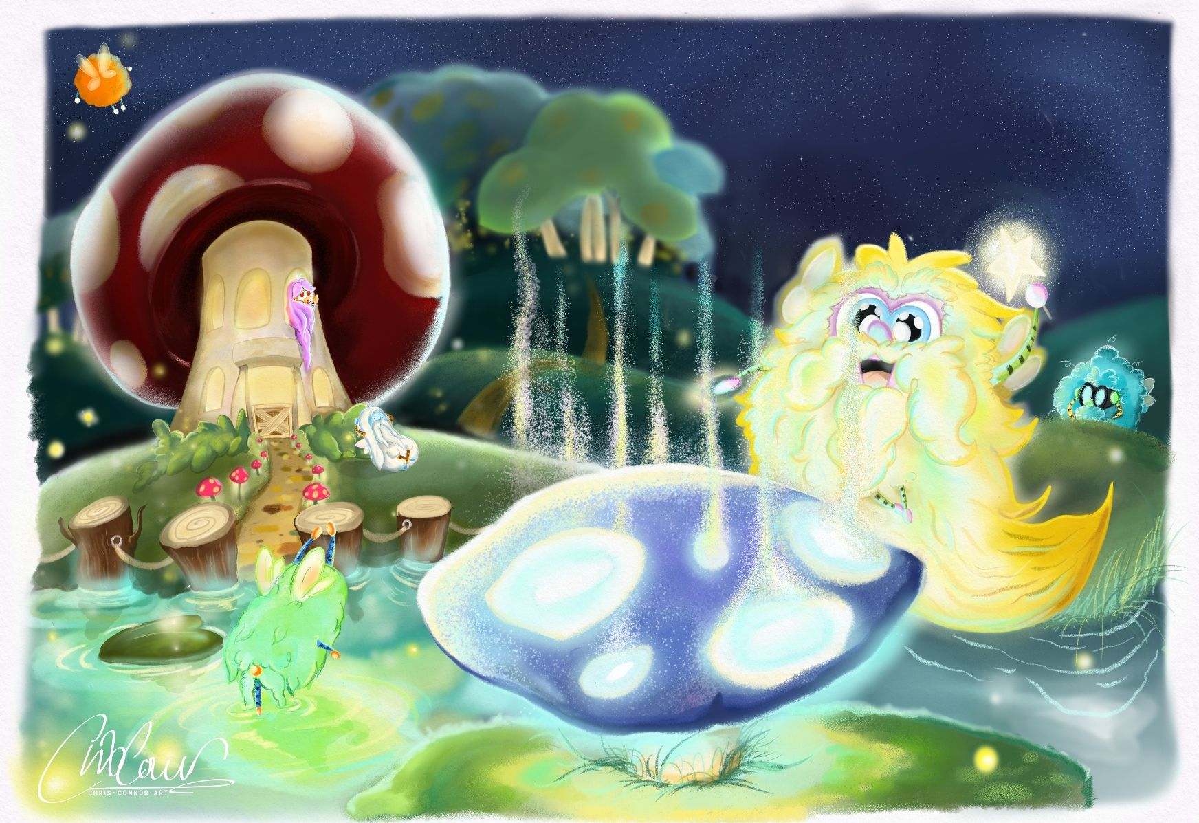
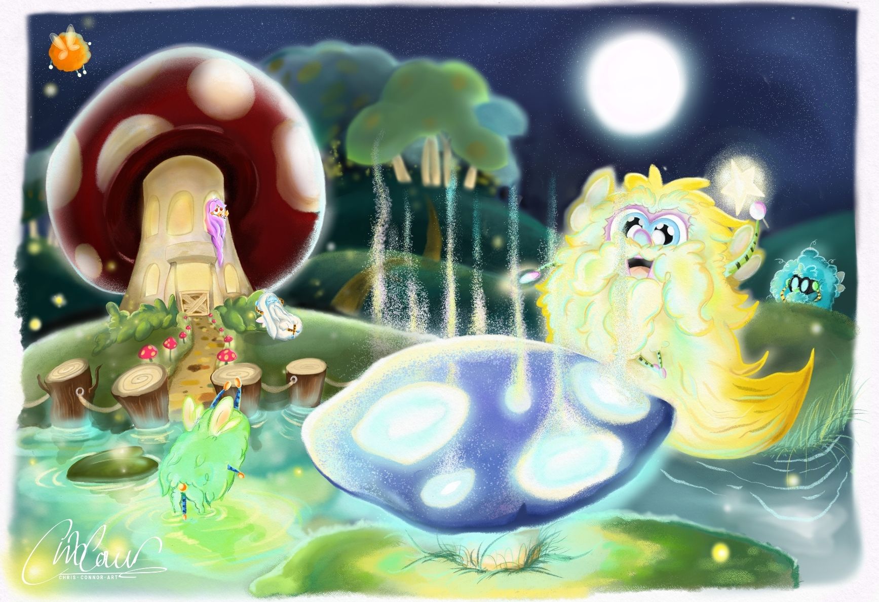
@Jacy13 thank you! Yes I did think maybe there was too much light. I've tried it with and without the moon as it takes a load off the amount of light from the page and let's the sky feel like that resting space. However I think it actually needs to be in it because of the fairy lying against the house is supposed to be "moonbathing". I've dimmed the rest of the landscape. Let me know your thoughts
-
I really love the mood you've created! I'd love to bring my art to the level you have it at now.
Maybe one quick-fix is to reposition one of the mushroom-glow-lines (the one that has a bit of a tangent with a tree trunk) -- I thought at first that the lines were coming down from the trees, but now I see what's going on!
-
@adas thank you!
Yeah those lines are the stalks of the mushroom forest. I could have a look at adjusting -
Hi Chris
I think it looks really nice though there are three elements that are about the same size and all are craving for attention making the eyes jump all over the place and not knowing where to focus on.
I'm guessing the blue mushroom on the front is your focal point so the character next to it could be a bit smaller (since it's about the same size) and/or less bright so it doesn't compete with the mushroom's light (something like the smaller blue character on the far right would work better on him). Or you could make the yellow character be the main focus so removing some of the brightness on the blue mushroom would make him stand out much more.
I would also try making the mushroom house much smaller so it looks farther away and also making it less bright as well, also could be positioned a bit more to the right so it kind of balances the scene a bit more.
The water looks really nice but I would also add some darker shading the farther it is from the main mushroom.One trick you can use is to add a new layer in multiply mode on top and paint with a 15% dark blue on most parts as to add some ambience and reducing the lighting on most of the objects (minus the main focus one).
Hope something of this is helpfull to you
 .
.