DECEMBER CONTEST: YETI
-
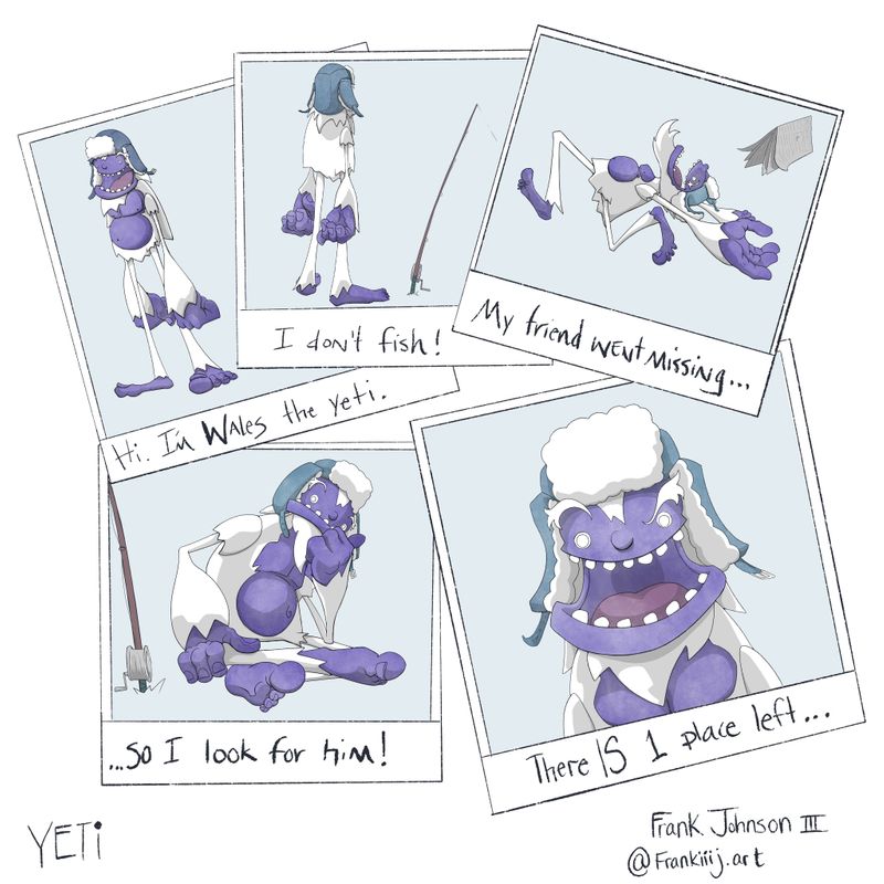
New year ... new arenas! 2021 goal make it in!
-
-
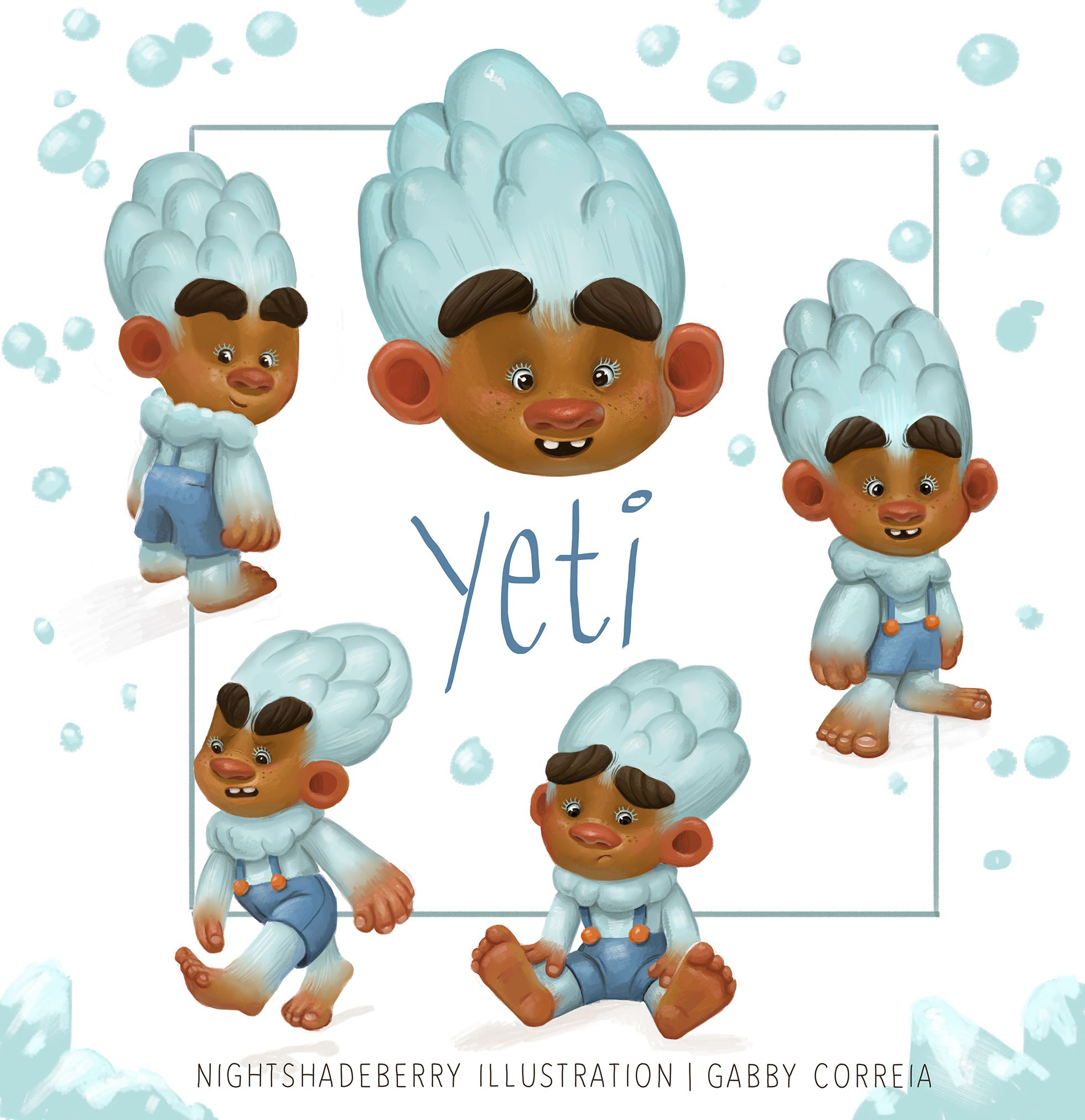
This one was fun! I decided to go for a young human-like Yeti character. Realized after that he does look like he could be added to the cast of Trolls

Looking forward to seeing what the rest of you came up with!
-
@dafoota This is so creative!
-
@chrisaakins this is so great! I love the body shape and his expressions- makes you wonder what he's going to get up to!
-
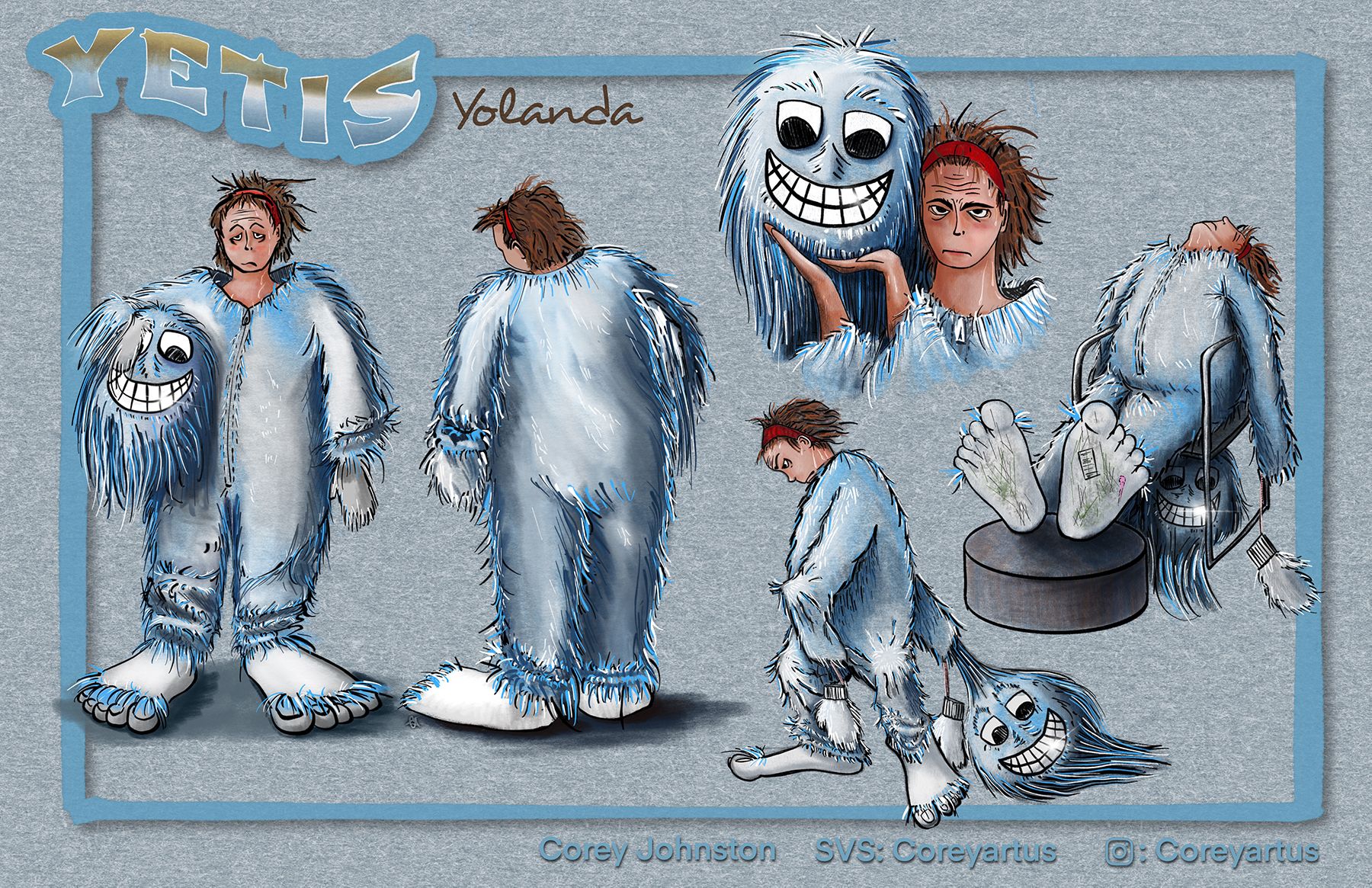
@Coreyartus great concept Corey! I didn’t even think of this. These drawings put a smile on my face as soon as I saw them.
-
Hello! I am just wondering, with the monthly challenges, I know that anyone in the Forum can participate, but do you select the 16 finalists only from your SVS paying members?
 Thanks !
 -
@ValD yes that’s right
-
@ValD Were you at the critique last week? yours was totally going to make it into the top 16 but you weren’t an active member you should join!
-
@Gabby-Correia great work! I love this little guy. He does resemble the cast from Trolls but you can’t go wrong with such cuteness:)
-
This was hands down my favourite critique arena challenge yet! Right up my alley, speaking to my interests at least. I’ve never actually done a full character design sheet like this so I’m glad I’ve got one to add to my portfolio now:)
-
Hey Fam!
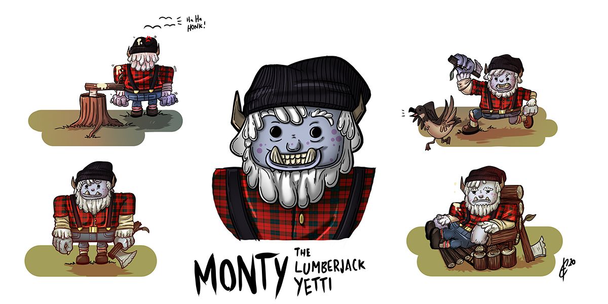
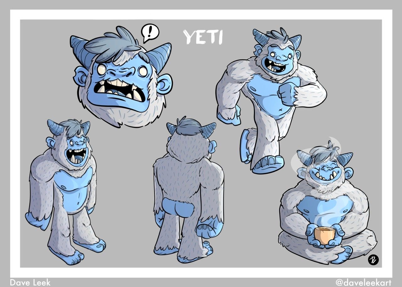
Here is my entry for December! Introducing Monty the Lumberjack Yeti.
The thoughts behind making Monty a lumberjack is quite simple. I thought about what SVS Learn said in their podcast about thinking on what makes the character so unique and why. Monty is a yeti and his environment is mainly in mountainous terrain so I thought about what other things like to hang out in that environment and a lumberjack came up. It was an added bonus that lumberjacks aren't animalistic, so it adds a bit of spunk.I also considered the shape of the yeti as well. In my research of different cartoon styles of the yeti I found most of the designs were quite rounded, so to add a contrast to usual styles of art I decided to make the yeti more square to add a bit more shape language. The square communicates strength and I wanted that to be incorporated. With that said I also rounded the corners to show a softer and friendlier character.
With this color and pattern pallet I didn't stray too far from traditional pallets you'd find in a lumberjack or a yetti because I wanted to make it obvious what this character is meant to be.
I also added a homemade stone axe as an added prop to help build the character's personality as a lumberjack. The geese are Canadian because...well... I'm Canadian. They add more to his story as a character and the environment he lives in, and you can tell that he has a personal vendetta with the flying bomber squad. I thought it'd be great to add to these poses set out by SVS Learn, to add more of a feeling of laughter and whimsy.
-
@DaveLeekArt Beautiful work I saw your preliminary sketches and I admire your style, very nice work!
-
@Kori-Jensen thank you!
-
@Gabby-Correia cute!
-
@dafoota great goal for 2021! Best of luck to you. I like your chances for this month, these drawings are fun. I’m also loving the choice of purple for the skin - why didn’t I think of that? Great work here, hope to see you in the arena.
-
@DaveLeekArt great job on the expressions... and bums!!

-
@Jeremiahbrown Thank You!
-
@DaveLeekArt Thank you and you too! The purple was a great accident...hehe. If I get in i'm sure I'll see your awesomely stylized yeti. He is dope!
-
@Gabby-Correia haha thank you! The bare butt was just to make myself giggle but if it makes someone else smile too, that’s a nice bonus:)