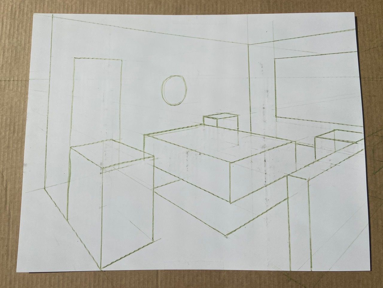
Basic Perspective Final Assignment (wanting critiques)
-
@TessaW you are my hero. Thank you for taking time to brilliantly mock up the room...looks so right...teach me that floor boards from where I’m sitting don’t make a hillobeans difference from where those doggy eyeballs are and I want crazy about the undersides of things...though you don’t really see those with yours either. Thank you so much for helping me graciously. I’ll try the other side of the room next week and see if I can make you chuckle again.
-
@TessaW I meant WASNT crazy....and I guess if it’s high enough you see under, like the shelf on the desk, but not if it’s not super high, like the desk and the table itself. That must have something to do with proportion and be the reason we draw in the whole cube. Brilliant. Thanks again
-
@sdn Yeah, the closer to the horizon line, the less underside you'll see of it. If you hold out a soda can eye level to you, you shouldn't be able to see the top or bottom. As you move the can higher and higher from eye level the more of the underside you'll see. If you move the can lower and lower from eye level the more of the top side you see.
For this desk drawing, I tried to match the horizon line and view point and placement of the room from your drawing to mine. What would happen if we lowered the horizon line more? Or if we structured the bottom of the wall and floor plane to be closer to the horizon line? Or if we zoomed in to the desk more and made the angles a bit more extreme? In all those scenarios, it could push the top of the desk further above the horizon line and we would be able to see much more of the underside.
-
@TessaW you have a really nice way of explaining things. Thank you so much for taking time to do it
-
@davidhohn @Eric-Droke I’m sorry this has taken me so long to finish. I wanted to take some time to go back into the class and review. My ruler and level were dirty despite cleaning them, so please excuse the black markings. Well, here it is. Would love to get your thoughts. (Also, noob question but when I’m uploading pictures from my iPhone to the forum, do I choose the actual size?)

-
@Jesse-Rivera Oh yeah ! What an improvement from your first upload!
-
@Jesse-Rivera This is a huge improvement from the first one! Excellent job!
-
@Jesse-Rivera looking good!
-
@Nyrryl-Cadiz Thanks for the encouragement. Also, checked out your new site and just love your illustrations!!! Best of luck with that book and shipping dilemma I saw mentioned on the forum.
-
@StudioHannah I appreciate the supportive feedback! Also, checked out your art on Instagram. Great work!
-
@Jesse-Rivera Thanks, Jesse! I hope I can figure it out too.
-
@Jesse-Rivera Great job! I see no problems with this at all. No need to apologize for dirty rulers, brother. These exercises are meant to be gritty, greasy, hard work. So, don't worry about if it's pretty or not... for now.
 As for uploading images from your phone, I would stick to the smallest size available unless it's a finished piece of art. No need for a full resolution image when 72 dpi will do. Hey, keep up the good work!