Couple thumbs for oz, looking for thoughts 💭
-
I’ve been all over the place with ideas for oz, this is one that I might go with. I need to get started!
Any thoughts appreciated.
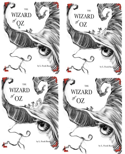
Two of these have just Dorothy and Toto. One has the O in Oz turned into a hot air balloon. And two of these have the trio added....in one they are crossing the hat in a way that they would be against the background of the hat so they would need to be lighter. And the other one they stand out against the lighter background.
Also wondering if the witch’s hat is cutting off the comp across the middle too much and should be raised or lowered possibly, so any thoughts on that appreciated too.
Thanks peeps for anything!
-
I prefer just Dorothy and Toto and no hot air balloon. The reason is that the witches hat looks like a tornado and none of the other characters were with her yet before the tornado hit. Plus it leaves a little more white space, which I think is nice. I think this is a really clever idea!!
-
@deborah-Haagenson In my opinion, I think this book cover would be very marketable to a wide range of people too. It's fun, but has a classic look and it would be easy to spot.
-
@deborah-Haagenson thanks so much for the input! I hadn't thought of the hat like a tornado but that's a cool thing
 . Funny tho, one of my early thumbnails had one of Dorothy's hair braids/ pony tails going up into and becoming the tornado. So maybe I still had that thought rambling around my mind and it came out subconsciously lol.
Thanks very much, your feedback was very helpful
I'm thinking I'm liking the same thumbnail as you too. It looks a little more like small girl and dog versus nature and witch. I think I just wanted to do the other characters but it would be easier not to lol
-
love this! do you have any without the crop marks? I like the fourth one.
couple things -
the brim of her hat wouldn't curl like that, maybe it can be what Dorothy thinks is a mountain, curving up and out of the frame to keep the brim more convincing.
The eye can maybe be covered a little more, and it seems like the placement would be better a little lower. Right now it's very close to the bridge of her nose and it's full, yet the face is a profile view. it's the focal point so that bulge is important. it might be good to get a reference for that, because the pupil needs to be focusing on Dorothy. It wouldn't be a perfectly round circle unless it's looking at the viewer. -
@carolinebautista yup I was struggling with those things, but hadn't thought of the curl of the hat being a mountain or something else instead. Good idea. Good point on reference. I was being lazy LoL. . I initially started with her face slightly turned towards viewer so her eye made more sense then but I didn't adjust it enough, you're right. Thanks a bunch

-
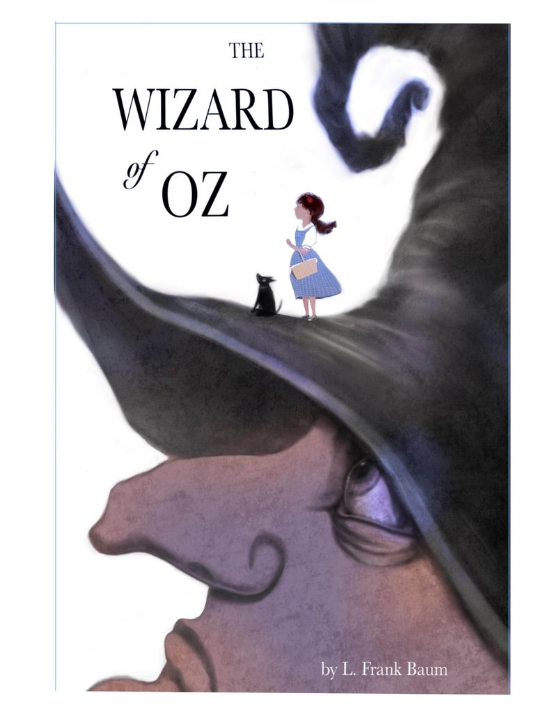
Update with eye and hat changes, a full bleed version and a cropped version with bleed cropped off.
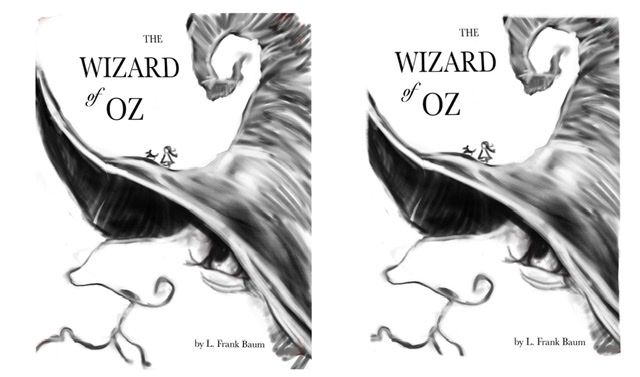
Still thumbnailing , albeit a little detailed.
I still think the hat is a bit pointier on the front than real life - whatever real life is for a witch lol, just gotta figure out if people can live with it. I like the up curve but if I keep picking I might be able to figure it out.
-
@Coley I love this concept! Really cool idea and has a lot of interest.
Personally, I liked the curl that was on the brim because it looked kinda like creepy trees and I felt it kept the viewer's eye in the frame. I like this version with just Dorothy and Toto, but you might try making them a smidge larger and/or moving them to the right a little bit to help balance out some of that open space below the curl.
I'm excited to see this finished!
-
@miranda-hoover thanks so much, all great input

-
@Coley i agree that the brim of the hat should still hug that curve to frame the image. i also think anatomically the eye is correct now, but there is a strange, rounder anatomy that would emphasize the all-seeing quality of the eye. more of her eye would show, i think, like mad-eye moody from Harry Potter.
Sorry to be so picky!
-
@carolinebautista the pickiness is awesome, thank you for pickiness LoL! Wayyy better than not getting any comments! I'm trying to understand what you're talking about tho, I know the first time I didn't really have the eye in profile ( ie the eye and socket and surrounding skin, it looked more like it was almost facing 3/4 view or front on). But now you're saying to make maybe the eyeball itself rounder? I'm just trying to make sure I understand

-
deleted!
-
@carolinebautista
Cool, thanks! It’s,easier to explain with a drawing sometimes! I appreciate that.
P.s. have you been adding to last month’s contest piece like you said you were going to? Really cool that you got the draw over! It’s a great piece!
I was playing around and did more rendering and the eye I think looks more like a round ball? Still only really her face that’s more finished, taking a break now and will rethink and relook later. Thinking the characters might be bigger once I get around to them.
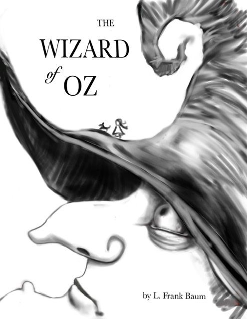
Edit... I think her eyeball is a little too buggy and the pupils needs to be looking up more.
-
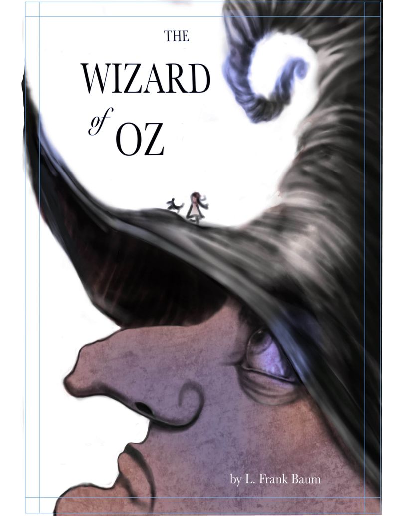
Toying with color ( I had no color plan, I have to get better at this!)
Have to add some more shadows...
And lights.
And there's a black line on the edge of the witches face I might toy with fading out or getting rid of.Will start work on Dorothy and toto later today.
And hauling out reference on tornadoes at some point to figure out the hat a little more.
-
@Coley - Looks good! I have been neglecting color studies lately, and i don't know why!
Yeah that draw-over from the contest was so great. It felt like I won the lottery, what luck! I had already added about 30 of the 50 animals, so i'm still working like crazy on it.
-
@carolinebautista can't wait to see your finished product!
-
@Coley wow! I love the concept of this a lot! and I also really like the colors so far. I think the forms, shapes and textures are what makes this strong, so I guess only little spots or very subtle coloring like you did already is fitting for this

I personally would maybe go and work on some textures a bit more, I love her face and eye texture, but I think the hat is a bit to soft and could use a bit of roughness, maybe more defined edges and stuff while her nose hole is in contrast a bit sharp and dark, could be a bit softer, (and maybe longer/bigger) for now its the element with the sharpest shape and therefore gathering attention I think you didn't intend for.
Super excited to see your finished work
 this is such an awesome challenge
 -
I prefer the last one. Love the idea!
-
@Freya-Chakour thank you
 I’ve been staring at it a lot and the softness of the hat and the hardness of the nostril is something I had been feeling too, I will be working on that today! I think I’ll harden up the hat in the area especially closer to Dorothy, as I want the focal point to be between Dorothy and the eye of the witch, so some harder edges there. I may just redo the whole hat but will try just some adjusting first. Great idea about smashing around some hard edges and textures !
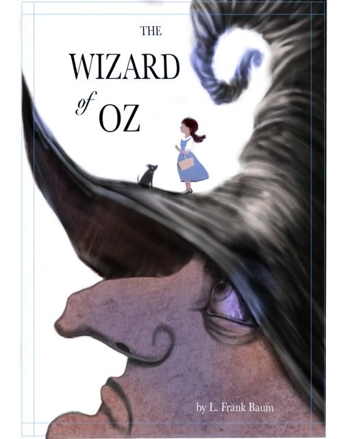
@Aisleen thanks so much for the feedback!I did some more work late last night, softened black line on witches face, am putting Dorothy and Toto in now. They’re unfinished so far and I’m toying with how much detail to have I there, especially on the faces but even the dress. I might smash up the textures or the overall solidity of it, I had one done on a soft light layer and Dorothy was really washed out but it was kind of cool. So I’m figuring out the balance between hard and soft and details and lost edges. I’m certainly not there yet! I’m trying to get it pretty. I have finished before Saturday night so I can add to my scbwi portfolio showcase.
If anyone had any thoughts on how to position Dorothy and Toto that would be helpful. In one I have Dorothy and Toto both looking off sort of towards the title, Dorothy holding a poppy. The other has Dorothy holding a basket with Toto in it, and a poppy in her hair. And another one Dorothy holding the basket and Toto sitting and looking at Dorothy’s face, no poppy.


-
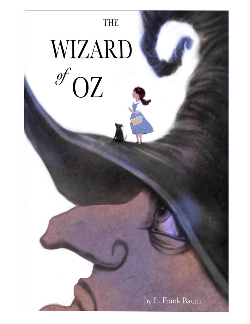
Finished enough to add to my Scbwi illustrator gallery tonight for the portfolio showcase.
I might do something else once I stare at it more. Possibly with the text but I'm sure I'll see stuff to fix and if anyone is still here and has any ideas, throw em my way

