Request for honest critique of portfolio...looking for gaps and direction
-
Hi all,
I'm getting ready to put out my first set of postcards in search of "real" illustration assignments/work and beginning the hunt for an agent/representation. I (think) I want to do middle-grade/young adult chapter books and book covers. I would really appreciate it if you could have a look at my portfolio and help me find week spots/holes to focus on correcting over the next three months (my time frame before I start my marketing campaign)...I also welcome any advice about how to organize marketing for this endeavor.Things I know I need to improve:
- my color choices (tend to be overall too dark)
Sequential narrative images
Possibly--more focus on children imagery...?
Help me find the holes: https://www.laurabalmacedaart.com/
Thanks so much in advance!!
- my color choices (tend to be overall too dark)
-
Hi @Laurasketches, beautiful portfolio! I can definitely see your work tailored to fantasy middle grade books! I especially love your Oz Cover!
If I were an art director, I would like to see pieces that include kids interacting and doing things. Since fantasy seems like your purview, maybe consider doing more fairytale pieces with kids, etc. I’m thinking Jack and the beanstalk and Hansel and Gretel, etc.
Great work! Would definitely consider your work in the book stores!
-
@Laurasketches Hi Laura, really beautiful work! One think you could try is mocking up your covers on to a book with a stock image of a book, I've been told art directors like seeing images in context. The only thing that really stood out to me that I would change is the third person narrative on your about page, I would change to first person. Your contact page is in first page already so it would be better to match. Hope this helps!
-
@Laurasketches Hi, Laura! The main issue I see is your lack of teenagers. If your planning to get into middle grade and YA, you'll be illustrating A LOT of tweens and teenagers. Right now all I see are adults. it's hard for agents and art directors to imagine illustrating for that market when you don't have a lot of pieces showing them proof.
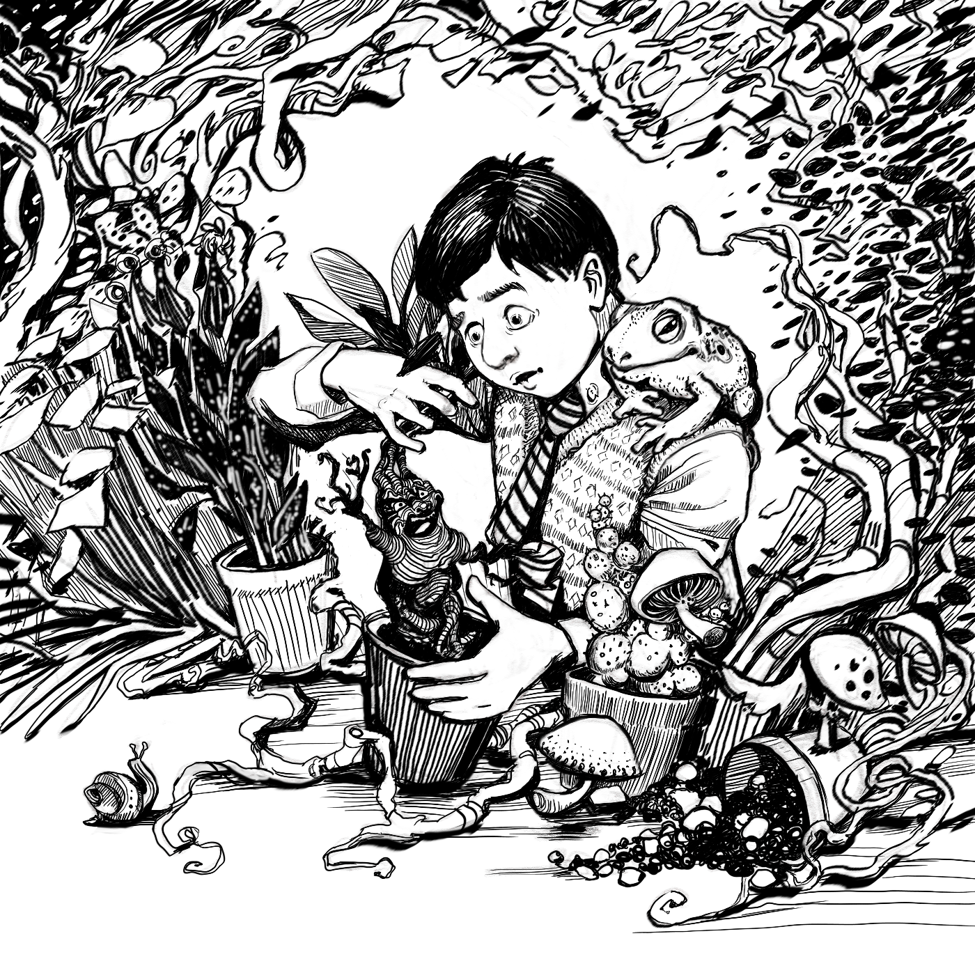
And like the children's book market you also need multiple illustrations telling a narrative, characters need to be consistent throughout the various pieces, you need to show how you interpret text, etc. Try illustrating a middlegrade book like Harry Potter or the Narnia books.
-
@Laurasketches Here's a brochure of the middle grade artists from my agency. perhaps you'd like to look though them for ideas and inspiration
-
@Laurasketches You have such lovely work, so in terms of skill I think you're already there but you should tailor your portfolio more to the kind of work you want to get. There are some pieces in there that are gorgeous but too irrelevant in terms of the subject matter, like your "single mom stories", the Paso Doble and the two black and white ones. To be clear you can have black and white work in there (and it would be a good idea to include them because middle grade chapter books often have inside black and white illustrations) but these two look like tattoo designs, not related. Focus on story driven, age appropriate illustrations. The first 2 rows of images are the strongest and I especially like your cover designs. I agree with you in general you have too many dark pieces, but you can easily adjust one or 2 illustrations you already have to lighten the look overall, with little effort. For instance, the Vivaldi 4 seasons illustrations could have a white background instead of dark brown, and this would significantly lighten your first row. Replace the last 2 rows with new illustrations that are more in line with the type of work you want to get. Think of the kinds of stories middle grade and YA novels would tell, work backwards from the target audience to find a suitable subject. Like @Nyrryl-Cadiz said, more teens and tweens is a must.
-
@Jeremy-Ross Thank you! Yes...I need to work on creating more interactive scenes...and I love the idea of Jack in the bean stalk or Little Red?
-
@carrieannebrown Good catch with my inconsistent voice...I am no editor. And the mock up idea is a great one...Thank you.
-
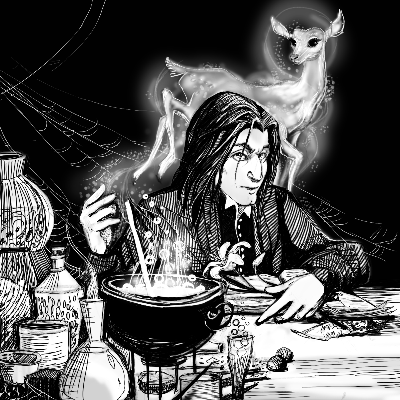
@Nyrryl-Cadiz...This is true: more tweens and teens...LOVE the idea of illustrating Harry Potter...I'm on it...

 ...wait....Snape is a grown-up and I need more interactive narrative story images....A huge thank you for the agent brochure. I really appreciate the critique.
 -
@NessIllustration Thank you so much for the critique....back to the sketchbook...