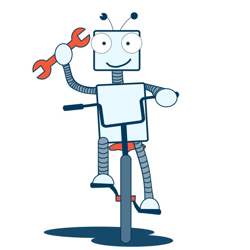
My first fully digital drawing. C&C welcome
-
My first ever project started and completed in photoshop. It's a t-shirt design for my husband, as he loves tinkering with bikes and his email avatar is a smiley robot face. I wanted to keep it really simple, as I tend to lean too much towards realism and get lost in details. Any comments on the line work? Should I've kept them more uniform?

-
@Yulia-Tsinko cute! My one advice is to maybe draw the bike in profile so that it would be easier to identify as a bike but that's just based on my taste. The image is definitely working as is. Great work!
-
Very nice. I like the line work. He reminds a little of Mr. Zip Code from the 1960s
 !!
!! -
@deborah-Haagenson said in My first fully digital drawing. C&C welcome:
Mr. Zip Code
I had to google him, but yes, I can definitely see the resemblance=)
-
Thanks! I did a few thumbnails with different bike angles, but I liked the simplicity of this one. In hind sight, I probably should have done a 3/4 view.
-
Very nice, so clean. Lee White has a shading class that if you decide to put tone and value on future work would be very helpful. He actually shades and highlights a robot in it.
-
This is so cute! I think simple is good for a tshirt design.
I'd just try and shorten the horizontal bar where the 2 handlebars join. Right now the vertical part of the handles are almost coinciding with the robot's body.