May isolation submission composition question
-
Hi! I really loved how they went through all the pieces in critique arena today, my piece they said had composition problems and I feel really dumb for not really understanding what they are , the way they said it, the clearly thought the issues were obvious. Is it to balanced between the tower and the big bird? Is the focal point to vague? Are their perspective issues? (Perspective is a weakness I am working on for sure) so I am just curious if anyone has a good idea what is compositionally wrong. Or anything else that’s problematic too! Thanks so much for your time. I am trying to be on here more reciprocating with critique.

-
Sorry Mairin, I was there but didn't catch the critique on this one. For my 2 cents:
-
The concept could be clarified slightly. Love the setting and it totally feels like she's isolated, but I feel like the pigeon message element is a little vague. Because the foreground pigeon is turned into the comp, it reads as if she's about to recieve a message from someone at the same time she's sending a letter out. If this is what you were going for, I think it would have more emotional impact if she was facing us and anticipating receiving a letter. If she's sending out letters, then I think having the foreground pigeon facing out would communicate this better and I would also consider having her face the viewer, just to simplify the message.
-
Perspective- I feel like the top tower would have the ellipses curving the other way, but I guess it depends where you envision the horizon line.
3.. I'd also consider possibly showing a rock formation in the foreground to really push the depth. I don't know if it's totally necessary, but it's an idea.
Great concept. This environment really stood out this month.`
Website: www.tessawrathall.com
Instagram: www.instagram.com/tessawrathall_art/
-
-
@TessaW Thank you so much for your two cents!! Honestly the larger bird was just to make it clear there were messages being sent - I didn’t even think about her receiving one! Really great feedback - thank you so much - I appreciate your time !!
-
@Mairin-Kareli I think it's not clear where you want us to look at. Usually the focus points will be accented in some way with lighting, contrast, different colors, thicker lineart, more detailed than the rest of the picture, etc. There's a lot of detailing at the bottom of the picture and I'm not sure why. It took me a long time to even notice the mountain goats and I'm not certain why they are there. Te bird and tower being at the same height and similar size, they compete with each other. It's a little weird how the bird is cropped out. You also don't use the elements in your illustration to create a clear path for the eye, so we just kind of look at anywhere and nowhere at once, instead of looking where YOU want us to look at.
vanessastoilova.com
instagram.com/vanessa.stoilova/Check out my Youtube channel for tips on how to start your career in illustration! www.youtube.com/c/ArtBusinesswithNess
-
@NessIllustration Yes that makes sense, a lack of focus. Thanks for you input!
-
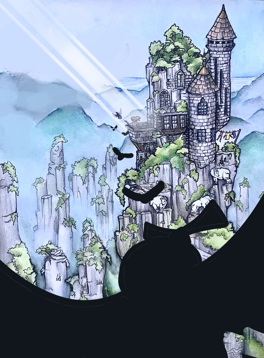
Here's what I woulda done to try and fix the composition. Divide space up with huge foregrouund element (and don't detail it) Create leading lines. and create more contrast on a single focal point (put beam of light, also another leading line)
My Drawing Show: https://www.youtube.com/ArtParlor
Instagram: https://www.instagram.com/frostdrive/ -
I think the main compositional issue is that the bird and the castle are competing against each other. Both are similar sized and detailed.
The bird is definitely the first read. Then the castle. Then the girl. Considering the girl is supposed to be the main subject, first add all elements to drive the viewer's eye to the focal point and then add supporting elements for your storytelling.
Really well drawn though! Lovely colors! -
Hello Mairin! It's lovely that you're reaching out for critiques! Here are my two cents regarding your image:
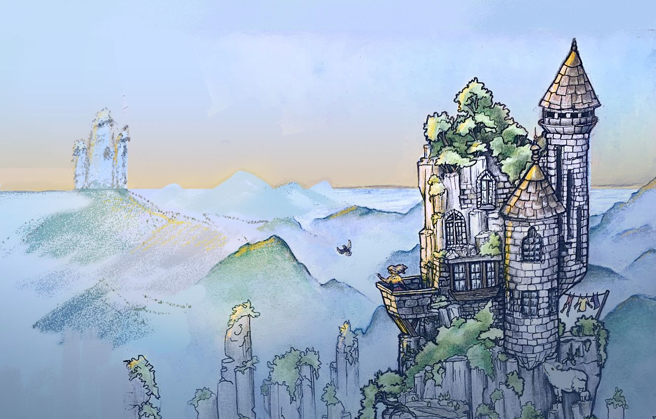
I felt like the tall composition wasn't really doing much for your story. I think you were trying to emphasize that the castle is very high up, but you already get that from the horizon line and by the castle being above all the other mountaintops. The goats were also leading my eyes straight down and off the page, so I felt like this crop made more sense. I forget who it was, but one of the three sages of SVS mentioned that the cropping tool is super useful when thinking about composition.
The main issue I think was that there were competing focal points as others have mentioned. I removed the larger pigeon altogether and I added another castle in the background to kind of imply that the smaller pigeon is a carrier pigeon. I also tried to use lighting (something I really struggle with) to highlight the focal point. I also used an orange-yellow gradient on the sky to separate it a little more from the ground. I had the goat on the bottom right look up toward the main focus as well so that when the viewer sees the goat, it leads back up to the focal point (I cannot draw goats as elegantly as you do, lol).
I hope this was helpful in some small way. We're all learning right alongside you and rooting for all of us to get better, so keep it up! I'm excited to see how you take on this month's prompt!

-
@Frost-Drive wow thank you!! That you too the time to make a visual is amazing. I m definitely going to rework in PS. It’s a traditional painting, but I think I want to learn from my mistakes and keep working on it. Thanks SO MUCH!
-
@aprilshin I love that you took the time to rework my piece and make a visual aid. That’s amazing. I have learned so much from the feed back. I am going to rework the piece to learn more - thanks SO So much for your input. I love the addition of the golden light. Great ideas they really help.
-
@Mairin-Kareli - thank you so much again for letting me know what the criticisms and suggestions were for my entry to last months contest, I had no idea they posted a video of the whole critique arena later on the SVS site so felt very foolish when someone from the SVS team explained this to me

As promised I wanted to give some thoughts on your lovely entry to the contest after you so kindly responded to my earlier query. However, I have to emphasise that I don’t feel I am in any way qualified to comment as my own skills are requiring of lots more improvement! I also just wanted to say that your image was original, intriguing and had lots of lovely elements. The superb skills of our fellow SVS students have been posted before me and I agree with all their great suggestions. I agree with @Neha-Rawat that the different elements of the image seem to be competing with each other. I think perhaps the use of detailed line work (beautiful as it is) across so many areas of the piece leave the viewers eye a little confused as to where to look first.
It’s so lovely when people take the time to do draw overs or reworking of an image and both reworked images by @Frost-Drive and @aprilshin have found ways to stop the elements of image competing by giving greater emphasis to what you want to viewers eye to be drawn towards. As you know, the critique for my image this month also highlighted that I should similarly have blurred the line work in objects which were meant to appear further away and to give sharper focus to those in the foreground. So I will be working on building these skills too!
Similar to @TessaW I was a little unsure if the bird was flying away with a message or returning with a message. However, the concept of the lady in the tower sending out messages is a very clever and original concept for “isolation”.
I’m going to be trying hard to work on my compositions skills this month. I think I might not enter the contest this month and will take a few more classes first as I’m a slow worker and new to digital art so getting an image ready to post tends to absorb all my free time instead of taking classes which I should be doing to improve! I’m sure you’re well acquainted with all the courses already but I found lots of a Jake’s classes really helpful as regards how to give emphasis to different parts of an image using changing values and changes in line weight.
Apologies, as I don’t think I added a great deal as most of our fellow students gave you great feedback already but we’ll done anyway for a great entry this month!
-
@Lorna-H thanks so much for your thoughtful reply!
") I haven’t taken any of the composition classes yet. So - Onward!
I haven’t taken any of the composition classes yet. So - Onward!