I would love some general feedback and critique on my art please?
-
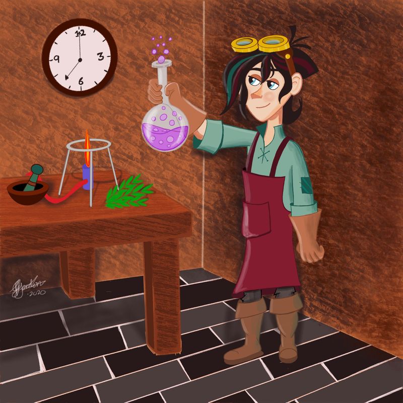
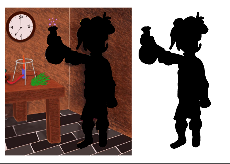
I am still in the learning phase, recently I got an iPad Pro and Procreate, I find drawing so much easier and this is the first full digital piece I have created.... I used Varian the alchemist from tangled as a reference. All the background elements I added just from memory.
I know its just a snapshot, but I wanted to get a critique from the many accomplished artists here on SVS. I appreciate any feedback good or bad as I want to improve and get better.
-
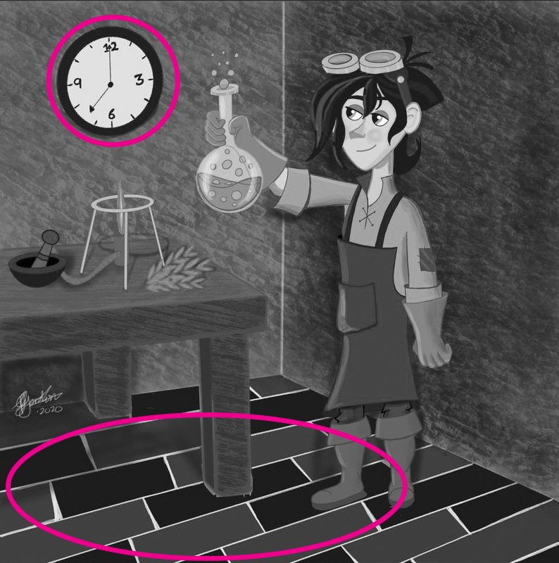
@Geoffrey-Gordon your character design is very strong, I like the specific choices you've made about what they are wearing. It gives off a very steampunk vibe. I think you could extend that level of consideration to the props and the background. To me, the clock seems too modern/generic and out of place. Same with the floor. To me the floor looks like those tiles that mimic wood which is a very modern product. Depending on your vision for the time period, you may also want to switch the gas burner out for a candle.
Another thing to be aware of is texture. Your strongest texture is on the walls which makes them pop forward and draw more attention than they should. I think it may help strengthen your focal point if you tone them down and let them fall more into the background.
Last thing is to watch your values. By switching your image to grayscale. If you are using procreate you can do this by filling a layer with all gray and then setting the layer mode to saturation. You can then toggle that layer on and off to keep an eye on values. What I'm seeing is that the strongest areas of contrast in your piece are the floor and the clock. Consider toning those down and lightening the wall behind your character to make their silhouette stand out and draw more attention.
Taylor Woolley
(Formerly Taylor Ackerman / StudioLooong)
Website: www.woolleystories.com
Instagram: https://www.instagram.com/woolleystories/ -
@Geoffrey-Gordon – Nice work! Lovely scene you've created... :-]
I think I'd have to agree with @StudioLooong concerning the values and textures. In addition, you could put some extra TLC in the perspective. E.g. the way the floor and wall are aligned, and how the table legs are grounded. They could be a distraction - nailing them would put the focus back where you want it: on the alchemist and his flask.
-
Yeah everybody pretty muchh nailed it. The things that are off are the values, composition and perspective/solid drawing.
I like the style of the way you drew the face though! seems pretty unique
-
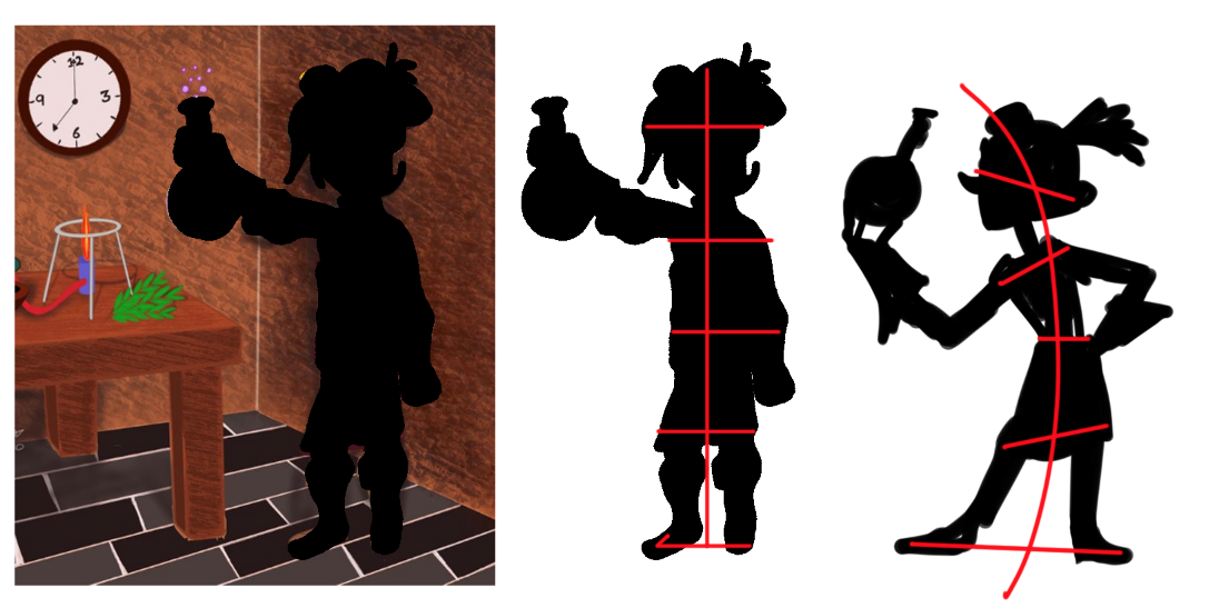
The background/perspective elements having been addressed - I'd like to make some suggestions for story/character design growth.
What is the story here? Is the person happy? Satisfied? Thoughtful? What have they made? What is it used for?
When you remove all the little details from your character, can you tell what they are doing? Is the silhouette working for the story? Is it expressive? Are you using shapes that are all similar sizes, or have you spent time playing with large and small shapes, thick and thin shapes.
*The gesture class would be a great place to start!
")
Right now your character is very still, and I don't feel like I can understand what they are thinking/feeling by looking at the image.
I would HIGHLY recommend watching like, old Looney Tunes cartoon still frames and looking at their silhouettes.
Think about diagonals, action lines. You want there to be movement through your character. Movement is created by juxtaposing directional lines.
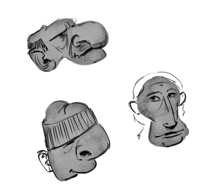
Here's my quick example of a more expressive silhouette.
Instagram: https://www.instagram.com/eliamurrayart/
Portfolio: www.eliamurray.com -
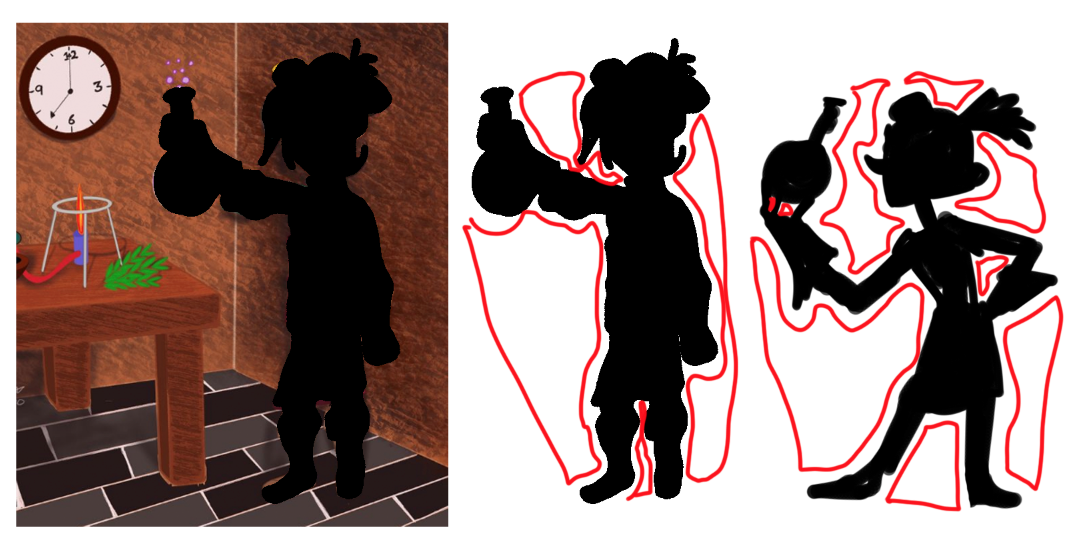
One more element to point out - is think about your negative shapes!
The areas around your character that equally inform what your character looks/feels like.Character design is all about balancing shapes against each other, straight lines, curved lines, big and little, square and round, open and closed.
-
Hi Geoffrey! I love the character you've designed! You have great style! I see that you're playing around with textures and I think you'll really get a lot out of Lee's YT video on how he handles texture: https://www.youtube.com/watch?v=N7DedDc7aU0
I recently rewatched this and it just has so much great info. Looking forward to seeing more of your work!
-
@StudioLooong Wow thank you very much for the feedback, so I gleaned 3 things from your feedback.....
- All elements need to meet the time or age they came from. I need to do more research.....
- Tone down the text to the point that it does not detract from the main point of focus
- Learn more about the value and how it works.....
Any suggestions where I could learn more about values?
Ps your work is really awesome.
-
@PieterVanDerBeek Thank you, I definitely struggled with perspective. Need to go back and learn that part better
-
@EliaMurrayArt thank you for your detailed feedback. I can definitely see clearly what you mean by your example, your pose is definitely more dynamic for sure. So a good image or pose is one where you can read the emotion in the silhouette phase.
Is it good practice to draw the silhouette of your character first to help you learn to pose them more dynamically?
Also, I love how you put in the line of action and angles to help achieve a dynamic pose. Honestly, I never thought about any of those questions before I started drawing. Do you have a list of questions yo go over before you start a scene or are they just in your head?
-
@Geoffrey-Gordon You're quite welcome!
Yes, in general a good pose/character is when a person can glance at a page and quickly understand what the character is feeling/expressing. Think about how we read children's books. We flip the pages (sometimes quickly, sometimes slowly) and a child, especially if they are not reading yet, must gain quite a bit of knowledge from looking at the images on the page.
If a child cannot understand the feelings expressed by the characters, then they are missing out on a key part of the story telling.
It is good practice to draw silhouettes of your characters to learn to see if the pose is dynamic. I don't feel that it is necessary to always do so, but if you are learning it then I highly recommend starting off by doing that.
For example, sketch your character out a couple times in a couple different poses - then on a separate layer on top of that fill in the poses with solid black to see which pose reads fastest.
Another good exercise would be to make a list of expressions - perhaps start with 10. And try to only use silhouettes to create those expressions. Show them to another person (or on here) and have people try to guess what feeling the silhouettes are trying to convey - if people are able to understand your silhouettes move on to filling in the details. If people seem confused or unable to understand the expression, then it's back to the drawing board!
I do tend to ask myself a lot of questions before I start an illustration, but I don't necessarily have a list... It's sort of second nature at this point but it does take a lot of practice to get your brain to think about them without a lot of effort at first. Sometimes I'll write out a little story for the image, in that story I'll try to make sure to hit some key elements: what time of day is it, how is the character feeling, what is their goal?
All these things inform the illustration and therefor inform the character design as well. Is your character young, old? Are they a teenager? Are they in their 30s? What's their job? Do they like the color green? Or are they more of a purple person. The less generic you can think, the less generic your characters will feel.
Another fun practice is doing this - start with random blobs. Try not to think about what you're doing (this can be done digitally or traditionally with watercolor.) Make a bunch of blobs and then try to fill them in with unique faces. This will help break the tedium that many artists face because we are saturated with very similar images/styles these days. We are influenced by what we see and what are the trends. The goal is to break up our imagination a bit to stop relying on our "stock visuals" and therefor create unique, expressive, characters. This will also help push and pull the sizes of your characters features. You can do this exercise with whole figures too - just use the random blobs to contain your character. Sometimes restrictions are a key to unlocking creative solutions!