feedback on my April contest entry
-
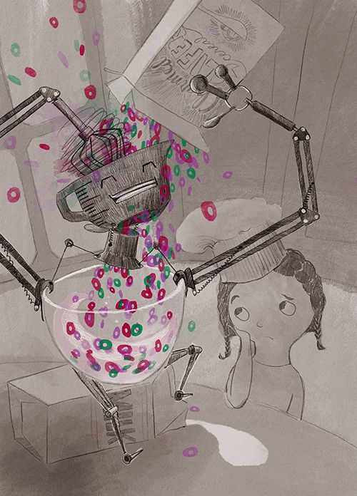
I thought I would do a draw-over of my own piece but to be honest, I'm done with it. It wasn't what I wanted to do. But here it is just in case there is anything you can tell me that can help me improve (aside from, you know, putting my name on it like the rules instructed).

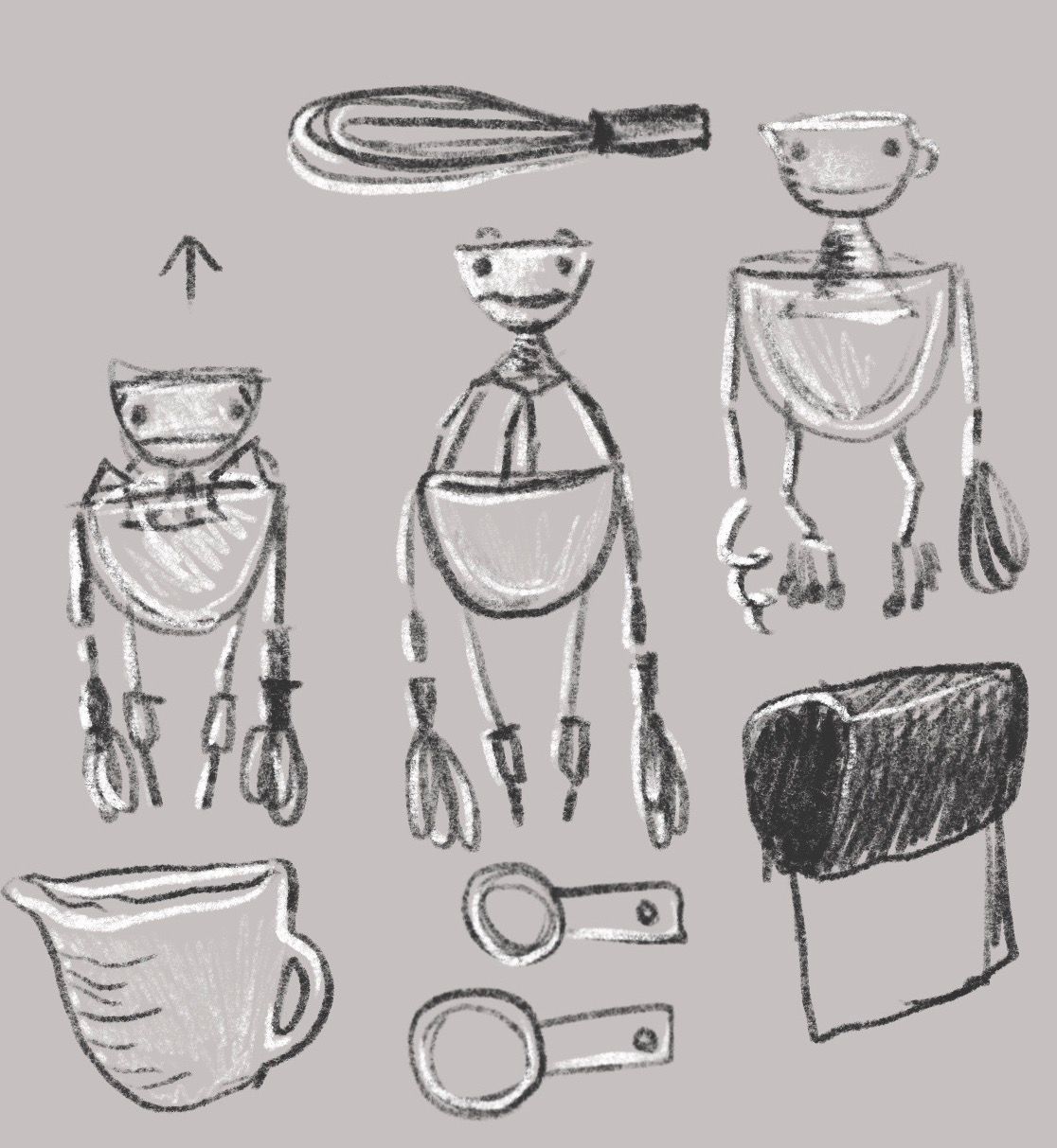
I think what I really wanted to do with my Lisa's robot was a simple animation. Here's the character design for the robot:

I liked this part so much that it was a huge letdown not to want to enter the contest. That's the way I mark the success of each entry - am I excited about sharing it on the thread? Because if I'm not, it's such a letdown. It's so difficult to leave it up there and not take it down.
So as far as the animation, it would have been sketchy, like the character design, with the robot blending things in his head, then dropping the blended stuff into his bowl body using some sort of sliding piece that would open up the bowl head into the funnel neck. Then he would lift his head and blend in his stomach.
Do you guys think that an animation is allowed in the contest? I wish I had done it regardless, because it was what I wanted to do.
-
Hi @carolinebautista, your robot piece is a lot of fun! You should have definitely entered it in the contest!
Regarding the animation, I think it would be cool to see your robot come to life; however, I don’t think animations are allowed in the contests.
I don’t have any critiques other than possible adding more color, but the piece looks cool as-is.
-
@carolinebautista this is super cool, a shame you didn't enter it into the competition...
-
It is a really cool image!! I love the way you used bright colors on a black and white base image and the concept is really fun! Too bad you didn't enter the contest!
-
@Elena-Marengoni @Rachel-Horne @Jeremy-Ross thank you so much for responding. I did enter the contest because my family urged me to keep it in. But I don't like the image. And I wish wish wish I could figure out why.
I think the worst that could have happened entering an animation is that they wouldn't pick it. And that's not so bad, because that's what happened with this one.
I have been struggling more lately, so I can't tell you how much I appreciate your responses. Someday I will create work I like and others respond to.
-
I loved seeing this piece in the contest thread.
 It was one of my favorites concept-wise.
 -
Can you describe what you were looking to do with this image?
What are the keywords? or (very briefly) what is the story you are looking to tell?Knowing what you are trying to say with an image will go a long way toward getting useful feedback.
Right now I see the happy, energetic robot. It's a good robot design. It's easy to see that this was your favorite part of the image.
The overall story looks like a bowl of cereal is being poured.
I'm not sure what the function of pouring the cereal through the head (measuring cup) does. I'm confused by the whisk (wouldn't that just make the cereal into crumbs?) Try to clarify what the robot's job/function is so the viewer can understand.
Girl character looks good as a design.
I see the girl looking unhappy. I'm not sure why though.
Did she want to pour the cereal, and is upset the robot did it instead?
It looks like there's no more milk. Is that why she's upset?
She's wearing a chef's hat which is not typical for pouring breakfast cereal. It seems like the kind of thing a kid would do for a "baking event" (like brownies, or a lovely big birthday cake) Do you really need that prop for this image?The window and cabinets in the background are --okay. They do help to communicate the setting is a kitchen, but right now you seem to be uninterested in drawing them. I recommend including only the elements that actively inform your narrative. This piece would be just as understandable without them and the piece would have a stronger overall design and silhouette .
As for animation -- I see no reason not to! First, you clearly want to, and your enthusiasm will be infectious. Second, artists who can make their images move will only be a benefit to prospective clients. It's true that the picture book market still deals in static images, but editorial clients (magazines, newspapers etc) are actively looking for illustrators who can make images that work both as static and gently animated for the online editions.
The rough sketch you attached seems to suggest that this robot will have a kind of frog-like squash and stretch would would look pretty neat!
Check the following with someone in the SVS administration -- but when you submit to the monthly contest just make sure to figure out how to submit both.
-
@davidhohn Thanks so much for all your thoughtful questions! It was just what I needed to figure out what wasn't working, and my distress over entering it has disappeared. I like doing every image as a series, so haven't been great at coming up with clear images for the contests.
My only keyword was 'cheerful,' but I think I wanted it to have some energy as well, and it didn't have that.
Lisa is a professional-level kid baker. She created a mixerbot to replace her stand mixer. Its scale is countertop appliance size (kid friendly), and I took details from the popular stand mixer: levers and bowl shape and attachments for hands.
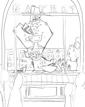
I didn't add lighting, but it would be morning, and Lisa would have baked something fancy already, but the robot has watched her pouring her cereal and is happy to show her that it can blend cereal for her, which is not impressive because it's the ONE THING every kid can do on their own. He emptied the milk into his belly, and the image is when he is gleefully adding all the cereal. And so the cereal sits there in the robot's bowl belly, not even eaten.Here's a redraw trying to answer some of your questions:

But it doesn't work, even with a changed setting. I think this is not something I will pursue because the central idea is flawed, and the little joke about a robot being so pleased with itself in creating soggy cereal just doesn't work. I'm ok with that, actually, because I'm going to take what you said about animations and try doing some of those. Now the drawing has value to me. It got me to admit what I wanted to do, but also that I can't just check the box for each step of the process, I need to genuinely feel where I want to go with what I'm doing. I seriously laughed at the part where you said "but right now you seem to be uninterested in drawing them" because it was so spot on... thank you!
-
@carolinebautista Just wanted to say I think the little girl in your original drawing is really appealing, her facial expression and the way the hat is tilted really works. There were a lot of versions of upset/sad/angry little girls in this month's contest and I think yours is one of the best.
-
@Braxton Thank you! I did notice that it was fun to see how Lisa reacted in the different entries. But I only just now noticed that you managed to leave Lisa out completely! clever. Yours was so charming I didn't think about that before...
-
@carolinebautista Haha thanks! I was actually worried about the fact I didn't include Lisa in the illustration, but in the end decided the "story" I was telling was more about the robot, and I didn't want to distract from that.