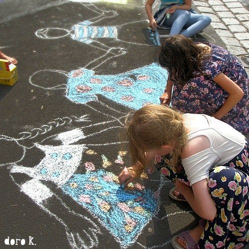
Does these look enough like chalk art?
-
I want to add another style to my portfolio that gives a more traditional media feel and was given that opportunity in a recent couple of books that have a few spreads where the character happens to draw some pictures with chalk. After playing around making a brush that would best represent chalk I got to work. I first tried using my off hand to mimic a childlike drawing but a 3 years old's picture would have been a masterpiece in comparison........
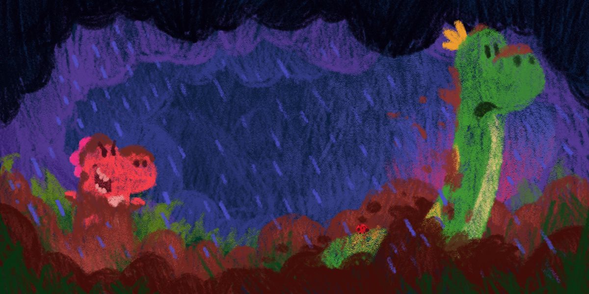
In the first example a dinosaur was doing the drawing on a blackboard, so i'm trying to go for a more simpler and messier look.
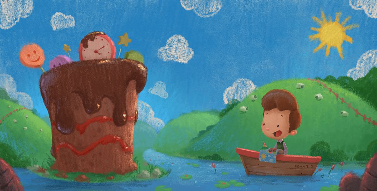
In the second the main character is a boy who i'd say is quite imaginative and I wanted to reflect that by been more detailed.
It's really hard to avoid going too much into the detail and my first attempt ended in disaster when I tried to go for a van gogh style, but wasn't feeling it and restarted the piece.
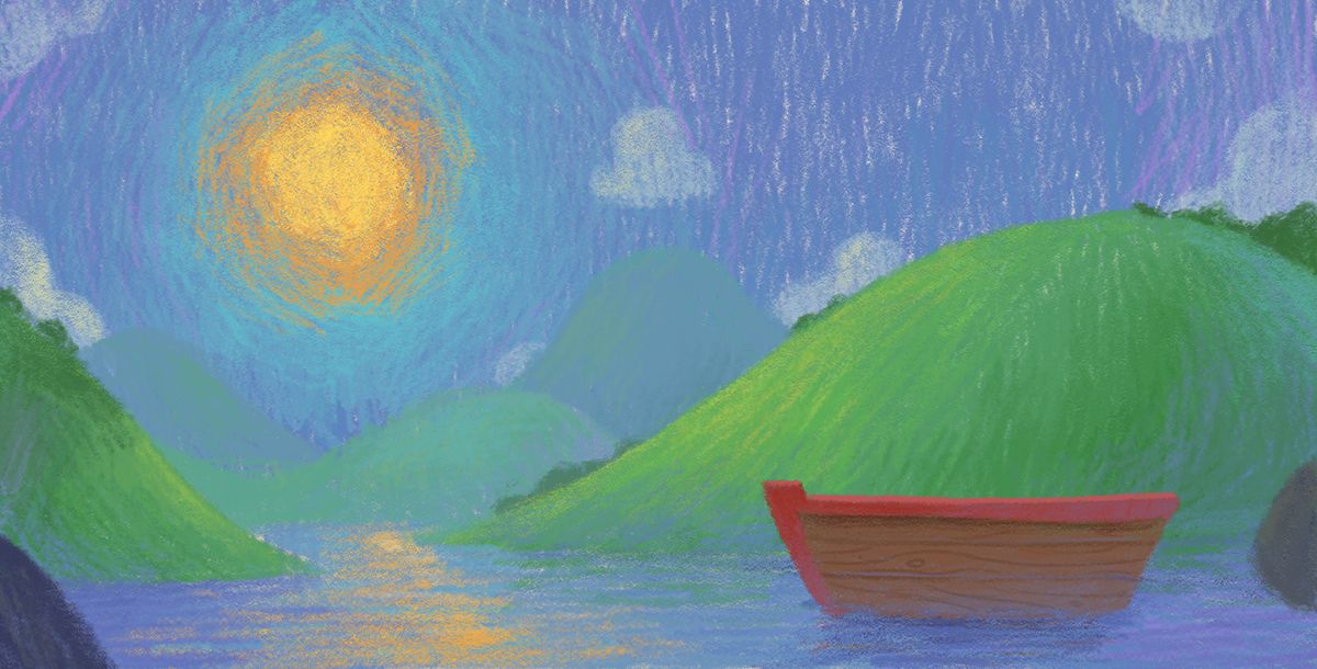
Although the boy in the boat isn't 100% there yet, I'm feeling quite good about where it is. Is there anything else I could do to make it feel even more traditional? I'm much more comfortable being digitally traditionally than actually traditional so for those chalk lovers, what do you think?
-
Hi Gary, lovely drawings first of all!
Something that caught my eye is the fact that your strokes are quite dense, especially in the second and third images, and the colors quite 'full' and bright. When I think of a chalk drawing on a blackboard I think messy lines (a bit like the first image but maybe with even more variation in density and direction?), chalk dust everywhere and quite flat and 'pastel' colors. Also, maybe the black could be a little bit brighter, like a real blackboard which is kind of dark gray/greenish. It could be nice to try and see how the second drawing looks like if the background becomes more sketchy and the contrast with the refined lines of the boy stronger. Not sure, I hope it helps!")

-
@Gary-Wilkinson definitely!
 ️
️ -
I'd say it's somewhere just to the left of # 2 is the visual sweet spot at least to my eye. I want to say the clouds and sun are a bit too basic on #2 and the boy himself too polished. It feels to me like the level of finish in the sky, background and foreground are very noticeably different. That all being said, I very much like #2 more and I think it's almost there.
I think #3 went too far and the sky got really distracting.
-
@Gary-Wilkinson These are all really good! But I'm a little confused about who is supposed to be drawing?
If it's for your portfolio, and you are the artist, then the 2nd and 3rd ones are on point! Lovely textures on those. The rendering of the boy could be toned down a little to match the stroke-y feel of everything else. The "imaginative" characteristic could be shown another way.
If you're doing it for a book where the main character (a kid) is doing the chalk drawings and taking into account the average skill level of a child, these are too beautifully rendered. Like what Elena said.