May: Adrift at Sea
-
I'm not sure if it's that I've been cooped up in my apartment for coming on 2 months, or the fact that it's MerMay - but I've been very into the "lone fisherman" theme this month...
I wasn't actually planning on making a piece for the May prompt but I've been exploring this Fisherman piece that I started a different thread about, and thinking about his life some more and it sort of spun into the May theme of isolation.
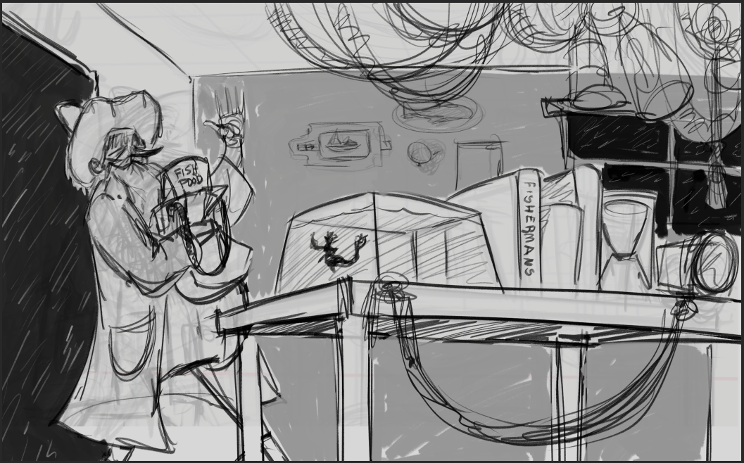
It started as this Fisherman's only friend was the little mermaid who he keeps on his desk and then I began thinking about his life outside... and what it might be.
So here are some thumbnails i've started, I think I'll do some more before I decide on one (or more) to pursue. But I'd love some input on which ones you feel exude more "isolation"
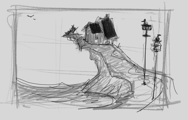
This is our fisherman friend, kicking back in his chair, overlooking his ocean.
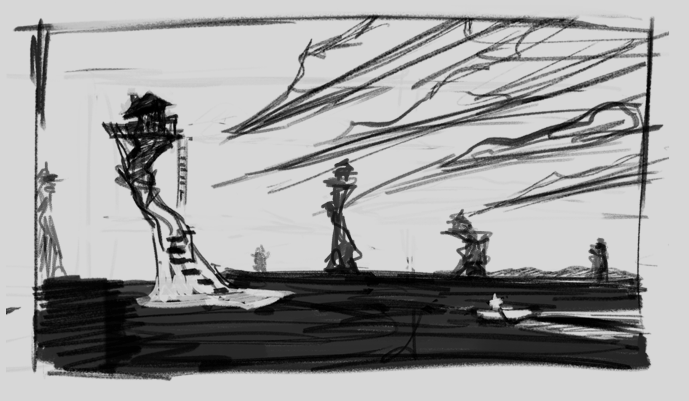
"Every man's an island" - our fisherman friend rowing his boat out to his home, with other homes scattered around the ocean away from him.
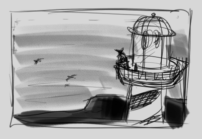
And finally our fisherman friend, standing at the top of his lighthouse, with his bird friends flying below.
Here's the original sketch that I'm still working on based off the comments from the other thread.
-
I love the second one!! Every man’s an island. So good, and I love that the houses are up so high. Sort of magical.
-
@EliaMurrayArt I love the second one as well. Even as just a thumbnail, it has a strong emotional pull to it. Definitely feels of isolation.
-
@sarahlash & @Christijan Thank you both. I definitely am most pulled to that one so I'm glad to hear it is translating well!! I think that is the one I will go with then

-
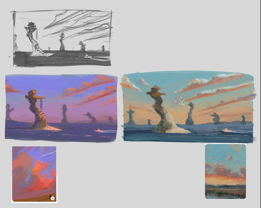
Working on some color studies. Trying to decide if I want more of a dawn or dusk feel.
What do you guys think? I don't want the illustration to feel sad, or forlorn necessarily.. more so quiet, solitude.I included the color references I chose for the color schemes because I thought they were such lovely paintings they really gave a feeling of isolation/quiet aloneness themselves.
-
@EliaMurrayArt I love the one on the right with the blues and oranges.
-
Thanks @sarahlash ! More of a dawn approach?

-
@EliaMurrayArt I love these color studies, especially the one on the right bc it seems kind of hopefu to me - they got me thinking about how a closer one would maybe fit in the left corners of your composition. I do want to step closer to the nearest one to see some detail with the steps and ladder. And I'm curious about how it would feel with someone standing there... but I love this composition and I'm not sure I would change it.
-
@carolinebautista a closer one is a good idea!! the step ladder will definitely be included in the final illustration - I want that to be the fisherman's island so I'm not sure i'd add him there, as I quite like him in his boat.... but I like the idea and I'll definitely explore it!
-
@EliaMurrayArt Such wonderful color studies! I love the right one as well!
-
@EliaMurrayArt I guess I was thinking of a kid sitting on a different style island, close by the viewer, watching the fisherman. What a vague idea! I thought that it would be a nice contrast to understanding the unique properties of each island, but mostly I was reacting to the shape and wanting to be closer. There is definitely a case to be made with being far away in this piece, though! I think when it's full size, the details of each island will read very well, even if it's just contrasting shapes. So yes, i did manage to remind myself that it will be bigger haha

I tend to veer off in different directions like this in my own process, and it can be really messy, sometimes unmanageable. And really time consuming, because it's difficult to make a decision about whether to stay on track or change direction without a lot of time as a break.
-
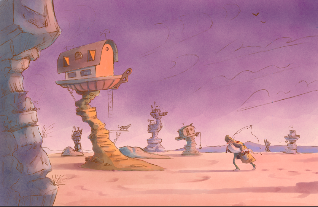
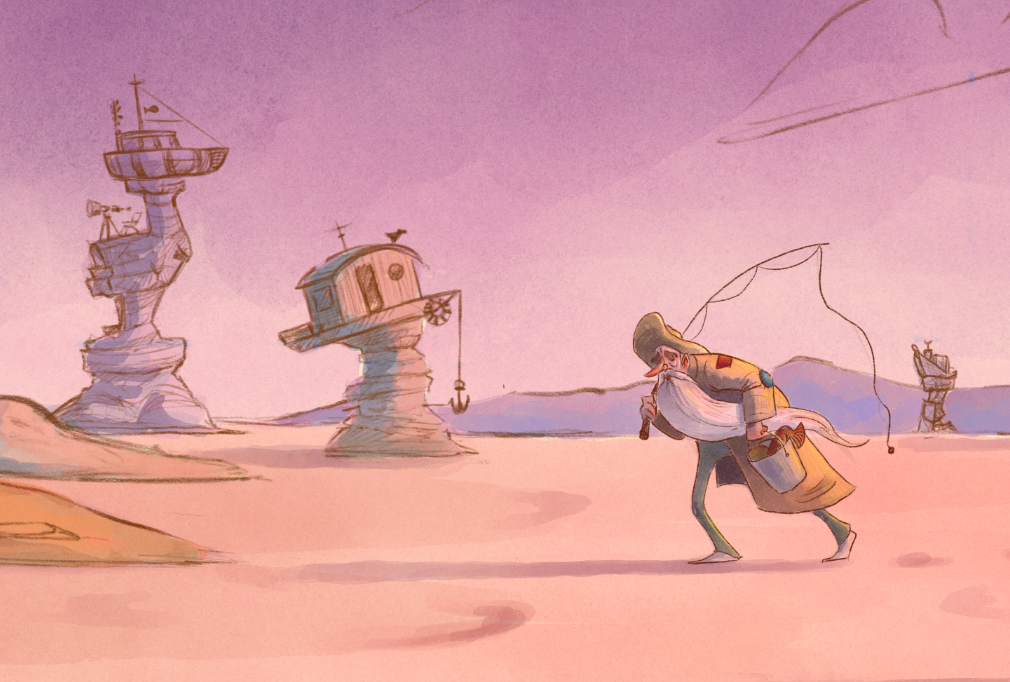
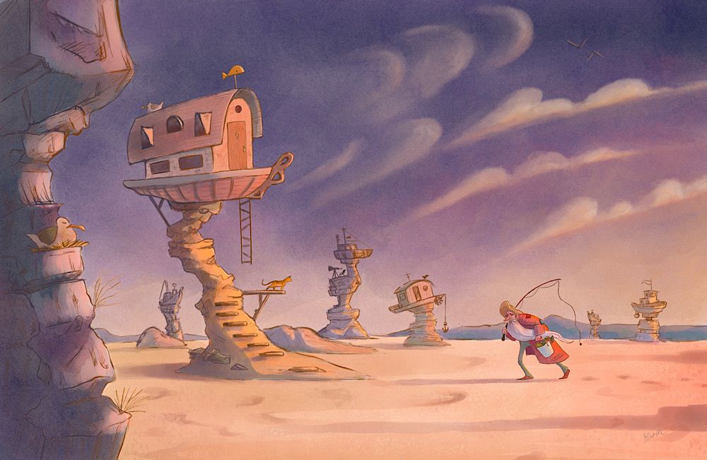
About midway through working on this painting!! I don't know that I will finish it in time for the contest, but I am enjoying it and will push through regardless.

I started off in the blue color scheme, but it felt too bright for some reason.... and then I tried to paint the water annnnd struggled haha so I opted for sand which actually progressed the illustration more (in my opinion).
Now all the houses are house boats, stuck, useless, alone. I dunno, I guess the drawing became sadder, but I think I am actually liking the story of it even more.
Thoughts?
What are some things I can push and pull as I work through this. Clouds are coming which will bring some interest into the sky.
A lot of things are sort of blending together right now so I'm figuring I'll have to push and pull the values more.
-
@EliaMurrayArt that close up island with the bird is perfection! The fisherman is wonderful.
It feels like the water should be creeping into the frame behind him, although I do like the feeling that the water has retreated back.
It's beautiful.

-
@carolinebautista Thank you!! I was considering having some water in the right bottom corner - so I'll explore that with your suggestion and see how it feels within the frame!

-
I love this - so quirky and cool. It looks like a dry lakebed, there used to be water here, so there this tone of loss and environmental issues I like. I like that he has fishing pole but there is no water.
-
@Mairin-Kareli thank you! That is exactly what I am going for.
I imagine the poor fisherman had to trek a long way to get those fish.
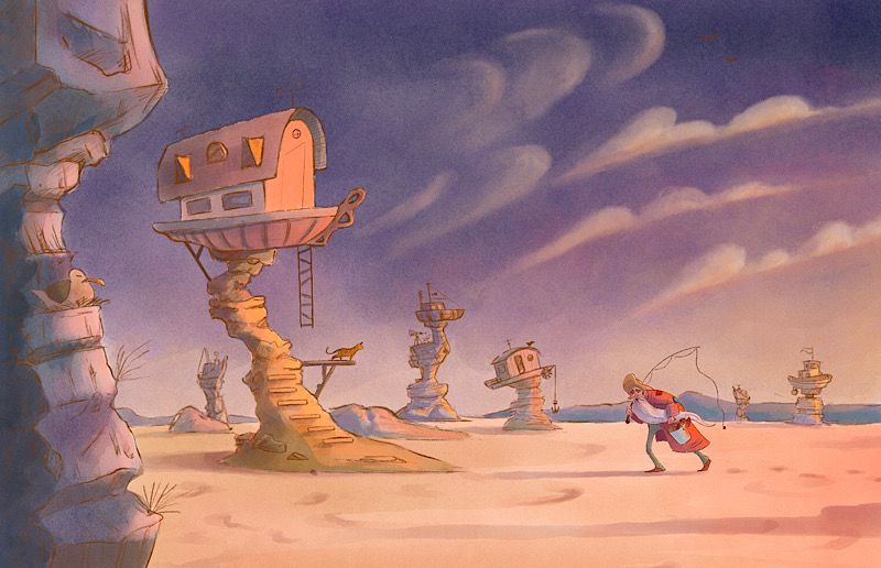
A little more progress. I want it to feel hot.
-
One more before going to bed! I’m enjoying how this is turning out. It might be too dark..... but
I think I’ll wrap it up tomorrow

-
This is so wonderful! I love how you've morphed the story from your initial thumbnail and I agree, this is much more interesting! Great design on all the houses!
There are a few things that are seemingly contradictory to me. (You've created such a beautiful piece already so please feel free to ignore if you don't feel the same)- I'm just wondering if it feels "hot" with a dark blue sky. It looked more cohesive with the warmer purple sky.
- The right half of the illustration seems more dynamic because of the fisherman's slanting pose (looks like he's walking against wind), flying beard, and slanting clouds. The left half looks very still mainly because the hanging ladder, anchor are not in motion.
Lovely piece none the less! I really love the character design and detailing!
-
@Neha-Rawat you are so right!!! Ugh I totally forgot about the wind and the ladder!!
I'll play with the sky color to see if I can bring it back to a warmer night feel.
Thank you!! Much appreciated
-
Super cool concept and wonderful image! I love this idea. I really like the look of your fisherman too. Good luck with your entry!