Isolation WIP - new to forum
-
Hi everyone! This is my first time sharing art for critique, but I've gotten plenty of experience with critique via my writing. It can't be that different, right?
")
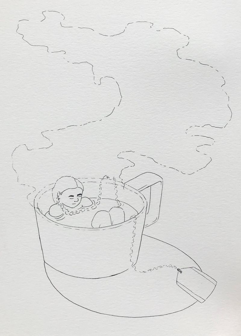
I'm including line-work that I plan to watercolor over, using lots of rich blues/greens around a warm focal point. Can be redone of course.
My main questions:
The concept solid enough? (This isn't the most innovative image, but right now I'm happy that I'm seeing progress XD If you can help me push toward greater progress, I'd appreciate it
 )
)
How's composition?
Improvements for the figure?
Anything else?Thanks!
- Sarah
-
Hi @slywriter!! Way to be bold!
Ah, just looking at this piece makes me feel so calm and peaceful. I also love your cup design! It doesn't look like a generic cup, but rather a real cup I could purchase in the real world, haha. I love how you broke up your linework for the smoke as well.
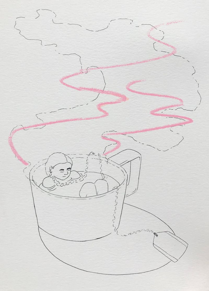
The concept is clear and I feel like your composition is pretty good, too. If I were to draw this, I might have the smoke taper off to the right side instead of the left to balance the main figure being on the left side. That's my two cents. I'm excited to see the finished product!
-
@slywriter Hi! Such a fun image! It makes me want a cup-shaped bath of my own!
The composition looks pretty good to me, though I think I agree with @aprilshin about the shape/direction of the steam. One other note: The cord reminds me of a metal chain (like on one of those stainless steel tea balls). If this is the case, I think having a chain draped over her shoulder takes away from the relaxation factor a bit (if this isn't the case, maybe it will look more like string once you've added color).
Also, I like how you've drawn your dashed lines!
Good work so far! I'm excited to see it finished!
-
@gavpartridge Thank you! Maybe I should've posted without my rough color-exploration bit, because I haven't painted over the line-work quite yet
") -- Actually just removed the color version. Makes things a little more streamlined
-- Actually just removed the color version. Makes things a little more streamlined -
@aprilshin Ooh, the composition would have some clearer focus that way. Thank you for your help!
-
@Miranda-Hoover The cord would be interesting as a metal chain, but that would definitely change the mood. Right now it's her braid--definition/color/whatnot to be added in later phases. My idea behind the image starts with self care, steeping in a bath. But the problem with steeping, especially in a cup of tea, is that the tannins will creep in after a while. That's isolation for you. Not sure how to communicate that whole thought in an image, so I'll stick with the comfort/self-care side of things for now. ----and now that I'm thinking twice about it, if I really want to give a slight bitter edge, a braid turning into chain could hypothetically work. Hmmm. Thanks for giving my brain a push
-
@slywriter Oh, I see it now! I like the idea of her hair becoming the string. I agree you should stay away from the metal to give it a more relaxing feeling.