Couple of characters and a Harry Potter fan art sketch looking for feedback
-
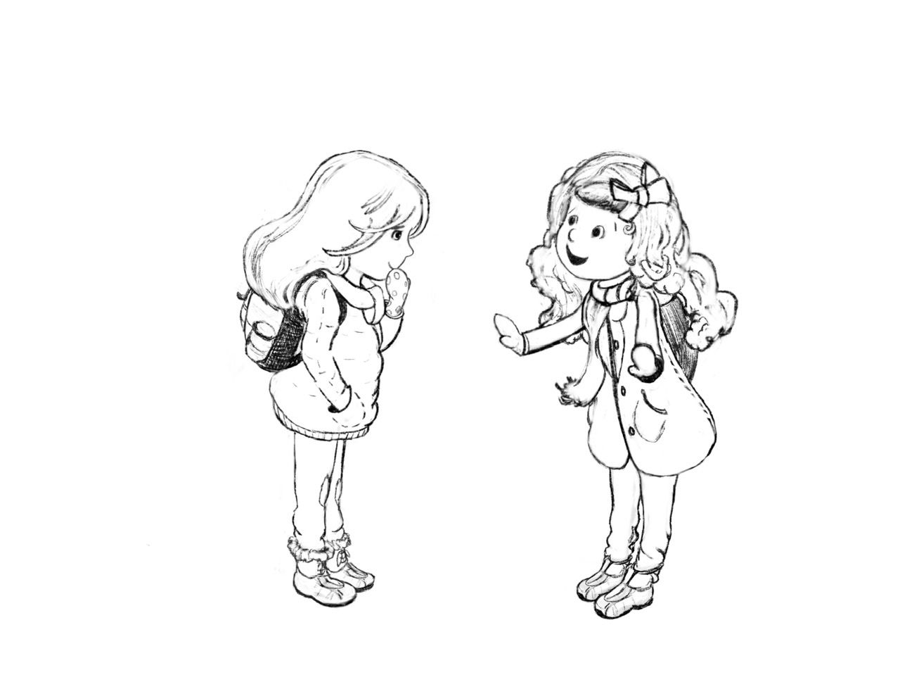
A sketch for few characters I am working on for a potential book collab, at least for portfolio. Any thoughts? Are they too boring? I kind of feel like the one on the left is a little too simple.
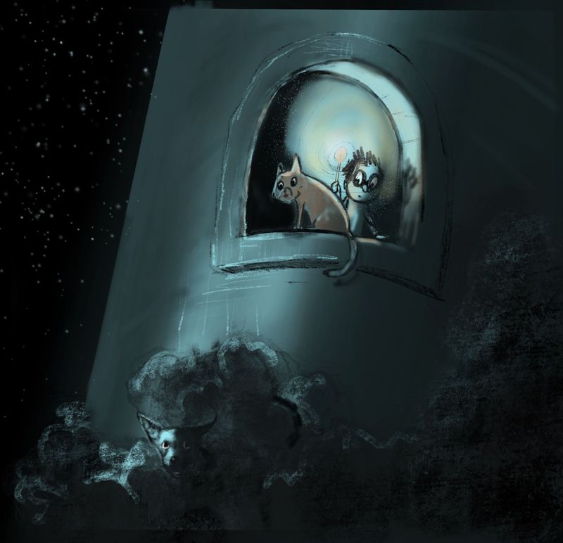
And Harry Potter sketch with values if any thoughts on that? I know that’s kind of open ended

 ,
, -
These are both really nice overall. Really well done!
On the Harry Potter sketch, the only thing that gives me pause is confusion with the light sources. Is one moonlight and one from the wand? The light source hitting the dog and tower is very strong and so is the one emanating from the wand and I feel like they are competing too heavily for dominance. Having the wand light be partially warm and partially the same color as the moonlight is also a bit confusing. I'd suggest making one light source a little more dominant than the other depending on the emphasis you want.
On the character sketches, the only thing I can see to critique is that their center of gravity looks a little off, like they are about to tip over toward the right. I think if you just tilted the whole image counter clockwise a little it would fix it. Other than that I think you've done an excellent job with their expressions, gestures, and how you've styled them.

-
@TessaW thanks so much. Will work on those things in my final pieces

-
Hey @Coley! I love the character sketches. They're pretty cute!
For the Harry Potter sketch, I do have a couple of feedbacks:
-
I like the texture you've used in the lower part. See you can use a similar texture throughout the illustration. This will also help let go of the "airbrush" look. Eg. paint the sky and the tower with the same brush but make the textures subtle. Subtle textures will come with slightly varying the adjacent colors used and/or using different blend modes.
-
Any particular reason the edge of the tower is slanting? I'm assuming it's a cylindrical tower and you're trying to show perspective. Perspective would if you're trying to fit a large viewing area into a small frame. Eg. showing the full tower in one frame. In this case you're focussing on a small area of the tower so it's ok to leave out the perspective.
-
The window is also slanting a little to the right and may need to be rotated counter-clockwise a little.
-
Maybe avoid the jet black inside the window? It's competing with the sky.
I love how you've drawn the dog. It looks like it's staring into my soul

-
-
@Neha-Rawat perfect, thank you! You are right about me trying to get the perspective, it's great to have the information about when it is needed or not. Thank you! I have to rework the lighting. It's basically just a test value layer anyhow
 the feedback will help me fix it in the final version!
I'm learning how to incorporate textures so that feedback is great
My doggie is maybe not quite as cute as your robo doggie LoL but I'm glad you like him! Harry found the big black dog scary until it was revealed who it was so I'm struggling with if he's scary or not in my illustration. I don't want him to be scary but being partially hidden leaves it a bit to mystery! -
@Coley I think as per Harry's expression, the dog is still an omen so a little mysterious scary is good! How about having the dog stare at Harry instead of the camera?
-
@Neha-Rawat he's supposed to be doing that so I guess I have to convey that better Ha ha
 . It's so good to know how others see things and get feedback. Thanks again
