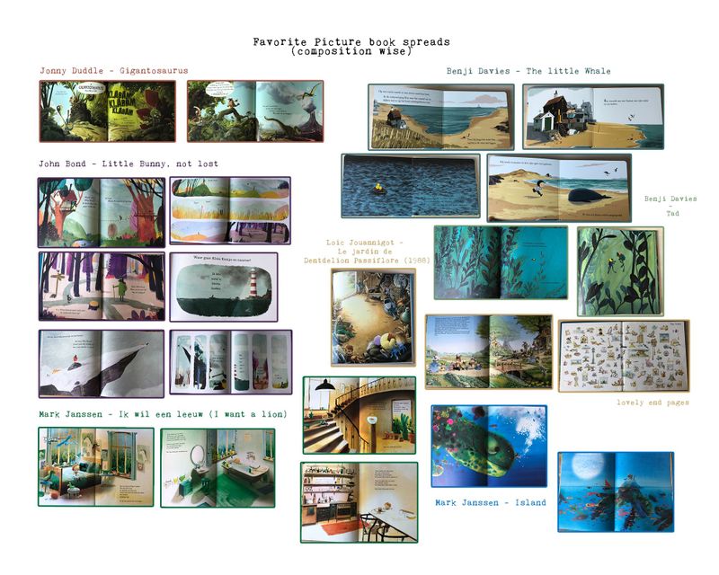
Favourite Picture Book spread Study :)
-
Hi everyone! In preparation for the storyboard of my book I just did a little study of the book spreads that I really like in my favourite children's books. I thought I'd share the file with you, maybe someone will find it useful. I now notice that I must be really drawn to blue-greenish with yellow color schemes :'). I've printed the page out and display it in my art studio for inspiration! What I particularly like is that some illustrators manage to create such depth and illusion of great size in their artwork. I struggle with this myself. I also like minimalistic spreads, quite simple with one focal point. This creates a lot of atmosphere I think. Anyways, I think this exercise was useful!
PS: if anyone would like the full res jpeg (its A3 sized)! Download here: https://www.dropbox.com/s/aqxo5dforegnniw/Favorite spreads overview 1.jpg?dl=0
PS2: sorry for those in my critique group who may read this for the second time :p)
-
beautiful! Great practice
 It's like the suggestion of finding the 10 artists you want your work to fit into - but with book spreads. really nice
 -
What a great idea!