Spring is Coming -feedback afterwards
-
Hi everyone!
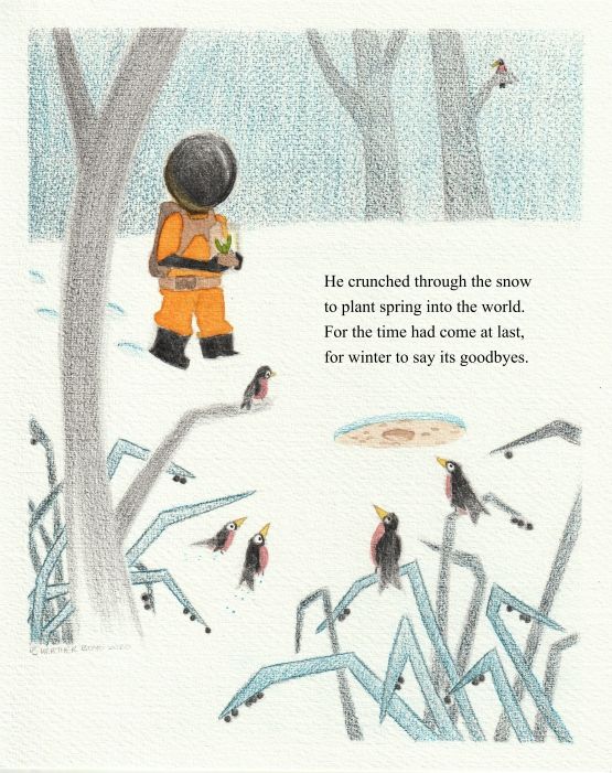
I finished this up today with adding my story text. Please I am seeking feedback on what you like, what's working and what I can improve on going forward. I wanted to play with pencil on watercolour, pencil on pencil crayon and pencil straight on. I will turn to use hot press in the future but need to use up the cold press that I bought. I tried hard to work on values but I lost them a bit I think and to work on my colours (warm and cools).
Thank you.


-
Very attractive style!
I'm thinking make either foreground elements get a bit darker or lighten the background slightly. I also want to see more texture over the astronaut's orange jumper. I'd also like to see some kind of detail element on the helmet. Right now it's a little too intense with it being a black circle. The highlight and reflection are a good start but I think adding some subtle detail on it to break it up would help keep the design more approachable. Maybe something to break up the silhouette or hint at a casing it attaches to.
You've done a great job overall. It's intriguing and makes me want to know more about the story. It feels clean and the texture gives it something special.
-
Thank you. One thing I struggle on with values is in this case the astronaut is a darker value and the setting is meant to be lighter value which it is. But you are also saying if I am reading you correctly that within that lighter background value there should/needs to be a gradient of lighter and darker? I feared going too light because the paper was already white (snow).
I was wary of adding small subtle detail in the helmet because I felt it might get lost (still working on how much detail I can add when I am unable to "zoom in" -as I once was able on my computer). I do understand and agree I could have given him a bit of a neck/attachment. I will be working on a more future human space girl character -this will help.
I also kept the helmet stronger black to help with the values along with the warmth of the orange colour -wasn't sure how far to push it.Thank you for the words like "intense" and "approachable" to help me understand how it reads.
I am happy the story intrigues you

-
I like the drawing, its light/airy and simple and the color scheme is good, but the astronaut helmet is really bothering me. I think that you can really tone down the black and add some more detail without losing the focal point there.
The tree to the left of the figure is crowding in a little, if you do this again, i think that you can scooch that over a bit to give the figure more importance and put the plant in front of the tree to break that long curved line.
I'm sorry if I'm coming to this late, I don't know if there is more to the story, so I'm wondering why is an astronaut planting plants in the snow? Disregard if you've explained this already.
-
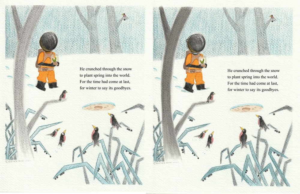
I was thinking of a very simple adjustment, something like this, just to help solidify the placement of the astronaut into the scene:

The astronaut is popping forward so much it kind of breaks the illusion of space for me. I think it's a pretty strong piece as is, so any feedback at this point is just subtle tweaks that may or may not be needed.
-
Cool cool thank you.
-
@burvantill like @TessaW did I will go back and darken the tree a bit more and lighten the helmet. I will look into adding a subtle element that I like to the helmet. I’ll keep your other points in mind for the next time burvantill,
 because I don’t plan to redraw it. Thanks ladies.
 -
I love your color palette here. The orange on blue on white is very attractive. Question: which parts here are watercolor?
-
@baileymvidler
Hi thank you so much about the colour, I am trying really hard. Watercoloured the following: the orange astronaut suit, brown bag and belt, the yellow reflected light on the helmet, the dirt on the ground, the dirt and the plant and the robin’s bellies and beaks. Lols I think I got them all!