Runaway Cupcake - New Piece for my Portfolio
-
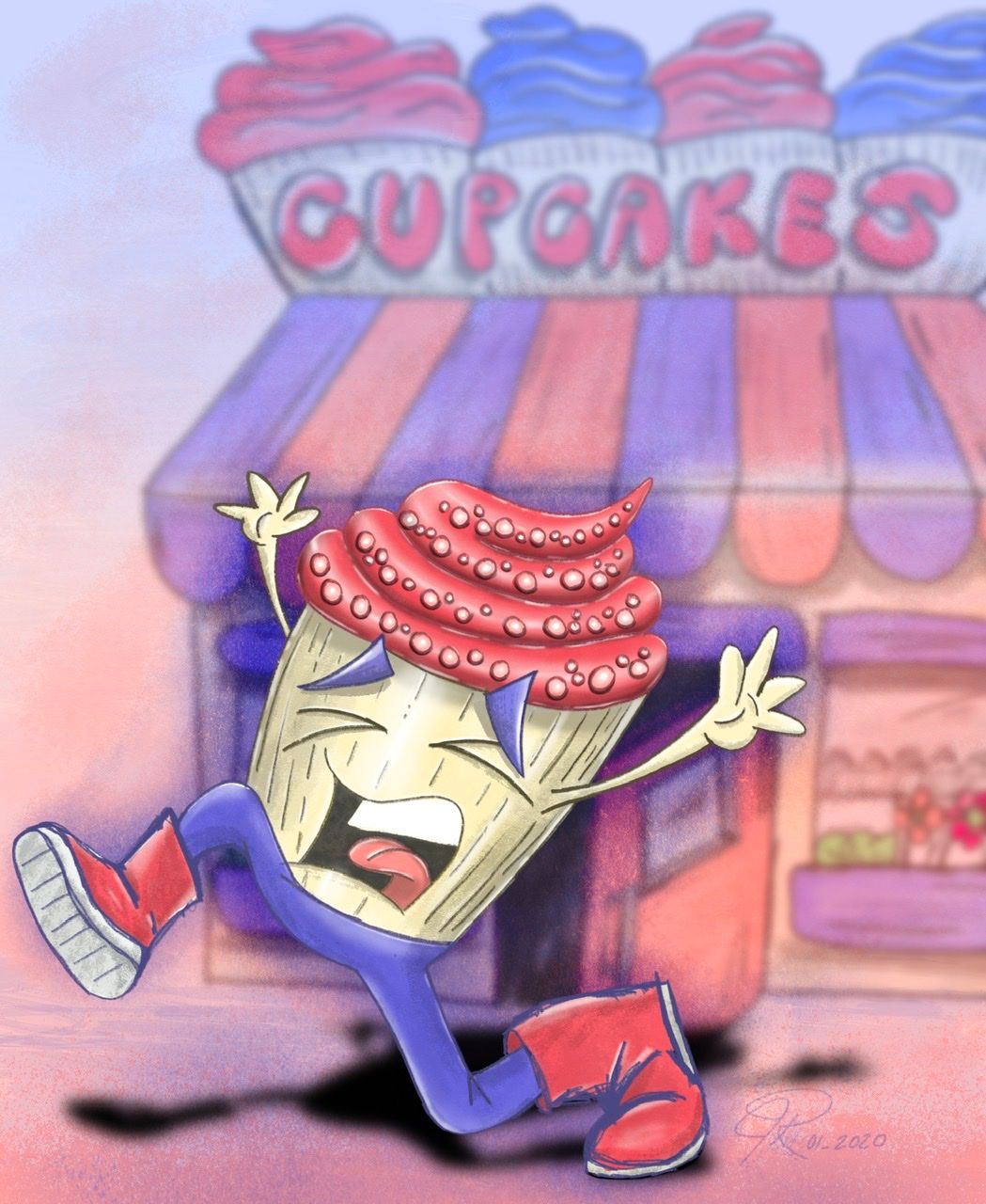
Hello everyone, I just finished an illustration for my portfolio titled, “Runaway Cupcake!”
I figured I should take a break copying book covers and make my own piece. The original idea of this piece came from Inktober traditional brush pen work (thanks @Jake-Parker). It’s amazing how productive I can be while taking my daughter to swim practice (love my iPad).
This piece was penciled and rendered in Procreate.
Thoughts?

-
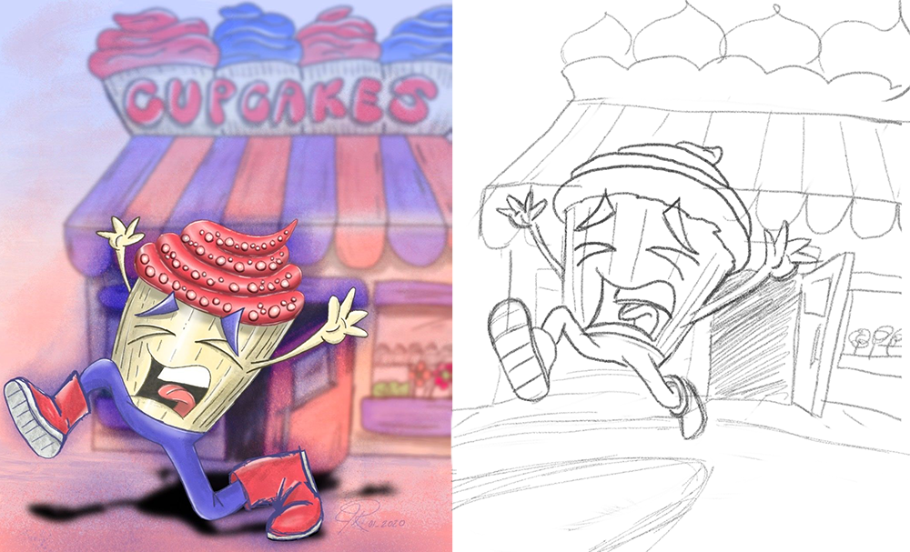
Hi Jeremy. Great job! I'm really impressed with how well you've conveyed his emotion, not just with the facial expression, but also with the gestures of the body and hands. I also really like the handling of the character vs the background- you've softened the background without overdoing it. The subtle texture over the smoother colors is a really nice touch. I also think that overall, the color scheme is pleasing and feels harmonious. I have a couple of suggestions- please feel free to ignore.
-
The way foot makes contact with the shadow, makes it look like he's stretching rather than running. I'd suggest shrinking that leg overall and making it "hover" over the shadow.
-
I'd also suggest making the shadow a dark purple instead of such a harsh black, so we keep the emphasis on the cupcake, and help our eye flow throughout the scene.
-
Perhaps make the door more open, so it's even clearer that he's escaping the cupcake shop.

Again, great job and thanks for sharing.

-
-
@TessaW, thank you so much for the constructive feedback! I agree with your suggestions 100%!
I really appreciate you taking the time to not only respond, but to also do a quick draw over to “illustrate” your feedback.
Another reason this community is amazing.
-
@Jeremy-Ross @TessaW gave you some awesome feedback on the drawing, covered it really well! All I have to add are a few pointers on another aspect: the composition.
-
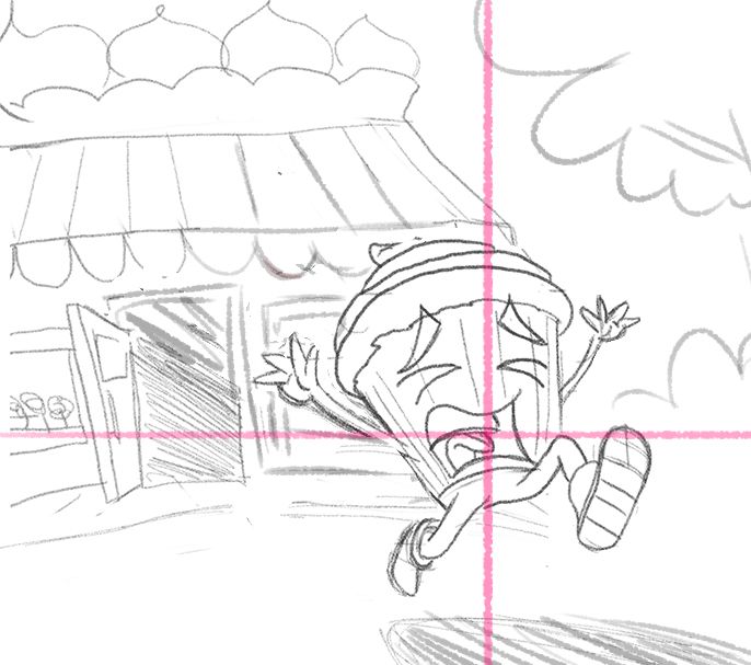
It's better to have the action going from left to right, as this is a more natural path for the eye. Your cupcake escaping to the left feels just a bit out of place, so flipping it boosts the composition instantly and easily

-
I would separate the cupcake from the shop a bit more and give the image more breathing room. This allows to see more of the shop, and the door he just escaped from.
-
In a new slightly wider composition, in this case it would work really well to place the character at the thirds of the canvas. Always a structurally sound comp and in this case it's easy to achieve as well.

-
-
@NessIllustration, very good points indeed! I’ll rework and post again.
Much appreciated!
-
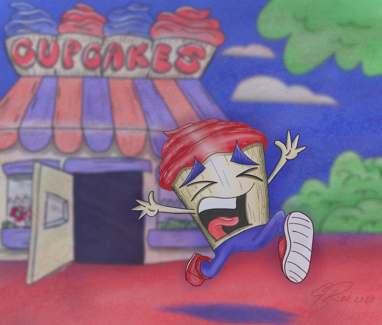
@NessIllustration and @TessaW , here’s the revision. I think your inputs improved the piece tremendously! Thank you so much!
