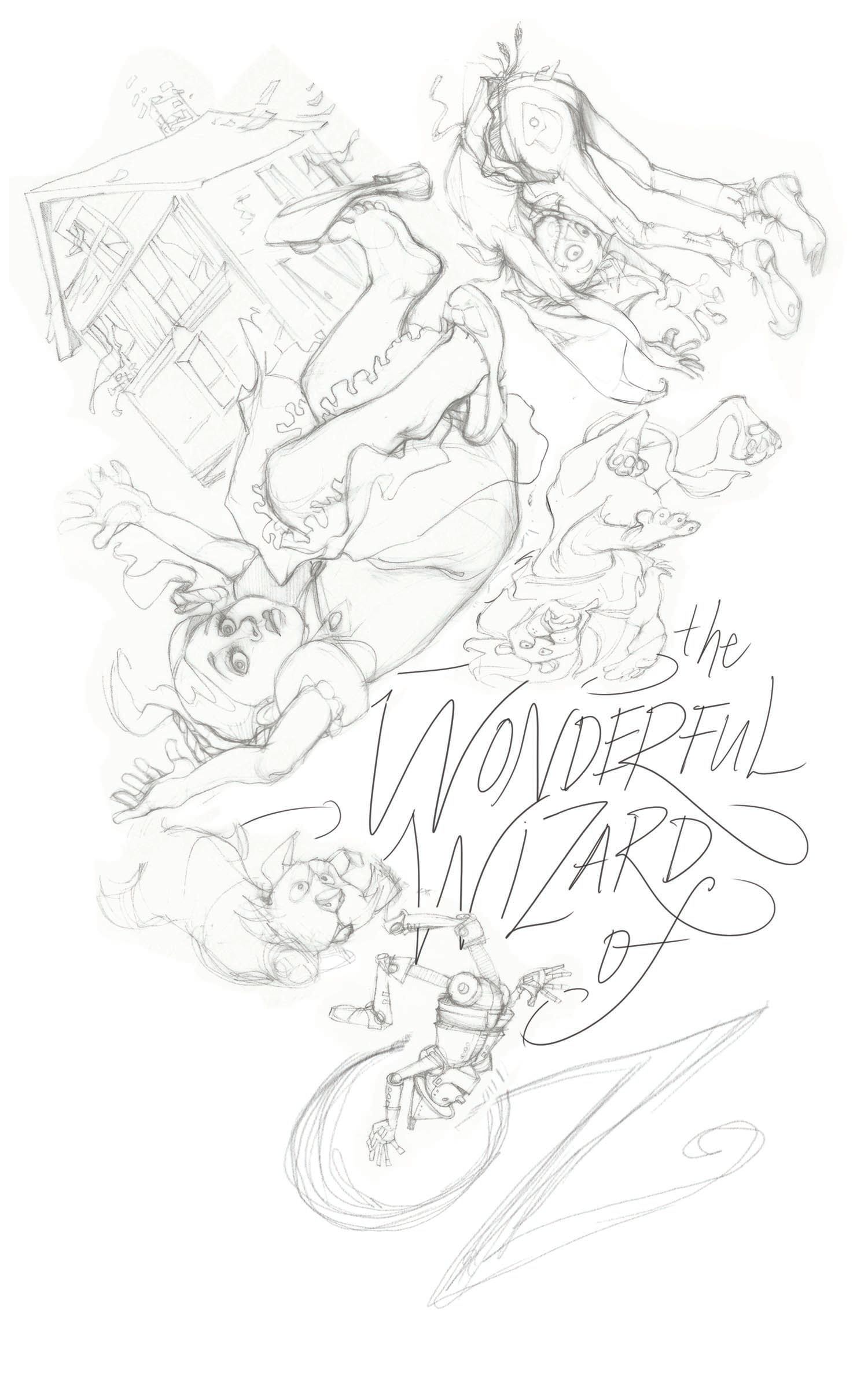
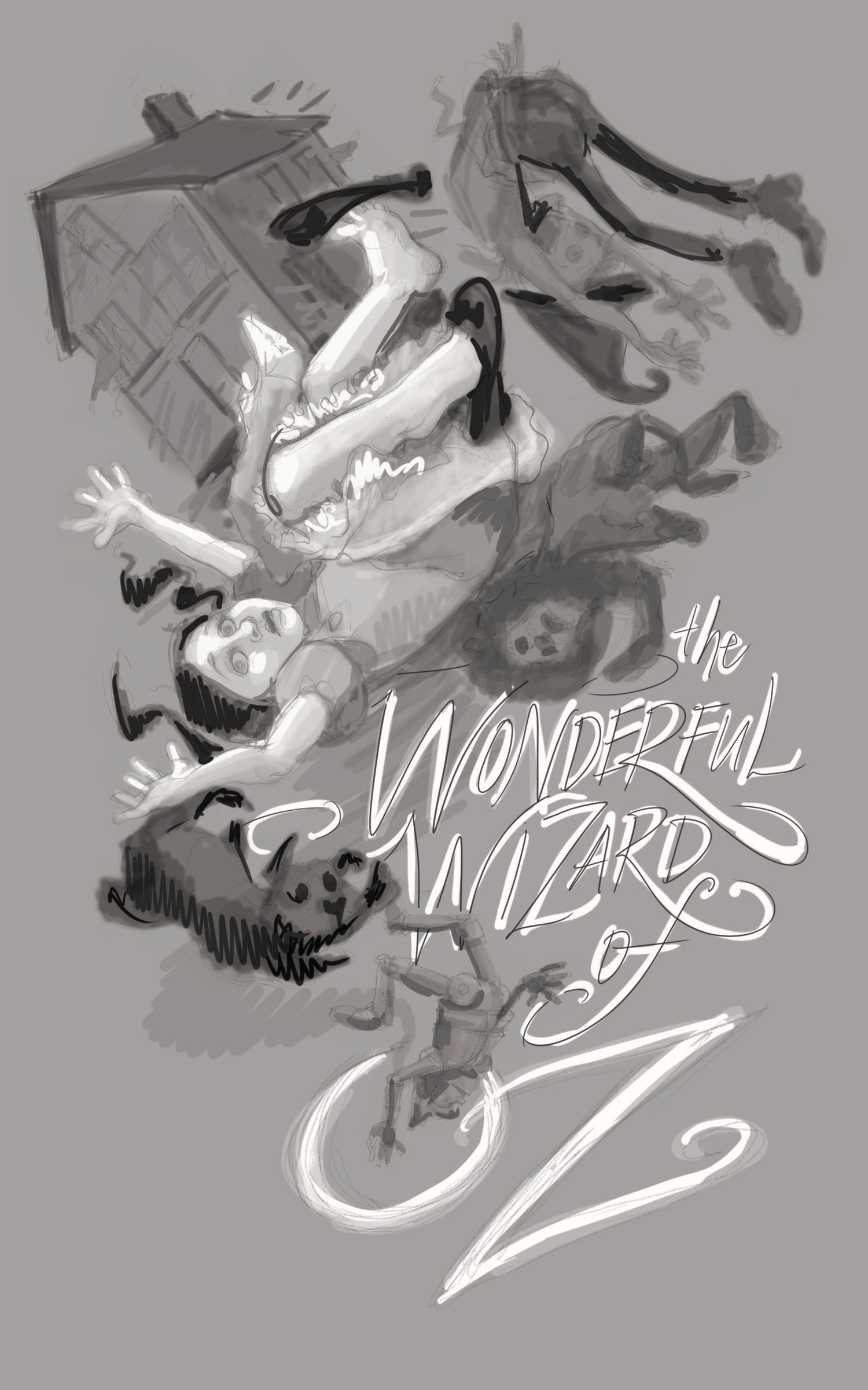
I'm asking for new critiques for the redo of Oz...
-
Howdy SVSers,
AND... work continues on my redo of book cover for Wizard of Oz. Last time I asked for feedback I was given the advice to:- make certain my design was readable
- move Dorthy away from looking like a pin-up (well, that was unexpected...did I achieve a girly look @Lee-White and @carolinedrawing ? and...I did decide to keep some of the pop-culture visual cues of oz...)
- Get that title in
Below is the line art and value study. Looking to finish with defined line art and watercolor...


And just as a question for those REALLY familiar with this forum, do you add to the original post when making corrections on critiques already posted or begin a new topic?
Love y'all bunches and thanks in advance for help and advice...
Laura
-
@Laurasketches hi! My one suggestion is to move the lion further from Dorothy. He’s so close it seems like they’re too cramped. Perhaps make him smaller. Make him seem he’s further back than the others, create a bit more depth between him and Dorothy. I hope this is helpful.
-
@Nyrryl-Cadiz that seems particularly true in my value study. Thank you. I'll try that.
-
@Laurasketches I love it ,very lively and fun to look at
-
deleted!