My first children's book illustration
-
Hi everyone,
Slightly nervous . . . .
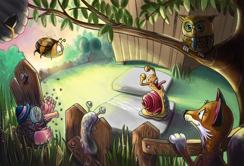
After learning from the Illustrating Children's book and from the tutors at UNI, this is the first piece I have created for a children's book I have written. I would love to hear your thoughts.
Have a great day
Pete
-
Hey, I don't know much about children's illustrations - so I don't feel very qualified to give much of a response here. But I like your illustration and wanted to let you know
") I like the richness of the colors you've used and the various textures of different surfaces. One suggestion I had was to pull some of that brilliant light on the ground closer to the snail so it illuminates him more and gives him more contrast. Right now, the spotlight is in the most empty part of the illustration, but I think if you move it a little closer to the snail it will also make those strong shadows on him pop more as well. Just some thoughts - as I said, I am not at all versed in children's illustration. And I really like all the interesting characters you created! This has a really nice feel to it!
I like the richness of the colors you've used and the various textures of different surfaces. One suggestion I had was to pull some of that brilliant light on the ground closer to the snail so it illuminates him more and gives him more contrast. Right now, the spotlight is in the most empty part of the illustration, but I think if you move it a little closer to the snail it will also make those strong shadows on him pop more as well. Just some thoughts - as I said, I am not at all versed in children's illustration. And I really like all the interesting characters you created! This has a really nice feel to it! -
My first reaction to this piece was a huge smile! I love the bright colors and playful characters. So fun. Will and Jake talk about first-read, second-read, third-read in some of their classes, and to me, this is an excellent example of this principle. My eye went first to the center of the image, then to the mole, the slug and the fox. And then the branch carried me right around and back to the center. Very nice.
Every time I look back at the piece, I notice another wonderful detail-- the subtle curve of the shed, the nail sticking out of the fence, the honey dripping from the hive, the slug's trail of slime on the fence, and on and on. It just feels like a lot of care and attention went into this image.
There is something about the bright yellow spot to behind the snail that isn't working for me, though I'm not sure why. I almost wonder if there could be a way to move the snail into the brightest spot (or move the brightest spot to the snail). Even though you've got lots of contrast around the snail, I find that yellow spot really grabbing my attention, and it ends up distracting from all the charming characters on the page.
Similarly, the bee feels too big to me, like it's demanding more attention than it deserves (if that makes sense). But that might just be nitpicking. Really, I have nothing more to say. I really enjoyed this illustration.
Twitter @MaileMcCarthy
www.mailemccarthyillustration.com -
@Maile-McCarthy Thank you so so much for taking the time to comment on my illustration. This is exactly what I needed. Now you've mentioned the yellow spot, I see it now. I will take at look at reworking that and re-upload it. I will also look at the size of the bee to see if it works better as a smaller character.
I really appreciate your kind words. It means a lot. I am working really hard to get this right. I'm 43 and feel that this is my last opportunity to completely change my career.
Have a lovely day
Pete
-
@Jeszika-Lee Thank you so much for your kind words and for taking the time to comment. I love the idea of moving the glow from the sun towards the snail. I will definitely try that. I feel so much better for showing my piece now
Thank you. -
Pete as you know I'm learning myself, but I will say that I like this image. I could be wrong but it seems like the owl should be turned around if he is looking at the snail on the ground. Otherwise nice image.
-
Pete, these characters are really cute, very nicely done. I especially like fox and mole. I agree you should try to have the owl interact in some way, he is the only one that feels a bit static, overall I think this is really great.
Happy Creating
www.charlieeveryan.com -
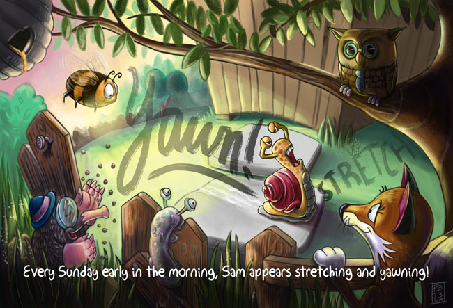
@Peter-Jarvis I just looked at your website and saw the version of this illustration with the words. I really like it that way! Totally solves the yellow-gap issue, and the lettering is so fun! Curious why you took it out. Are words-in-images frowned upon in the children's market?
Twitter @MaileMcCarthy
www.mailemccarthyillustration.com -
@Charlie-Eve-Ryan Thank you so much for your awesome feedback. I am loving this. I hadn't thought of any of the things you guys had mentioned. I am going to rework it and upload an amended version.
I haven't had any of this feedback from my tutors at uni. I am seriously considering whether I should go back or not.
Thanks again. Have a lovely day.
-
@Kris-Knight HI Kris, thanks for you kind feedback. Charlie mentioned that also. I totally agree. I will take a look at the owl and upload a revised version one it is completed.
-
@Maile-McCarthy Hi Maile, I removed the text at the request of one of my tutors. He mentioned that it was distracting. My intention was to have the typography emphasise the actions of the main character. I like it too. I don't think it is frowned upon. One of my favourite artists, Jonny Duddle, executes it extremely well in his books. And thank you for saying you like it.
I am loving the honesty and feedback from you guys. It's just what I needed. I suppose it's what we all need and that's why we are here.
Here is the image just incase anyone else wanted to see it.
thanks again Maile. Have a lovely day.
-
very nice;
Never give up, always push yourself two steps further than you believe you can go.
-
@ Peter Jarvis I think the reason the tutor may have suggested you remove the text may be because as it stands it feels like the text is crowding the character, especially the snail. They can play off each other and enhance the other but ideally you want to give your characters a bit more breathing room. Also the text on the bottom is going directly over multiple characters which I feel is taking away from the overall design. Make sure you are really planning out text placement early on, so you don't end up with crowding issues. Overall well done, I hope this is helpful.
Happy Creating
www.charlieeveryan.com -
@Steve-Young Thanks Steve.
-
@Charlie-Eve-Ryan Now you mention it, it does look crowded, now the text is over the image. I will take another look at it. I am loving everyone's feedback. It's just what I needed. I really appreciate you taking the time out to comment.