Illustration Feedback? :D
-
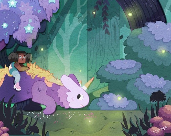
Hello! I've been gone for a while and taking some time to myself. While I'm working, I draw on the weekends and I'm trying to strengthen my portfolio. If willing, could anyone offer me feedback on this piece?

-
@ixspen I really love this piece so I'm going to tell you my reaction: I feel like your focus, based on contrast, is the horned creature's face, yet that is what I find the flattest. Is it a triceratops? It has a sort of mane that is more detailed than the face is, and as a result I look around at everything else, just like the girl. Her arms and face and hair are so well done and the expression on her face tells me she's amazed by the environment. But she is in shadow, and so is less emphasized than the creature.
She has glasses with a reflection and eyebrows, all that dimension, while the creature's face feels like a lost opportunity. Can't really tell what it's thinking. -
I love your illustration! Very adorable. My only critique is to move your girl and unicorn(?) more to the center. They are so close to the edge especially the girl. That’s all.
-
@ixspen I love the colors! And the style of your illustration

My 2 cents:
-
The tree in the background seems to be diving your drawing right in the centre. Which sort of emphasises the fact that the 2 main characters are only occupying the left half of the drawing. Maybe you could try extending the artwork on the right and include something else interesting, or shift the characters and the tree a little.
-
The trees on the left seems to have more contrast as compared to the ones on the right though they appear to be on the same plane.
-
I agree with @carolinedrawing about enhancing the creatures face a little more. I also feel the creatures mane is not in sync with the rest of the strokes (most of the strokes are round-ish where as the creatures mane is very detailed and pointy)
Seriously, LOVE the color palette! Good luck!

-
-
@Nyrryl-Cadiz @carolinedrawing @Neha-Rawat
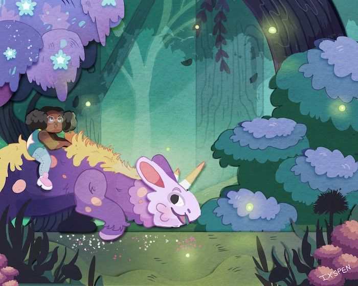
Hello! Thank you all of you for your compliments and your feedback!! They've been a lot of help!

I've started my revisions. I still need to fiddle with the tree positioning but how is the creature looking? Candycorn was intended to be across between a rabbit, a dinosaur, and a unicorn. I hope this design is a little more clear and they don't feel so flat...

-
Interesting work! I love your color palette and the concept of this illustration. The first thing that strikes me is the background right behind the girl's head. The values are quite similar so that her head does not stand out immediately. Making the background just a little bit lighter may help.
The foreground at the right bottom corner is a bit confusing too. Maybe switching layers of pink flower and dark flowers?