Would love help with book project style
-
Hello supportive community,
")
Would anyone be willing to share your impression of the style I’m trying out for the book project I’ve been working on? There are a few specific questions that have been on my mind, but I’d also appreciate general opinions or suggestions.
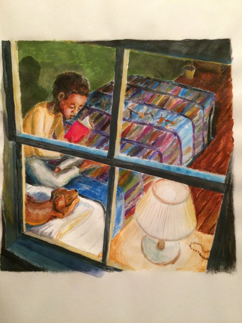
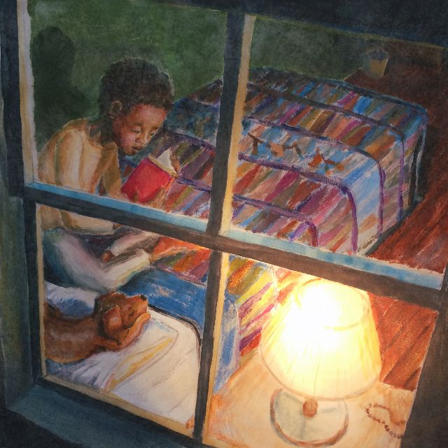
So the book focuses a lot on light as a metaphor, so throughout the pages are spots of light which are essentially created by shining a flashlight on the pages while photographing them.
Here’s a WIP of one of the pages...
The original painting:
The edited version with flashlight effect:
If you wouldn’t mind helping me consider these questions, I’d really appreciate it...
- Is the light too overpowering?
- The original is done with watercolor and acrylic, then in Gimp I added some overlay texture. Does the digital splotchy texture (like on the boy’s face) look unprofessional, corny or distracting?
- Are the colors ok for a children’s book? This page is a bit on the darker end of the spectrum when looking at all the pages, but I’ve been wondering if the overall pallet is too dark.
I wish I could share more pages, but I don’t think it’s appropriate at this point in the project.
Thank you for any advice or feedback. I’d love any thoughts or advice you can share!
-
@KathrynAdebayo I do not see a problem with this process. I like how your final piece came out, it definitely has a children's book feel.
To answer your questions directly.
-
No, I don't believe the light is too overpowering. I feel like your finished version actually uses much more of the value spectrum making it much more powerful.
-
Not sure exactly what you are asking here. I am not sure how the original was created. If it was digital it does a good job mimicking oil pastels. Maybe that is your question. It has a nice loose feel.
-
I don't know if you would want every page this dark (unless they were all at night) but the color spectrum is just fine.
Thanks for sharing, nice work.
-The Prairie Fox
https://www.instagram.com/theprairiefox
https://www.theprairiefox.com -
-
@theprairiefox Oh thank you so much for your thoughts and for helping me realize that the second question is not clear. I’ll edit it a bit. I really appreciate the input. Thanks again!
-
@KathrynAdebayo after your edit, I would say that no your changes in Gimp are not looking unprofessional, corny or distracting.
-
@KathrynAdebayo This is really lovely! I far prefer that second photo of the painting and I think using the flashlight is a brilliant idea!
vanessastoilova.com
instagram.com/vanessa.stoilova/Check out my Youtube channel for tips on how to start your career in illustration! www.youtube.com/c/ArtBusinesswithNess
-
@NessIllustration thank you, Ness!
-
-
The light looks great! Maybe the boy's face is getting just a little lost in the blanket? I'd consider upping the contrast ever so slightly- make the blanket behind his face a little lighter, or put a little more light on his face. It wouldn't need much.
-
The texture looks good to me.
-
I think the colors work for a children's book. It reminds me of the color palette and values Dan Santat uses in many of his books.
It's a really beautiful illustration and a fun way to do a lighting effect. Never heard of it before.
Website: www.tessawrathall.com
Instagram: www.instagram.com/tessawrathall_art/
-
-
@TessaW Hi Tessa! Thank you so much for your feedback. I appreciate the note about contrast between the boy’s face and the blanket. It’s nice to know that the color pallet looks ok to you! Thanks for taking the time to write your thoughts!