Slowvember, opinions, please?
-


I guess I should say: Hi, I'm new :smiling_face_with_open_mouth_cold_sweat:
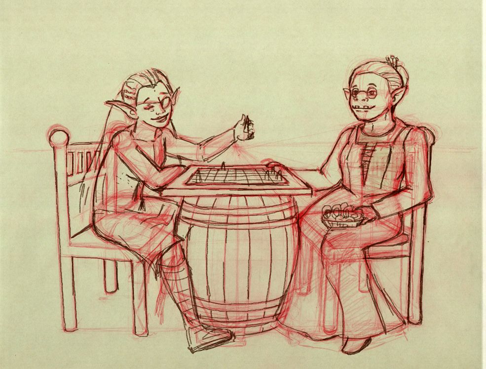
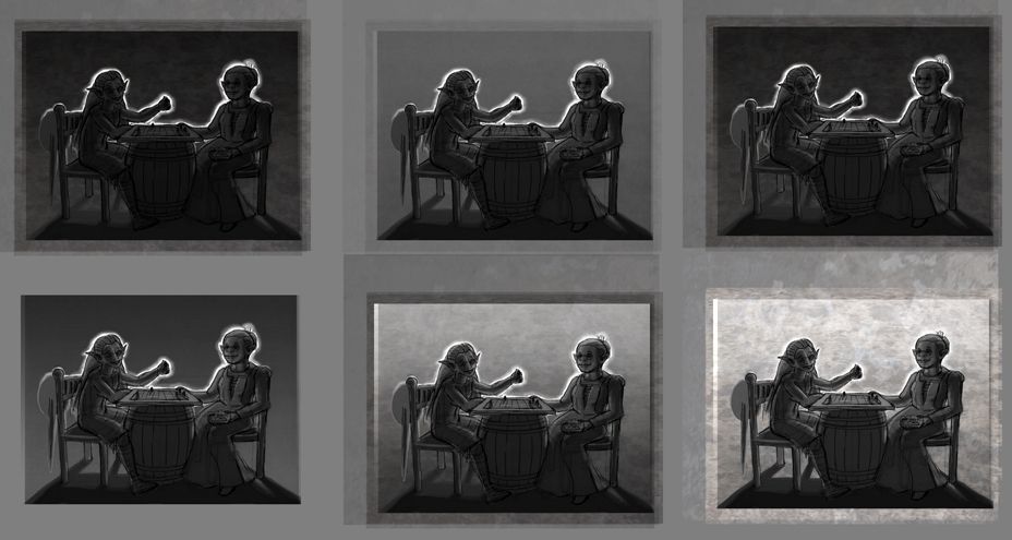
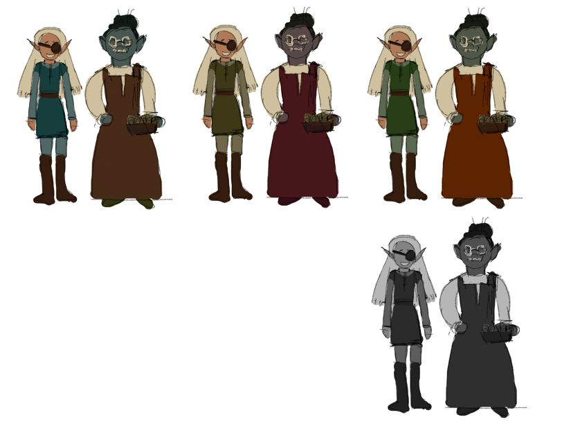
So, I've got a "final" drawing (in quotes because it's only final because I decided I didn't have enough time to get it perfect) and I realized that prior value studies weren't exactly detailed enough, and that I needed to decide on local colors for the characters.
My value studies all look too dark to me (o.o). And I know from experience that my color sense tends to be . . . weird. Anyone have any opinions or suggestions (**Note, I already know that the shield/sword combo is missing some shading)
-
Hi! Welcome to the forums

What ambience are you looking for in the background? Is this an inn lit by candlelight? Daylight? What's the setting?
-
I like the ones in which the background is lighter so that you can see the figures more clearly silhouetted against it. If you do that, also work a little more with the silhouettes of the figures themselves. I can read the arm on the lefthand figure through the silhouette, but can't tell much about the one on the right (for instance, the basket or bowl in her lap gets lost).
If you're going for a particularly creepy look, another idea would be to keep a dark background and throw a fairly strong uplighting on the figures. But dark on dark doesn't give quite enough information to work with.
You might also play around with cropping the composition somewhat because you may not need all of that empty space on the edges.
I can see that you worked on the perspective and spatial aspects of the figures, and the girl on the left reads really well in spatially, but just make sure there's enough room for the knee on the far leg of the older woman (ogre?). Also move the other knee up just slightly so that there's room for it on top of the chair. Showing all the structure like you did is really helpful! Good luck with the piece!
-
@Braden-Hallett I'm going for a kind of golden hour backlit look. I want the piece to appear friendly, like these characters are enjoying a happy moment
-
@LauraA thanks for the insights. I am going for a warmer look, so I'll work on adjusting the silhouette of the woman on the right (orc. But since ogres don't really appear in lotr, maybe that's the same thing?). Since I added the sword and shield back in for the elf girl, I do have a little more room to play with for balance.
Thanks again for the feedback. Much appreciated
-
Hi! If you’re going for a golden hour look, have dark characters on a light background.
-
@Nyrryl-Cadiz thank you, I think I'll go that direction, then
-

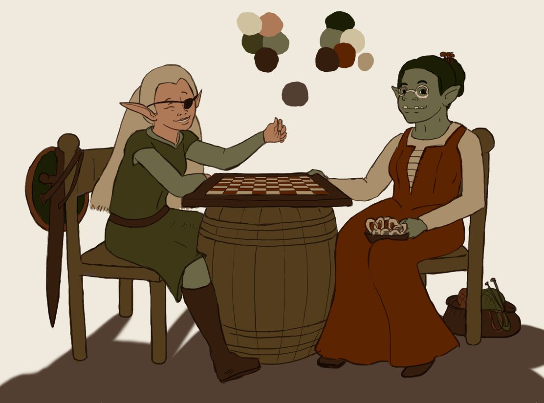
Well, I had a vacation day, today, so I worked on cleaning up the drawing . . . and here are the flat colors.
More value/shadow work coming, I promise, and I also have some chess pieces in the works that should make it look like these friends are actually playing a game, instead of just chatting over a chess board

One thing that concerns me, that I might have balanced out with the dark green of the shield: does the orc lady's hair look too dark for the overall color scheme, at the moment? I tried lightening it a little from what it was before, but I think it might pop a bit much, especially in comparison with our lovely pale elf on the left.
Any comments or crits are welcome. Thank you!