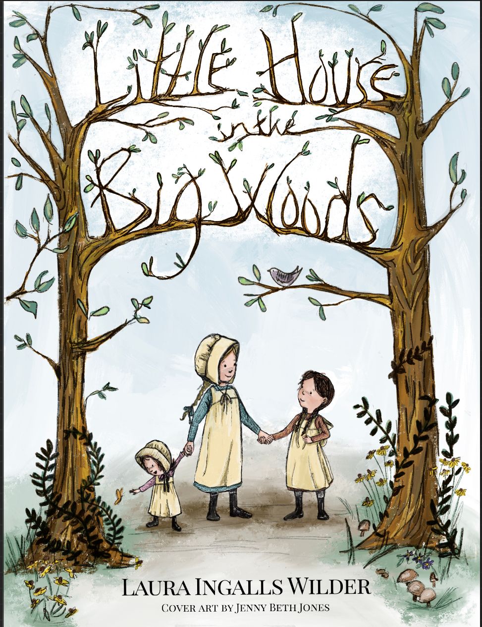
A classic book cover reimagined...criticism invited
-
I began this project several months ago when the monthly contest prompt was book covers. I was never happy with what I put together. But the revision I am happy with. It’s a Personal ‘level up‘ for me. I did it on Procreate and I am still learning how to use the digital methods.
I have been struggling with my people. I want them to be sweet and realistic-ish and detailed, but not overly so. That,of course, is subjective. But I feel like I got the girls how I think they should be. Hopefully they are not too stiff or cartoonish.
I am open to criticism. I want this piece to go I’m my portfolio so I would want it to be as good as it can be. How is the composition, readability, coloring, and look of characters?
I know I said I like the piece but I am also looking for honest criticism as I am fully invested in improvements.
Thanks,all. !
-
I think that you did a great job on the little girls. The title is a tad bit hard to read. “In the” was completely lost to me until I looked closer and saw that it was a Laura Ingalls book. I’d never heard of Little House Big Woods.
 .
.
With a bolder title I think you nailed it. I am a rookie so take this with a grain of salt.
-
I think that overall- gorgeous! It has that classic feel, but looks contemporary with the text treatment. I love the color palette and I think you nailed the character design.
My 2 cents- feel free to ignore
 - I feel like there's just a little bit of tweaking here and there that would make it a bit more balanced and flow a little better. Really nit-picky stuff.
-
Like @burvantill mentioned, I think the title could read slightly better. In addition to the "in the", "Little" Also gets a bit lost in comparison with the other words. It's lighter and there's more busy leaves happening in the lower portion of the word. I think you could stand to darken it and take away a bit of the leaves- my suggestion would be a few of the leaves on the crossbars of the Ts. I think the title as a whole could be lowered just very slightly.
-
I also think the very right hand portion of the overall comp is lacking in some leaves. There's a heavier balance of leaves on the left. This is a pretty symmetrical composition, and I think it could use that balance.
-
My last suggestions are even more nit-picky that I almost feel silly saying them, but it has to do with the area of the characters.
a. I find that the littlest character is leading us out of the comp with the direction of her gaze and the left arm/foot (her right). It leads us a little too much to the left and out of the comp, when I think those elements could be shifted so they point a bit more down to the corner of the title- therefore leading our eye to circle back around. You'd just have to shift those elements a hair.
b. Next the big-ish branch above the littlest character could be shifted down a tad in order to fill in that negative space a little and give the title a little more breathing room.
c. A little more strip of colored skirt peaking under the pinafores of the younger girls.
d. Very slightly more grassy wisps to flow around the edges where the green grass is already located. It will frame the title nicely and lead the eye around better (the older girl's feet create a strong implied horiztonal line- and adding a few more wisps in the green area below the outer girls feet will soften it).
Anyway- told you it was all nit-picky! lol.
Great job- I think think this would make a great portfolio piece. I think you are really starting to get a good grasp on rendering in Procreate. Looks lovely!
-
-
@burvantill ,@TessaW Thank you for your kind words and constructive criticism. I totally see what you are saying about the title. There is certainly room to shift and rework it a bit to make it read better. That’s a pretty important part of a book cover
 I will work on the several little tweaks and repost this evening. Too bad I have a day job to do or I would take care of them now. But my 5 minutes break is over and I am headed back to teach preschoolers. At least picture books are a big piece of my job and I have some built in audience for book dummies and special projects. Field testing!
 -
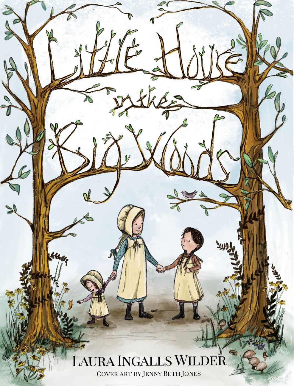
Ok. I have done some revision and I think I have the cover complete now.
I moved the title and tweaked the spacing and size of several letters. I added and deleted foliage in the foreground all around the trees. Added more leaves and branches to make the piece more balanced and added a bit more skirt peeking from beneath the aprons. I also added a little highlighting to the title and leaves around the title to make it stand out a bit more.
What do you think? Does the title read well? Is it too much or not in keeping with the look of the piece?
Thanks in advance.
-
@JennyJones ,
I have no critiques, just want to say I love it specially after all the adjustments. First pic, I completely missed the title, but now it is much clearer. Good work! -
@RG-Spaulding Thank you so much. This one has been eating away at me for months. I like it much better after the revisions too. I really do appreciate people seeing things my eyes cannot after looking at the piece for so long. The forum feels like a safe place for a fraidy cat like myself. I need to summon the courage to put up a website and get instagram going too. I suppose a full portfolio doesn’t mean much if it isn’t visible

Thanks again. It means a lot to me.
-
It gorgeous. Get that insta and website up!
-
@TessaW I’m doing it this weekend! Priority #2.... Priority #1 for the weekend is turning my 5 year old into a refrigerator for Halloween. I need luck on that one!
-
@JennyJones Yay! Good luck! And yay for homemade halloween costumes. You rock.