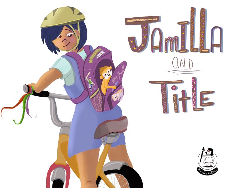
Critiques requested
-
I completed this as for an assignment for another course I am doing. Would really appreciate any honest feedback I can get. I don’t expect to be picked for the class critiques - they only pick the best to highlight so can be hard to figure out specifically what you need to do to improve. Hardest part of self-learning. I have not yet developed a style of my own so am trying to emulate what I think I see out there.until I figure it out.

 ️
️This was supposed to be about introducing the main characters - Jamilla and a monkey called Title. Monkey sneaks into Jamilla’s backpack in the text we were given.

-
Hi Michelle,
I'm really liking your image! The colors are fun. The title is lovely — love the patterns. The positioning of Jamilla and how she's sweetly looking back at Title is very nice. There really is so much that I love about this illo! I do have suggestions that might make this stronger though. Please accept what you find to be useful and disregard what you don't.
Might there be a way to have the title and characters work together or interact more? They're quite separate currently. If this was a book cover, maybe this could be a vertical and Jamilla and Title could wrap more around them?
Jamilla's eyes need a bit of fine tuning. They are a bit too close together and uneven with the positioning of the head and eyebrow. Think about the vertical (and horizontal) center lines of the head running from the chin to the top of the head and make adjustments if you agree. Also, the right eyeball should be adjusted right a hair so it looks like she's looking directly at Title. The ear is tipped to the left and should be rotated clockwise. Take a look at the arm as it looks a little too flexible/curving to me.
But most of all, I'd love to see little Title interacting with Jamilla. If it could be peeking back and up at her, that would be precious!
Best regards,
Su -
@Su thanks so much for taking the time to give me a critique. I really appreciate it. I see what you mean about the eyes. In my original sketching I did the grid on the face and thought it was all fine but I think as I was painting trying to ‘fix’ things it slowly got away from me. Good thing for me to be aware of for next time.
Good point re interaction between characters - I will give that a try!
Thanks again! -
It's really cute! The main thing I would work on is the head though. The helmet and the face seem to be going different directions. The ear and helmet strap are too close to the face. If the face is turning, the rest of the head needs to turn with it. I get the feeling that her face is unnaturally turned too far. If I had the means I might be able to do a drawover to show you what I mean but, I'm not that savvy
 I hope you can understan what I'm trying got say.
I love the colors. You might deepen the shadow a bit around the monkey so that he looks like he isn't flat on the backpack but that there is space behind him.
I think it is really cute and colorful and a good composition!
-
@Marsha-Kay-Ottum-Owen thanks! Yes I feel the head needs work . Thanks for the critique!
-
@MissMushy It is really sweet ! Like everyone else said everything is good just fix her expression a little.
-
@DOTTYP thank you!