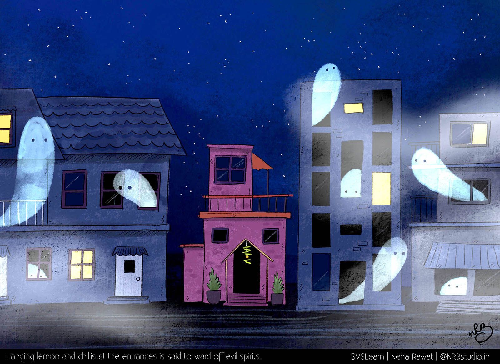
Superstition WIP
-
This is actually an "almost complete" piece but I'm still contemplating whether the story is being clearly conveyed. When you work on something long enough, your perspective tends to keep narrowing and for you the message seems obvious. But I would appreciate an honest feedback on whether there is anything that would help me improve on this illustration.
Thanks!
-
No crits from me, except that the spirits look waaayyy too cute to be evil... but appearances can deceive I'm sure. I think it's great as it is, really

-
I like this a lot. My only comment would be that it kind of looks like they're avoiding the house because it's a different style/color instead of specifically because of the lemons and chilis? That was my first thought before I read the text.
-
@Amanda-Jean Ah! Yes I tend to cuteify (is that a word?) my characters a lot
 Yes I think I'll try and draw a variety of ghostly characters instead and compare. Thank you so much!
-
@eroomba Oh! Yes I guess it could appear that way. I'd actually started with all the houses having different colors but I wanted the lemon chilli house to stand out so I did this. But I see what you mean. I'll see how I can make it blend in more. Thank you!

-
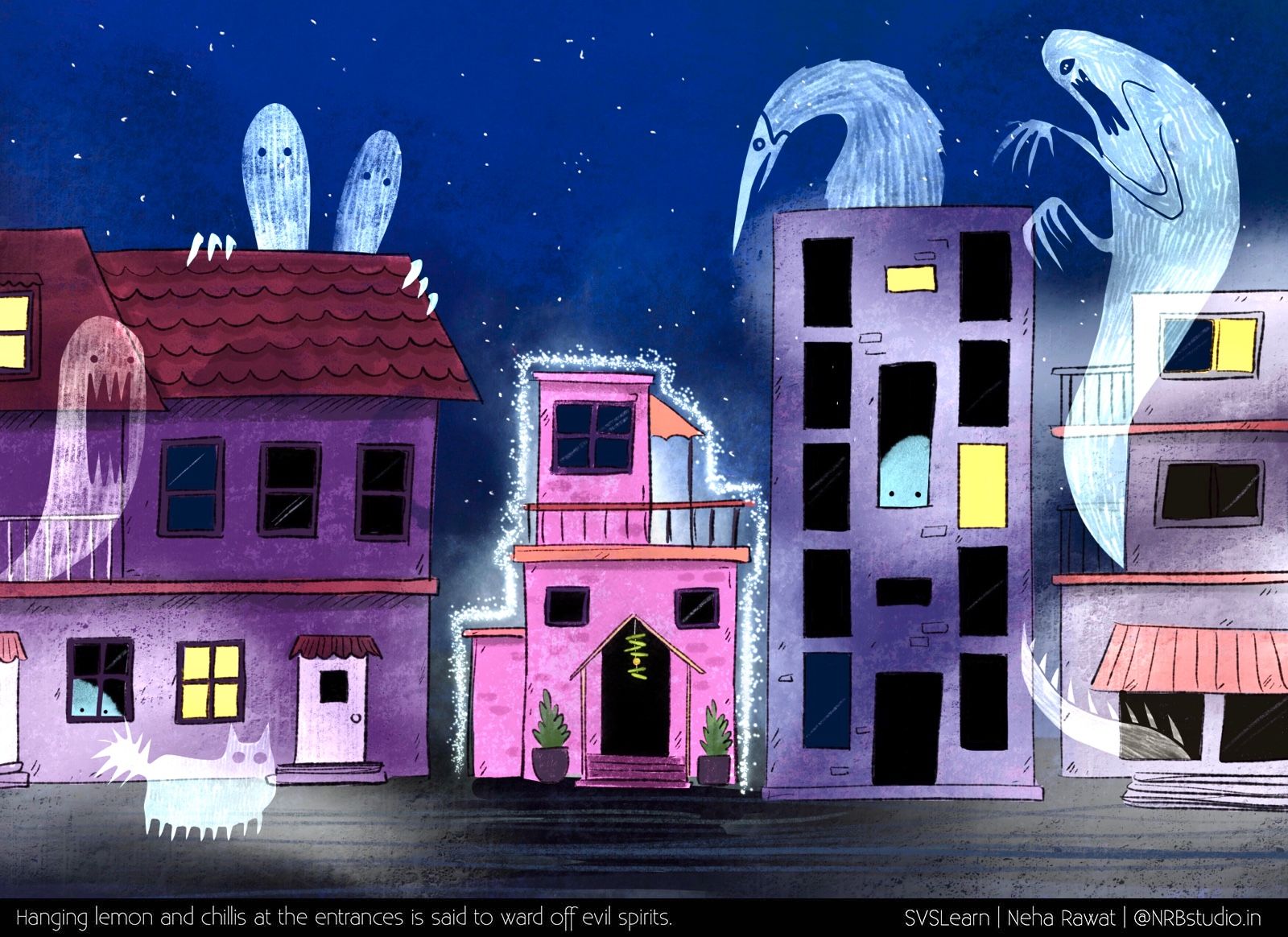
I thought about the suggestion and made the following changes:
- Made the ghosts a little more eerie so that they look more like something you’d want to keep out of your house

- Coloured all the buildings so that the center one doesn’t look odd
- Added a protective shield around the center house to make it stand out
Do you think the message is clearer in this version? Feedback appreciated!

- Made the ghosts a little more eerie so that they look more like something you’d want to keep out of your house
-
Although I liked the simpler spirits in the first rendition I think this one illustrates the idea much better. The spirits paying more attention to the house helps a lot, I think.
-
@Neha-Rawat I liked the desaturated version better, the ghost are cute in the first version, little bit scarry in the second. The two blue ghosts in the window, maybe some structure on them like the other ghost have and more white than sky blue.
-
Heaps scarier, although I liked the rough edges of the ghosts in the first one better. The addition to the house looks great!
-
looks so great. Love the changes you made. I would just maybe make the ghosts a bit blurry... just a thought. love that they are way more scary and fun because they are different

-
Love the cat ghost!
-
I love this concept...is there any way to bring the lemon and chilis closer into focus? The challenge of course will be keeping the ghosts and homes there while enhancing the visibility of what's in the doorway.
-
Thank you everyone. I thought about this piece over and over again and since I don't like scary stuff, I'm not liking this piece too much. The ghosts are a little scarier to my liking. I think I need to find a balance between my first and second versions :smiling_face_with_open_mouth_cold_sweat: