re-do on guardian angel
-
I took part in the guardian angel project for Will a couple months back. It was only my second photoshop finished project so I was looking to finish it up a little better. I really liked the idea of it
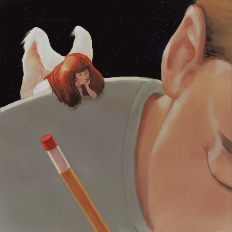
") Unfortunately I think I deleted the original photoshop file so I'm just working in layers on top of the jpeg. Just looking for some ideas and thoughts that I could improve. On the original, there was some spattering on the background darks that I liked but also some brushy marks that I didn't. So I just started today to darken the background again and I'll re-do the spattery stuff perhaps.
Unfortunately I think I deleted the original photoshop file so I'm just working in layers on top of the jpeg. Just looking for some ideas and thoughts that I could improve. On the original, there was some spattering on the background darks that I liked but also some brushy marks that I didn't. So I just started today to darken the background again and I'll re-do the spattery stuff perhaps.
I'm trying to have a couple finished thing I could post on instagram along with sketches, and hopefully inktober too.
any thoughts on potential changes? anything at all thank you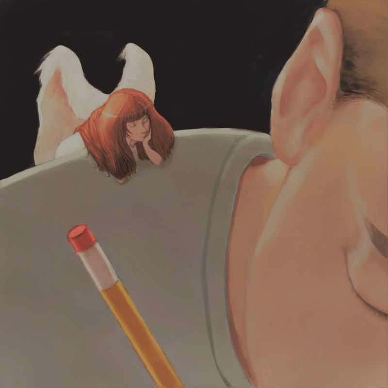
-
@Coley I remember loving this piece, so I went back to your original post. I actually prefer this solid background. I am going through the composition class (again!) and looking for the design elements you incorporated. I see the rule of 3rds vertical & horizontal, interesting negative space & point of view, size variation, simple curves and straight lines, differentiation between foreground and background is clear, I see color harmony throughout—even the shirt includes colors of the skin tones. I think it’s beautifully done.
Is there something in particular that you thought needed reworking?
-
 thanks @BichonBistro
there were some smudgy lines along the angel's wings and along top line of his shoulder/shirt. also wanted to improve the edges along the pencil and shirt collar, and touch up the ear a bit. I did all that, still left a bit of smudge I think in the background! I may have smoothed things out a little too much.......... But it was good to practice re-working. too bad I had deleted my original photoshop file! Thanks for the feedback, really nice to hear