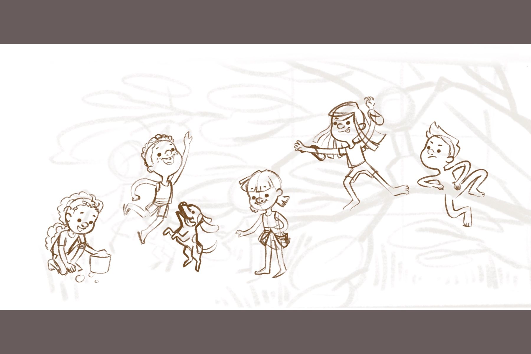
Portfolio pieces WIP- help please
-
@Adriana-Bergstrom i think it’s going to be quite some time before I revisit that piece but thanks for the input. I really appreciate it.
-
@BichonBistro @Jana thank you so much!
@xin-li i also love folklores and myths from around the globe. They’re so interesting and great inspirations for art.
-
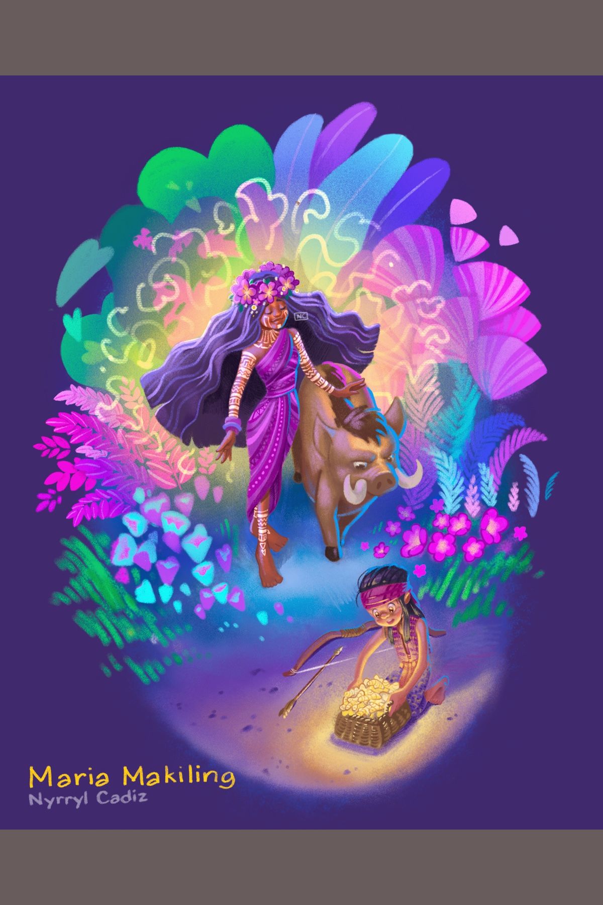
Hi, everyone! Almost done!
-
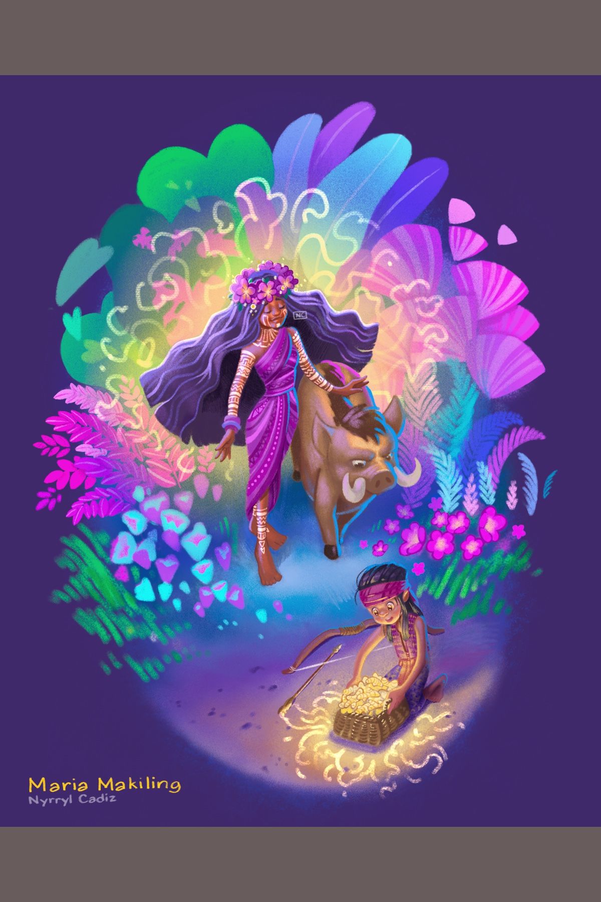
Done!
-
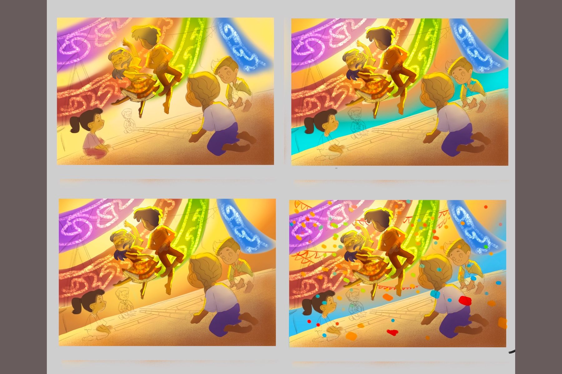
Hi, everyone! I’ve been doing some color comps. I want the piece to have an afternoon backlit lighting. I’m just trying to figure which type of sky i’ll go with.
-
Colors are looking good to me! Although the lighting looks like it's coming from the right side of the page. Which is fine, but if it's backlit, the "outline" of light should be a lot thinner. And the back light is only outlining the dancing figures on their right side, EXCEPT for the boy's left arm. So the direction of the light is a little confusing. Let me know if that makes sense
-
Tough one. I think top right is the weakest one as I personally feel the turquoise is competing to much for attention. The left side ones look beautifully atmospheric, but the blue does tend to shift the focus even more toward the dancers. I think if you do add blue, I'd possibly lighten the value and maybe extend it around the sun halo very slightly.
-
@Perrij definitely. The comps are still very rough though. I’ll make sure to correct the lighting when I get to the final painting stage. Thanks for the input!
-
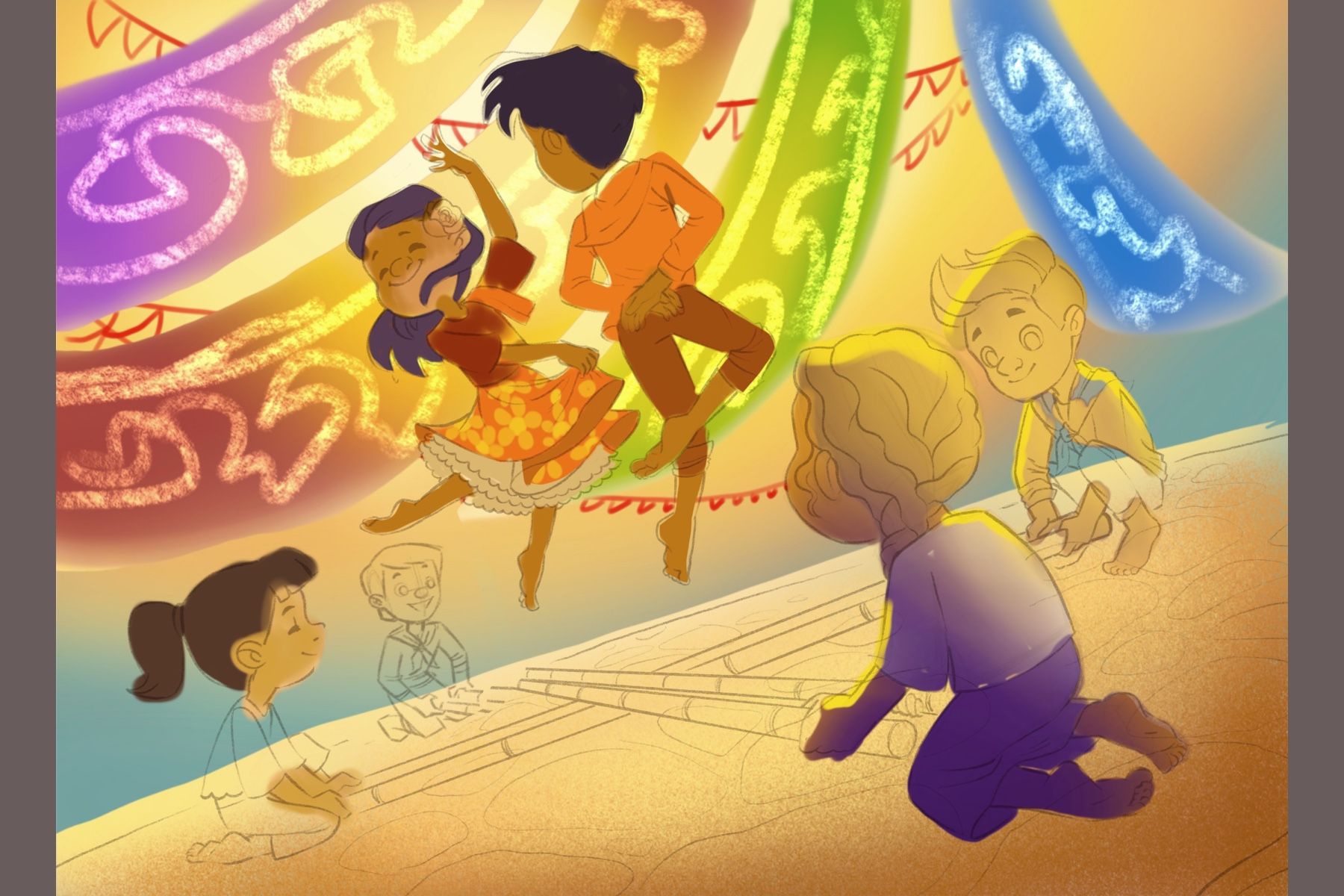
@TessaW i definitely see what you mean. I also like he blues on the left comps. I think they add more interest to the atmosphere but I also think they are too saturated. That’s why I came up with the color comp below. I lowered the opacity fo the blue until it became thisbrownish/greyish blue but I think it suits the piece more. Thank you so much for the input.
-
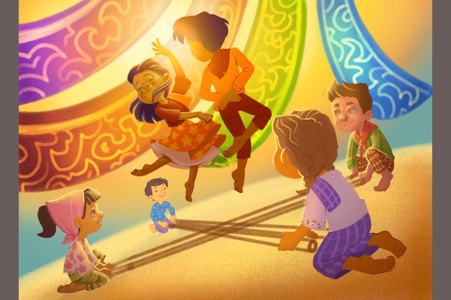
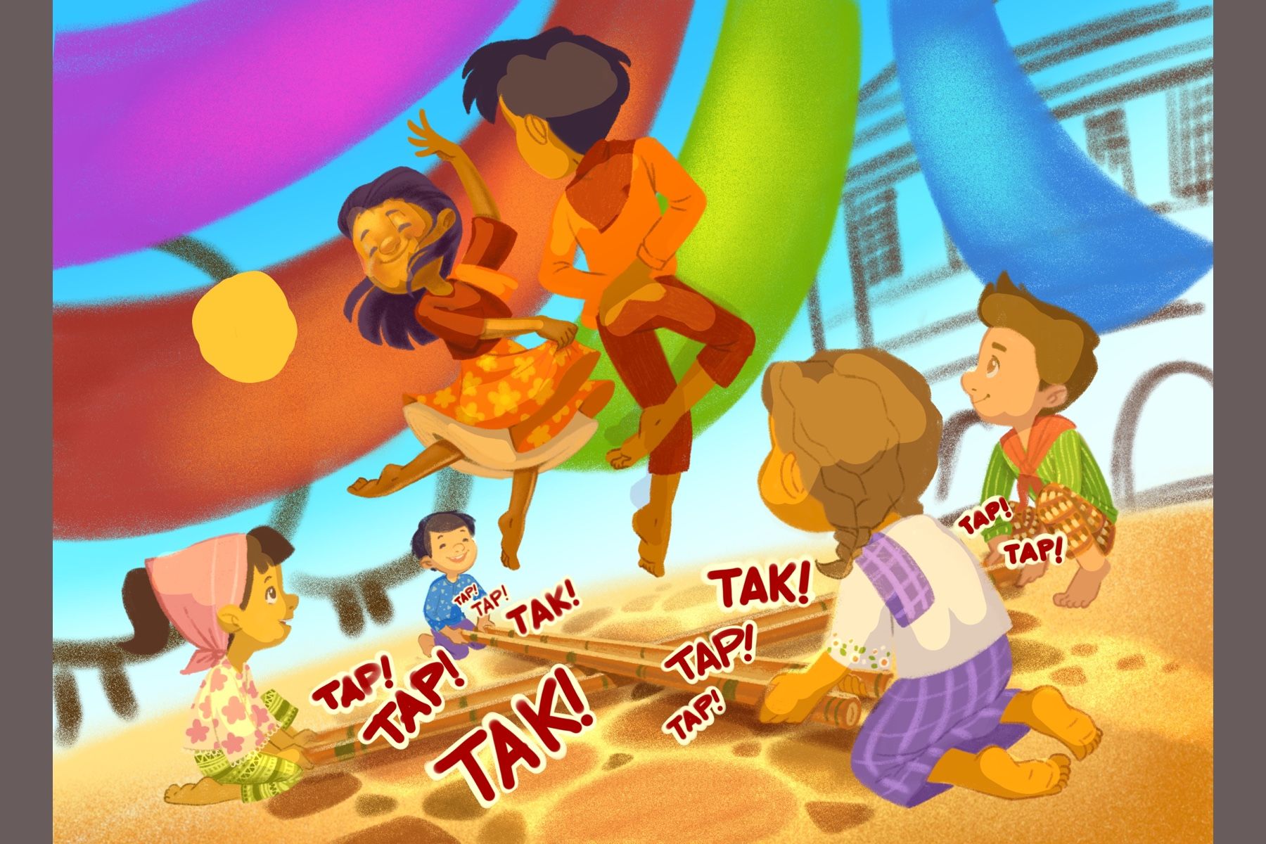
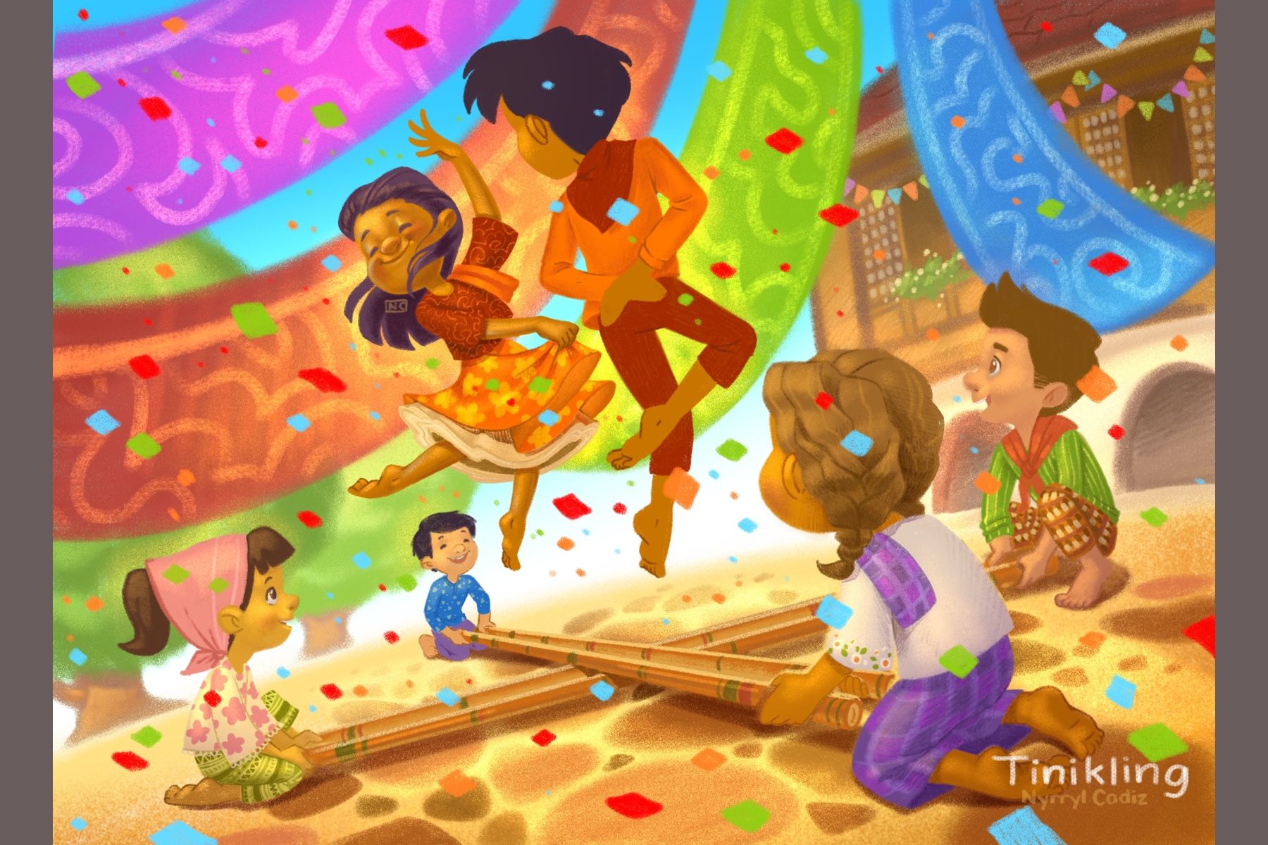
Hi, everyone! I’ve been painting my latest and I came to a halt. Though I love the afternoon lighting, I again felt that it did not suit the scene well. I don’t feel like an afternoon setting would be best for this one just like my Itik-Itik piece. So I made a midday version and I love it more. Here they are below. Please let me know what you think.
-
I like it, Only one thing, the red and orange of the shirts are to similar to the red banner in the background
-
@MichaelaH i agree. I’ll have to tweak that later. It’s still very rough
-
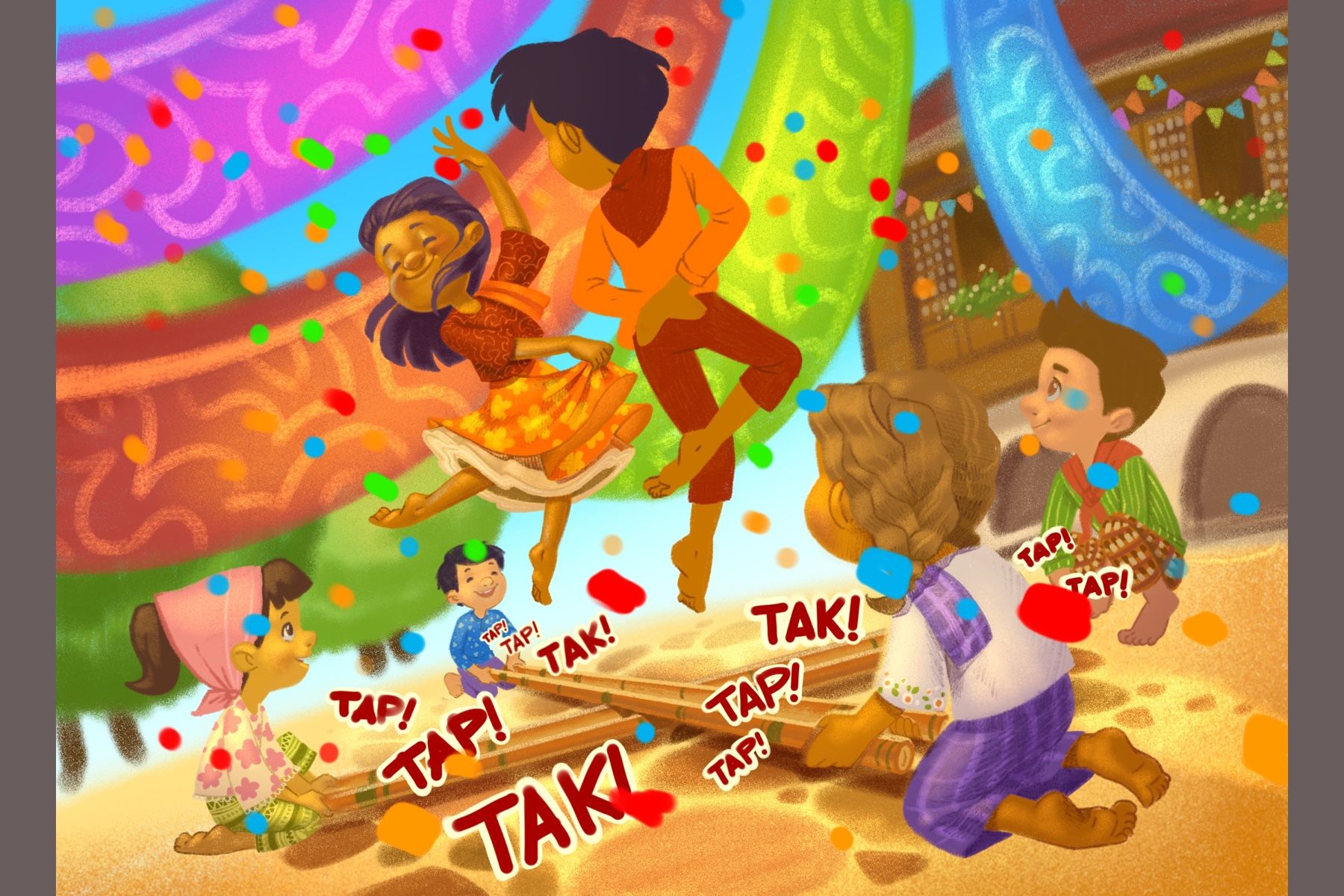
Here’s an update! Things are coming along great.
-
Looking great!
-
@Amanda-Jean thanks!
-
I’m getting there.
-
Here’s the final piece. Nothing much has changed. Finally, I can lay back and rest for a while.

-
Another job well done!
-
@Amanda-Jean thank you!
-
Hi everyone! I’m starting a new illustration. This piece is about guava picking. We used to do this a lot when I was younger. I’ve decided to experiment with the eyes on this one. I’ve always found dot eyes to be appealling. Now, i’m revisiting my first love. LOL!
 stay tuned