Portfolio pieces WIP- help please
-
Lookin good! Lookin good. I like that you ended up shrinking the house so that all the tentacles could fit in. I have an image in the works with some tentacle arms too, you'll be my inspiration haha
-
@Perrij LOL! I’d be honored! Thanks

-
I did a bit of painting today. It’s not much but i’m satisified I did something today. I’ve been in a slump lately. I’ve been forcing myself to do even just a little art evryday to get myself into my usual rhythm again.
-
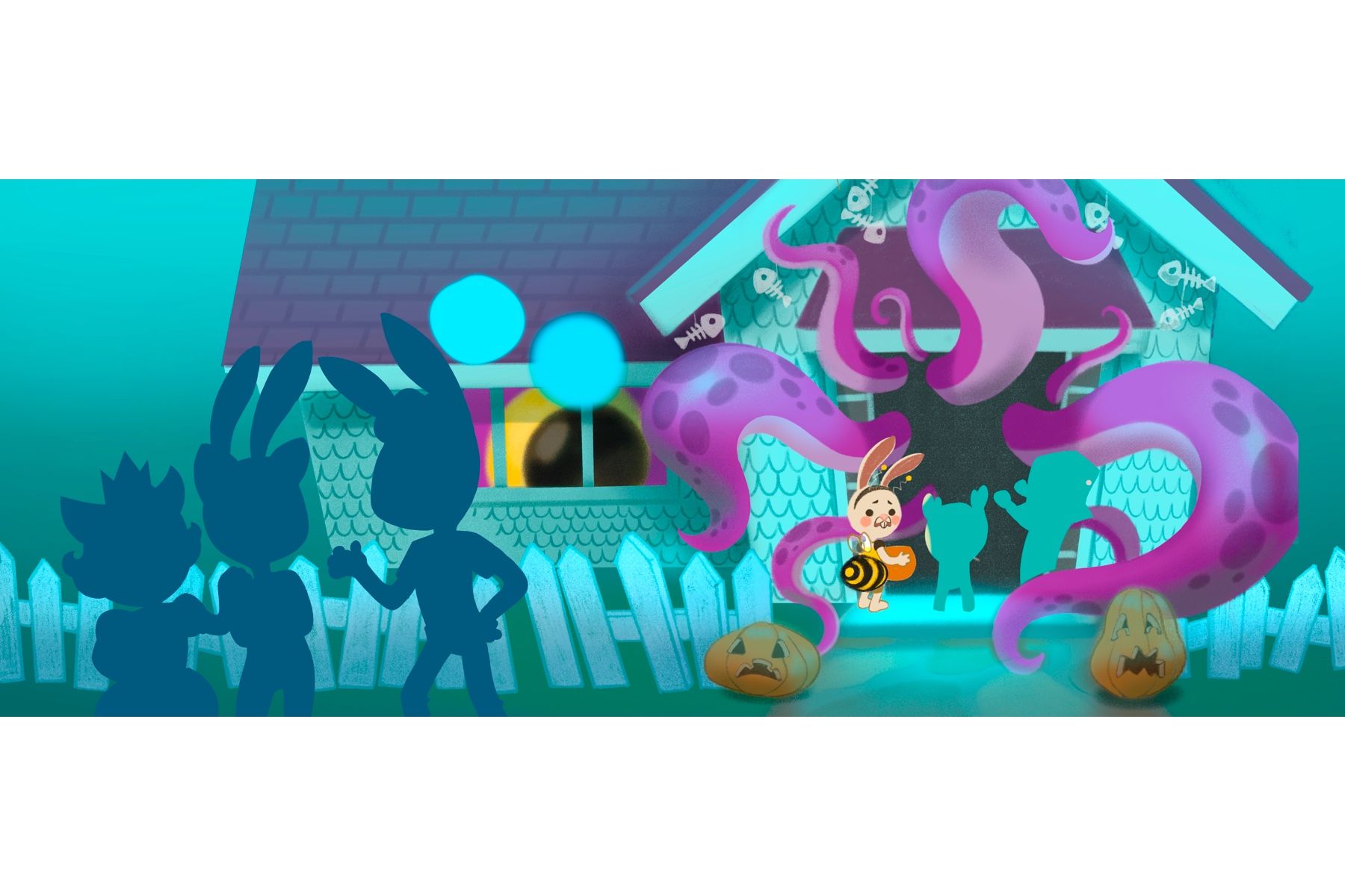
Here’s another update! Almost there. Guess who my kid characters are dressed as.
-
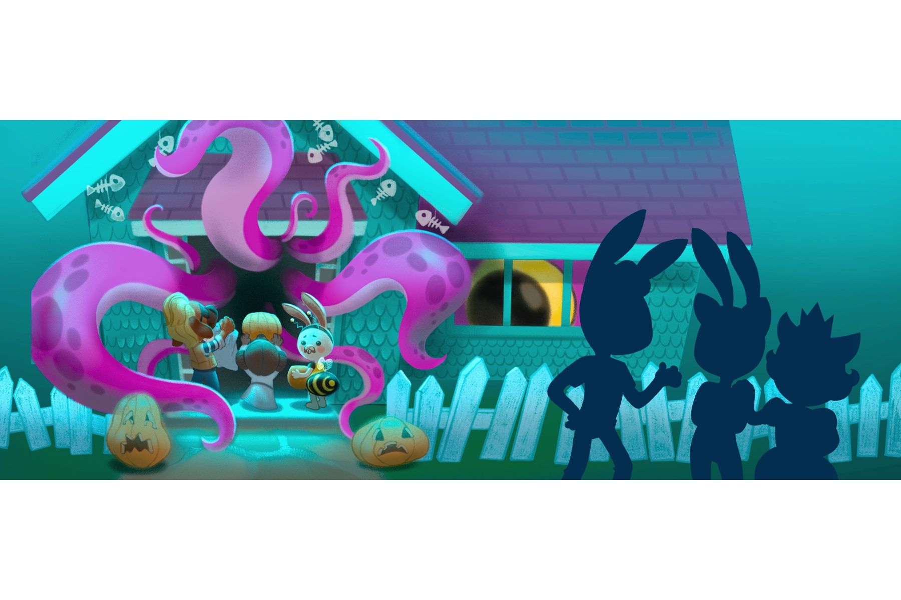
Almost almost there!
-
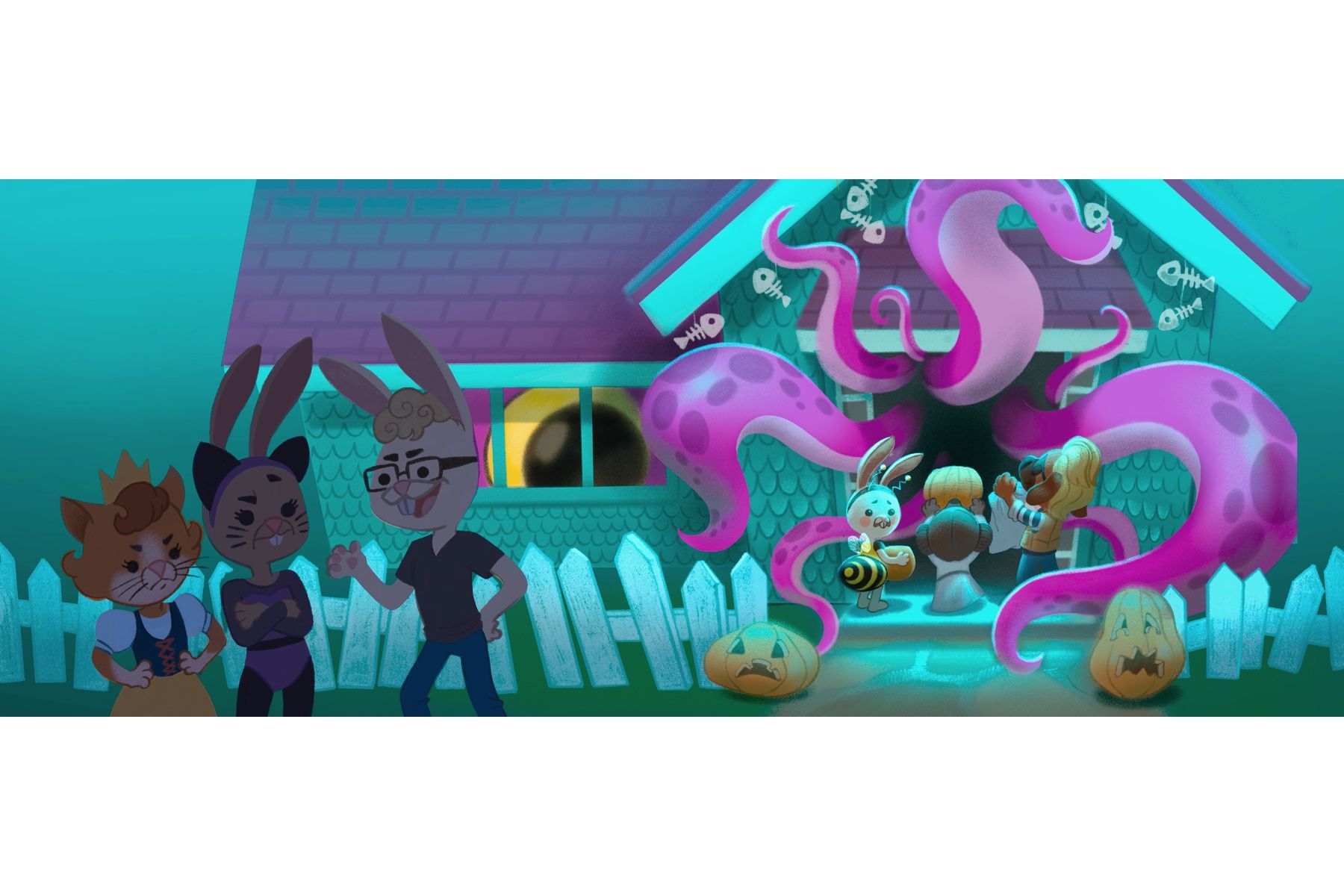
Almost almost almost done!
-
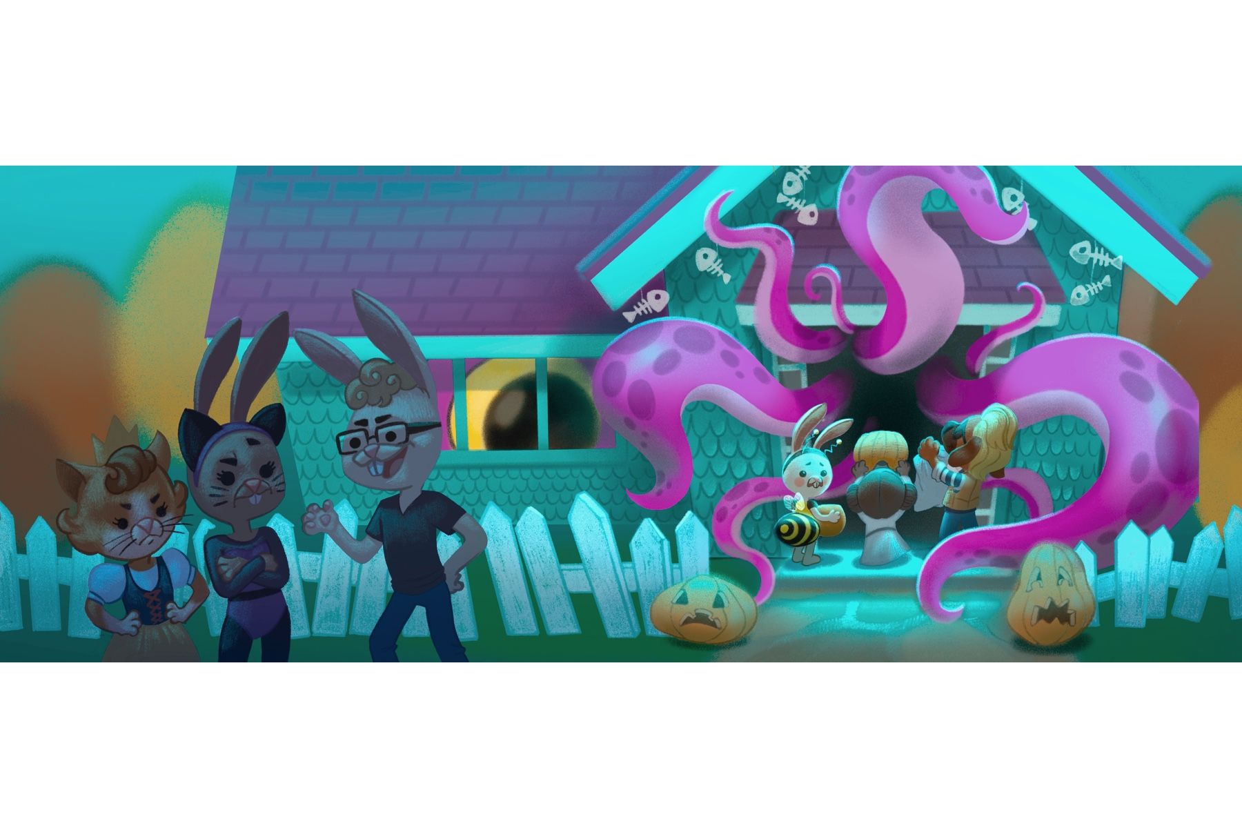
Done! Any comments? They’re highly appreciated. Thanks!
-
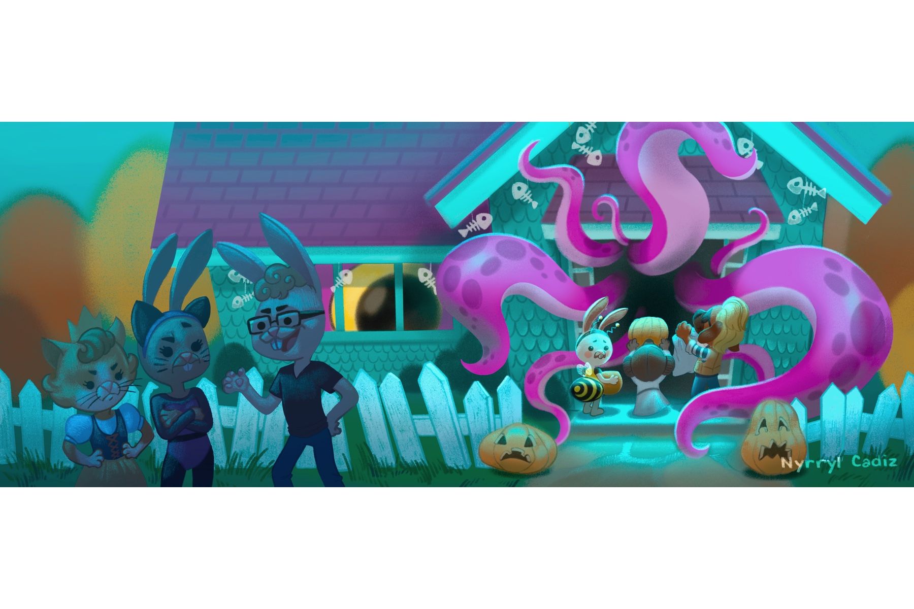
@Nyrryl-Cadiz Where should be the main point where should I look at first? You had obe version mirrored and I liked it little more to see the action first and the the kid looking for help to the bigger kids standing outside. It is looking wonderful, like 3D like, the tentacles are great work.
-
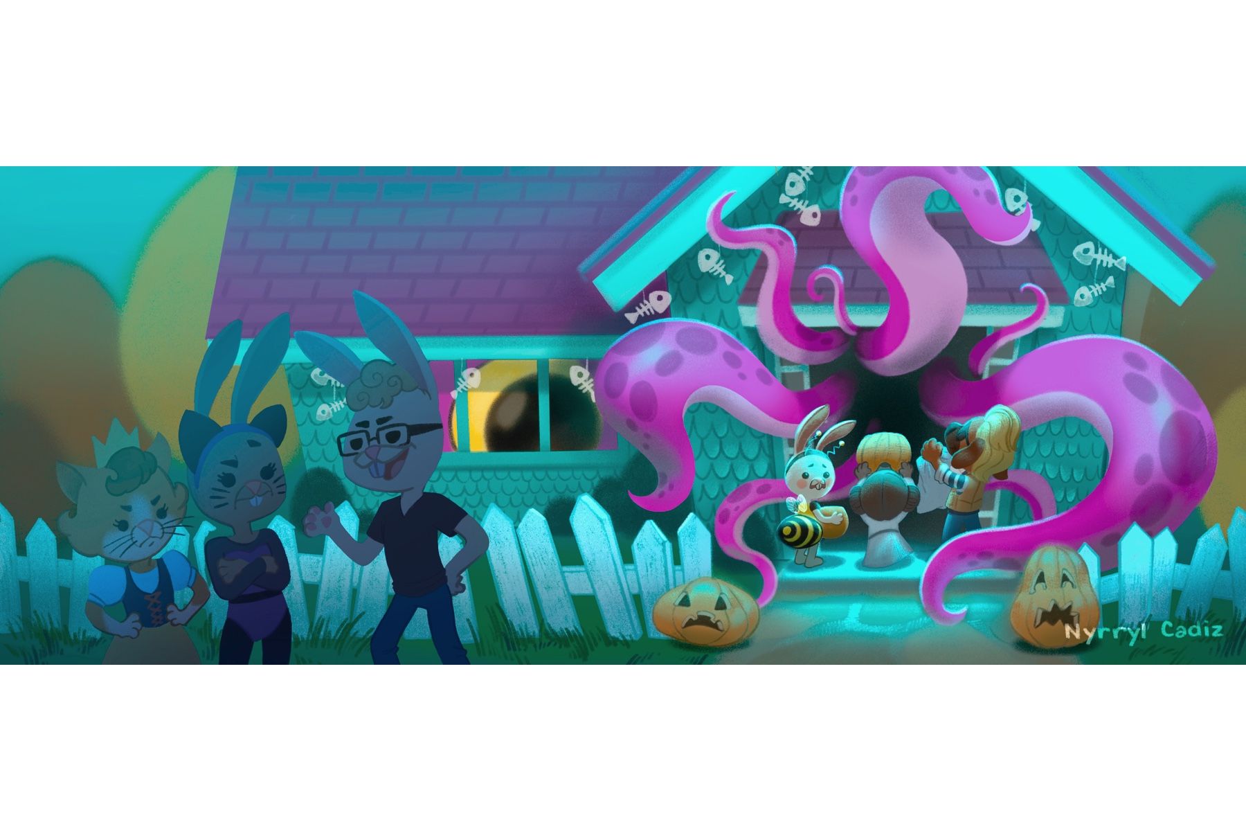
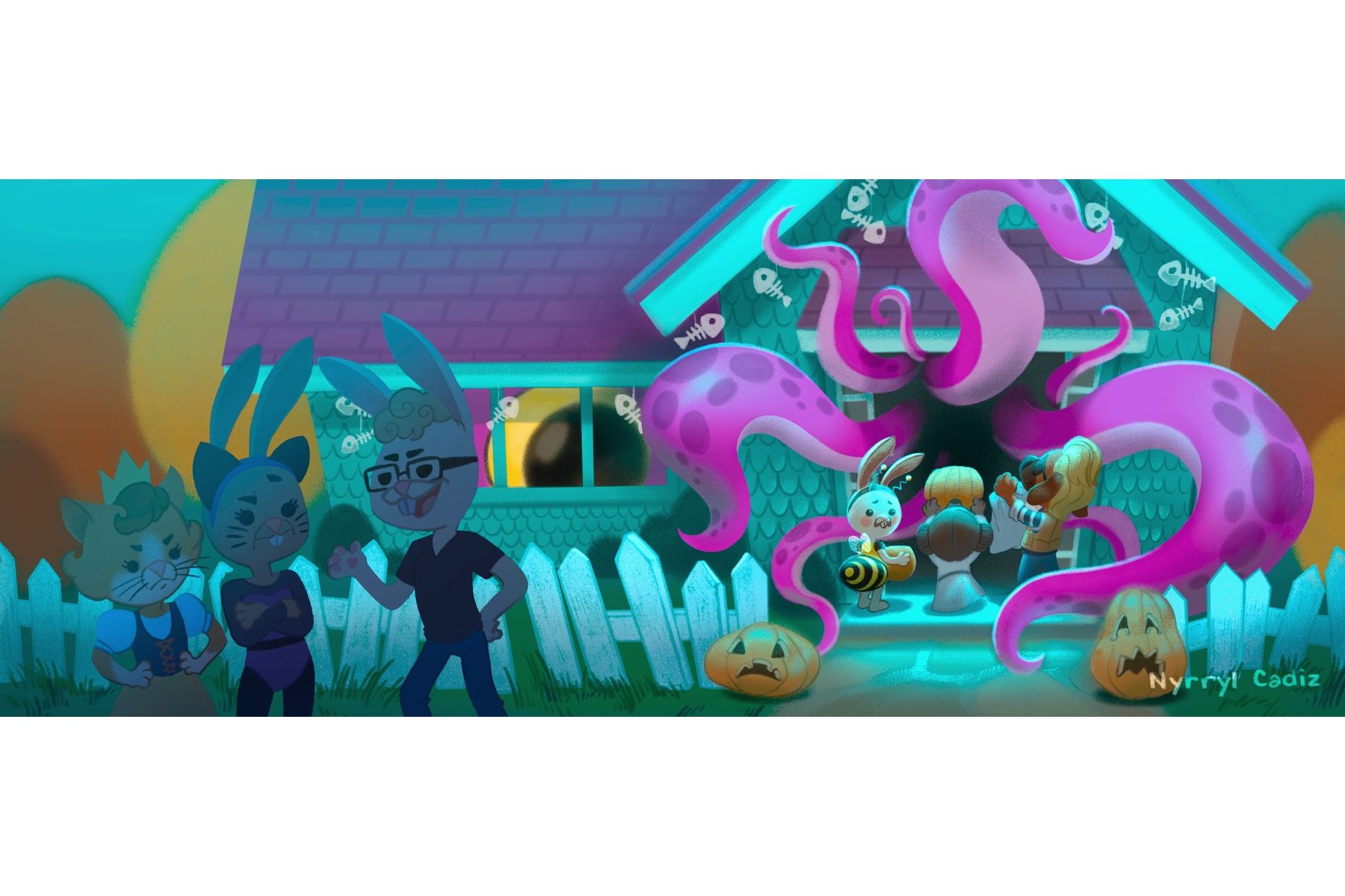
@MichaelaH Thanks for the input. I want the main focus to be on the kids. However, given your thoughts, I see that the focus is not standing out that well. That’s why in the new illustrtaion below, I removed the lighting on the teenage characters to decrease their definition, darken their value and shift the attention more to the kids. What do you think? I feel kinda sad not using all that work that went on to the older characters but I’m fine with it too. LOL
 I was kinda going for a more graphic look anyways.
-
@Nyrryl-Cadiz I think it is better like this, the teenager are still strong, I am switching with my eyes there, but I think it is ok
-
@MichaelaH As long as they’re not the first thing you see, I’ll take it!
 Thank you so much for the help!
 -
The trees ere too vibrant so I lowered their opacity. Any more comments? Critiques?
