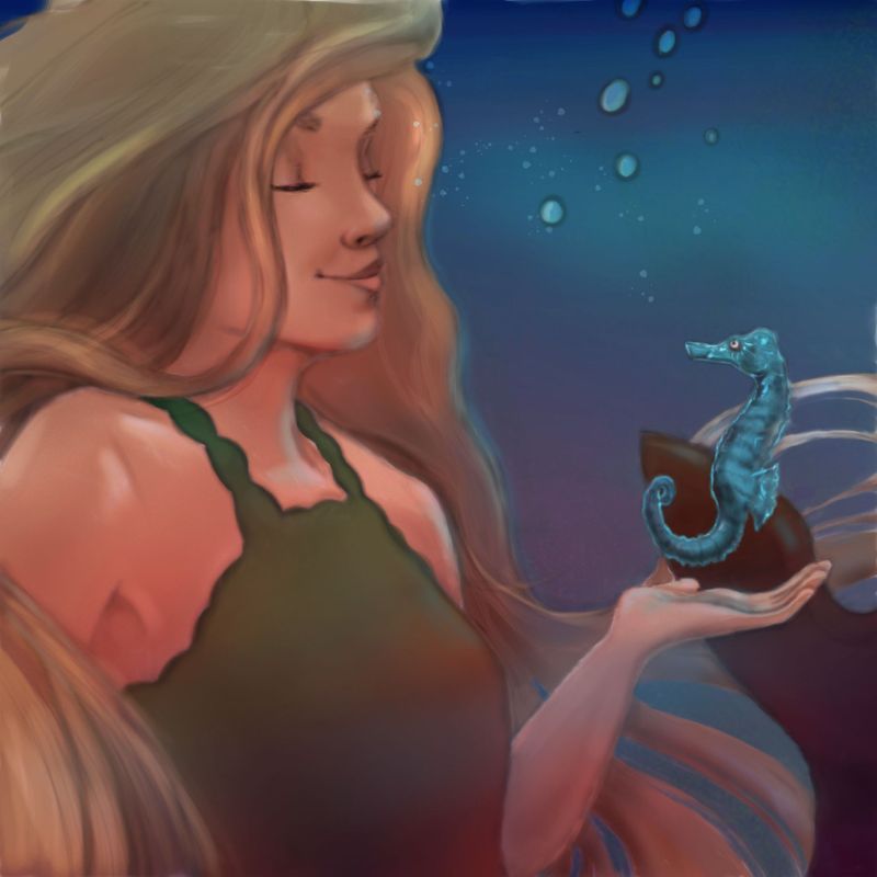
Mermay serious (or not if you prefer lol!) critique request
-

Hi ,
Was looking for critique of my Mermay. I am open to serious critique! I know a couple flaws already, mainly being there is not much of a story here! I had intended it to be a little connection between mermaid and seahorse with her eyes slightly open but she ended up looking a little tipsy lol! By then I was out of time so I posted anyhow. I also think the blue light cast from the seahorse isn't working on her chin. I learned a ton about handling Photoshop on this ( only my third finished Photoshop piece) but would love to learn more via critique.
I really am open to any thoughts anyone has. Thanks ️
️ -
Your photoshop painting is really good!
I agree with you on the lacking of story, and I would say totally push that seahorse glow so that is the only light on her and work your story around that if your going to do a close up as you have done. If you had a swarm of glowing seahorses I was thinking of Happy Feet 2 swarm of
 krill. It could be about her discovering them -a new species or they are helping her find her way home, I like stories and wished my skills for rendering were at your level. I will get where I want to be soon enough and so will you.
I find the cropping a tad problematic -I know it was due to lack of time -with her tail squished in on the side.
Yeah I keep editing because as I type I can’t see your image, my iPad has serious issues, I may return tomorrow to add some more.
 Found the video combining both ideas:
https://www.youtube.com/watch?v=pdd9pwmVJQQThis one is great too -both from Happy Feet 2:
https://www.youtube.com/watch?v=ObEdGZsys6Y -
@Heather-Boyd thanks so much Heather. I appreciate your input! You always have a developed idea/story in mind so I will try to learn from you and improve my sense in that area. It is a great strength of yours!! I will try to osmose it lol. I saw Happy Feet once , can;t remember that scene, will have to go look it up. Thanks again

-
@Coley maybe adding some more fine detail on the parts at the forefront. Like some fine strands of hair nearest the camera and on the seahorse, to give more of a sense of depth? Some darker shadows would make the glow on the seahorse stand out a bit more

You've got a really nice sense of proportion, can't wait to see more of your pieces.
-
@Coley I love your rendering. This is really looking nice.
I think you nailed it on the head though with the story. That is really where it needs development. I can't tell what is happening or going to happen.
A couple more items that might improve it.
-
Pull out the camera. It feels very tight and you can just barely tell she is a mermaid. If you pulled back it would give you a little room to play with the story and clarify.
-
Her lips look a little odd to me. Not sure what it is. They almost look like they are faced to the back?
Good luck, have fun.
-
-
@theprairiefox thanks, and I did have a bit of trouble with the lips! Thanks for the advice on the camera angle too. I actually added her tail in after the fact to add a bit of mermaid to it.........lots to learn

-
@Coley after looking again, I think I figured it out. Her lips are in true profile, but the rest of her face is not. I think they need to be turned toward us a bit and they would come out right. Good Luck!
-
@sarahlawrence good ideas, thank you! I think those extra wispy hairs would help for sure. I think you're right on the darker shadows on the seahorse for glow, too. I was trying to figure out what to do there
 Thanks again!
 -
@theprairiefox yes I think you're right
 I don't think I'm going to go back and fix this due to time committments (moving forward with new art), but I want to learn for the going forward stuff. And, who knows, I may come back to it again so if I do I will definitely be fixing those lips