Christmas Children's Book - Early Feedback Please! (updated)
-
Hi all!
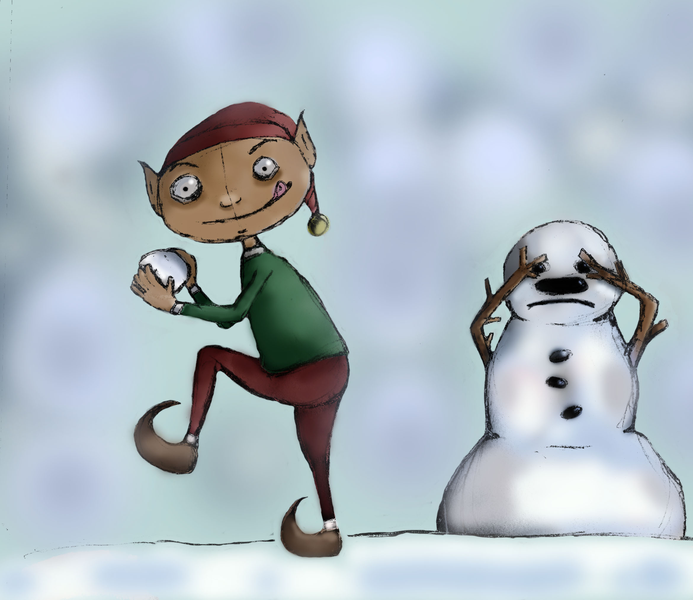
I'm currently working on a children's Christmas book project - got plenty of character sketches but am just now trying to develop the color palette and style for this particular story. The elf character is a not your usual jolly or kindhearted helper so I'm playing with a darker, murkier feel. Would love thoughts on every element - from scratchy style, to palette, to character design - every insight welcome!!
-
Also playing with lowering the saturation just a little...
-
What if you simplified the background more? Or alternatively, added some structures (trees/houses/mountains). Right now it's kind of vying for the viewers attention.
Question: is this going to be an "anti-children's book" book (like for adults/young adults) or is it just going to be a "deviant" children's book (for children but just a little cheeky)?
I ask because I think there is a way to do a cheeky/somewhat deviant kids book without going "murky." When I think of "murky" I think of books like: Everything Can Be Beaten or the Johnny the Homicidal Maniac series (definitely not children's book).
Is the character going to be reformed in any way at the end (i.e. learn his lesson and be good)? If so, and if this is going to be for children, I wouldn't go "murky". You can stay edgy by the way you draw your characters--i think you've done a good job with that on your elf.
Additionally: I think the image would benefit from a more defined lighting scenario. I'm not sure what time of day it is, where the light is coming from, what type of light it is, etc. I suppose it's kind of a overcast afternoon maybe?
-
Great points for me to delve into pp, thanks so much for taking the time!
Okay so yeah, it's a kid's book with a positive resolution for sure, so obviously I need to narrow my aesthetic a bit more. Murky isn't working, so true.
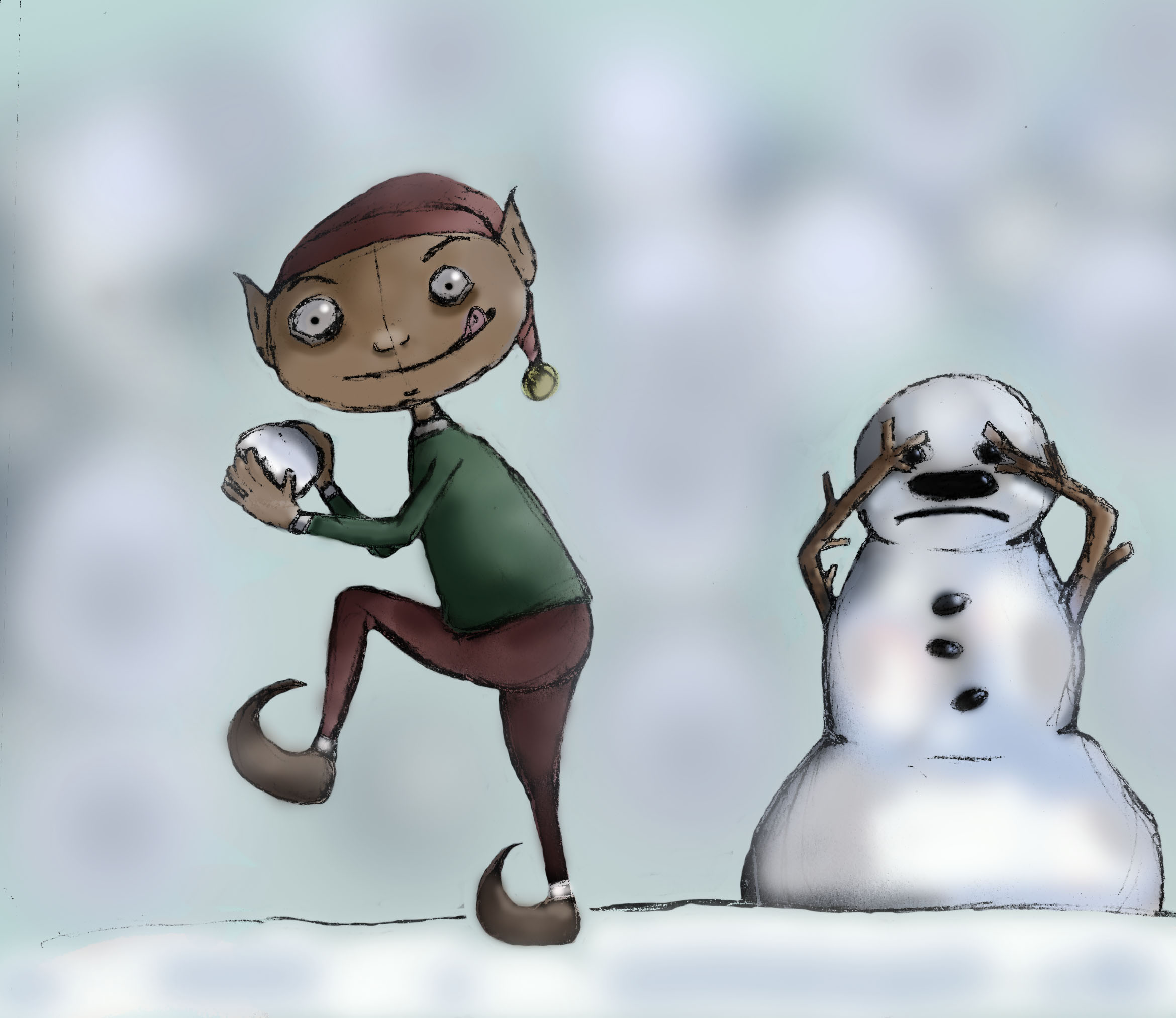
Here I've played a little with lightening the character's palette, highlighting the foreground more and adding some background interest... thoughts?
-
-
@carlenevick
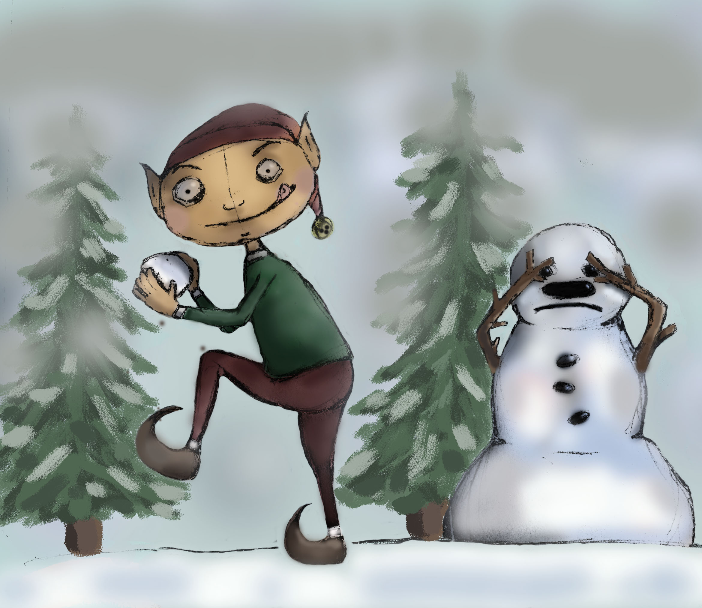
Hi I did a quick overdraw what I would change:- Get rid of the grey, it only makes it worse. Mist or smoke does not looks like this
- Be careful with light source. Clothes are nto shiny as this if it is not latex or something. Also you cant have reflection on his buttocks, they are in shadow. This applies more throughout the image. You ahve the think where the shadow will be.
- I just painted with blue over backgroud to nock it more to the background and make the character pop, this should also create easy mist effect
- To create even more depth you can add hint fo trees in the mist
- To get more interesting colors create overlay layer and add warm or cool colours. I added Dark blue to the left to make him more sinister and a pinch of violet to his face.
- be ceraful with random dark spots like you did with the snow. Snow does not look that way
- Always add a shadow under the character or wither it will look weird or the character will be floating
Hopefully this can give you some new ideas and I also hope I did nto overwhelm you
 I just started typing and kept rolling.
-
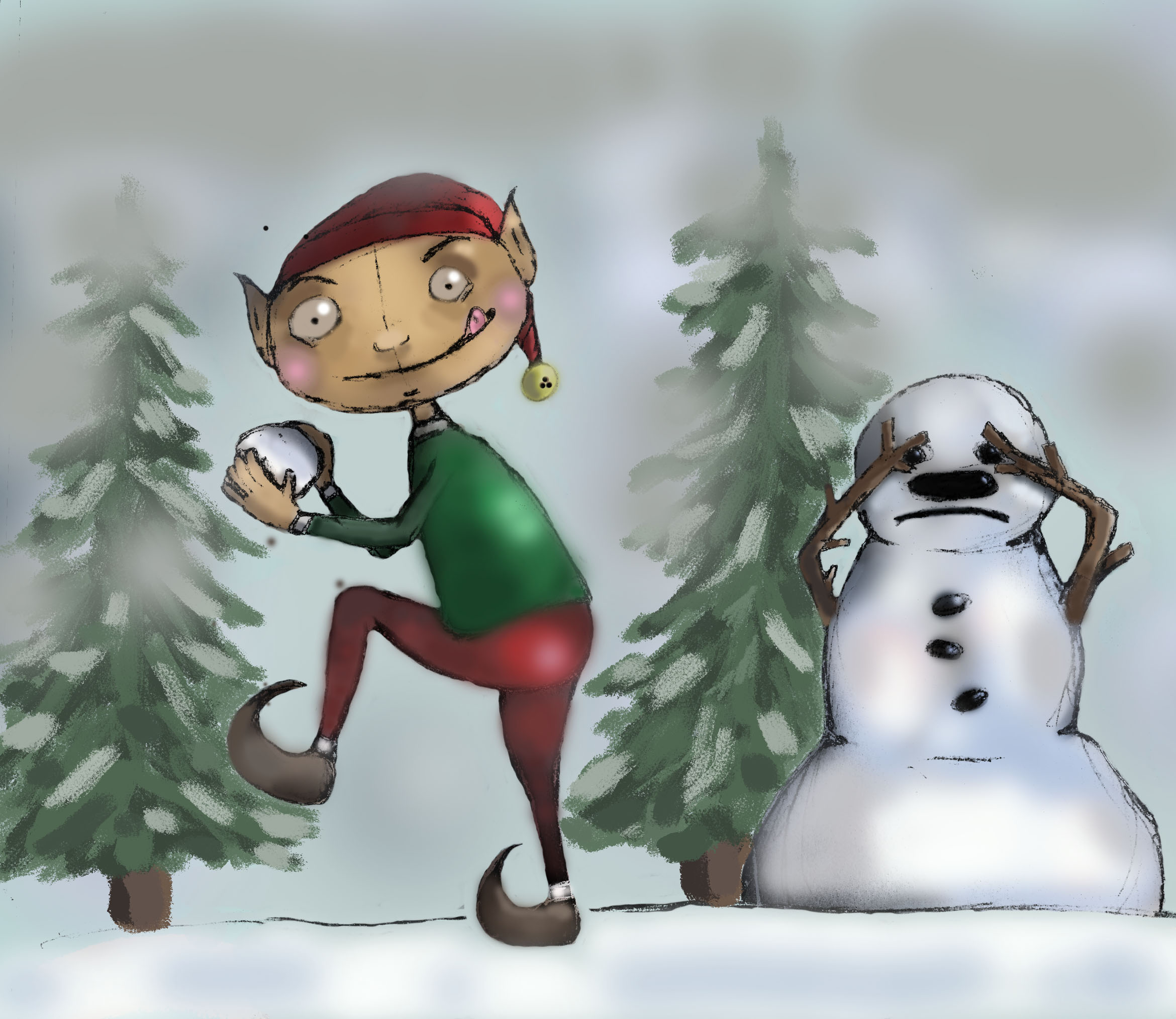
@Jiří-Kůs I am SO grateful for all that you just relayed to me. I love the changes you made, they all make perfect sense to me, and so naturally I have challenged myself now to replicate them and learn as much as i can from this (feeling both inspired and a million miles away right now - I so want to be able to produce something similar myself!).
So this overlay layer... i'm struggling. I've dived into all kinds of tutorials and videos but i'm still getting something wrong. Any tips or resources to share so i can utilize that and practice?
THANK YOU!
-
@carlenevick You can download demo PSD here https://dl.dropboxusercontent.com/u/22093970/OverlayDemonstration.psd
There are three layers
color layer - normal mode layer with flat colors. I chose skin tone
shadow layer - multiply mode layer just with tones of grey to create shadows
warm/cold layer - overlay mode layer to create more interesting colors, like usually you want have blue for your shadows or night scenes and warm color for light sources, you can adjust this here.UPDATE:
You need to remember 2 things about multiply and overlay modes:
multiply always darkens the image while blending color
overlay lightens or darkens the image depending on the colors eg bright overlay on dark color makes the result darker. Overlaying white stays white no matter what. -
@Jiří-Kůs Sorry should have been more specific - I'm struggling with taking my jpeg, placing it back into photoshop (easy enough!) and then getting the layers to comply so I can add my tones and values below the image I already have... is that possible/what you did?
Or perhaps I'm just not using the right brushes to achieve the blending effects over the top pf my image?
Thanks so much!!!
-
@carlenevick It should work to open PS with your image, create a new layer over the top of the image, set it to whatever mode you want and then paint.
I was going to do a paint over but Jiri beat me too it--essentially, it was all the points that she covered!
One thing I wanted to mention: if you had a particular artist/book/or style you want to be like let us know or post some references/links. We should be able to nudge you in that direction.
-
So grateful for all this feedback. It's a steep learning curve and I'm fresh out of the gate but so very pleased to be here and working at this! I'll post updates as I work on it!
")
-
@mattramsey I am male
Jiri basicly translates to George
@carlenevick Like Matt said, first I created multiply layer for my shadows, second i cut out the character using lasso tool and placed him in a new layer. The I painted into the background getting rid of greys and creating misty effect. After that I added more trees to the background in the background layer. After that I created new overlay layer at the very top. Unfortunately I did not save the psd
-
-
Looking forward to seeing the final piece and some of the other characters that you have for the project.