Finishing Drills for a Chronic Dabbler.
-
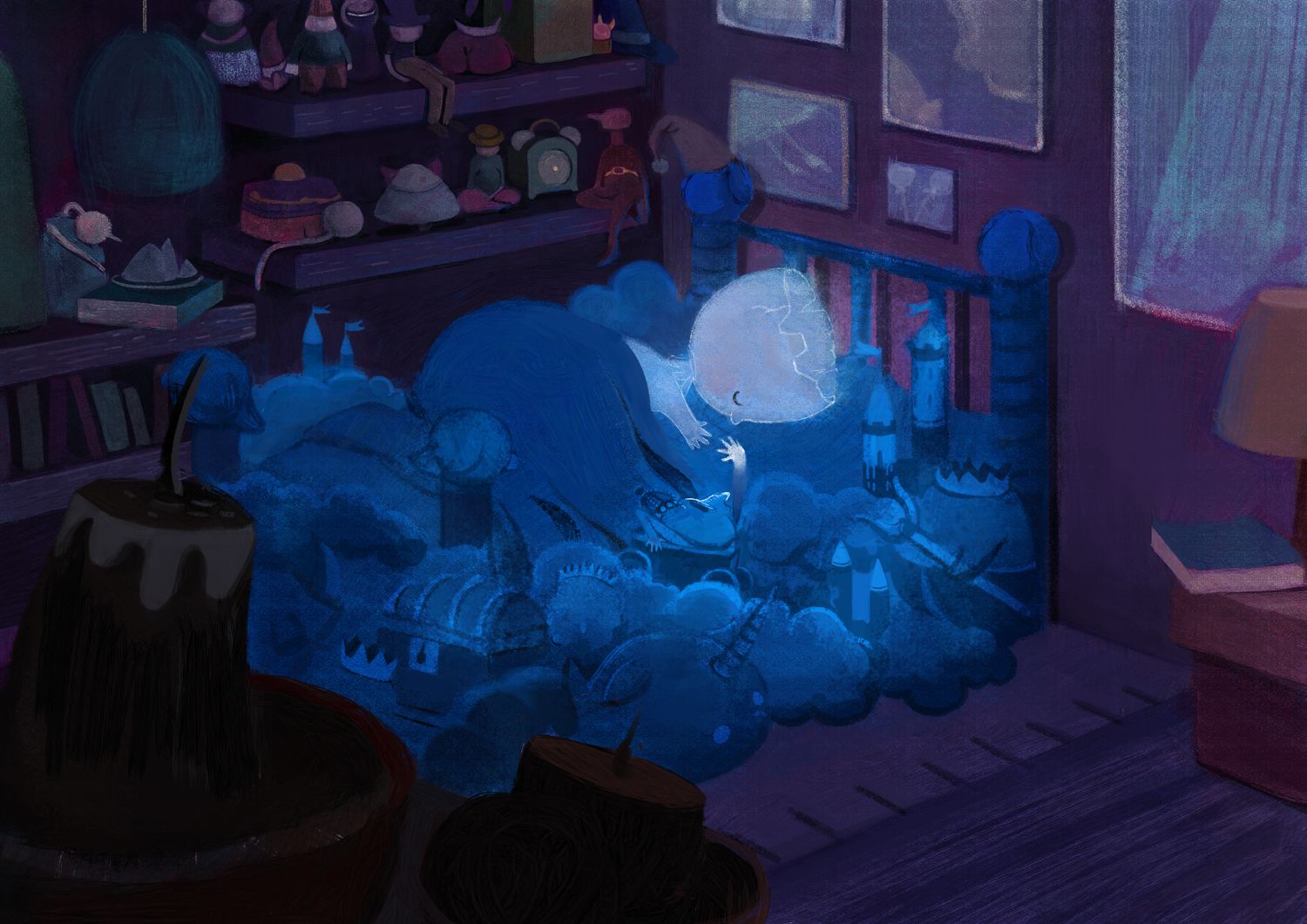
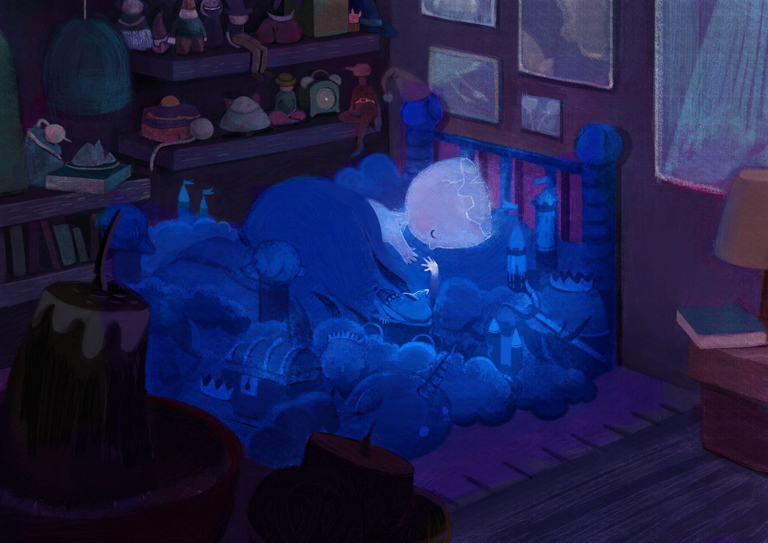
@MichaelaH XD Here are the two versions side by side.:(The only difference is the blue.) Thank you for all your feedback!
-
Week 6:
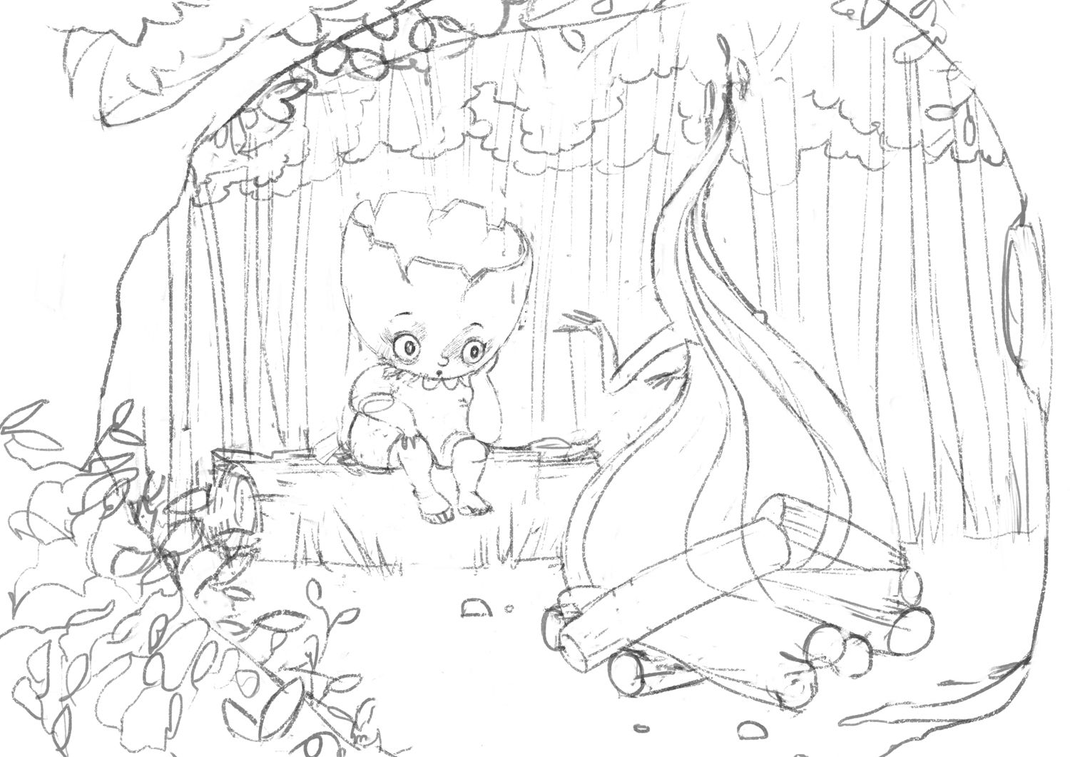
I've been reworking this sketch based off of the feedback I've already received. This is where it stands now. I'll be finishing this painting this week.

-
I've only been looking in occasionally, but this finishing drill your doing is producing some beautiful results @animatosoor . Thanks for sharing. I may have to try the #100illustratedtexts
-
@ThisKateCreates Thank you for the kind words! Unfortunately, for years I'd just kept telling myself I can't bring any of my work to a finish, and I was just too afraid (of what exactly, is up for debate. XD)
I'd love for you or for anyone else to join in!
-
@animatosoor I have been focusing on that the last month, though not so many down as I see here.
I was calling this finished:
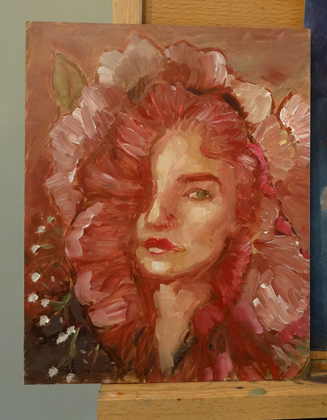
but after showing it for critique I may go back in and sharpen a few things. -
@ThisKateCreates Beautiful

-
@MichaelaH Thanks.

-
@ThisKateCreates I also think this is beautiful! Such an expressive portrait.
 Did you do them in oils?
 -
@animatosoor Thanks. It's oils. I find them really soothing to work with. They stay open so long ond go on so smooth.

-
@ThisKateCreates It's been a long while since I last touched them, but they are indeed awesome.
-
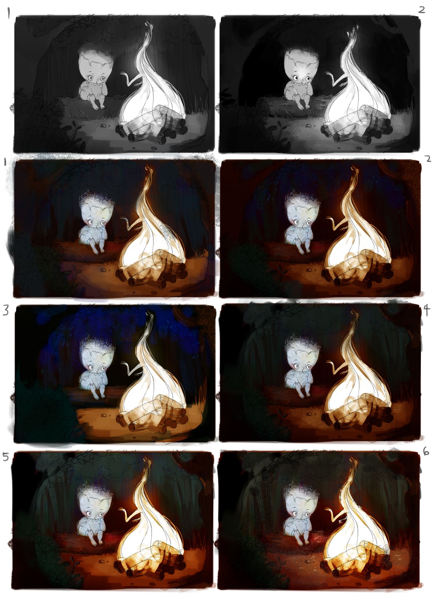
These are my value and colour studies for the campfire scene. I am leaning towards #6 for the colours.
Critique is always welcome!

-
@animatosoor I like the first Value and colors the 5 and 6 the most, maybe you can go little ligter in values? It is still very dark. but maybe it will get better later when you do the real colors. And PS: It looks great, love this colors of the fire
-
@MichaelaH Thank you! I agree that it's still too dark. I'm going to work on improving 5/6 to make the values slightly lighter. There's too much black at the moment, I think.
-
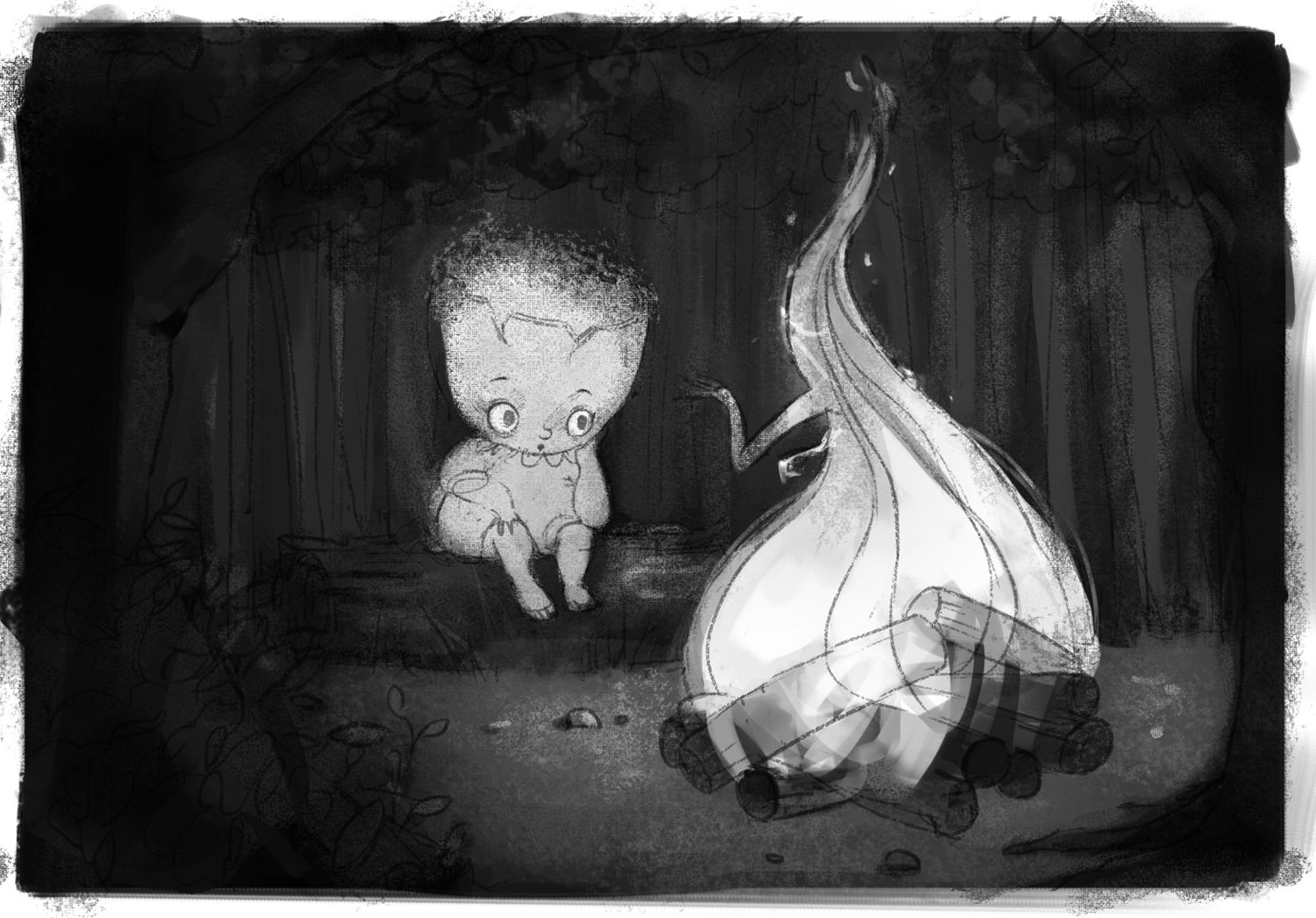
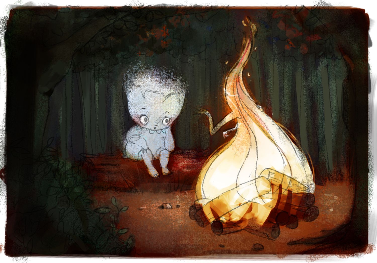
I've arrived at this value study and colour study. I'm thinking the values are no longer too dark - especially in the background! I know it's still overall a really dark image, though.
-
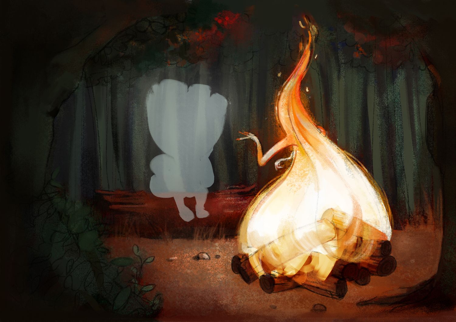
This is my progress with this illustration. I would love critique.:
-
@animatosoor wow I love Your fire, it looks great. The tree on the right and the bush on the left will be much brighter?
-
@MichaelaH Thank you! That's a great point. I was honestly quite confused about how much light would be hitting the trees and bushes, haha. But you're right, they should be getting light from the fire and should be brighter. I'll work on that.

-
@animatosoor Love the progress!! there's so much energy in that fire. good work!
-
Oh this is awesome!
Just see that the tip of the flame does not form a tangent with the top edge of the picture..maybe desaturate the tiny flames a little?
Are you using photoshop layer blend modes to overlay the color on the values or are you starting of with color directky with the value study as a guide?
Looking good so far!
-
Love the concept of the flame friend.
I took me the second look to notice the hands - which is the most interesting element of the concept for me once I saw it. I wonder if the hands could be more prominent somehow.