Goldilocks
-
Hi Everyone,
As some of you may recall I am currently working on illustrations in which photos of special children are then turned into a storybook scenes (as if they have landed inside the story and are a key character). Previously I shared the Rapunzel scene and the beginnings of a Cinderella scene I was working on.
I have since finished off a few other scenes but on the latest one of Goldilocks I think I had a real break through on my technique and style. I had received feedback from Lee White not so long about how my backgrounds were looking great but my 2D flat/outlined characters were not really a match and that I needed to either simplify the background or enhance the characters.
And I think I might have finally figured out how to do that in this one.
I will start out with the initial sketches so that you can see the entire process I used on this one:
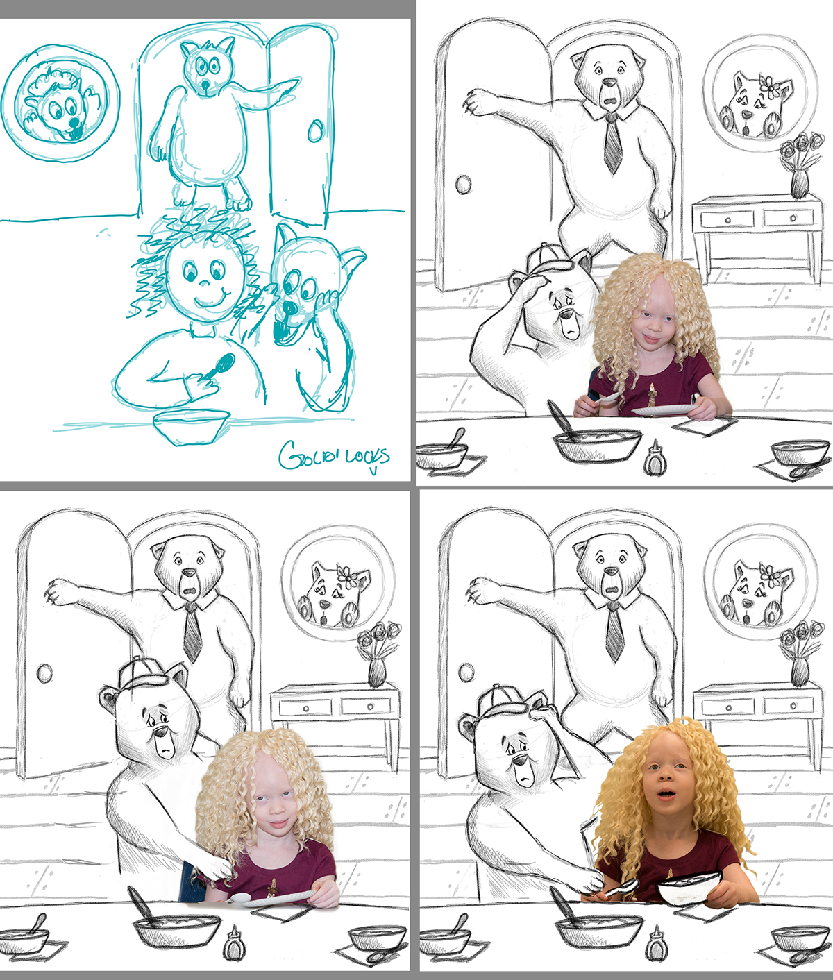
I create very rough sketches of layout ideas that I provide to the photographer who is leading this project so he has an idea of the scene and how to photograph the children. For this one that is one done in blue.
He took photos and came back with several options of this charming little girl with curly golden hair and I worked on a refined sketch and used the various photos of her in each to give him some options to consider. I kept everything the same except for I would adjust the young bear and have him looking puzzled or doing what kids would do and reaching out to get his porridge back from her etc.
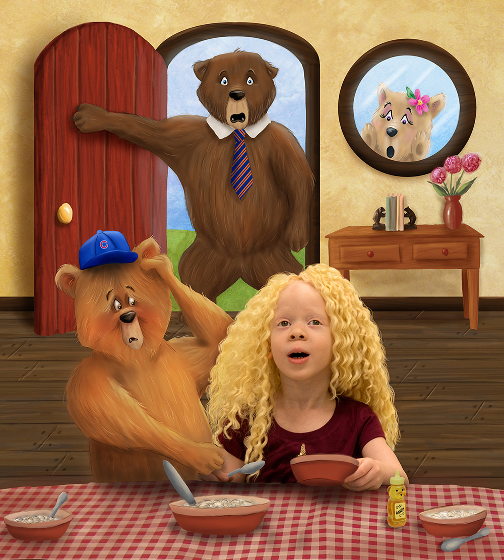
He imagined the girl is surprised that she has been "caught" by the bears eating their meal so we went with the photo where he mouth is open. It also worked out well as both of her hands were visible in this photo which makes it easier to understand she is holding a spoon in one and a bowl in the other.
Once the sketch was finalized I started the process of color blocking in and as you see at first I was thinking of going with some green scheme but it was too cold and was not going to play well off of her hair and the ambiance of the original room color in the photo.
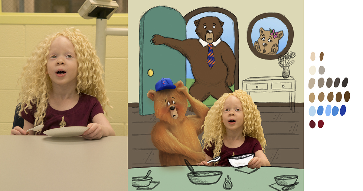
So in the final piece you will see that along the way I warmed up the walls to a golden/tan and then realized that the burgundy red of her shirt was the perfect color to use throughout the illustration to tie it all together and further put her in this space. So the door, vase, bowls and table cloth were all created using various versions of that base color.
And then after a few weeks of really struggling with how to improve my characters and achieve a look that combined the fun cartoon like characteristics I enjoy with a bit more painterly and almost more realistic treatment I guess you could say - I went for it. I had watched either one of the SVS classes (not sure which as I play them all on repeat all day as I work) or if it was in Will Terry's You Tube video where he was painting the new Santa scene - where it was said the painting will often look worse before it begins to look better. And that is when it clicked! Seeing as I never had any painting training or classes - I was always trying to go straight to the finished look when I began painting. But instead this time I built up the layers of base color, then shading, then streaky stroke "fur" and finally the little hints of lines/hairs etc and I had something I was really liking.
You can see those details here in this close up.

You can also see that I painted in more of her hair - around the edges of her real hair to further integrate her into the scene as trying to Photoshop mask in strands of fine blonde hair against that beige wall was never going to happen. And I think this really pulled her in and is a detail the casual viewer of this piece will never notice but you can also see if you look at it in that close up.
Because this illustration will be part of a book based on these Chicago children - it just made sense that the bear cub would be a Cubs fan and the bear dad would be a Bears fan (his tie is the Bears blue/orange combo).
Then for fun I added I drew in the little Honey Bear - honey container on the table and put some bear bookends on the entry table.
Finally you will see that I did not use the same color scheme on all three bears. I wanted to have some interest and also make them feel diverse just like the kids. I like to think mom bear is a blonde, dad is a brunette and young bear the red head. And I think it works.
Finally - I just want to thank everyone on these forums for the input, suggestions and help we all provide to each other. I have been learning so much from everything I see going on here and it is definitely making me better and better all the time!
-
@Rich-Green WONDERFUL! I love it !
Leontine
"A picture is worth a thousand words."https://leontineillustrator.com
https://www.instagram.com/leontine.illustrator/
http://www.facebook.com/leontineillustration -
@Leontine Thank you so much!
-
@Rich-Green Great job!
-
@Rob-Smith Thank you Rob!!! Really appreciate that!
-
I wanted to add that you are improving so quickly ! chapeau!
-
Congratulations on your breakthrough
") It is so satisfying to finally crack a problem especially when it's been hard to work out...I really like the rendering on your bear, with the variation in colour and the little fur details
It is so satisfying to finally crack a problem especially when it's been hard to work out...I really like the rendering on your bear, with the variation in colour and the little fur details -
Great work. One little suggestion is to darken the occlusion shadows right where objects make contact with a surface, like under the bowls, honeybear and door. I love how you integrated the girl and great idea to draw-out some of her hair. Very nice work.
-
@Dulcie thank you so much! And yes it sure does feel so satisfying to see changes and improvements beginning to happen! I love seeing those improvements from everyone who posts on these forums as well - so much motivation and inspiration out there!
-
@joanie-stone Thank you! Yes I see exactly what you mean - I did not make them dark enough to make the bowls feel like they are not slightly floating on the table. I will be sure to revisit that! Appreciate the input!
-
This is so wonderful Rich!! I agree, take care of those shadows, and you will have a truly stellar piece! I love all of the little details, like the Cubs hat and Da Bears tie, well done!
-
The bear expressions are great!
Happy Creating
www.charlieeveryan.com -
@Lynn-Larson Thanks so much - even though I did not draw him that way on purpose, I feel like the Dad bear is channeling his inner "Da Coach" Mike Ditka as well! HA!
-
@Charlie-Eve-Ryan thanks so much - I really had fun working on them, I am thrilled you pointed them out!