Learning Photobashing Techniques!
-
Hello there amazing community!
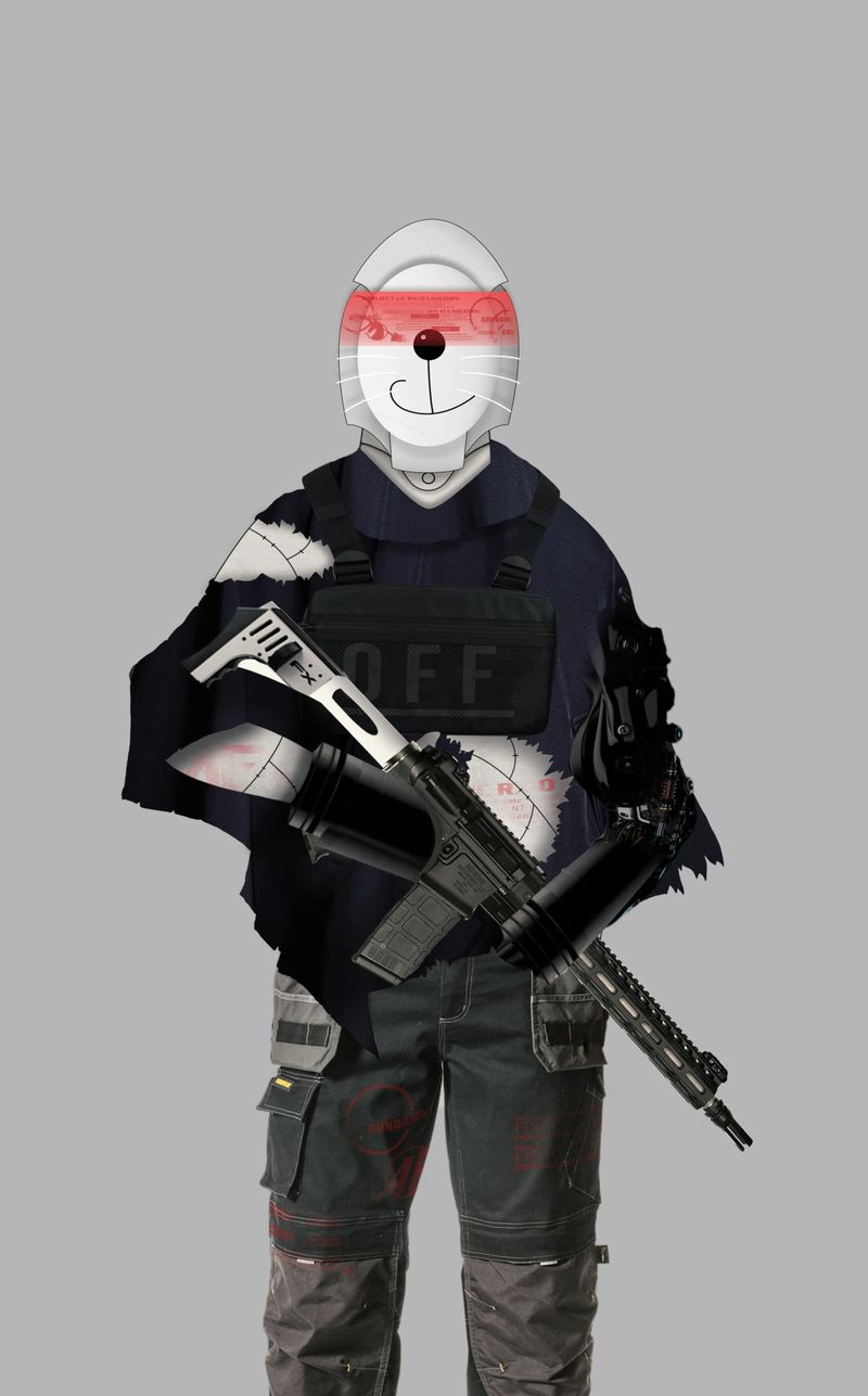
A few days ago I decided to embark myself on the journey of learning photobashing.
For the ones that aren't familiar with it, photobashing is a technique where artists merge & blend photographs or 3D assets together while painting and compositing them into one finished piece.
https://conceptartempire.com/photobashing/
My initial idea was to blend a photorealistic style with a cartoony style, and make it look good and cohesive.
Have I achieved what I was looking for? What could I improve? Any thoughts? I would love to hear em all!
(This character has no purpose besides practicing and learning. No story, no anything. Just practicing photobasing, and hopefully finding a style that I enjoy developing in the future.)

-
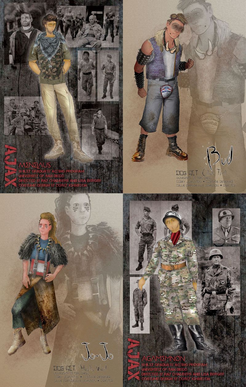
I sometimes do photobashing in my own work as a costume designer. Costume renderings can take time that I don't have, so photobashing helps me create an image that will communicate to the director and actors what's in my head very quickly. The specificity of using actual images of actual pieces I'd like to purchase helps immensely, but I often find I'm sacrificing character for content.
(One word of caution, though--because I started using it as a quick substitute for drawing, my drawing skills plummeted because I wasn't using them. I'm still recovering and struggling to draw human poses and clothing accurately--proportion and fabric folds were the first to fall away... Just a word of caution.)
Here are some techniques I've discovered work for me:
1--To pull all the assets together, I create texture and color overlay/screen/multiply layers so they all have the same quality of light and begin to feel like they go together. Sometimes these have to be quite severe, so if you enter into it knowing your final image will be heavily shadowed or textured you wont' be surprised.
2--Sometimes I don't actually use the photo asset in the image but use it as reference instead. Use them to trace over or draw rather than as an actual element of the image. This could be especially helpful if your trying to balance cartoon elements and realistic elements. Don't let the photography dictate your shapes and lines.
3--OR (which is what I more commonly do) draw the rudimentary shapes of your image and use the warp/puppet warp/transform tools to shape the image asset into a shape that fits your drawing. That way you aren't using shapes just because the image assets are a specific way, but making them fit your silhouette and your proportions. It creates a level of "non-photographic realism" that stylizes the images slightly and makes them feel more "drawn".
4--Don't use photographs at all but texture image layers for fabrics. Draw your own shapes and lines, then use textures to fill those in, bent with the warp tool into shapes that hang/drape similarly, cropping them to fit, and then augmenting them with shadows and highlights. A LOT of fashion design is done like that, because frankly it's impossible to find photo assets that are exactly what you want and you don't want to be dictated by what you find but rather what you, as the artist/designer, actually desire. It's your image. Not a collage of others. Use it, don't let it use you.
So since you're interested in combining cartoons and photographs, keep the photographs in their place. Don't let them control the story of your image. Find imagery you can use that you can manipulate to what you want, and don't settle for just what they are. Don't be scared to draw your own versions of things instead of using the assets.
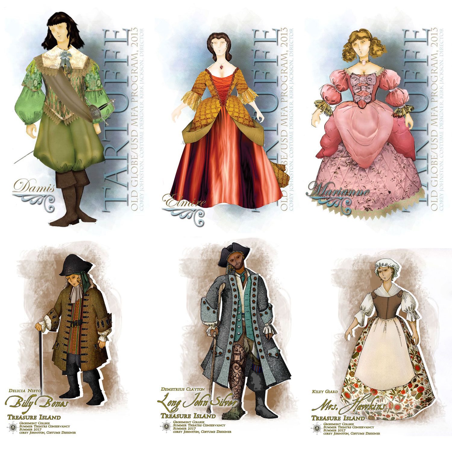
Below are some examples of costume renderings done using photo assets as launching points and the techniques I've mentioned above. Very importantly they're not like concept art, where suggesting realism is sometimes a key goal. Don't mistake more "realistic" for "better", especially if you're trying to cartoon-ize things. Realism, as a style in video gaming especially, is on its way out because after you've made everything look real and magically satisfied everyone's capacity to be visually tricked, where do you go from there? The only place left is VR. And that's a totally different medium... In movies, CG still dominates the industry and the more "real" something is the less obtrusive it is (thank-you Star Wars). But even now, people are tiring of the "Pixar" look and want something more expressive. So don't let your photo assets dictate where you want to go with your characters.


-
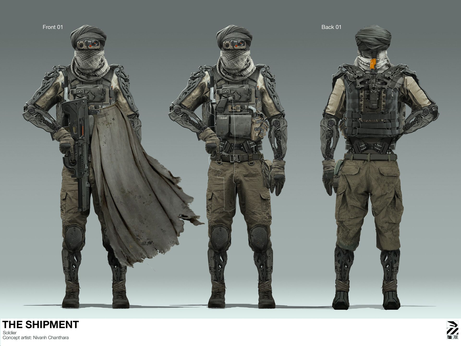
@Coreyartus Awesome! Such amazing advice you just gave to me! I really appreciate it. I agree with you. But I'm looking to "replicate" something like this. (With a cartoony side to it) What do you say?
Great love and respect!

-
I think you need to define "cartoony side" first.
Because I'm not at all sure how to offer you more advice without knowing what the image is for, etc. What are the advantages to photobashing it? What are the disadvantages? Is there a reason you're not just outright drawing it? What is it that you're trying to accomplish with the cartooning? What quality are you seeking that demands a combination of the two approaches?
-
Hello Ashton. First, I commend you for trying different approaches, and for producing work, also, for taking my advice on focusing on individual aspects first, so keep it up man. Second, and here is where I'm really honest man, I have to say given your own standards, this was not a successful image.
Now let us analyze why. The first most important aspect of it, is basic draftsmanship skills.
Photobashing is an advanced skill that really requires you to have a thorough understanding of forms, texture, values, etc. If you can produce one good, clean, detailed, hard-surface drawing, complete with hand-painted textures and values, that looks convincing that's when you start experimenting with photobashing and stylization, because it becomes a tool to speed up the process of painting, not a crutch put in place of it. See the warning Coreyatus posted,
"(One word of caution, though--because I started using it as a quick substitute for drawing, my drawing skills plummeted because I wasn't using them. I'm still recovering and struggling to draw human poses and clothing accurately--proportion and fabric folds were the first to fall away... Just a word of caution.)"-Coreyatus
Second, is that the image is not clear. A photobash can be detailed and realistic, but it also needs to still communicate clearly what everything is, in fact, that is the entire purpose of using photobashing, to more quickly and clearly express complicated details that would take too much time to render in a tight turnaround, integrating with an also clear drawing/painting. Right now, the piece looks more like a collage than a cohesive design, which is what you don't usually want from a production photobash. I am also not sure about what most of the hand drawn elements are. I get its some kind of helmet, and a kind of animal head? I get thhat there are some kind of rags too, but it all is rather unclear and flat, and it just doesn't gel with the photorealism (what is the helmet made of? why arent the rags following the forms underneath?)
However, if your example is something you still want to pursue, there are a few, concrete things you should be capable of doing before photobashing. First, understand the human figure (what lies under the clothing), second, be capable of understanding realist rendering (light+texture) third, understanding form and form language and finally, understanding your specific reference, in this case, guns, military equipment, and hard-surface forms . After alllll of that, start playing with style. You put that together, you will be in a much better position to do a successful photobash, and try it again.
Let's start from the beginning. Give me a sheet of 5 hand drawn soldiers from reference, without stylization, just line-art. Try to keep them around an hour each. If this is too difficult, this means we have to scale down and really work on the basic chops. But try to do it, and post the result. I'll be there to provide some feedback if you want.

-
@CesarAndradeArt Thank you Cesar! I really appreciate your amazing advice. It means a lot to me. Now it's time to keep practicing. Great love and respect!
-
@Ashton-H No problem man! I hope i wasn't too callous, it is all in good faith, and you have a great attitude, so I hope to see more work from you, definitely

-
@CesarAndradeArt Thank you Cesar! You've helped me a lot. Right now I'm practicing 24/7. Road to mastery. Can't wait to see more work from you. I have already checked your whole body of work. Thank you for the inspiration.
Cheers!