Does this Look Like a Snowboard? The Collaborative Book Project for Will
-
Hey Art Peeps!
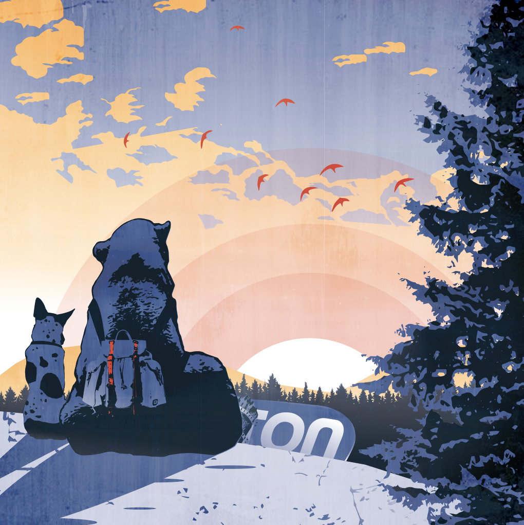
I'm doing this piece for the collaborative book project for Will. So far its been a fun piece to do.
I have Will as a bear and then his dog next to him. On his YouTube channel, Will is always talking about taking walks with his dog up the neighboring mountains and snowboarding down. So I wanted to include a snowboard. But I feel like I can't quite get the snowboard to look right or at least recognizable. I feel like its kinda a blob. I'm thinking about maybe just taking it out. What do you all think? Any tips or suggestions on value changes or something? Maybe the bear foot is too lightly valued also?
-
It reads as a snowboard to me, but I don't know if thats because I read the title of your post first and had that in my head when looking at the piece.
-
@Squirrelsize , wow it's beautiful! And so touching!
It reads as a snowboard to me but to make it a bit more obvious I would make it more curvy on its end, like freestyle snowboards. So curvy going up on your illustration, right now it's curvy towards the ground. -
@Sarah-LuAnn Hahahah, good point. I was wondering if that would happen after a posted this thread lol. Thanks for the input

-
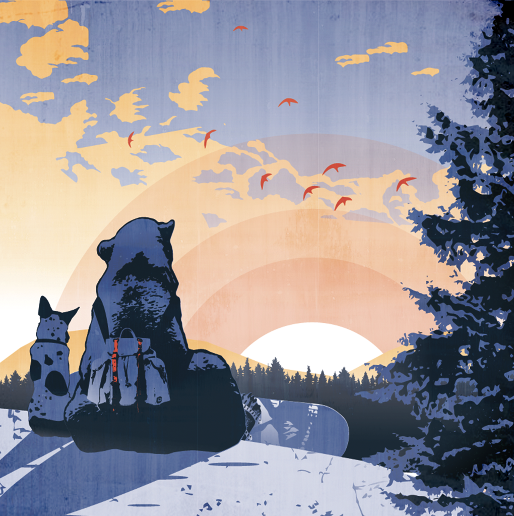
@marine Oh! I like that idea! I'll try for the freestyle model! Guess what Will! You are a freestyler!
-
Okay, Swapped out boards. I like it better

-
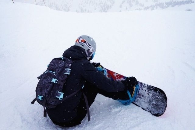
The board reads well to me but the binding and how it is attached to the board is a little off, it might help if you included the base of the binding peeking out from under the bear's foot and had the strap attached to that instead of the body of the board. The angle is slightly off in this pic but you can kind of see what i'm referring to with the light blue bindings.
-
@StudioLooong Yeah, I think your right. when i was making the bindings, I was wondering if I should include the base of the bindings or not. I'll go for it and see what happens. Thanks for the reference pic too
-
It looks great, and the changes make it even better. I just really love this.
-
I was inspired by the bright blue bindings. So I made mine yellow

Thanks @StudioLooong
Any more tips? Or should I call it done?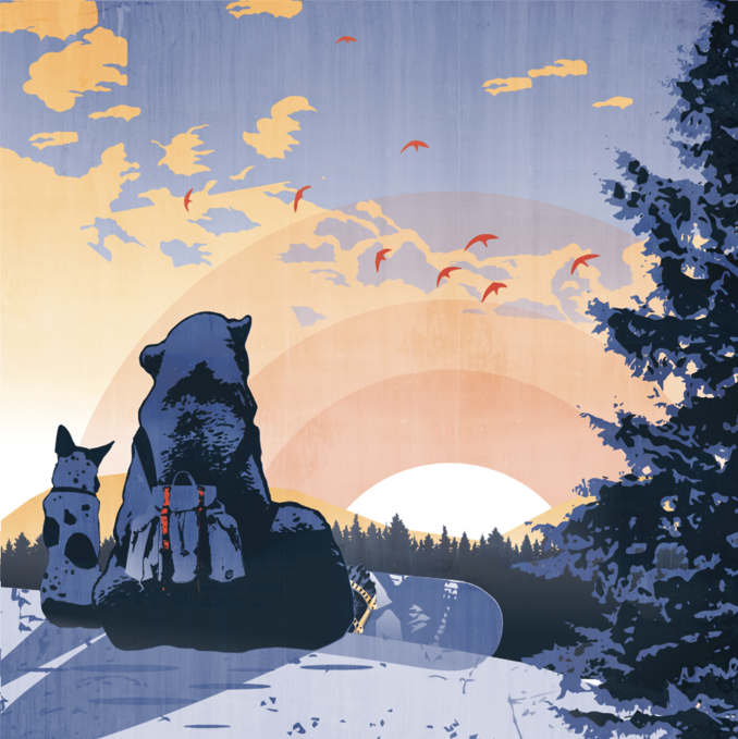
-
@Squirrelsize Looking great!
Another thing, did you changed the opacity of your snow? It looks like we can see the hidden part of the snowboard. If it's a shadow, maybe change it a little bit so it reads without ambiguity. -
@marine Oh yeah, I added the shadow, but yeah, it does look like part of the board. I'll fix that. Thanks girl!
-
I'm loving the graphic design feel to this piece. And the desaturated colors fit really well with the mood of the image. So calm and peaceful.
-
Okay, Shadow fixed.
Also How do you all like the texture?
The first one has texture and the second is without.
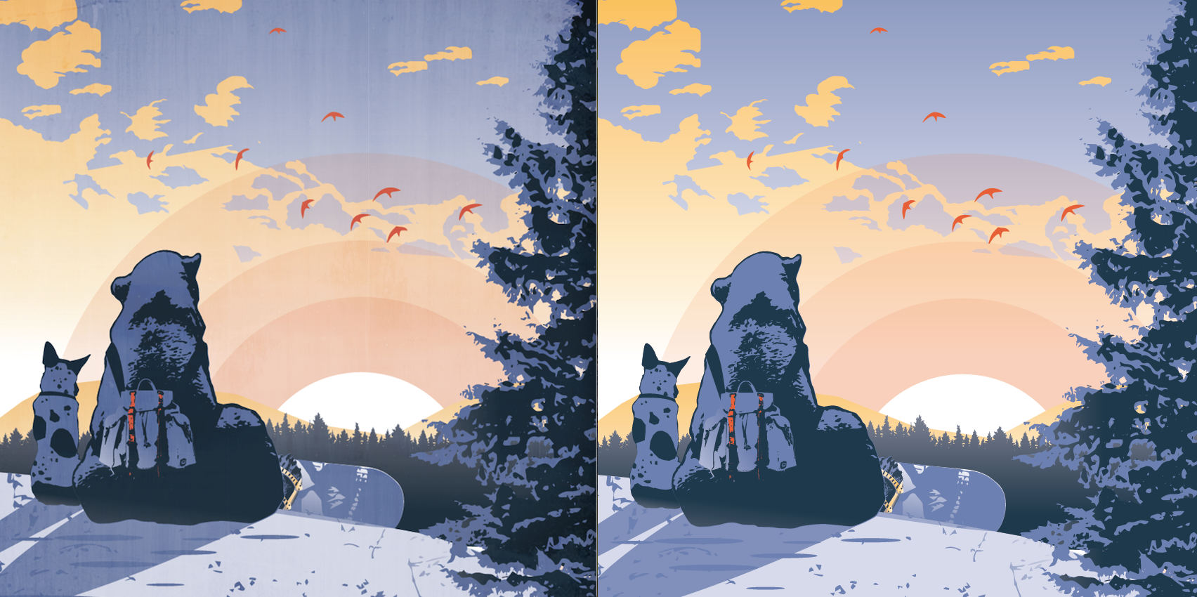
-
I think I prefer a little texture.
-
Very sweet. Love the image. I like the texture!
-
I too, like the texture and the entire picture. Beautiful and peaceful feeling.
-
With texture. Great image, very well done and I love the idea!
-
I am not sure if the bindings should be that bright, since they are on the backside of the board? At least they should get darker in the lower region
 ?
? -
@mellebluesworld Hmmm, I was actually wondering the same thing. I decided to let it pickle overnight and look at it with fresh eyes in the morning. Looking at it now, and yep, I agree with you. I'll mess around with that and see what I can do
