Tuesday critique update.
-
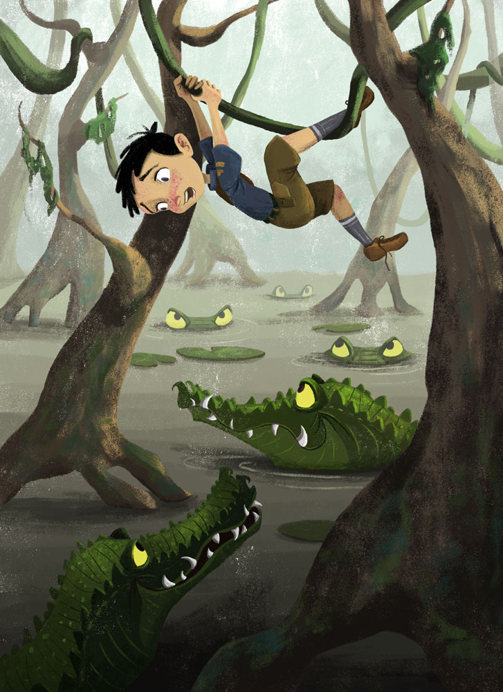
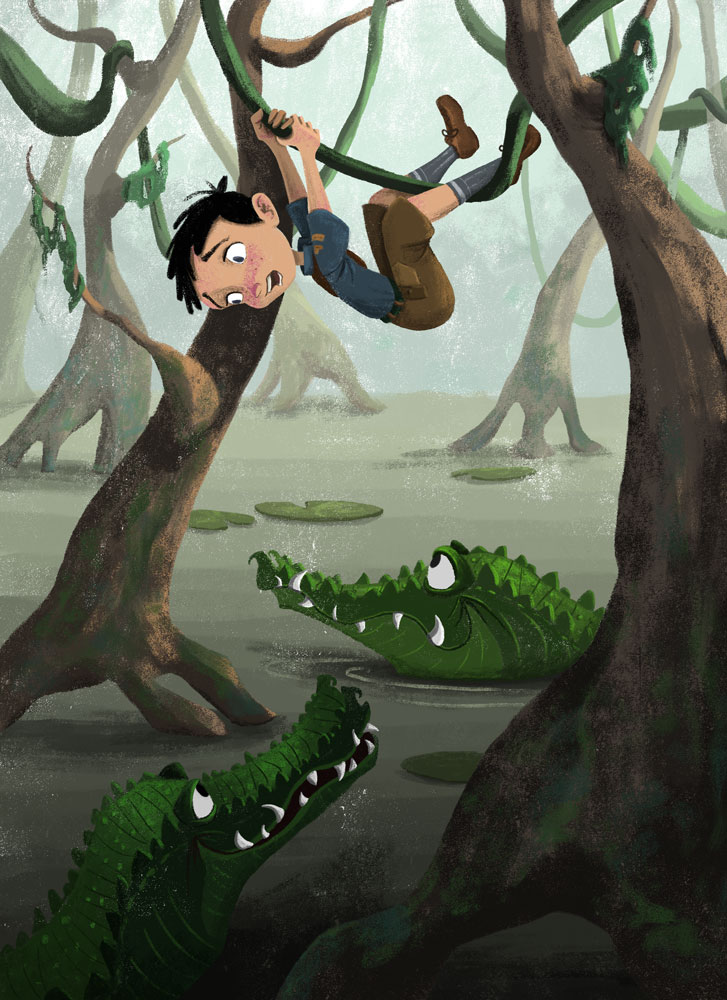
Hi all. I participated in the live critique session last night and it was really good. Here is my re-worked image (on the top). The main points they had for me were to make the boy look like he was in more danger and to enhance/unify the colors. What do you all think? Thanks!
-
@joanie-stone Dang, this looks like this is one of the critiques that I missed...
Your reworked one definitely has more of a sense of danger. And I really like your coloring/rendering style!
-
Great shapes here and texture! I love the character so much! I wonder if a boy scout needs a hat of some kind, possibly fallen?
Honestly I liked the yellow eyes on the alligators a little more, but I can see how the cooler color works as well.
-
Fantastic piece @joanie-stone! I really like it...lots of fun, very engaging....the reworked one is at the top, right? I love the design of the crocodiles (they are tricky things to draw & get right!), the composition, and I agree that your rendering style is really nice, with the textured feel.
-
Really enjoy the updated version - you certainly got in that heightened sense of danger with the added crocs and the yellow menacing eyes. Very nice!
-
Thanks everyone and yes the top one is the newest version.
-
This is coming along great!
I definitely feel the danger more. I think that the two exposed crocs/gators (I'm awful at distinguishing them woops) might look a little happy/inviting still, and not in the mischievous "we found dinner" way.Love the heads peeking out as the swamp drifts back, and the subtle increases in texture on the boy's rendering!
-
eat him! haha I love this. The texture is so good and the pose is spot on. I would roll his pupils at the closest croc, just a suggestion. Great work!
-
Fantastic. Not sure I'd change a thing.
-
Love it!!