Group run through creative environment design week 1 art and feedback
-
@Nathalie-Kranich Not kidding, you've become my new favorite

-
@Nathalie-Kranich @Nathalie-Kranich the reason the first one looks so good is because that is Jake Parker’s example

Thanks for providing such clear feedback on your approach—location and usability are 2 concepts I would not have considered: it was just a blank page staring at me to create something from basic shapes. I am going to try that thinking, thanks!
-
@Heather-Boyd @Heather-Boyd thanks so much for providing your exercises (I do get lost in this forum!)—wow the 2nd group without reference and so quickly has so much energy.
I don’t even want to admit how long this is taking me . The third row went a little faster, so I am going back to the drawing board with all these hints in mind, especially not taking the silhouettes to the page edge. Thanks again for helping me not give in to the temptation to quit!
 -
@demotlj Thanks for this tip, Laurie—I realize I don’t have a footprint, which is probably why I am filling too much of the “page” with each silhouette. Boy, silhouettes are a lot harder to implement than it appeared at first glance, right?
-
@BichonBistro I'm so sorry I only realized that when I saw some others XD I don't have the exercise sheets myself! Your forth row ones seemed to get better, with more negative space, I feel. The others just suffer like you said yourself from shapes blending together, but as long as you keep that in mind I bet knocking out some more thumbnails will soon proof much easier!
-
@murielle hahaha cheers XD You have some really cool stuff on your website, I like the water colours and drawings a lot :3 you got an instagram to follow you on?
-
@Nathalie-Kranich Yes I have instagram https://www.instagram.com/artbymurielle/
-
@Nathalie-Kranich yes, more negative space needed! yours are great examples


unexpected overnight guests last night, but getting back to it tonight, thanks! -
@BichonBistro I look forward to seeing more then!
 I'm still trying to find some time to get started on the week 2 exercises, but they look rather time consuming. Some people did some really detailed studies - I think I'd rather paint a 100 more thumbnails. XD
 -
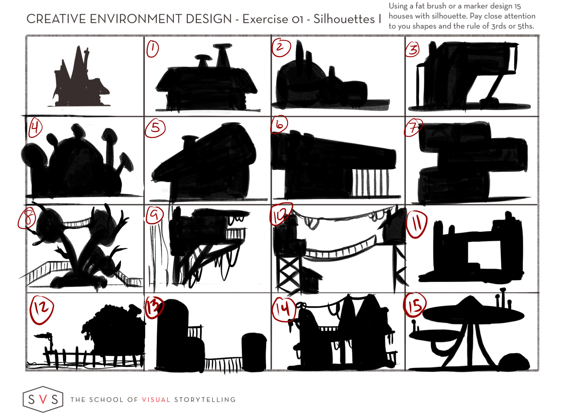
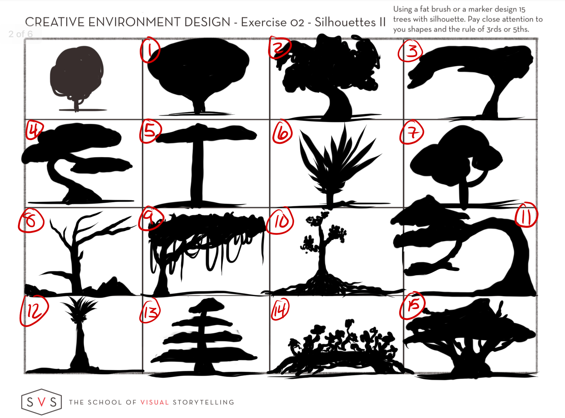
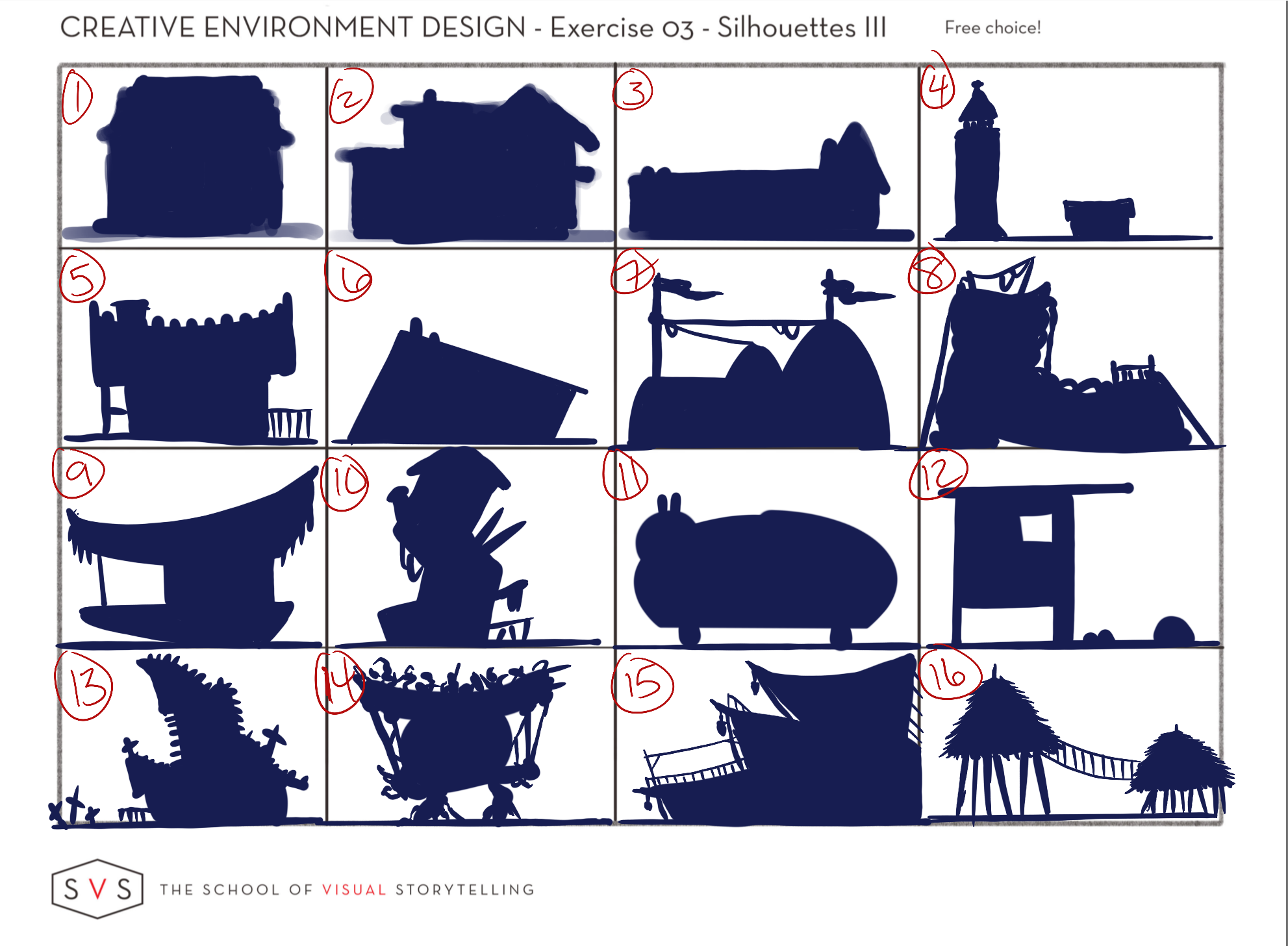
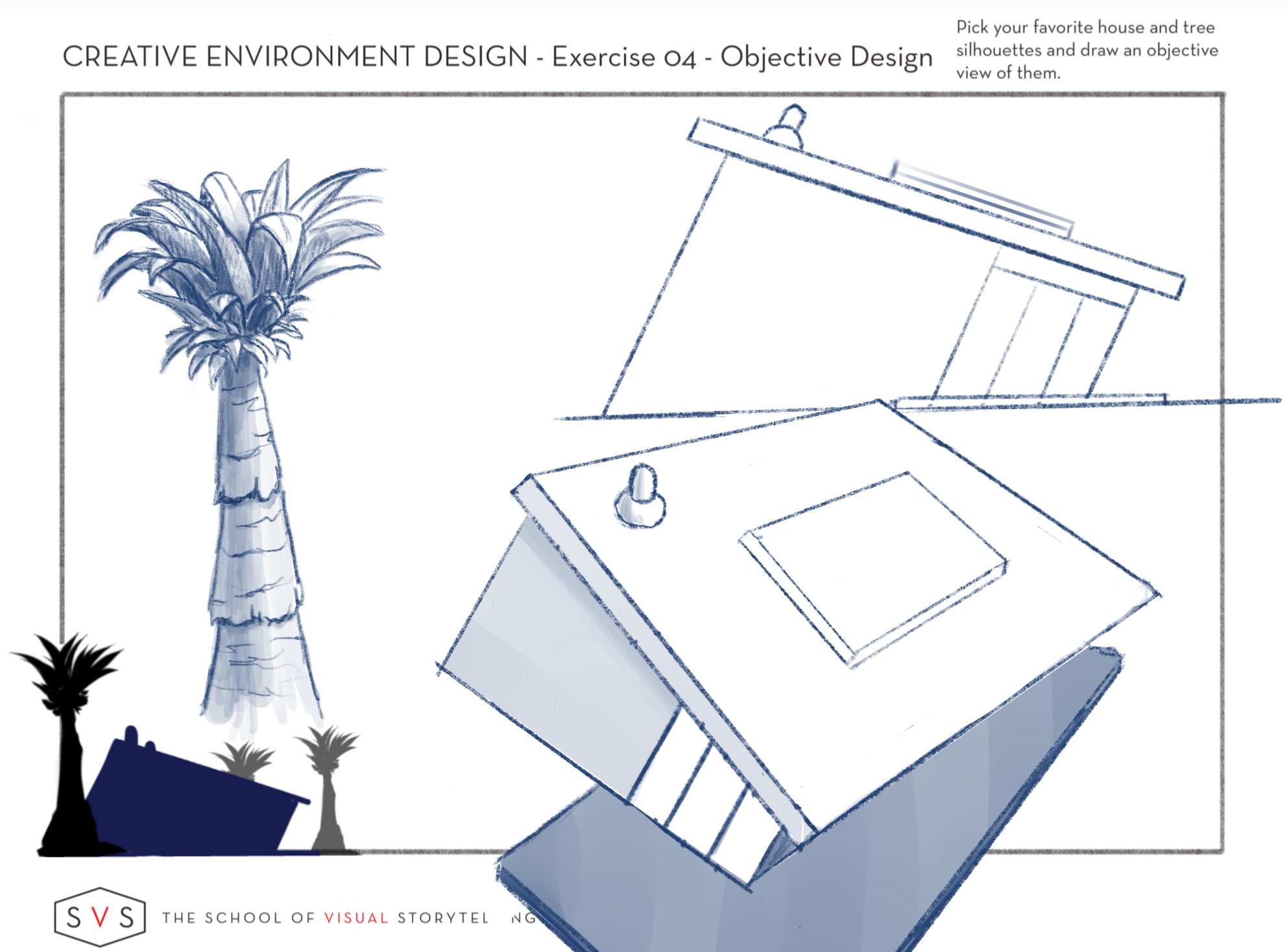
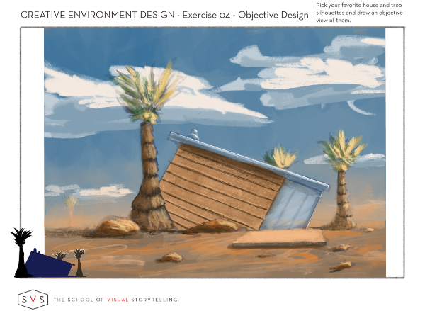
Figured I would try to catch up to everyone and get started on this class. This is what I have so far. Feel free to make any critiques. I decided to do both an objective and subjective view for exercise #4.
Also, extra points to anyone who can guess what I was going for with #8 on exercise #3. Lol.
-
@Buddy-Skelton Nice work!
#8 is totally a boot, yes? There was an old woman who lived in a shoe and all that
 ?
?You certainly chose an interesting design for the objective and subjective view. Keeping something consistent at that angle is tough!
-
@Braden-Hallett You got it! Bonus (imaginary) points for you!! Lol. But yeah, doing the perspective on that one was kinda challenging. Still not sure its sound in that aspect though.
-
@Buddy-Skelton i dig this, no pun intended
-
@Heather-Boyd I keep looking at the work here and try to figure out “how did they come up with that?!” It’s becoming clear I may still be on the first 4 exercises by the time everybody else has finished
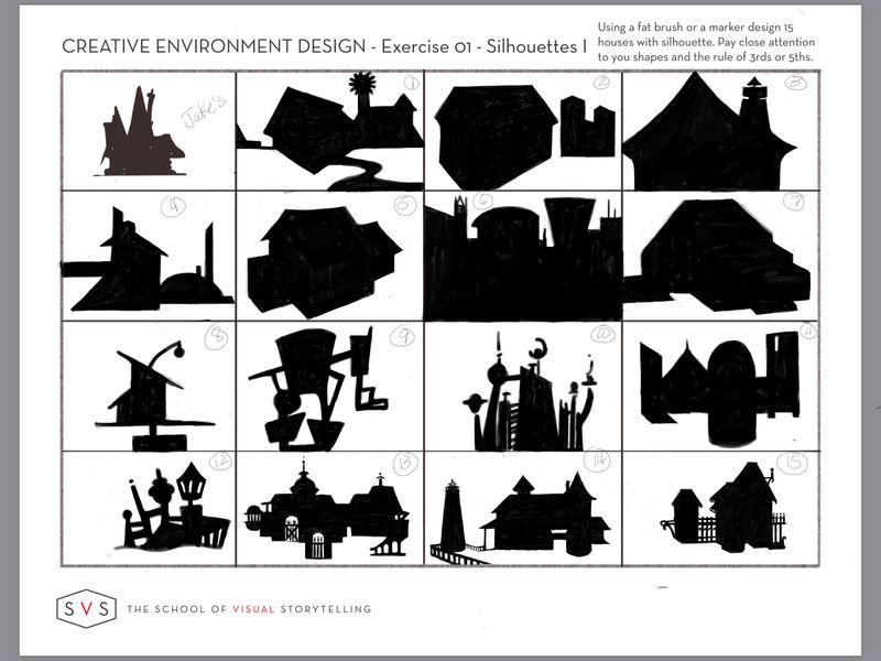
 . I tried to work quickly in an attempt to “play” in #8 and not run off the page. In #13, #14, #15 I tried to think of a location (but forgot about usability) as @Nathalie-Kranich suggested.
The “beach-house” seems to have become yet another village that bears no resemblance to the house that was in my head-it is almost as if my pen is on auto-pilot, detached from my brain! #14 was supposed to be a lighthouse next to its adjacent lightkeeper’s residence, but the actual residence shape was so boring I couldn’t think of a way to make it interesting aside from adding on projections that don’t make sense and again, I trailed off the page. #15 is supposed to be a gingerbread house, where I noticed my tendency is to work top-down, rather than establishing a footprint and working up as @demotlj suggested.
Thinking trees may be less frustrating as @Heather-Boyd found, but am already quaking at the thought of turning a silhouette into an objective drawing (still wrapping my head around that concept, as I’ve never heard it before)

Back to the week 1!
-
@Buddy-Skelton another group of WOW exercises that inspires awe!
-
This post is deleted! -
@BichonBistro I love your whole lower row! these turned out really nice, I can picture them in a background of an environmental painting somewhere, a little fantastical, locations of interest. Nice work!
-
@BichonBistro I really like your last row -you have made pretty nice progress. It's struggle for all of us -so much too learn -it can bog us down and put us to stop (personal experience). Your not tied down to a silhouette -meaning you might have an idea in your head but if it doesn't come out quite the same way, make another and another -you'll work in those practises and find you may like something else along the way. Also I am still on week 3 so you may catch up to me. Don't worry about object drawings yet -deal with what's in front of you and work through it as you are able and to the degree you want to pursue it -you can always come back later.
Writing helps me put all my thoughts down and it helps me remember what's important -now I need to take my own advice.


-
@BichonBistro I definitely found trees to be less trouble

I think these look really good, though! It's amazing how quickly everyone's silhouettes go from fairly basic to intricate between rows 2 and 4

Lookin' forward to seein' the trees!
-
8.9.19
I know I'm jumping into this super late, but I just wanted to toss my worksheets into the mix. Thank you @Braden-Hallett for creating these threads! It's really cool to be able to see everyone else's work. It makes it feel more like a traditional class where you can walk around and peer over your classmates' shoulders to see what they're working. Love this so much!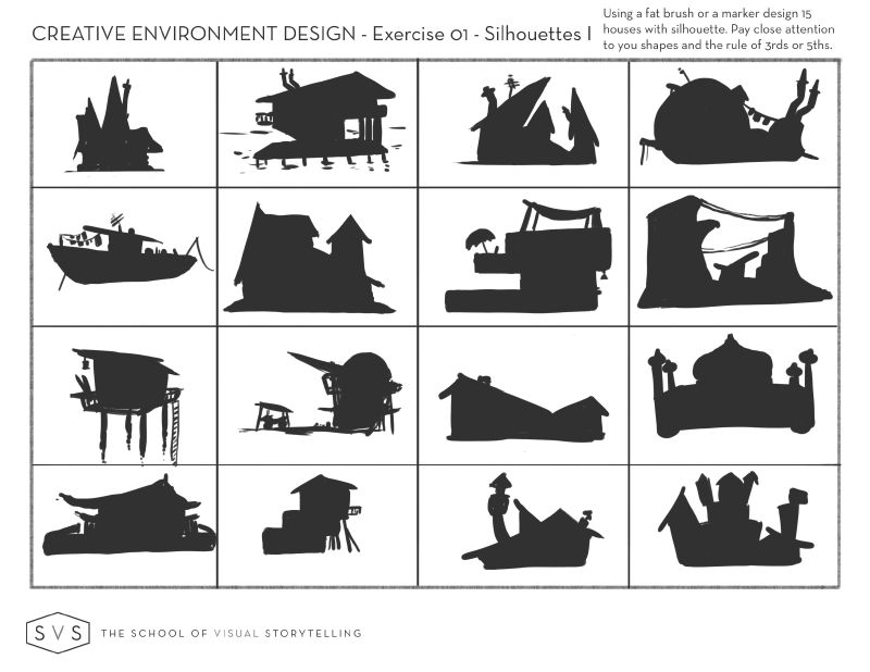
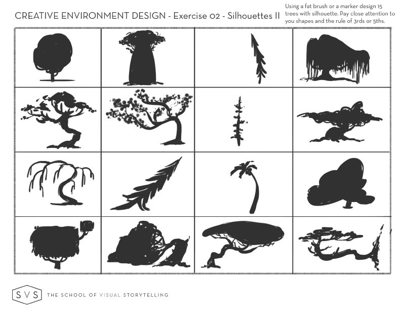
*edit
8.15.19
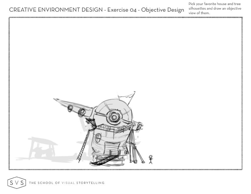
Thank you @Braden-Hallett for the constant encouragement and inspiration. Your work and your work ethic are incredible! I tried to sketch out one of the silhouettes from the above thumbnails, and I don't think I'm doing this right. I made the silhouette, but I had no idea how the parts would come together within the silhouette and so I am making it up as I go. It's supposed to be old, random space junk cobbled together to make a makeshift home, but I don't know how to pull that off. I think I was too ambitious, lol. This is what I have so far. I'm trying to decide whether to keep working on it or scrap it and pick a different silhouette. Any and all comments are welcome!