Wip portfolio piece
-
Hi, I'm new on the forum. I'm a 37-year-old Dutch guy looking to start an illustration career. I'm building a portfolio. I went to a children's book publisher's open portfolio day and they said my work was too cartoony for them. I can see where they are coming from. Now I have another opportunity with another publisher to send in a portfolio and maybe get work there. So I would like some feedback on my WIP for a portfolio piece.
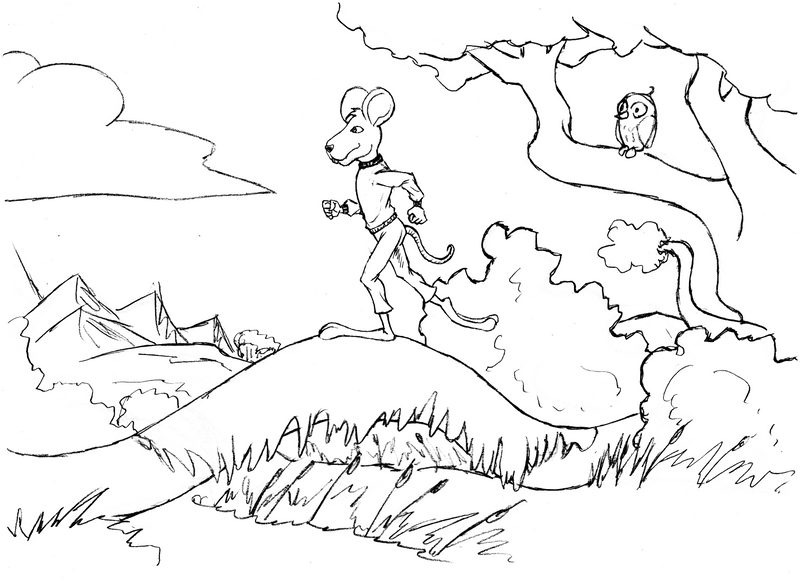
Is this still too cartoony? This is just the first set up for the composition. I do intend to keep the line work and color using watercolors.
for comparison, here are some of my "old" pieces:
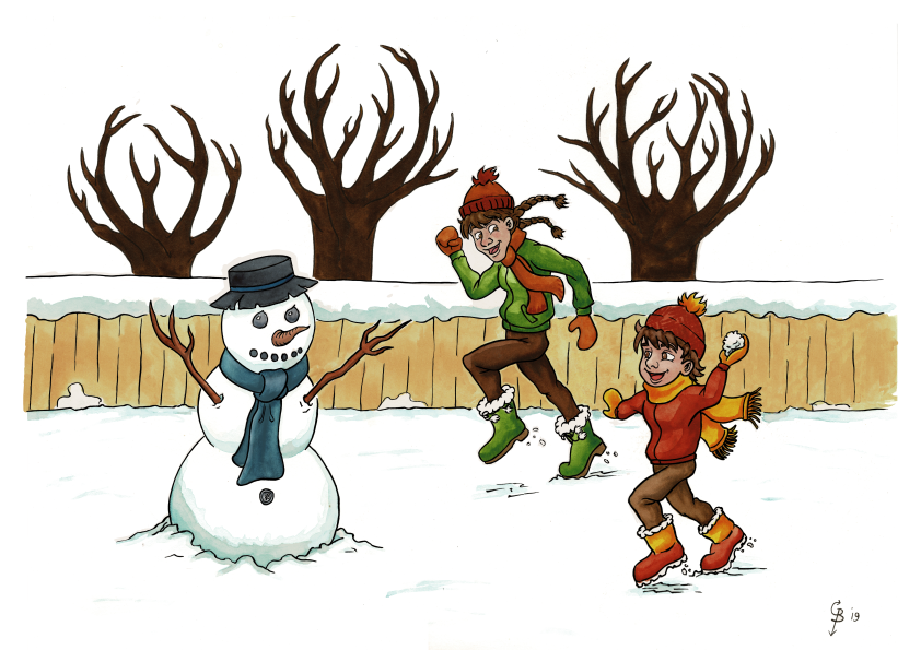

These were the worst offenders, so to speak. Please help. -
@Potterkun Your work is cartoony, but ‘too cartoony’ depends on who you are asking and what you are going for. The publisher you spoke too said it was too cartoony for them. Before you show your work to another, research the artists that they usually publish and work with. You need to understand where your work fits in. Different companies want different things and different stories require different illustrators. You need more opinions than just one publisher, although I wonder what other critique they gave besides saying it is too cartoony.
The gesture of the character in the first piece is very upright. I can see that he is walking forward, but I think the line of action and gesture can be pushed, so he has more momentum. What are some specifics you want critique on or think you need help with?
-
@Teju-Abiola Thank you. Well too cartoony and expression and poses pushed too far (for them) was the only negative they had. They mentioned that I showed some skill with perspective and composition. So I tried toning it down a bit with the mouse, but I see what you're saying. I personally like it when I push stuff more, gives it soul and character in my opinion so maybe I should just push the pose anyway.
As for critique, my weak spots generally are later in the process with color and value. But if something looks wrong etc. I'd love to hear it so I can adjust and improve.
-
@Potterkun It's definitely an interesting balance, trying to listen to critique and stay true to what you like to do. Do you do value and color studies before the final illustration? Doing three to four developed studies of each will help solve those issues.
A good exercise for color is to steal the color palette of a successful piece by an artist you admire that has a similar mood as yours. That way you know that the color works, and sort of reverse engineer it.
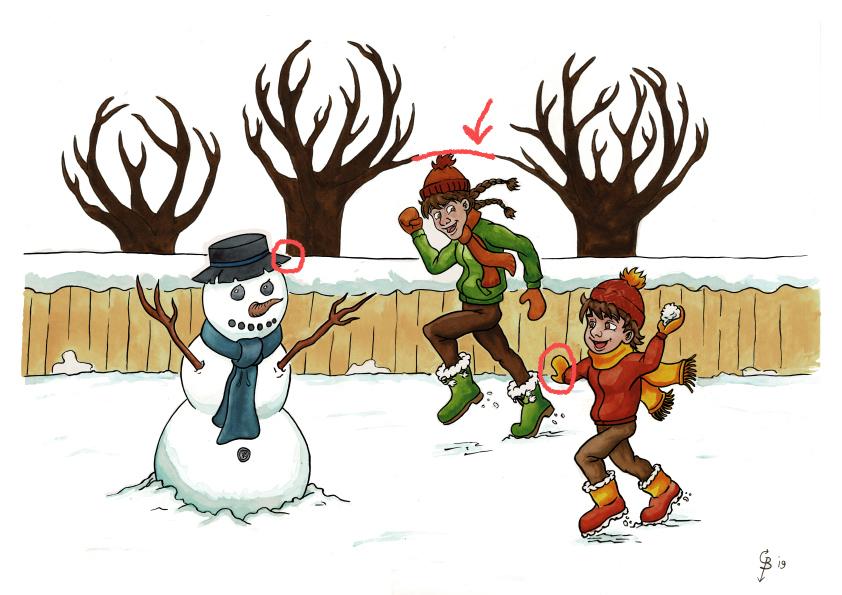
Also keep in mind certain tangents that are flattening space.. The cuff of the mouse's pants makes a tangent with the bush, and in the second image, the top of the boy's hat lines up with the arc of the tree branches in the back.
-
Nice work @Potterkun! I agree with @Teju-Abiola she makes a great point about the "too cartoony" comment. There is a place in the industry for cartoony work (Mo Willems, Dr Seuss, etc). You probably just need to keep exploring other publishers and keep perfecting your craft. I wouldn't try to be less cartoony but try to push and perfect your personal style by continuing to work on the fundamentals.
Your work is fun and appealing keep working hard.
-
@jakekalsbeek thanks, i will.
@Teju-Abiola Yes I do make a value study and color before I start painting so I know what I want, but when I am painting it just seems to come out a little different (less contrast). I was working and I figured that maybe you thought he should be running, but the Idea was to have him walking, so I changed his pose a bit and added props so the walking comes across better. I can see the tangent in the new image and I fixed it in the new version. But I don't get what you mean with the other tangent, I don't see it, can you explain further?
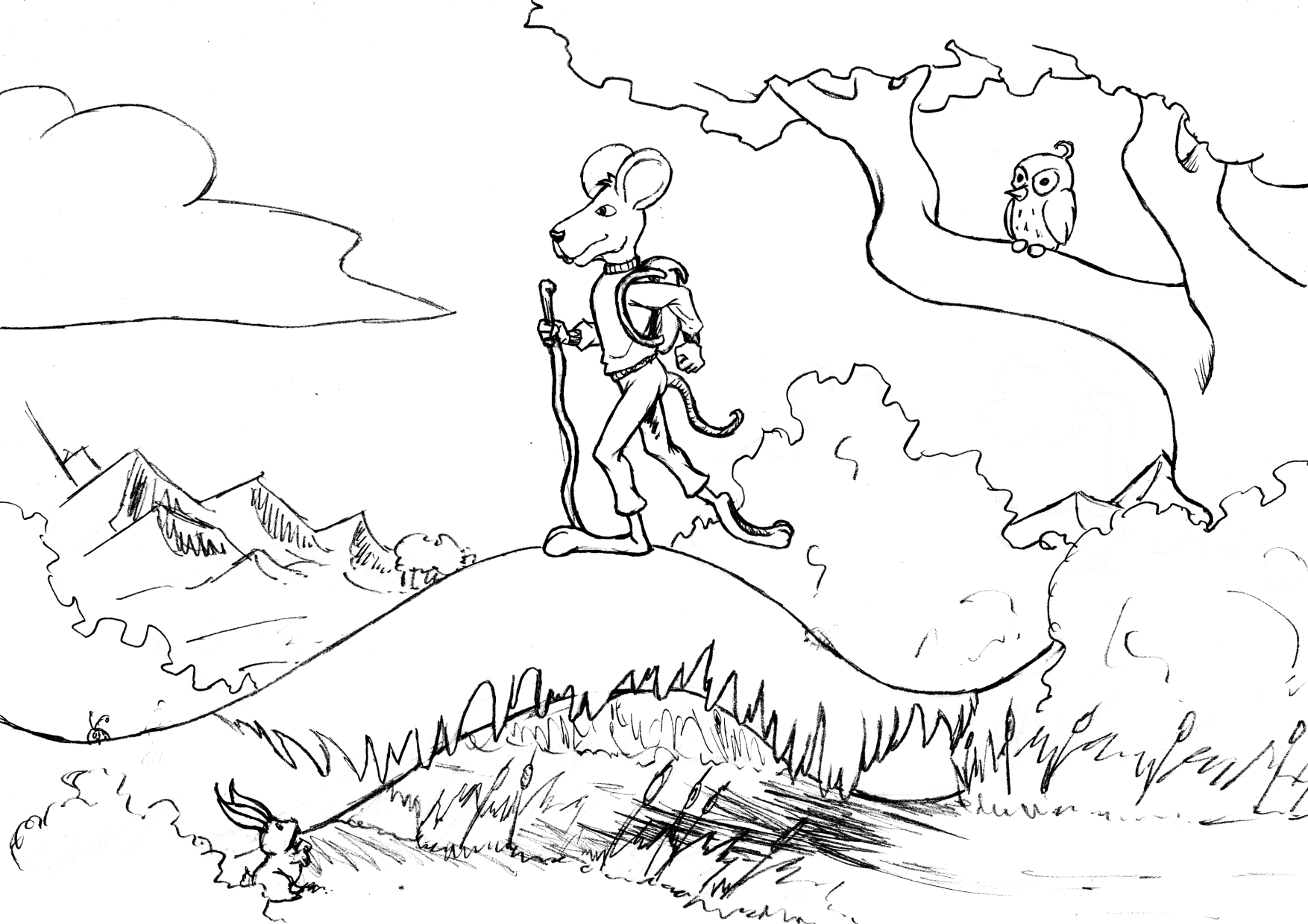
How is this?
-
@Potterkun Welcome to the forum! Glad to have you.
When everything is outlined in black, the piece will have that air of cartoony-ness. You can experiment with using more ink for shading to give it more texture and depth, or have the background elements be lineless. That's what I'm working on for my own style - I love linework, but am learning to use value/contrast to define shapes too.
Your composition has the subject right in the center, which can make a piece feel...too balanced, neutral. Try using the "rule of thirds" to place your character to the right or left to give the piece more energy.
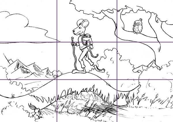
I think approaching this as an environment illustration with a character in it might be a good approach. Try playing with sizes (small, medium, huge) for the environment to make it more engaging. The character, log, tree, cloud all kinda feel like they are the same "size."
Samples:
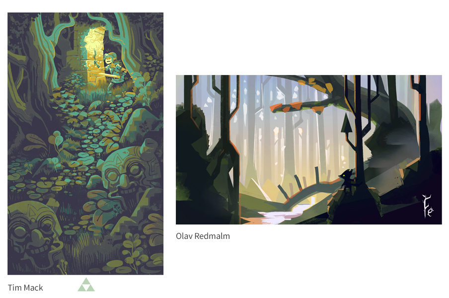
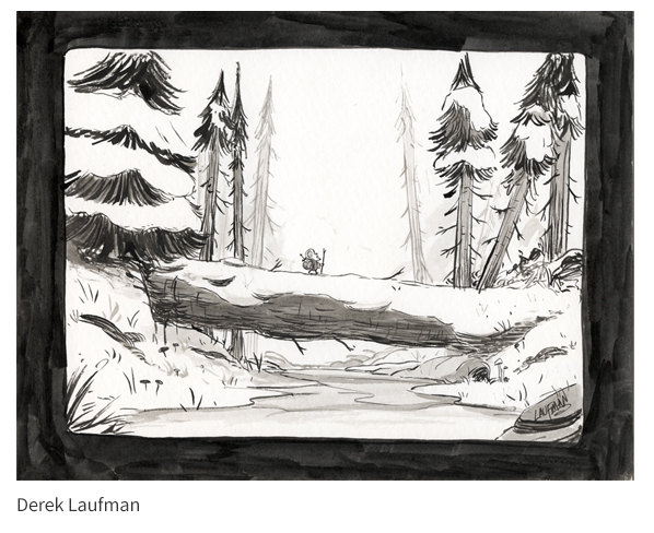
This one even has a mouse kinda in the middle, but the play on sizes (tiny mouse, huge log) makes it interesting:
If you have an SVS subscription, I recommend checking out:
- Creative Composition 2.0
- Environment Design
- How to Ink 2.0
-
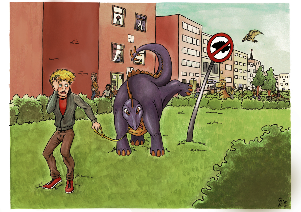
Potterkun- it’s ok to have a cartoon style, as the world of picture books is full of them. A picture tells a story and of the 3 pictures the last one with the pet dinosaur is stronger than the others, but your male character has dark bags under his eyes, making him look a little too scary to kids. Seeing the actual pee of the pet dinosaur might be a bit too graphic and maybe there’s a way to tone that down, unless your audience is geared towards graphic novels and teens.
-
@Potterkun I also tend to have finals that are less contrasted as I like. Try overcompensating the values, and there is also nothing wrong with making a few adjustments in Photoshop when you finish. I think the walking stick works fine as long as it still keeps with the story.
I've pointed out the arc tangent made by the hat and the trees, and a couple of other minor ones. The arc is the one that really flattens the space.
-
@carriecopa I love linework too. But I can try and experiment with a lineless background. I can definitely see what you're saying. I will have to play around with the composition a bit more to add interest. Thanks for the tips, I do have a subscription and will be checking those courses.
@RobinCampbellArt good observations, I will tone the dinosaur one down a notch.
@Teju-Abiola thanks for the tips. I am always to afraid to go too dark and ruin it, but I'll just have to bit the bullet and do it. I totally missed those tangents, thank you.
-
@Potterkun I love these! Others have done a great job addressing composition. As far as being "too cartoony" (sort of a vague piece of feedback, in my opinion), I think the storytelling could be pushed a little farther and it would breathe more life into the pieces. As a few examples:
Is the mouse on an expedition or adventure, or just out for a serene hike? What if that bird in the tree said something to him?
In the snow scene, are the two characters playing together? The small boy is looking off-screen - is he playing with someone else and the character with the braids wants to be included?
In the dinosaur illustration, the character is reacting to his pet peeing but looking elsewhere, which makes it seem a little flat or disconnected.
I love these! Keep up the good work!
-
So I made a few tweaks to 2 of the 3 images the third will have to be completely redone, but I don't have time right now. Anyway here's what I've got:
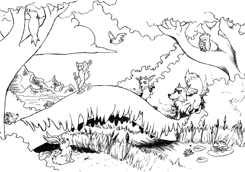
I've changed a lot about the Mouse WIP. I redesigned the main character and added a bit more story elements and changed the composition to be less boring. It helps that I now have a better idea of what the story is: The mouse was goaded by the fox to go on an adventure. the mouse is a little scared but is going anyway. the rest of the animals came to see what the ruckus was about. Her is the new and hopefully improved version (still a sketch):
 :
: -
@Potterkun I like the change in the Mouse picture, but my first look goes to the wolf (if it is a fox, the muzzle has to be more sharp pointed) I think the mouse could be little bit bigger or at least thicker lines, because the other animals have stronger lines and You see them better.
I like the changes in the dino picturue, but now I am missing the pee (not so strong as before, but little bit? I thozght this is the main point. The boy is looking much better.