Illustration WIP
-
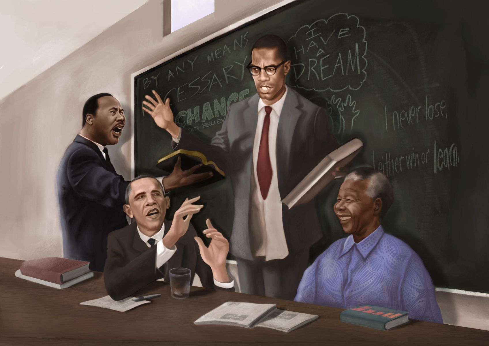
I am currently working on this commission for a client of mines. King J.r., Obama, Mandela, and Malcolm X devating in a boardroom, Please let me know your thoughts.
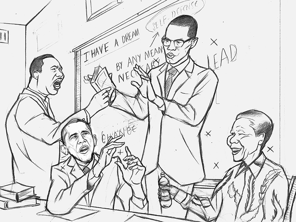
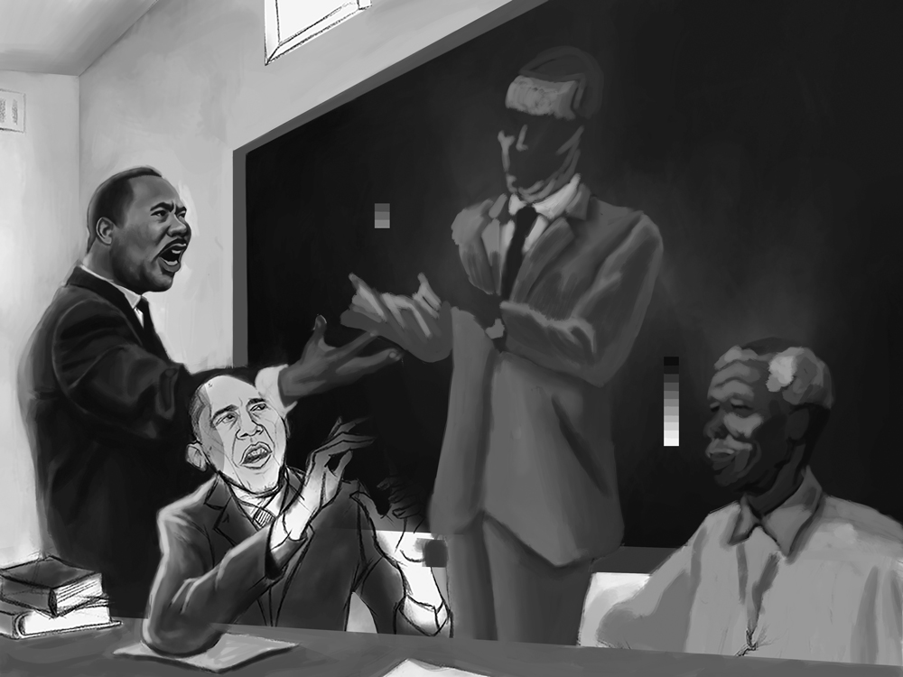
-
Oh man - this is beautiful - and I just love how you handled the gestures - there's actual movement in the piece - I can feel the arguments/discussions.
I really quite like having a chalkboard in the back because it hints at nostalgia and is a technology/tool that connects them all - plus you can play with "erasing" ideas throughout their discussion, where there's still a hint of what was written.
As of right now though King Jr. stands out the most because of his contrast with the back wall - but he's also the most rendered at this point. I'm curious how each figure reads as a group once they're all rendered.
I feel like, based on what you've laid down already, that you're just going to nail it and that each figure will read beautifully - but since it is a discussion among equals, if King still takes the center stage you could always throw a whiteboard in the back to pop all the figures out.
I really look forward to seeing how this grows
-
You've captured each person so eloquently - just beautiful!
-
@kaitlinmakes thanks. I'm excited to fully flesh this one out.
-
@djly thanks again.
-
Here's a WIP
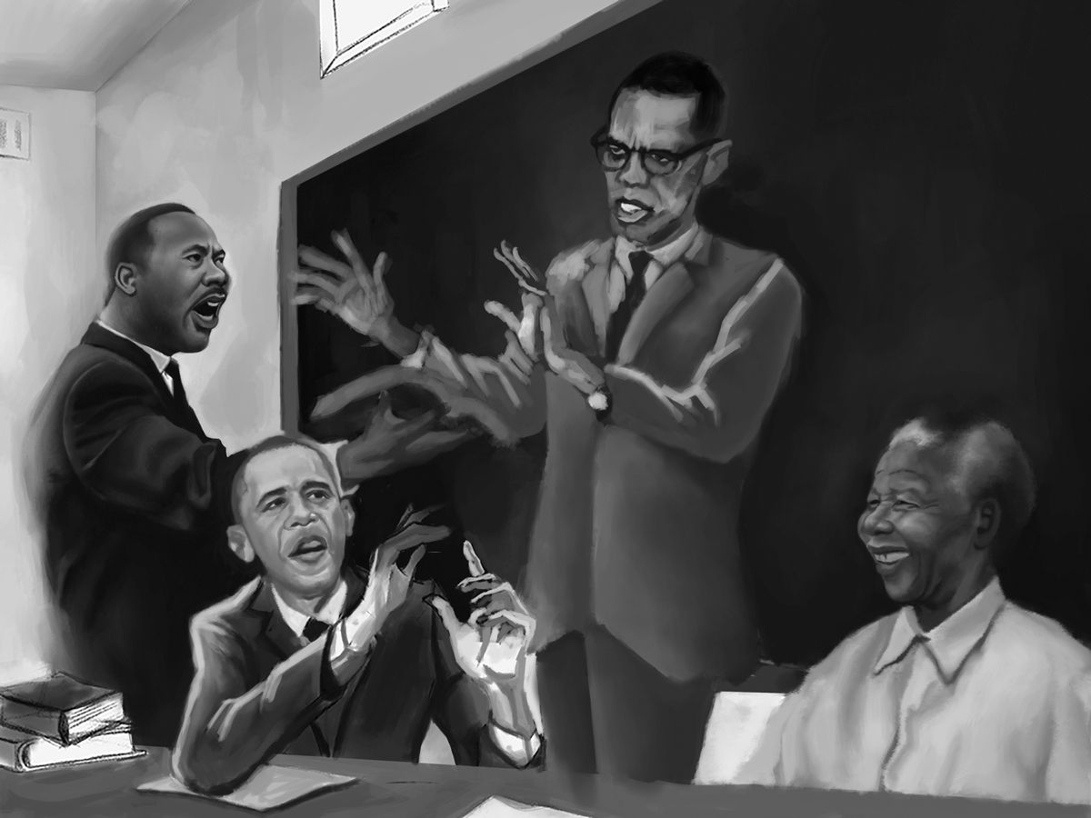
-
Its off to a great start! I feel that Obama doesn't really have a neck. I'd move his head up a bit more. Also Mandela seems to be off in his own thoughts, and not part of the crowd. I dont know if he can be looking more towards Obama while he hands the water over? Just my few cents for improvements.
-
@MirkaH I agree with your take Obama. He's the one I'm having the most difficulty with so far. I have Mandela more or less enjoying the atmosphere. Thanks for your input.
-
@Durrell-Odom cool idea to have all of these men in the same room, I like it.
I was looking at Obama too and I think you might be having a problem with layering and perspective. He looks smaller than King but is in front of him which is messing with the perspective a bit. I think maybe if you broadened his shoulders so that his silhouette read as closer it would work better. Just a thought. Or maybe if you pushed King's hand holding the bible back it might help? Not sure. Just a thought.
-
WOW this is great. You've really captured likenesses and character so brilliantly here. I don't have anything to add, critique-wise, but please continue to post your progress! Such a cool piece
-
@Eli thanks. It's been a while but here's a WIP.
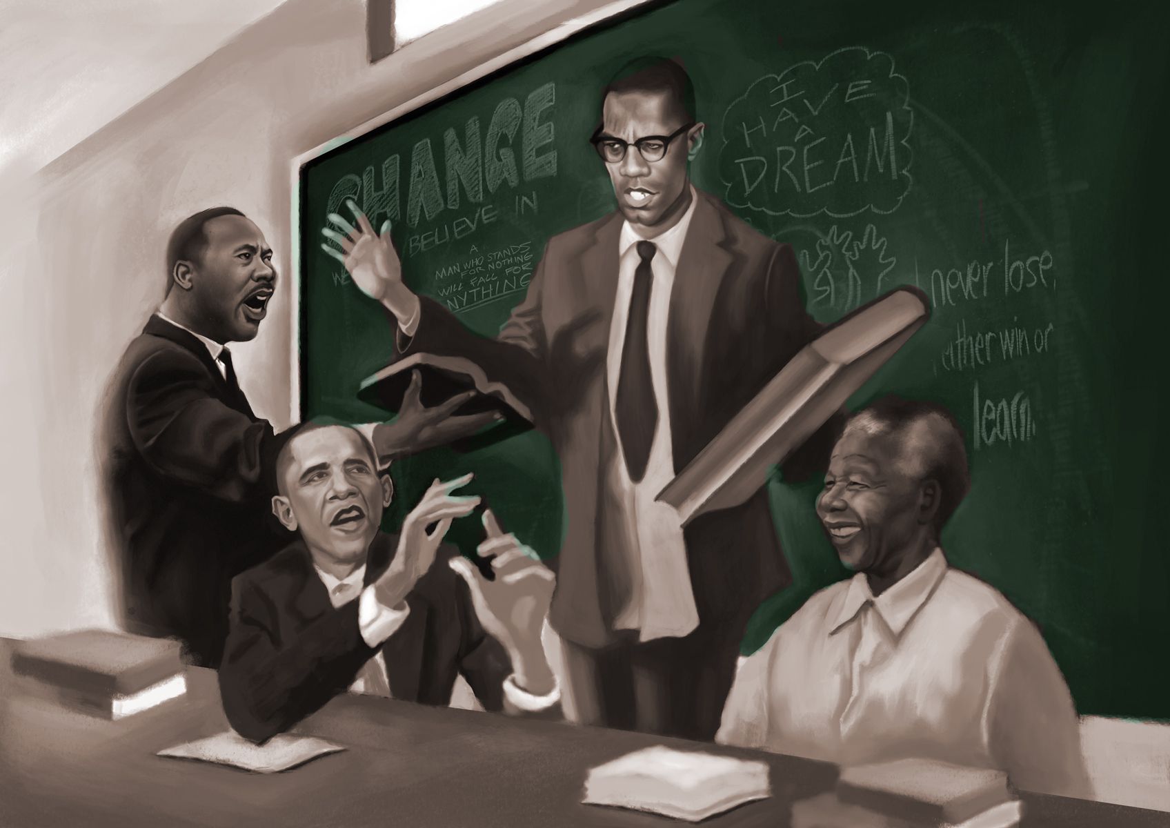
-
I like the change to Malcom's shirt and positioning. I think that really brought the piece back together. Everyone feels in proportion now. The only thing I would say about him though is his book looks really big!
The color on the chalkboard is really working well too.
Nice to see some progress.
-
Cool concept. Are you looking for critique at this point?
I'm loving Mandela sitting there grinning.
-
@theprairiefox thanks. Malcolm X part was bothering me a lot until I shot some new reference.
-
@TessaW thanks. A critique would be helpful rn, but I'm going for that Chris Van Allsburg's Polar Express look. Not looking forward to adding more details as I go along.
-
Finally done. Please let me know what you think.
-
@Durrell-Odom looks very good. Nice to see it finished.
I love your stuff can’t wait to see more.
-
@theprairiefox thank you and appreciate you following this project for a while.
-
It’s really clear who everyone is. This turned out so awesome. Also a fan of your work here! Thanks for posting for all to see.