WIP for February the LOVE month 😂
-
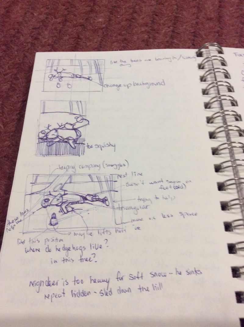
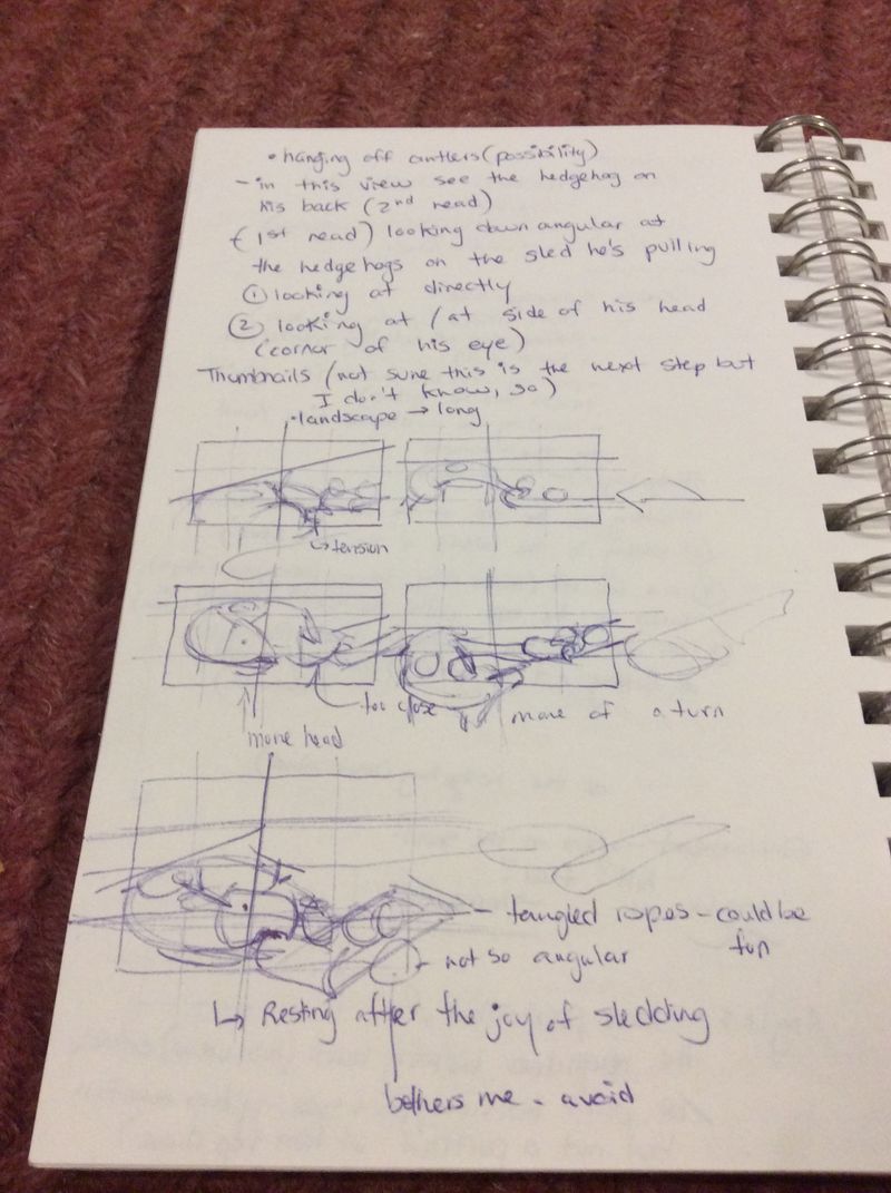
So this is work I hope to have drawn sometime this year - I came up with it in December 2018. It’s about a deer or elk who has hedgehogs for friends and decided to take them for a sled ride. They are quite light and so the sled sits lightly on top of the snow but because the deer or elk is a heavier beast sinks into the snow every step. Which composition do you guys favour? I already have my choice but any additional thoughts I always appreciate. I added a tree house for the hedge hog in the composition one that I like, the last one on the first page. Thanks!
-
@Heather-Boyd This is a great concept. I see where you're headed with the 3rd composition. It might be interesting to see evidence of the deer sinking into the snow. Can't wait to see where you go with this.
-
@Elaine-B Thank you, I plan on showing the evidence of a sinking reindeer. I have pinterest researched how a reindeer sinks into snow and how they lay down in general and see how I can merge the two. I am also using the Beginners Photoshop frog drawing as a template to play around with my painting style approach.
-
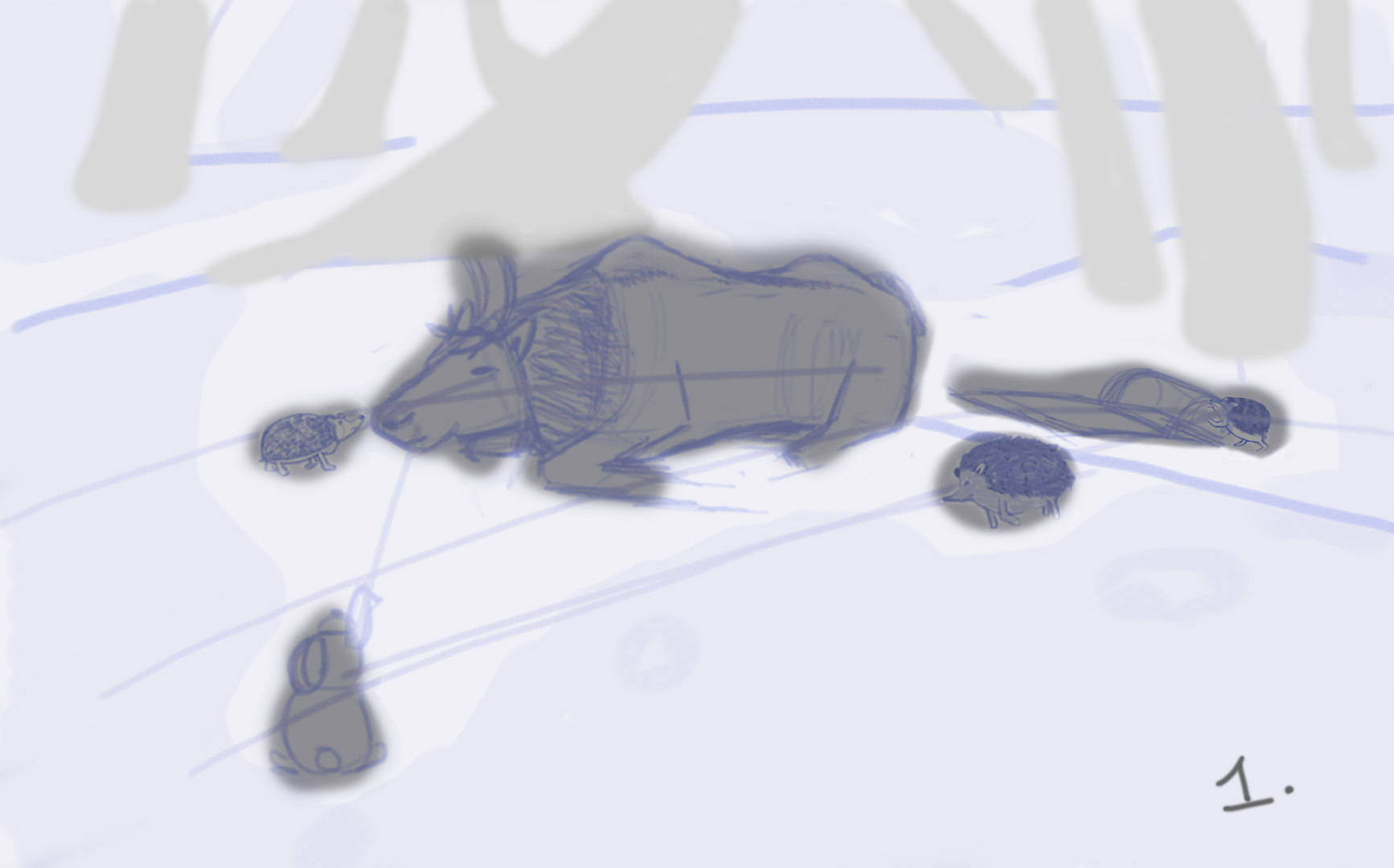
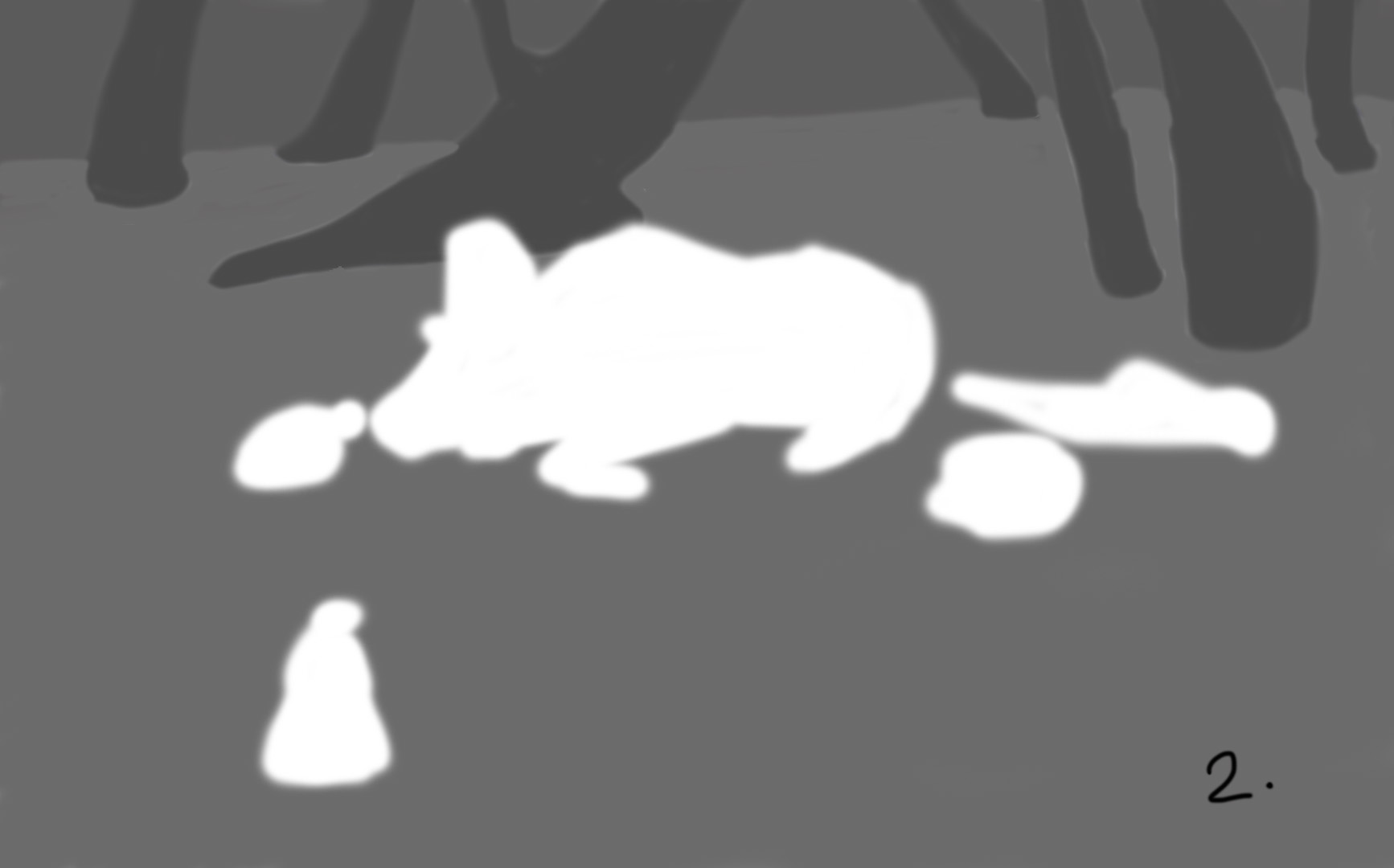
I found after watching Emphasis and Unity on Creative Composition 01 I needed to go back and do a value grouping thumbnail as well as emphasising with characters being a lighter or darker value than the background. So I did these just now.
- Being lighter outside with creature characters having a darker value. It's a bit more cheery.
- Would help emphasise how tired the reindeer is (as it is late outside).
I had started to visualise the creature characters so I sketched two pages of helpful references (not shown here). And sketched out my ideas (not nec. cohesive right now - sort of cut and pasted them together).
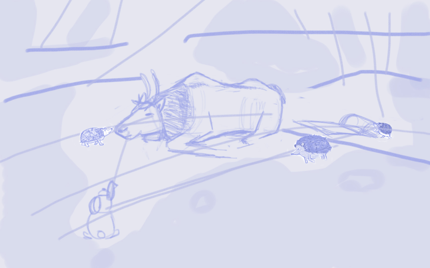
That's where I am at. Comments or constructive criticism is always welcomed.
Do you like the lighter one (1) over the darker one (2)?
Some of the characters/ sled may be too close together -do you agree and where?
Any tangents that upset you?
Also (I forgot) do the animal's sizes look proportional to each other and with distance? Hedgehogs are quite small lols.Thanks
 I am trying really hard to incorporate my Creative Composition 01 class into this piece. About 50% through the class material.
 -
Hello @Heather-Boyd -
This concept is adorable!
- I agree that the lighter one is a bit more cheery, and so that's my preference given it is a bit comedic.
- Perhaps the hedgehog to the left of the elk at a bit of a tangent or close placement to the sled? Could you have the sled at a bit of an angle upwards (coming down a small embankment perhaps) to capture the driver of the sled a bit more?
- I think the animal sizes look proportional.
I'm a complete newbie, so take these comments for what they are worth.

-
Thank you so much for responding. If you have an active heartbeat I am happy to hear your comments -newbie doesn't determine worth!

I am so happy you found the "it is a bit comedic" - I agree I like the lighter one. I will play around with slanting the sled and that tangent (
 )
)I hope to see you comment more!
Thanks -
@Heather-Boyd thanks for the kind words. I'm excited to see the final!
-
@Heather-Boyd I really like the concept, it's really heart warming.
I think you could make the elk look a bit 'heavier' in relation to the other animals. I also agree with the idea of putting the sled on a slope and giving it more of a dramatic composition. I recently finished the Creative Composition course, its amazing. I look forward to seeing where you take this. -
@lovetherobot I have been trying to sink the reindeer into the snow with deeper visible footprints and just now thought to add some weight by possibly adding snow on the bottom ends of the reindeer. The sled is on more of a slope now so thanks @djly and @lovetherobot

I haven't got a rendering style but I am playing with pastel and charcoal brushes right now.
Thanks!

-
So I finished and posted on "LOVE" Contest. Later this week I will post smaller process -it was far more scattered than I'd like but I learned an impressive amount. And I will update you on what I learned at that point. I spelt February wrong and realised that my snow was too yellow. So I made small changes.
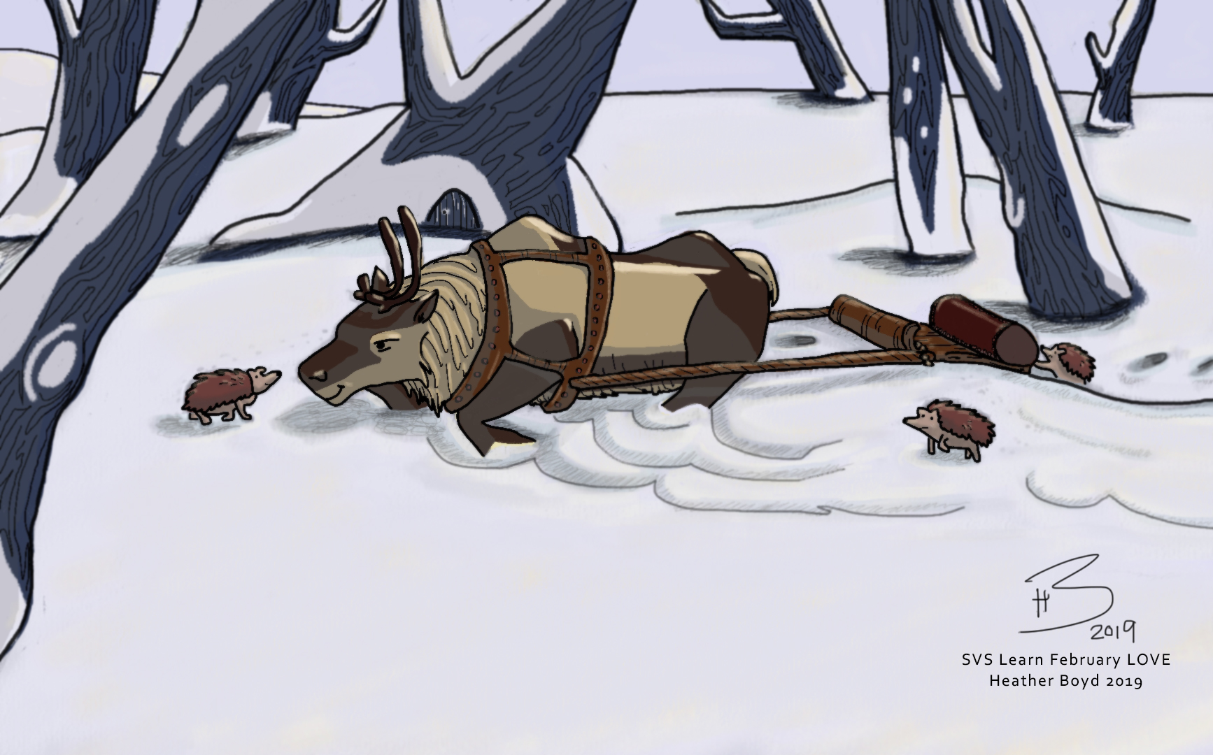
I am very happy with it and look forward to working it into a personal style, with some more experimenting and line practise (lols).