I’m stuck on an illustration
-
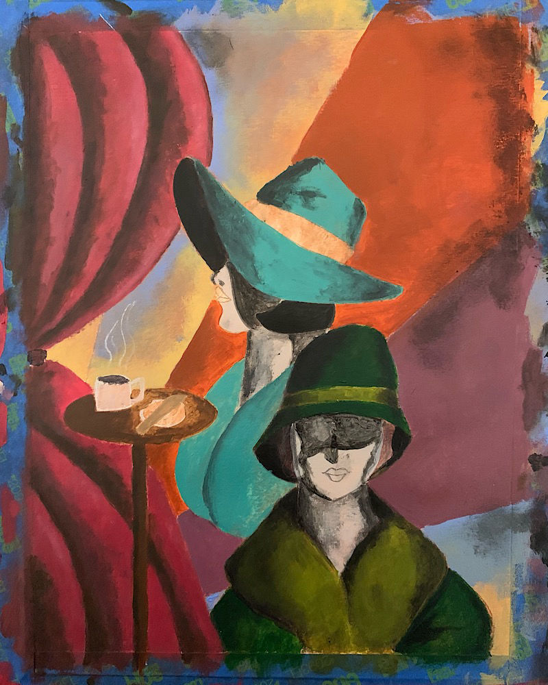
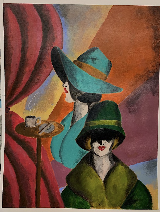
So I’ve been working on this illustration. It’s inspired by 1920s Art Deco posters most often seen for movies or ads. My reason for doing it is purely technique related. I loveeee the grainy shades and highlights found on the Art Deco posters of yesteryear. I tried to suggest that technique with a bit of a different spin attempting to make it more blended than grainy. But I’m stuck. It isn’t finished because before I go further I wanted help trying to make the lines more clean. I’m also stuck on the shadows. Also wanted to see what everyone’s initial thoughts are. What can I fix before I finish it completely? Thanks! It’s acrylic paint on cold press watercolor paper.

-
@12before34 I like the influences you are using here. I think it could come out very interesting indeed.
First on the shadows. I think the face shadow on the woman behind is working well. It creates a nice air of mystery and it feels appropriate with the large hat. But the shadow on the woman in front does not seem to register for me. I think if you cut back the shadow and showed her eyes you would also be able to add specific feeling to the piece (sultry eyes, sad eyes, whatever you are looking for).
Second, you may want to ground the woman behind. She seems to be floating because her dress/coat just stops in mid air. Even a hint of a line moving to the bottom of the page would help ground her.
Just a couple thoughts, good luck and hope it helps.
-
@12before34 if you're looking for a very smooth line, in the future you may have better luck with hot pressed paper, the cold pressed paper has some toothy-ness to it that you're fighting against when trying to get clean lines.
A tip that may help with this piece is to use low-tack tape to create a mask around the part of the piece you're painting, that way you can be really aggressive with the paint all the way up to the edge and still get a nice sharp line when you remove the tape.
You may also benefit from adding a flow aid (not water) to your paint to make it less thick. This will help it blend a little better and the slower dry time will allow you more time to blend colors into smooth gradients before the paint drys. Using water will thin out the pigment and give you a transparent look but the flow aid is able to thin the paint without effecting the final color too much.
-
I'm not an expert on colors, but they're something I'm trying to learn about currently. I like the overall color scheme you have going on here... I think it works well with the style you're going for. Unless you're trying to copy a very particular style that matches what you've done here, I might suggest staying away from black for your shadows. Try blues plus browns for the darkest places, or blues plus deeper shades of the colors of the forms you are shading. One example of where this might make a difference is on the faces, where your current shadows in the flesh tones have become grey. Again, if what you have is what you're going for, I think it looks great as a stylized piece, but here is a suggestion to try. Thanks so much for sharing your work. I think it's helpful to everyone's learning processes to see critiques in progress.

-
@theprairiefox Thank you
 I totally agree that I need to ground the woman in blue. That’s an update I haven’t made yet but am going to ASAP. Her coat has a large collar so I’m thinking of making her actual coat a darker blue. I really like what you said about her hat and shadows creating an air of mystery, that made me happy because that was totally my intention.
With the woman in front (and the other woman) I purposefully covered her eyes with shadow because (and this might be a bit of an abstract idea) I always see eyes as a personality trait. I wanted to avoid giving these ladies too much personality because my intention is that they’re less of a character and more of an element to the overall atmosphere of the illustration. Unfortunately, I can’t cover her up without it being an off looking shadow lol. I’ve added more to the illustration including deepening that shadow that I’ve attached at the bottom of this post. I’m also thinking of turning that bizarre biscotti into another cup of coffee haha.
@StudioLooong Thank you! The advice about hot pressed paper is very much appreciated and i will definitely pick some up. I do have two mediums at home that I use in my canvas paintings (I paint abstract work on canvas primarily) and that is gel medium and gloss medium & varnish. I also have satin varnish that I prefer over gloss to finish my paintings so maybe I can mix a little satin varnish with the paint (I’m out of my gloss medium and varnish). I wonder how well that might work.
@KathrynAdebayo
I should have mentioned earlier that the skin tone I’m going for here is gray. That’s done purposefully but I see what you mean about the shadows being tooo gray. So, I used black for shadows for the ladies. But I used burnt umber and a dark red for the shadows on the curtains and burnt umber and deep violet for the shadows on the green clothing. Perhaps I should have stuck with the same mixture for each shadow. Thank you so much for the suggestions Perhaps I could scan it into photoshop as well and do some retouches
I did the line work in pencil, outlined it and made changes to the composition on my iPad in Procreate and then turned the lines into a vector file and printed it out. I then used carbon paper to transfer it to the watercolor paper, this way I can keep experimenting with the coloring without having to keep sketching out the line work over and over again.
