Feedback on WIP thumbnails
-
I have started an illustration and am using Will Terry's check list.
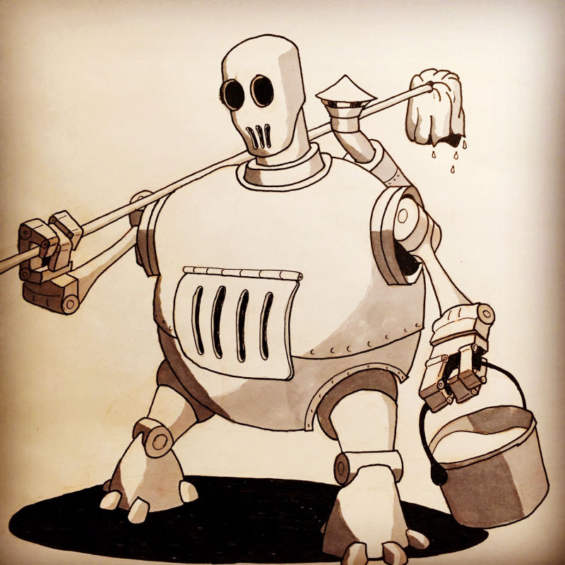
The prompt for the illustration is "The Passage of Time" for a local show. The basic concept is to have a small girl finding or working on an old broken down robot.
One thing to note is that I intend for this to be finished as a drypoint (so it will be B&W lines). I may add a tiny bit of watercolor (think maybe red scarf or something) if it makes sense.
List
- Objects : gears or pieces of the robot, trees
- Characters : Girl (6-10 yr old), peasant or farm girl. Robot, resting peacefully, humanoid, no violent undertones.
- Environment : Snow / winter, forest or mountain
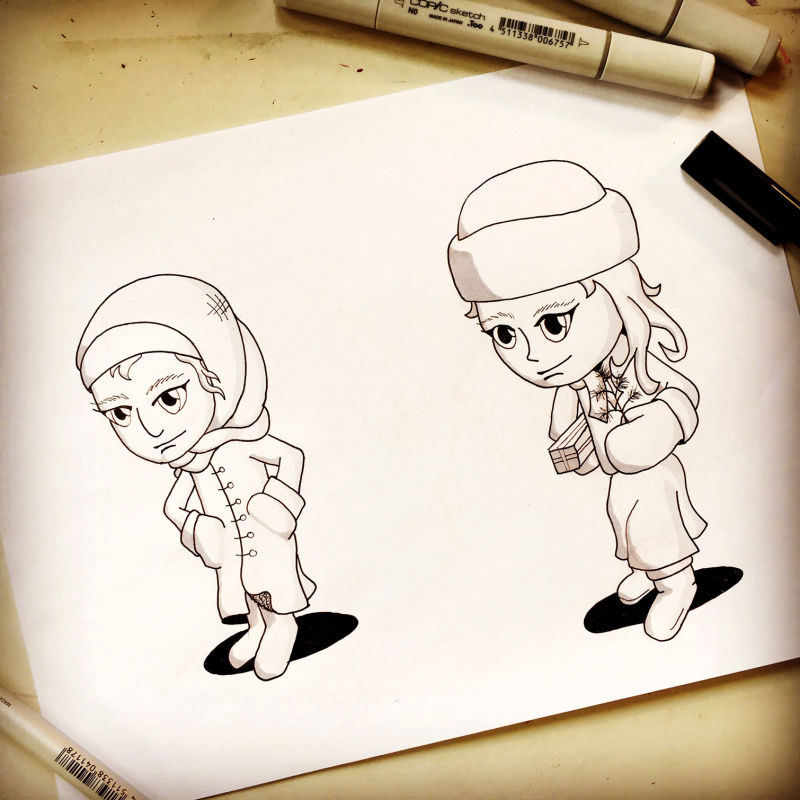
Next, I developed a few character designs.
and
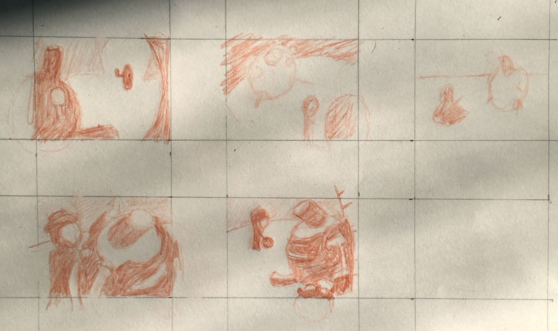
Finally, I am working on the thumbnails. Here is what I have for those and I would appreciate thoughts on them. I am leaning towards the last one but the first and second to last are both interesting too. I am using the snow on the robot to help with definition. Let me know how you think they read. Or what I can do to improve them before I move on.
Thank you in advance for the feedback.
-
@theprairiefox Kudos for actually DOING the thumbnails
") It's a step that a lot of people tend to think they can skip (I have suffered many broken hearts from a composition that just doesn't work in final)
It's a step that a lot of people tend to think they can skip (I have suffered many broken hearts from a composition that just doesn't work in final)I'm leaning toward the first one, or the last one, Both for the same reason; they're both using huge objects vs small objects (That's a big point that gets rementioned in many of the videos. Think not just big but huge/collosal/gargantuan things contrasting small objects.)
If you go with the last one take care that the robot's head doesn't form a tangent with the top of the frame.
As for character design (this may be something you do for your next project) I'd watch the 'how to draw anything' class. It'll really help you nail down those basic shapes when creating characters.
Neat work so far! Please post the final picture, I'm interested to see how it turns out
-
@art-of-b thanks for the tips. After re-looking at it I thought saw the potential issue with the tangent of the head at the top on the last one. I think I will go forward with that one but reposition it just a bit. I intended the head to be at the 3rds focal point.
I hadn't thought about the exaggerated size difference as helping with the contrasting objects. That is a great point. So many things to think about.
On the character designs, I have watched the 'how to draw everything' class and was using it pretty heavily to do the basic character design. I was wondering what things you saw that didn't seem right with the basic shapes. After re-examining I see a few things but was curious what you were thinking.
I will make sure to post more on this as it progresses. Thanks for the feedback, very helpful.
-The Prairie Fox
https://www.instagram.com/theprairiefox
https://www.theprairiefox.com -
@theprairiefox said in Feedback on WIP thumbnails:
So many things to think about.
Just when you get used to juggling 2 balls they up and throw you a chainsaw, right?

If you're thinking about those basic shapes then you're on the right track. It takes practice and time to really get those sphere to look like spheres and those cylinders to look like cylinders.
-
@art-of-b Yeah, it is difficult cutting spheres into spheres and cylinders into those. You can definitely see some of that struggle with the robot. Thanks again for looking at these. I will post an updated thumbnail soon.
-
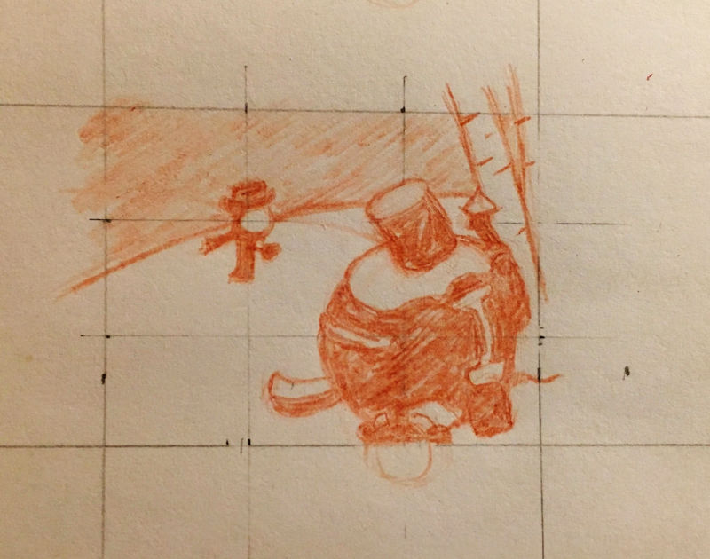
Updated the last thumbnail to better align focal points.
-
Finished the initial composition sketch! Let me know your thoughts. Tangents? Values? Balance? Anything look funny?
Feedback is easier to work in now than once I get into the final.
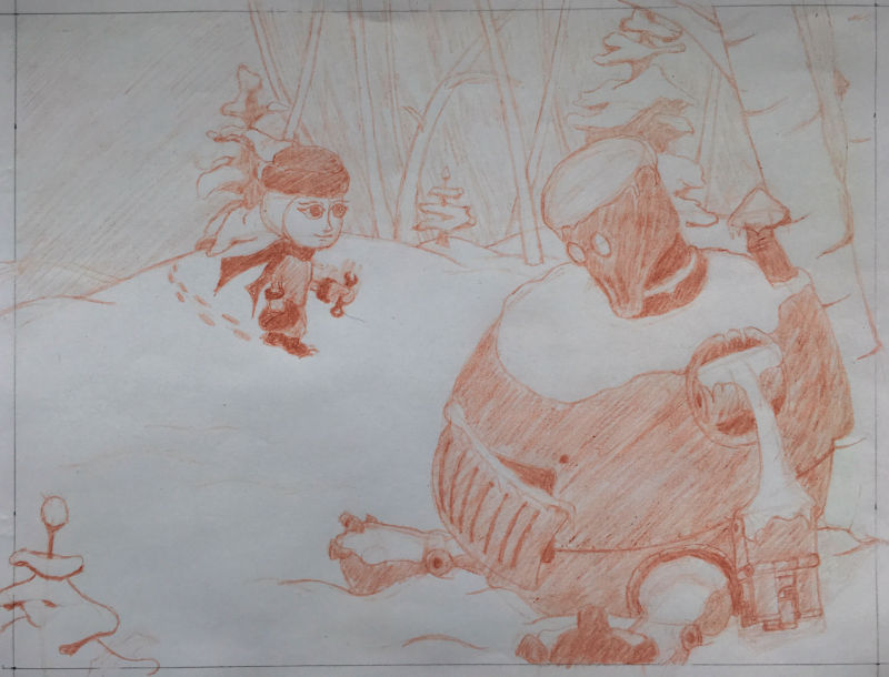
Thanks for looking and commenting.
-The Prairie Fox
https://www.instagram.com/theprairiefox
https://www.theprairiefox.com -
@theprairiefox I'm having trouble pinning it down exactly but I think there is something with the perspective on the person coming down the hill. Like... I can't tell how close she is supposed to be or something. She looks smaller relative to the robot and further away in the small thumbnail.
Her face looks like the angle on it might be slightly off, but it could be on purpose. Not sure of your style. The head seems pointed a tiny bit to the right edge and the eyes more just drawn straight, but possibly on purpose.There is a risk of tangent on the robot hand and back but I think it's ok as is.
You've got a few paths inf for the eye as well.
Just my two cents. Mileage may vary.
-
There is something about the tree right behind the little person coming down the hill and that big blank space to the left that feels wrong to me. Seems like there should be a little something off to the left to balance things out. There is a lot of weight on the right of the composition compared to the left side. It might tip over
Love the robot!Marsha Ottum Owen
-
@marsha-kay-ottum-owen and @ThisKateCreates thanks for the feedback. I had many of the same thoughts.
I did a test with line work (as I am going to finalize this in drypoint) and some of the same things come out to me as well.
Here are a few of the things I plan on working on:
- I think I liked the smaller version of the girl in the thumbnail. This will cause less detail for her but I think it will enhance the piece. More focus on the robot.
- This will change how I render her face as it will get much smaller and I will have less detail.
- I will do something about the balance of the background... I think I may try to put the empty sky behind the robot and put the forest detail behind the girl.
Let me know any feedback on the line work as well if you have any. I think that I might try something a little different for the major parts of the robot. I like most of the details but am not 100% sold on the main body.
Thanks for the feedback. It is nice to have others to collaborate with.
-
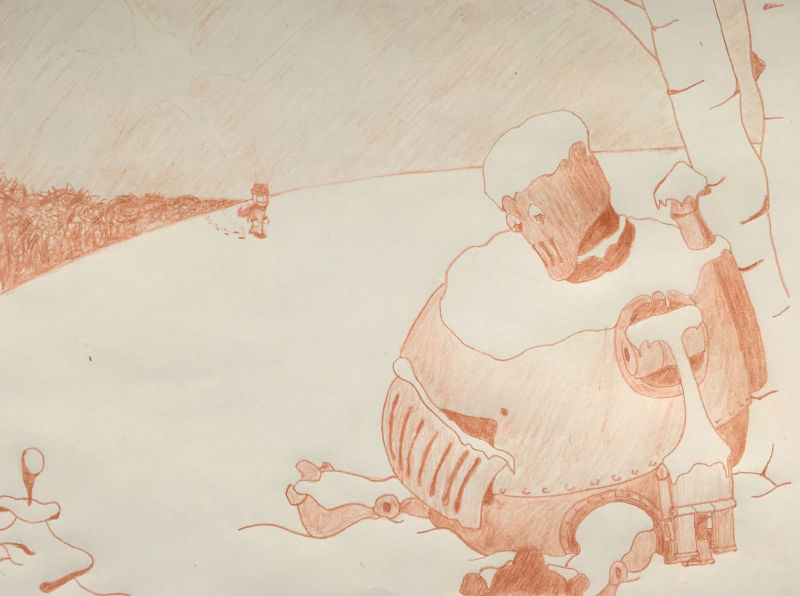
@Art-of-B, @Marsha-Kay-Ottum-Owen and @ThisKateCreates I have redone my comp based on your feedback and some changes I wanted. I wanted the piece to feel more lonely and lost.
I pushed the girl much farther away. I think this makes the robot feel more abandoned. In doing that I had to change the background as well. The trees are pushed further back and I kept them on the left side only to balance out the robot better (I think the overall balance improved.) To help with that I also added the sun on the left side (not sure if you can see it very well in the comp). But both the trees and the sun are pointing to the girl bringing focus back to her and the robot.
Let me know what you think.
-The Prairie Fox
https://www.instagram.com/theprairiefox
https://www.theprairiefox.com -
@theprairiefox That looks much improved. The tree line does draw the eye to the girl but also intersects her ear where it disappears. I might draw them out past her. The bottom left tree might be worth looking at adjusting too. Things coming into the foreground can be nice but it feels like a solo element instead of grouping with the robot so it could be distracting.
-
@thiskatecreates thanks for the quick feedback. I will play with those elements and see what I can do. I do like the feel it much better now. Much more what I was going for.
-The Prairie Fox
https://www.instagram.com/theprairiefox
https://www.theprairiefox.com -
@theprairiefox I think the idea is getting across more now. I see this more isolated idea. Pretty cool!
-
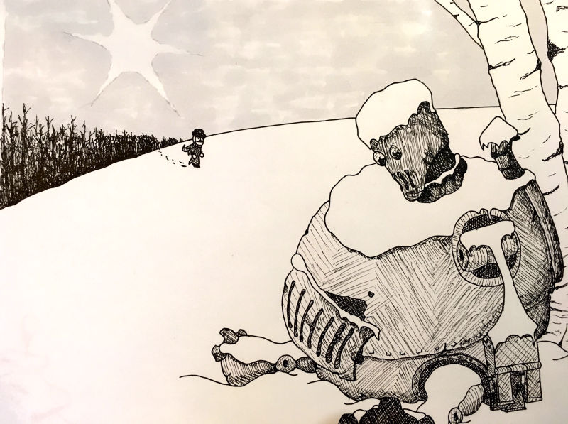
Here is my final inks. I will be re-rendering using drypoint next.
@ThisKateCreates I made some changes around the tree line and removed the foreground tree. I like the effect... I think it looks even more barren and lonely.
I also did the inks in a slightly different style adding a more distressed look to the robot. I think it came out pretty nice, we will see how much carries over into the drypoint.
Any feedback would be appreciated. Otherwise enjoy.
-The Prairie Fox
https://www.instagram.com/theprairiefox
https://www.theprairiefox.com -
@theprairiefox Looking good!
-
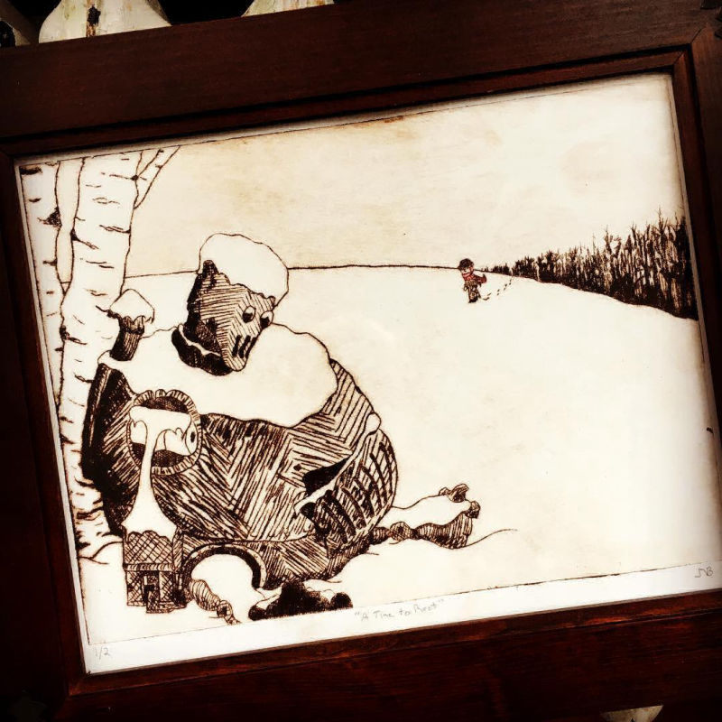
Here is the final! It is finished, framed and was accepted for the an art show at a local gallery. It is my first work to be shown. Wish me luck. It was very fun to do the whole process and see it come out.
It is definitely not perfect, but it is finished! And I am pleased with the results.
I learned a ton about the whole process. Thank you all (@ThisKateCreates, @Marsha-Kay-Ottum-Owen, and @Art-of-B) for your feedback it improved the piece a lot.
-The Prairie Fox
https://www.instagram.com/theprairiefox
https://www.theprairiefox.com -
Nothin' better than finishing a piece
Awesome work!
-
@theprairiefox Congratulations on a job well done

