Poster Illustration—Watercolor + Digital Process
-
Scroll to the bottom if you just want to see the finish and don't care about the process
Hullo, everyone! I've been on the forums for a while now, but other than my intro I think this is the first illustration I'm posting

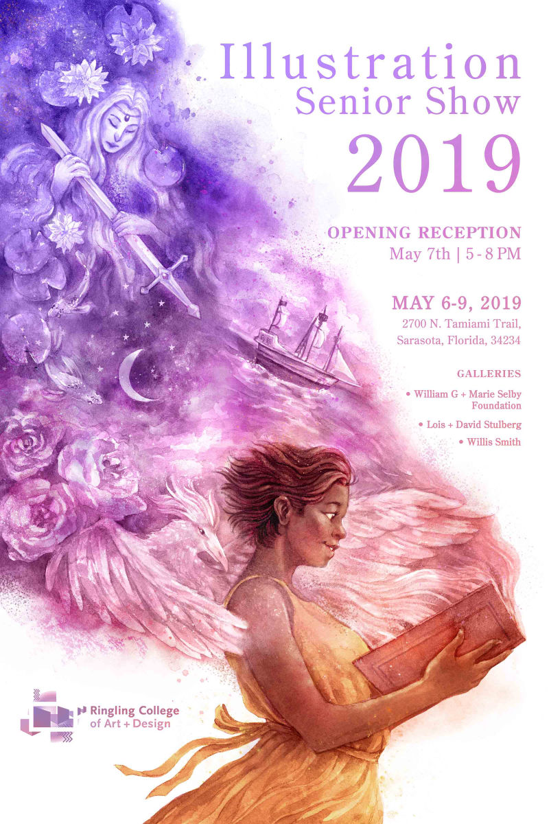
So the illustration department at my school decided to do a little poster competition this year for our Senior Show poster, and this is my entry. Although our thesis projects are pretty open to whatever we want to do, our only criteria is that we need to create a book of some kind. So it's not the most original idea, but I wanted to represent that aspect of the show and symbolize different imagery you might find if you pick on up.
I thought it would also be fun to show and describe the process I've been using for my finished illustrations lately, especially since I've been combining watercolor and digital and I haven't really seen a similar approach on the forums.
1. The Sketch
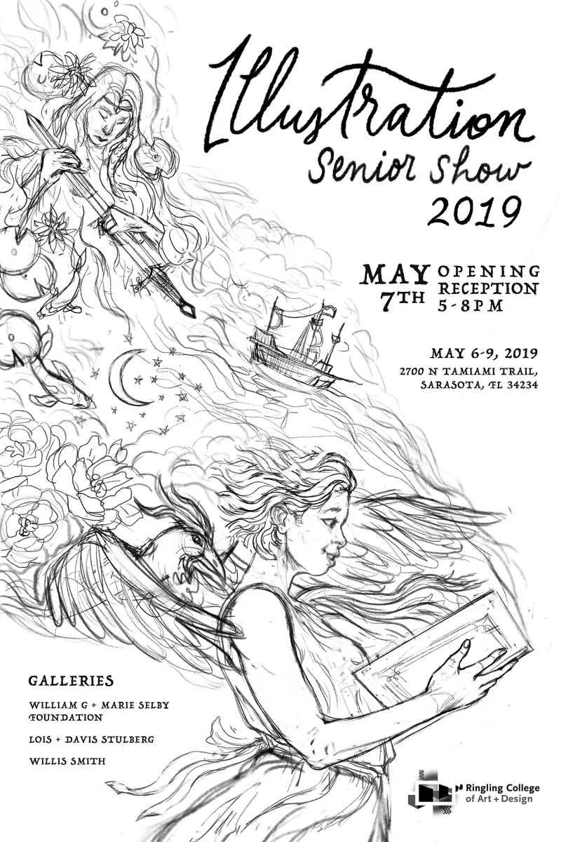
If I'm doing a random painting or just working in a sketchbook, I just sketch straight onto the paper, but when working on an illustration I always do the sketches digitally. I'm a lazy artist who hates drawing things multiple times, so it allows me the flexibility to move things around, resize, and version things out. It also allows me to screw up a lot since I've still got a lot of work to do on my drawing skills.
Really rudimentary idea thumbnails might be traditional, and then more refined 'showy ones' digital, but I didn't do thumbnails for this because I knew my concept and I honestly just didn't want to. Lately I've noticed I'll just do a minimal scribble for the idea in the corner then delete it and edit as I go.
This is the level of finish to which I probably ever work to in sketch stage since a.) I'll refine/edit it when I have to transfer it to WC paper, and it's a waste of time for me to essentially draw the same thing twice, b.) I like to make final/spontaneous decisions while painting. For me drawing is fun, but painting is even better. I also just draw faster with an actual pencil for some reason.

2. Transfer
I unfortunately didn't scan the pencil line stage. I printed out the sketch, taped it to my LED light pad, taped my WC paper on top and traced it. Some people use transfer paper, but I've found that takes me forever, isn't as clean as this tracing, and can leave little nasty spots on the paper. I 'finalize' my drawings at this stage. (I usually end up changing things when I paint regardless)
3. Traditional Painting
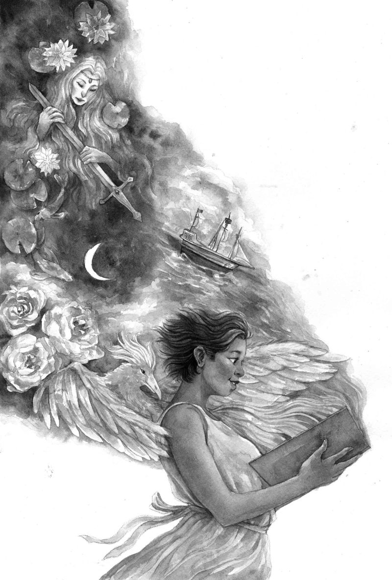
This is a little different than I usually do, since I prefer painting in color, but I was also doing Inktober when concepting this and had other projects, and didn't want to go through the trouble/time of coming up with a color scheme and painting a bunch of color studies. So in the spirit of Inktober I just painted it grayscale, which I actually hadn't done before for a WC illustration surprisingly. I kept it pretty midtone because that's one of my tendencies, there is a lot of negative white space in the composition, and I knew I'd have more flexibility in the edit later. I'm sad that I killed some of the movement in the sketch like in the hair, but that is something I'm working on.

4. Photoshop, Color, + Finish
The poster size is 24X36 at 300dpi, but no way I had the time to actually paint that, so I painted it ~11x17, but scanned it in at 800dpi. I cleaned it up in Photoshop (balanced the values, cleaned up the paper, fixed some mistakes, yada yada) and if it was painted in color that would've been that.But I painted it in B+W, so now I had a problem. I had no clue what colors I wanted for it. Also one of the reasons I paint traditionally; I am forced to work within certain limitations and can let the pigments do a lot of the heavy lifting. I take so much longer digitally due to indecisiveness alone, my goodness. Mad respect to all you digital painters who paint such wonderful things. I attempted to paint everything with local color but it looked bad and was talking too long. Can't have that if I'm on a deadline.
I usually colorize B+W sketches/paintings, so I did a few random things before slapping a gradient on it and messing with the hues until I started to feel like I was getting somewhere. I added a slightly different hue to the skin and made the dress yellow, but the base of everything else is a gradient. I scanned in a bunch of watercolor texture and blooms and played around with them. I tweaked and painted highlights, shadows etc. I pushed the stuff coming out of the book back a little as well. Just a lot of tweaking. Finalized the type (RIP me) and then here we are


It ain't perfect, and I can't say it turned out how I pictured it, especially since I didn't have a clear picture of it in my head, but I do think it captures the warmth, spirit, and magic that Illustration holds for me and my classmates. There are a lot of amazing submissions, so I'm not holding my breath, but it's a decent portfolio piece I think

If you actually read all this, have a virtual high-five!
-
Thanks for sharing your process. Would love to try a similar process - paint in bw traditionally and color digitally. Very beautiful piece.
-
@xin-li Thanks for reading it! It's also fun to paint it in color and spruce it up digitally too
 Then you get all the fun watercolor blends and granulations.
 -
OMG!!! This is GORGEOUS!!! Before comitting to the style I have right now, I really wanted to do watercolors digitally but my work just looked too flat and synthetic. It never lived up to the real deal. But you made it work perfectly! You need to make a video tutorial of this. I just love your colors, your textures, your concept, everything. This is amazing!
-
@nyrrylcadiz Aww, thank you so much, Nyrryl! I might make a video when I have some free time

Before I developed this process, tried to do a 'digital' watercolor, but it was never really quite convincing or satisfying. But I love the flexibility of digital, so I figured I would combine the two! I started out only fixing flubs I made while painting, then really changed my outlook after needing to make changes after class crits or version my art for multiple uses at work.
By painting traditionally first, in addition to being fun, it lays the groundwork and produces the quintessential watercolor texture and accidents computers can't yet. I usually work in color from the beginning too, so that also lets the paint do funky cool stuff computers have yet to learn. With that done, I then have the freedom to do whatever I want
 Once I really screwed a characters face up real bad near the end of a painting, repainted it traditionally, then stiched it in and only I knew.
I scan in additional textures and blooms which are what push it over the edge in my opinion and make it more convincing. I also stumbled upon a perfect speckly PS airbrush that makes editing watercolor really nice. Blending modes are also crucial to this kind of process. I guess I separate it in my mind like the traditional step as the painting step and the digital part of this like photoediting.
This piece has more of a digital painting feel to it since it all digital color and lots of textures, but it's possible to hide smaller edits l. I always try to keep the overall watercolor magic. One day, I'll make it completely seemless! It helps to have experience painting traditionally to be able to make PS do what you want. As far as I know, the only way (so far) to get that authentic look is to put authentic scans into the image while still taking advantage of digital tools.
Some artists do 'digital watercolor' work which is really cool and amazing, but the edges never quite look right for traditional paint. They might fool you from a distance but a little closer and you can tell. I keep edges forever in mind whenever I take a piece from the WC stage to the PS stage. The transparency and diverse attributes of pigments makes it hard for programers to crackk completely.
All this technical froufrou is why I have to do traditional sketches to keep my sanity
 , although I end up scanning and tweaking those to post too lol! Sorry for rambling! Once I get started about watercolor I just go!
 -
@teju-abiola Don't apologize for rambling. This is all very helpful stuff.
-
I haven't been on the forums for quite a while but I wanted to login so I could just say this turned out great! Those colors are fantastic and I think that'd be a fund method to try sometime in the future. Thanks for sharing