Critique on a portfolio piece in progress :)
-
Hi everyone!
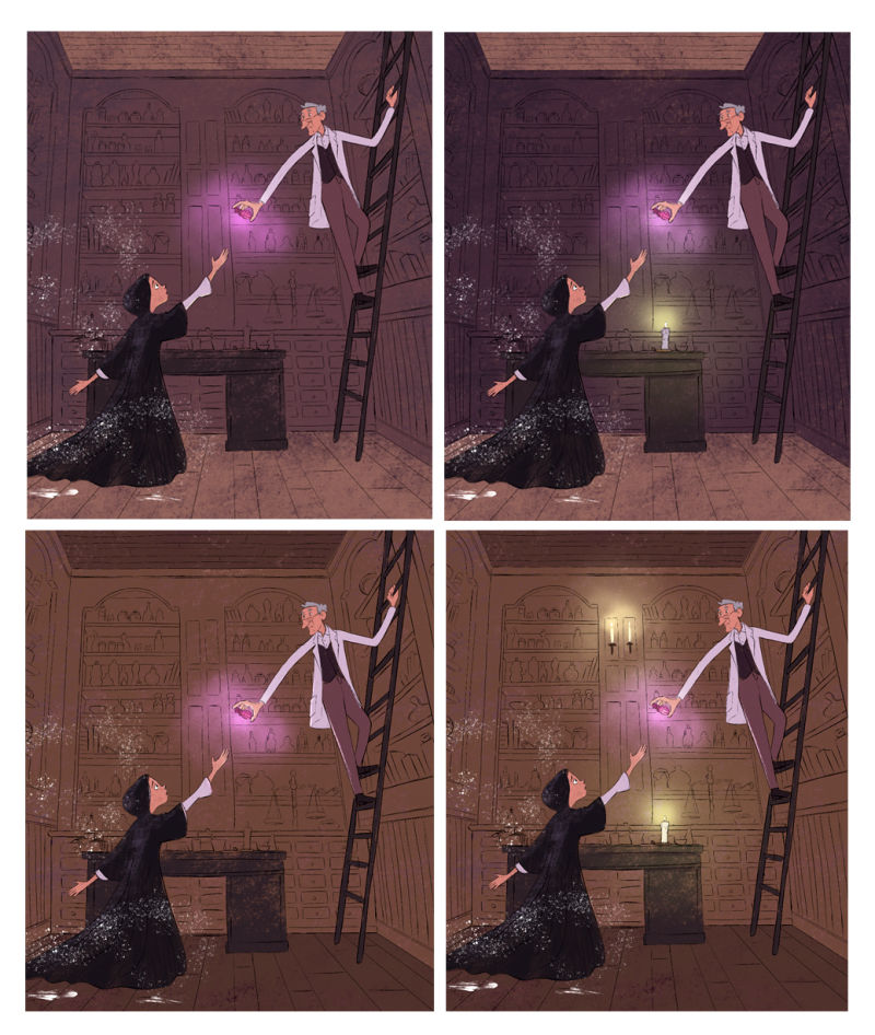
I am working on this piece for my portfolio and before I start painting I would like your opinion on the sketch and color scheme/lighting. Thanks as always!!
-
This is really lovely, i love your characters and their accentuated features
") I think I like colours of number 2 but I would lose the candlelight as it's a little bit distracting. I would maybe add some extra objects/detail in the foreground to frame the scene a bit better, at the moment it's looking a little empty and this room could be so interesting if there was a bit more to it. Maybe also add a bit of a vignette when you come to colour so the main focus is the light coming from the bottle? I'm also not sure about the hooded character's left hand, maybe that's something you could play around with.
I think I like colours of number 2 but I would lose the candlelight as it's a little bit distracting. I would maybe add some extra objects/detail in the foreground to frame the scene a bit better, at the moment it's looking a little empty and this room could be so interesting if there was a bit more to it. Maybe also add a bit of a vignette when you come to colour so the main focus is the light coming from the bottle? I'm also not sure about the hooded character's left hand, maybe that's something you could play around with.
I love the sparkles around the girl character, is she wearing a hood or is that her hair? If it is a hood then maybe you could add a bit of hair coming out too!
I'm intrigued to know the story of this piece too as it looks really interesting
-
I like #2 the best, the purple ish background colors are really nice! the dark bg blends a bit with the character's cloak though, all those values are pretty close. I think I'd put a candle on the left of the character on the table to really silhouette her against the background!
-
I suppose it all depends on what you want your focal point to be. The gentleman in the white coat stands out no matter what because of the, well, white coat. The fancy bottle pops most when the shelves are lowest in value, but then the girl is kinda lost because of her black cloak.
My gut says go with number 2. The single candle and really lets us know the room's dark and so the bottle glow really stands out. Looking forward to seeing all those tiny items on the shelves lovingly rendered

-
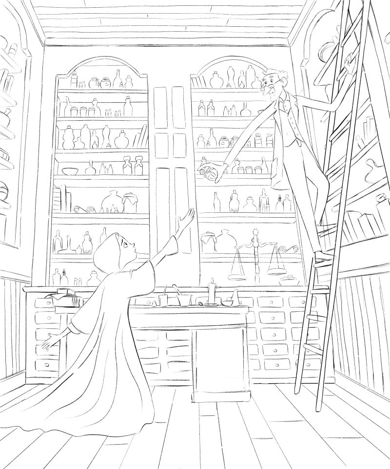
This is so mysterious! I like the story I feel in it. Your lines are so consistent and your hands are pretty - the little girl's especially.
I'm not SUPER great with words so I scribbled on your beautiful art - I apologize! Your style is so different from mine.
I feel that, since you are pretty dang consistent with perspective, that the professor's face should also be in perspective. If we are looking up at him, we should be able to see up his nose (gross, I know) and under his chin etc.
I was feeling a bit of tension because the little girl is reaching with awe and the professor is feeling a bit nonchalant. If that is the case: disregard my comment here. I made him look a bit more like he has just retrieved the phial and is carefully giving it to the little girl while also trying to remain safe-ish on that ladder. I shifted his weight a bit and made his hips/shoulders tilt in opposite directions. I also made the phial stand up straight and meddled with the pose of the hand to make it make sense a bit. I don't really like how my phial is setting riiiiight along the edge of that shelf... it's a tangency and I would stay away at night until I fixed it.
The little girl's face is also sublime. Well done.
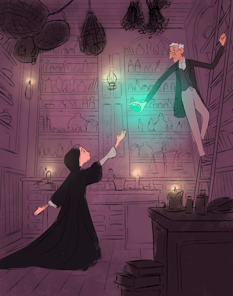
I added a bit more clutter around the room. There seems to be quite a bit of open space and I wanted the shadows to play a little more. Speaking of shadows: I may have overdone the light source, but I am a big fan of contrast. If there was a window to the outside or a fireplace to cast long, interesting shadows, then the phial would not have to be so... bright. I don't know your story so I went with this.
Your forms in the shelves have nice repetition but they may benefit from a bit of diversity as well. Try taller things, fatter things, etc. to push that visual interest around the room. This piece sort of reminds me of @Will-Terry and his #draw50things challenge. This is a prime candidate for that!
I painted her gown away from the edge of the piece. Perhaps it is supposed to be very lengthy though - in that case, really commit. It was dangerously close to being a weird tangency that would draw the audience away from looking at the focal point.
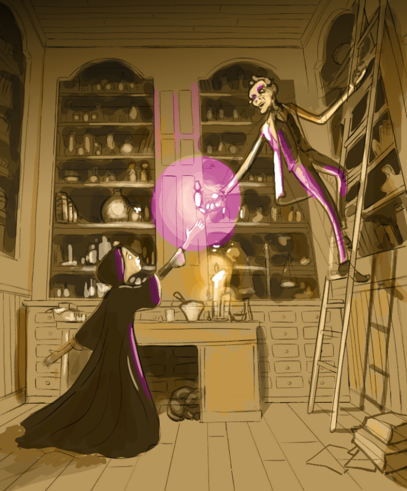
Color scheme: I really like your plum-ish background colors in your pieces and I DON'T think it needed changing - so I just messed around with gold and purple because... I dunno. I am not sure it's effective.
Focal point: I was having a real hangup with the white coat the professor is wearing. It is such a light value in the piece that I kept looking at it more than the phial. To solve the issue I just toned back the inside of his coat to reduce the overall real estate of that bright white and I used the shadows of his body to obscure the brightness on his left. This still makes me feel like the coat is white but doesn't compete too much for my attention.
I'm certain you're proud of this piece. It shows and you should be! -
@Bob-Crum @Art-of-B @NessIllustration @hannahmccaffery
You guys are awesome!
When you work for too long on something you kind of get a blind spot. I was really happy with my sketch but then reading your comments it felt so obvious something was missing! The main point is the foreground. It makes a huge difference I think. Also you correctly spotted the the white lab coat was way to much competing for attention. The only thing I am not sure about is the perspective on the man's face (@Bob-Crum ) Since he is looking down, I am not sure we would see up his nose... Anyone else has thoughts on this?Finally, I am still not sure what to do with the lights/candles. I tried having several candles producing very faint lights so it would compete less with the magic bottle. What do you think?
Thanks again for the help!!
-
This is so much better just by adding some foreground details, lovely work! It frames the scene a lot better and tells us more about the type of room they're in, i'm looking forward to seeing it all in colour!
I'm in two minds about the perspective on the man's face, I do like yours but I also like @Bob-Crum version, so it's whatever you're happy with I guess, you could always try both and see which one looks better?
I like the addition of lots of different candles, I'm sure if you keep their light source quite low then it shouldn't distract away from the purple bottle