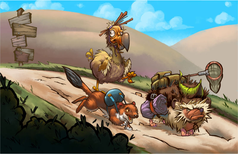
Traveling Animals WIP
-

Hey all, I posted the start to this painting about a week ago and got a lot of great suggestions from you guys. Here is what I have so far but I must admit I’m not super satisfied with it and am not really sure what isn’t working about it. Again, I need your guys help to lead me in the right direction. Thanks again for any and all help.
-
This is really cute and your animal characters are hilarious.
A couple of things I’m noticing that might help:
-
Your hills in the background could maybe use a more organic flowing shape. They are just two round humps and look kind of unnatural.
-
Check your values. The values of your foreground objects seem pretty close to the values of your hills. I see that you have lightened them a bit, but maybe push that a little more.
-
You’ve got a grass line that creates the border of your path on the lower left corner and then on top of that some bushes. It’s kind of an awkward overlap and I think you could lose the path outline and you would have a much nicer and more interesting shape to your path.
-
-
@kristin-wauson
Thank you so much, your advice has already helped! I got rid of the grass boarders and it looks way better now. I’ll mess with the values some more, I can see what you’re saying about the hills. I wanted to add something to them like a small village or cows grazing or something so that’s why they are as plain as they are. Again, thank you for the advice! -
You’re welcome! Glad I could help. It did look like those hills were not quite finished so that makes sense. The level of finish was not the same as the stuff in the foreground. I’d love to see more progress as you work on it.

-
Hey @mikecañas I think you did a great job of getting a sense of personality in the characters and each of them really comes through. Nice work!
I would agree with @Kristin-Wauson about values. I think it might help to spend some time messing around with big value shapes. What I mean by that is are there ways you can group things into bigger value clumps?
I feel like what's happening right now is that you have a really great sense of detail and the small things like the character's expressions and conveying their personality through their pose, props, etc. working, but the big picture is kind of falling apart because the big shapes aren't leading the eye.
I don't know if that totally makes sense, it's hard to convey just writing, but to me that's where you would get the biggest gains in making this a stronger picture.