Misunderstood Monster WIP
-
Ok so i haven’t really made my piece for this month’s prompt but i thought it would be fun to share a piece i made a while back that relates to the topic.
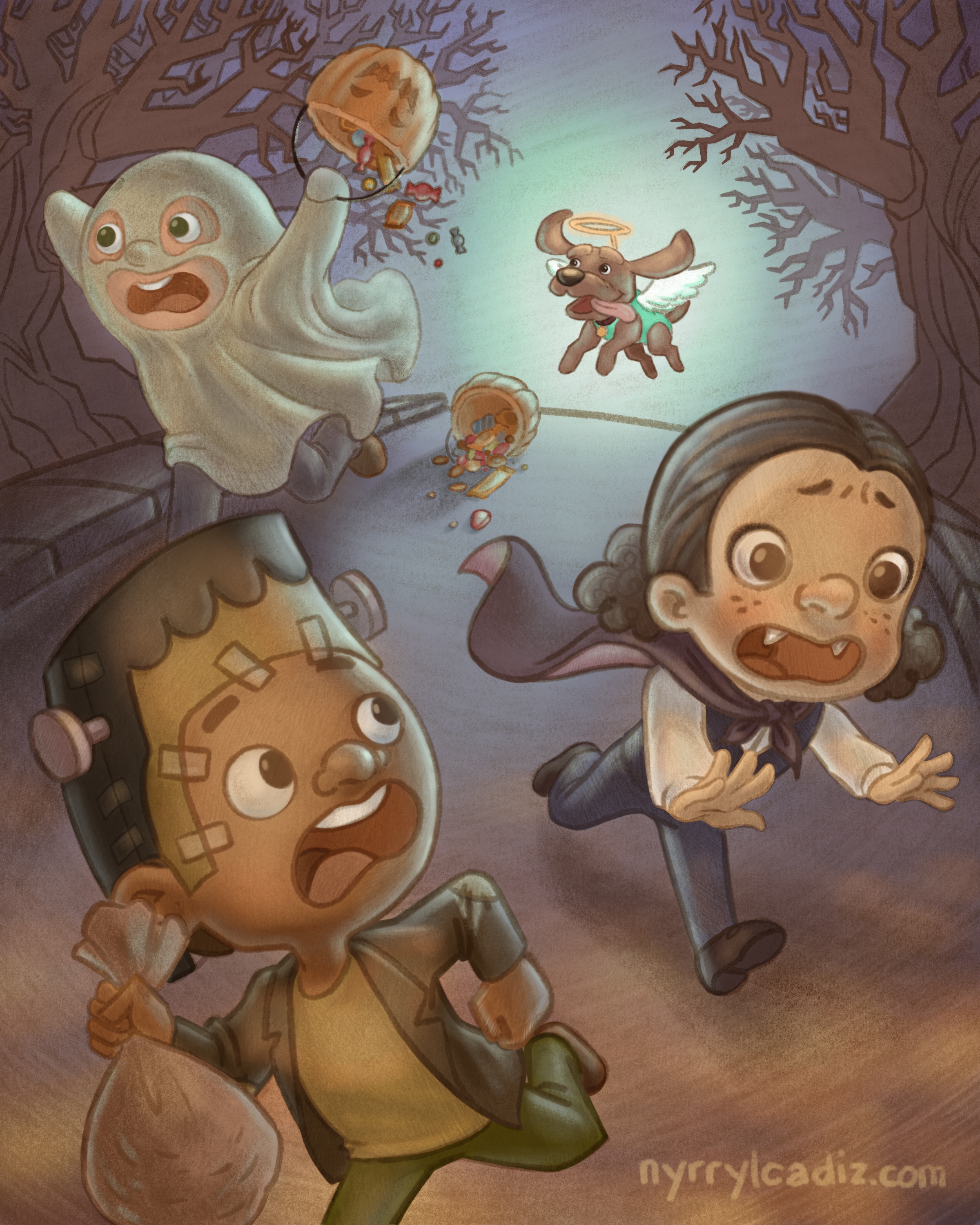
How’s that for a misunderstood monster? hahahaha!
(The illustration above is not my entry for this month)
-
@nyrrylcadiz
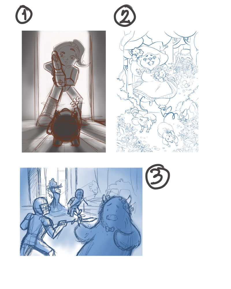
Hi, everyone!. I had a lot of ideas for this month’s topic. The sketches you see above are my top ones. Some are more finished than the others. If you ask me, i’m leaning more on 1 but i really wouldn’t mind finishing 2 as well. I think it will be a fun entry to my portfolio but i think #1 is more inline with this month’s prompt. Please let me know what you guys think. I’d love to know your thoughts. Critiques are welcome!
-
@nyrrylcadiz I like number 1 a lot.
-
@chip-valecek haha thanks chip!
-
@nyrrylcadiz one more for no#1. Great concept and comp. Please please take it further

-
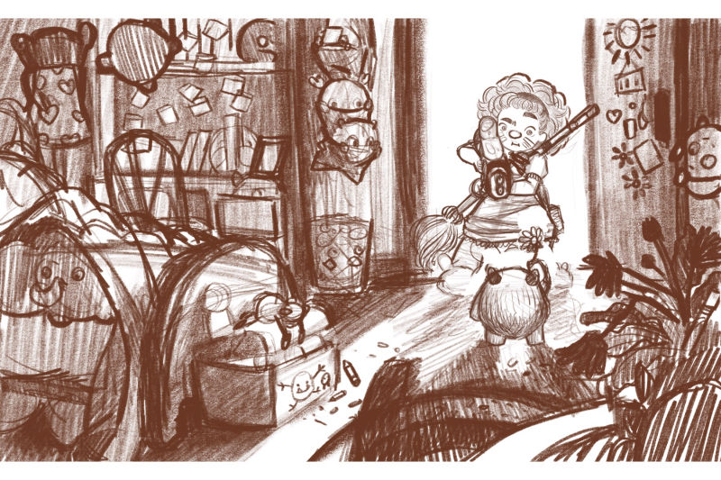
@nasvikdraws hi! Thanks! Yeah i’m planning to expand that illustration such that it will show the girl’s entire room, showing tiny monsters just like the one in the sketch, hiding in nooks and crannies and what not, hinting that what he’s actually doing may not be because he likes the girl but is actually a making a diversion for his friends. I think that concept will raise more confusion on what his real motives are which in turn will trully make him a misunderstood monster. Phew! I hope that wasn’t too wordy. Lol
-
I like number one. It's definitely got a lot of potential for dramatic lighting. That cat chasing after the mouse Hansel and Gretel is just amazing, though!
-
I like one but the silhouette of the kid could read better so you know what she is holding
-
Yeah, i like nr 1 a lot too, it have very sharp values, but i also liked nr 2 with it storytelling

-
@nyrrylcadiz Another vote for number one. Love your ideas though

-
@sas @rcartwright @Art-of-B @Ailantan thanks ror the support guys. I’m very happy you like the sketches.
I’ve been working on sketch one and so far this is what i came up with.
I’ve also been working on number two. The one wih the with witch cat and mice hansel and gretel. I’ve been playing with the colors and i really like how .they’re turning out. Here’s what i’ve worked on.
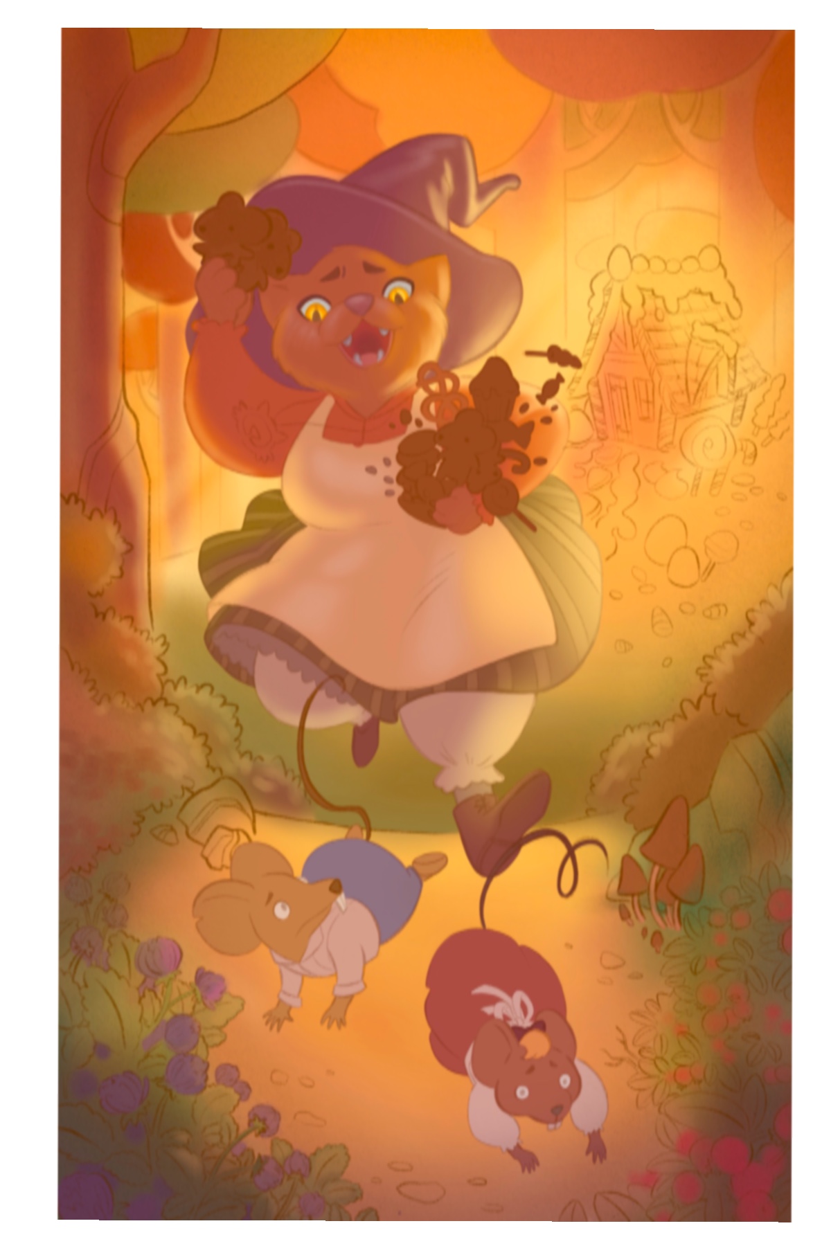
Working on number 2, i’m finding myself liking it more and evevn considering using it as my entry. I’m not really sure though. What do you guys think? Should i keep on working on #1 or should i go with #2 instead? I would definitely love to know what you guys think. Thank you!
-
@nyrrylcadiz I love the colors you’ve used for number two! Although this one is really great looking too, my eyes kind of lean more towards number one because there’s more mystery in that picture. Also more to see, more to take in. My brain goes to wonder what will happen next.
-
I like number one more now

-
-
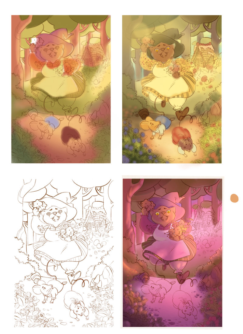
Hi, guys! I know some of you might be mad at me for posting this since you prefer option #1 but i just can’t resist working more on sketch #2. It’s just more apealling for me. Also since i’ve been seeing a few entries similar to #1, a monster giving a flower/gift/something to a girl or vice versa, I’m afraid sketch #1 is getting too common. It’s a also making me recons9der if i should go through with it. My main goal for these monthly competitions is to have a new portfolio worthy piece but having a little exposure here and there also wouldn’t hurt.
So, below are some color comps for sketch 2. I’m leaning more to that pink one at the bottom. What do you guys think?
-
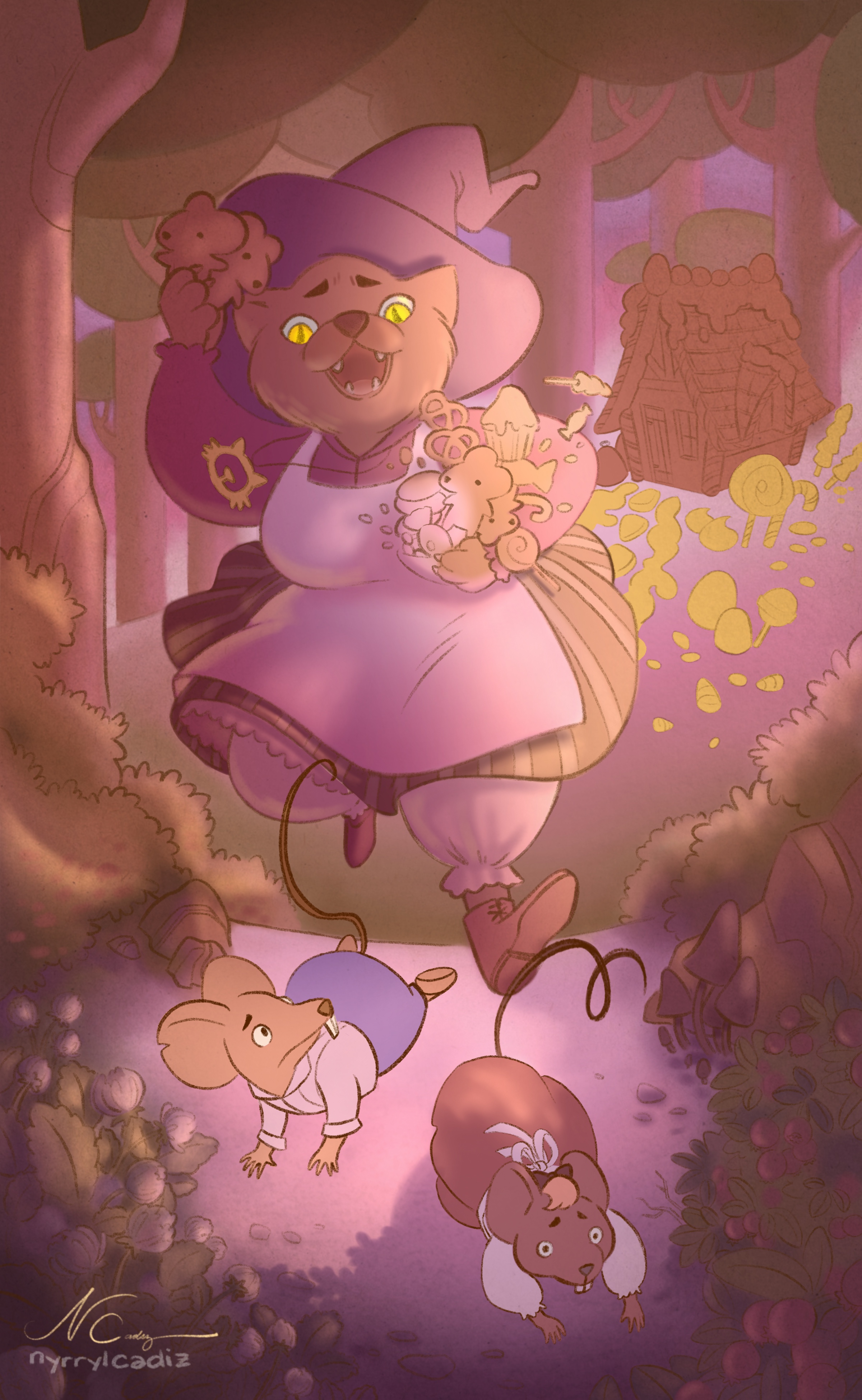
I’ve been trying to finish it, too. If time permits, i’ll make another piece similar to option #1 but with a slightly dufierrent concept. Then, i’ll let you guys decide which one i should use for the contest. I hope you like this. It’s still a work in progress. Please let me know your thoughts and critiques. They’re highly appreciated.
-
-
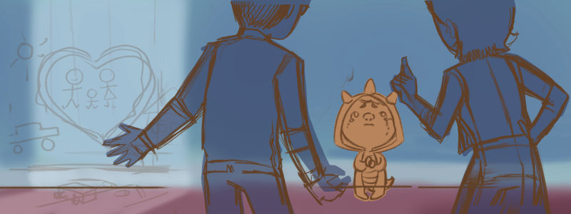
Hi, everybody! I’ve been playing around with this new sketch. Any thoughts?
-
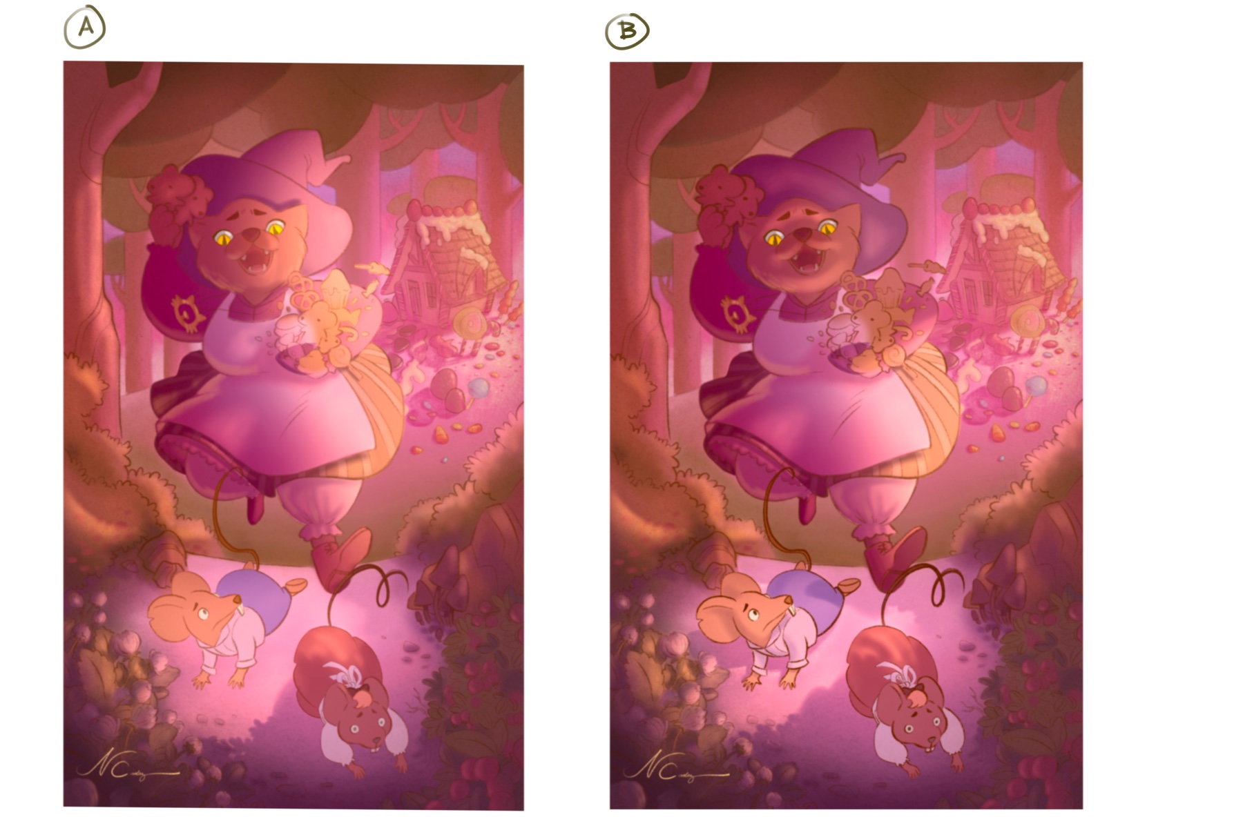
Hi, everbody! I need your help. Which lighting do think i should go with? Option A is fun but perhaps it doesn’t sell the ‘misunderstood monster’ theme enough. What do you think of option B? Thanks everybody. Please let me know which one you guys prefer.
-
@nyrrylcadiz Very late to this, but first I wanted to say that I really like the piece you did with the flying dog

Going back to your original concepts, I think that 1 had the best read. I also liked 3 as I thought it was a nice snapshot into a bigger story.
I don't think that you needed to expand the frame to include the other objects and monsters in no.1, as it feels like there is too much story and the main concept has been lost somewhat.
the new sketch of the kid been told off by his parents is also very promising, but perhaps it would work better in portrait rather than landscape as the composition is getting divided up into quarters.
In regards to the cat and mice one, i'm not exactly sure what the story is about. On first read it kinda reminded me of the crazy cat lady from the simpsons who throws cats at the children. I don't know if you decided to veer away from the competition title (which is fine if you have a great concept) but is the cat good or bad and which character is misunderstood? Also why is the candy/chocolate she is holding in the shape of mice? Is it following the same story of hansel and gretel or is the cat witch (?) actually nice and the mice just got shocked and decided to run away once they saw the chocolate mice.
I love the design you did of the house, but it has much more detail than the foreground elements which I feel is causing issues with the composition. I would much rather see the characters much closer to the house and interacting with it in some way as it seems a shame to be just used as a background object.
In regards to the lighting, it depends on what is the story you are trying to tell. I don't think that either lighting scheme helps narrate the story and I would go back to working on it in black and white to do a few value studies first, rather than working on the details before the main idea has been told.
I hope this critique didn't come off as super negative. I think you have the skill set to get a great piece done and it feels like you are spending a lot of time working on the details before the foundation has been built.