Pushing My Art Forward/Critique Please
-
Hello everyone~ I just joined the forums today! I really would love to take my work to the next step in order to land some illustration jobs, but have been struggling to push my artwork over the top. I work predominantly in watercolors. If I'm being honest, I don't think I have a lot of depth to my work.
I'm looking for some honest feedback in terms of what works, what doesn't. How does subject, skill, expression, and story rank?Thanks in advance!!
 !
!
-
Welcome to the forums
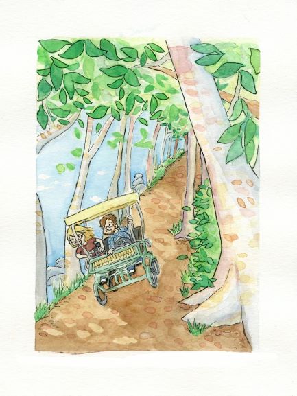
 glad to have you. I'm an amateur so take my words lightly lol but I really like your style. All the pictures look fun, tell a good story. The colors look good. Something I noticed though is maybe the expressions of the characters in the illustrations. They could probably be more vibrant and different, more expressive. The first pic for example, I really like the composition and everything, but I know if I was the guy riding along with a girl driving like that, I'd be considerably more concerned lol. I hope I'm making sense.
I'll ask as well, have you listened to the 3 point perspective episode about "I'm a good illustrator why won't anyone hire me?" or something like that lol. That's a big help. The podcast on general has tons of good info if you haven't listened to it.
-
Hey, thanks for the review! I have listened to that podcast.
 I'm definitely looking to compare my work to those of masters I admire. I think I'm just struggling with how to get to that level, if that makes sense. Like, by looking at my work, it's clear I have a lot to improve upon when placed beside them. I know line work is definitely a thing I need to improve. I just was hoping for outside perspective into whats working and whats really not. I agree though, haha, a lot of my artwork has similar expressions.
  As much as I try to expressing things through the body, I know I could definitely push everything more.
 -
Hi Sarah! Welcome! I just started getting active here too, so we're classmates - how exciting! Although I haven't made the giant leap of asking for a crit yet - so kudos to you! I'm really enjoying your story telling and how you push some of the viewers perspectives to make more dynamic compositions.
The thing that popped out at me is how soft your paintings are - I work in watercolor too and for me it's really scary to add that second layer of darker colors, but I think your pieces could really pop if you played a little more with darker colors, some browns, and more saturated colors. The beauty of watercolor is you can still have soft images with richer color.
Also mixing browns in watercolor is so rewarding! I love to throw a rich blue and a rich orange together, and sometimes the pigments separate from each other which gives so much life to the neutrals in an image.
Really looking forward to seeing more of your stories
-
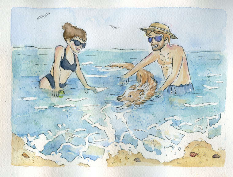
Love these, especially the one with the couple teaching the dog to swim! I would just reiterate what has been said already--add more values and more color.
-
Welcome. I agree with @kaitlinmakes
-
@sarahmaeliz hi Sarah!!!
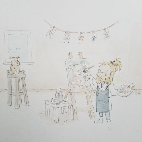
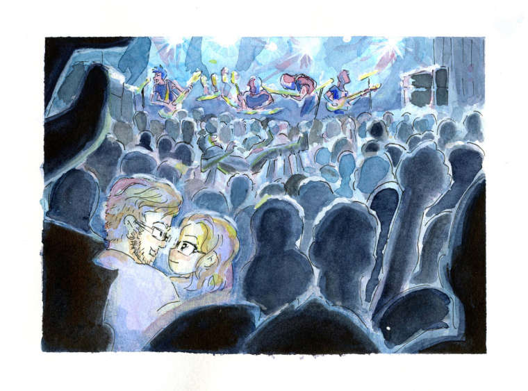
 I agree with many things already said, you have a lovely vibe going on, and I would suggest you dare to make more contrast. Not always easy hahah but contrast gives so much more life into things. Maybe doing some more trials like the last one, the couple at the concert? that one has the more depth of all the uploaded ones. Playing with the 3 layers (front dark one, middle colorful one, far away lightest one) to give depth can be a nice exercise. That, only if you wanna go that road for adding depth, that's a good rule and way to add it. I do love the couple in the water with their dog, and the first one too. lovely style. And that lil girl
Story telling for me is good, they all tell stories
About face expressions, mmhhh... yep you could try making more different ones. They look all same happy for me.
Lovely style
-
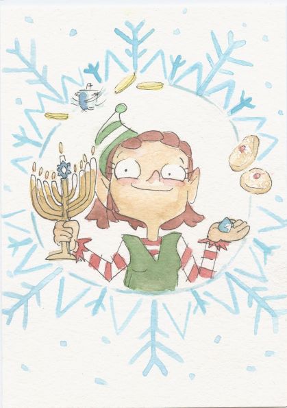
What a promising start! I think you've got a great sense of composition, anatomy, and color. You have lots of lively scenes and engaging scenarios. Your chosen medium, watercolors, can be very challenging to take into full darks and lights and get the contrast you want out of them. I would also take note and avoid compositions where the main character's face is diced up in an awkward way (like in the first image). I would also work on getting comfortable rendering hands so they have the same lighthearted feel as the rest of the work. Love your holiday elf! Keep going.
